Alameda bedroom painting

Top Paint Colors to Increase Your Home’s Value

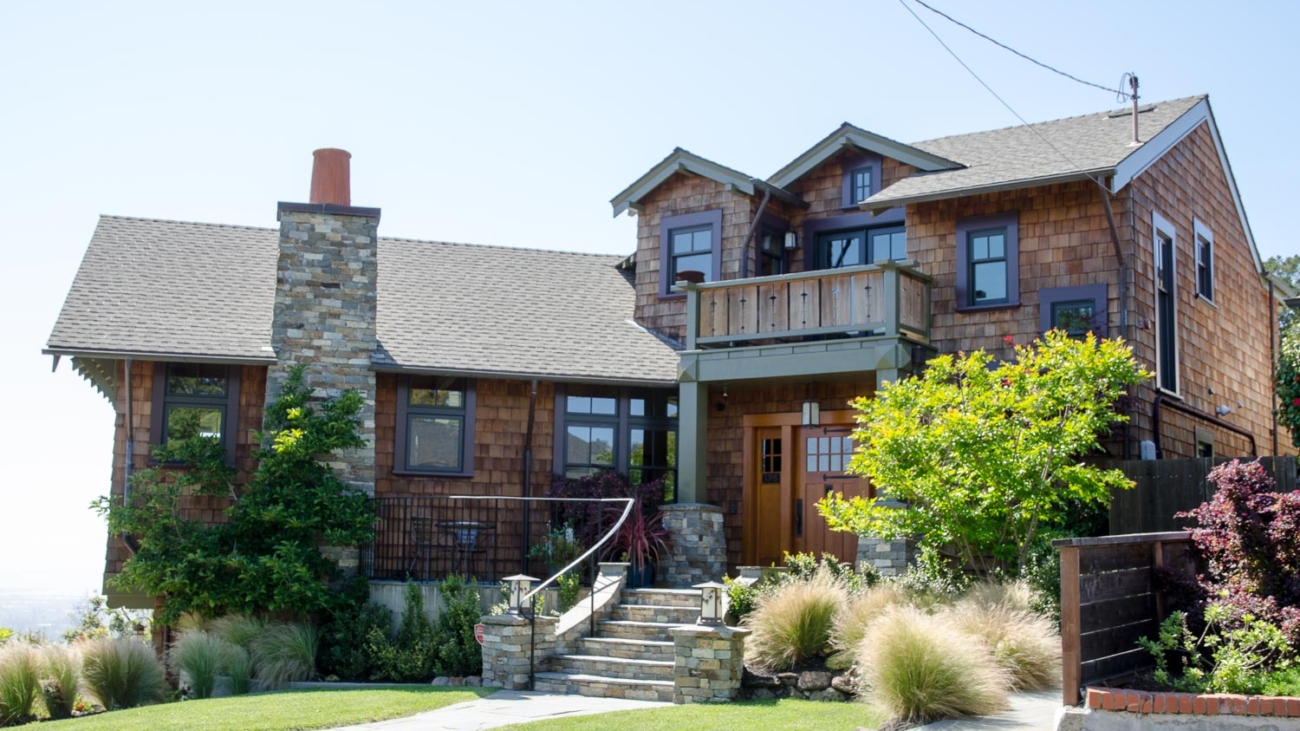
Curb appeal is everything when it comes to elevating your home’s market appeal and value, the power of paint (and choosing the right color) cannot be overstated. Selecting the right palette can transform your space from “just another property” to the property on the block. But in this sea of endless color choices, which colors should you bet on? Fear not, as we guide you through the top paint colors to boost your home’s allure and value.

Neutral Yet Sophisticated: Why Grays and Beiges Reign Supreme
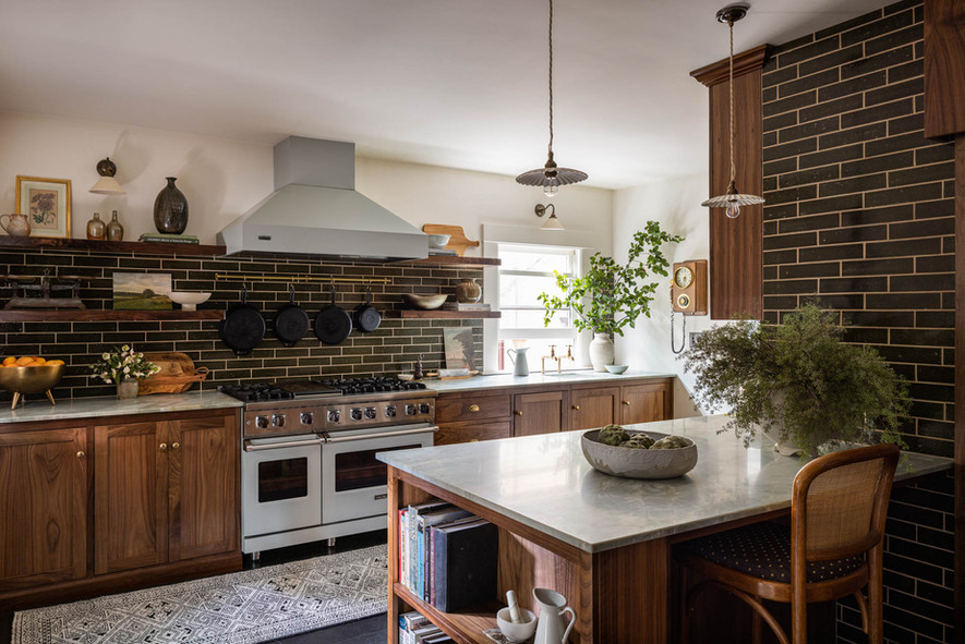
First on our list is the ever-versatile gray. Far from being dull, the right shade of gray offers a backdrop that is both sophisticated and neutral. It’s like the Switzerland of colors—peaceful, neutral, and widely appealing and it goes with everything! Whether you opt for a cool slate or a warm dove gray, this color supports a variety of decor styles, making your home a canvas for potential buyers’ imaginations. Some amazing Benjamin Moore grays are Kendall Charcoal HC-166, Wrought Iron 2124-10 for darker and richer grays, on the lighter side, there is Storm and Chelsea Gray HC-168

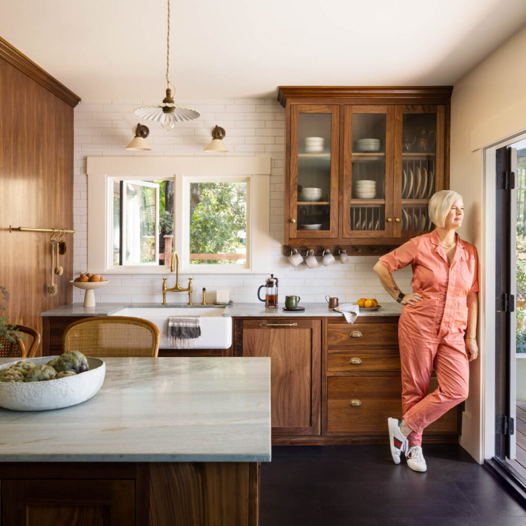
Not to be outdone, “beige” has made a comeback. Just be careful you are not bringing back the 70s version of it. Once deemed too blah, today’s beiges are anything but. With undertones of pink, green, or gold, beige can add warmth and depth to rooms, suggesting a canvas of endless possibilities to prospective buyers. It’s like giving them a warm hug, saying, “Welcome home.” Benjamin Moore’s Shaker Beige HC-45 is a CLASSIC that Interior Designers use as a go-to, Grant Beigh HC-83, Manchester Tan HC-81or Sherwin William Accessible Beige SW 7036 or Valspar Savory Beige 3002-10C.

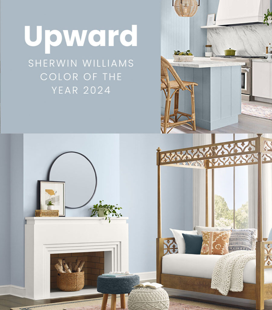
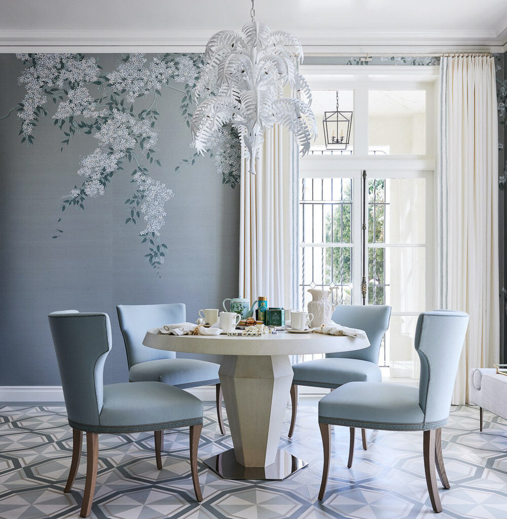
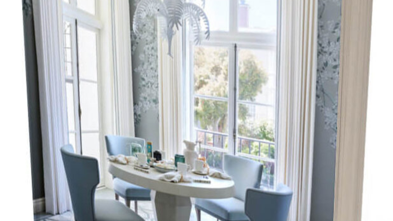
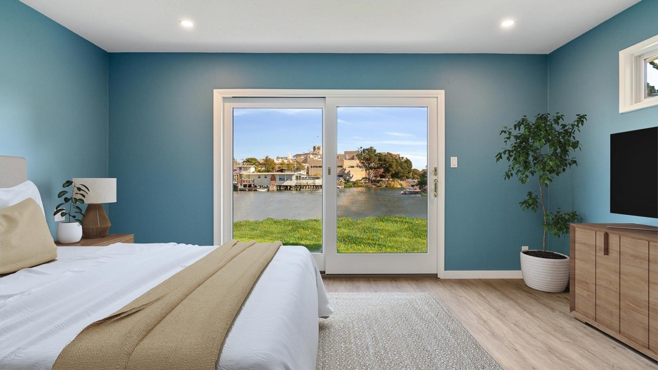
Blue Hues: Tranquility Meets Value
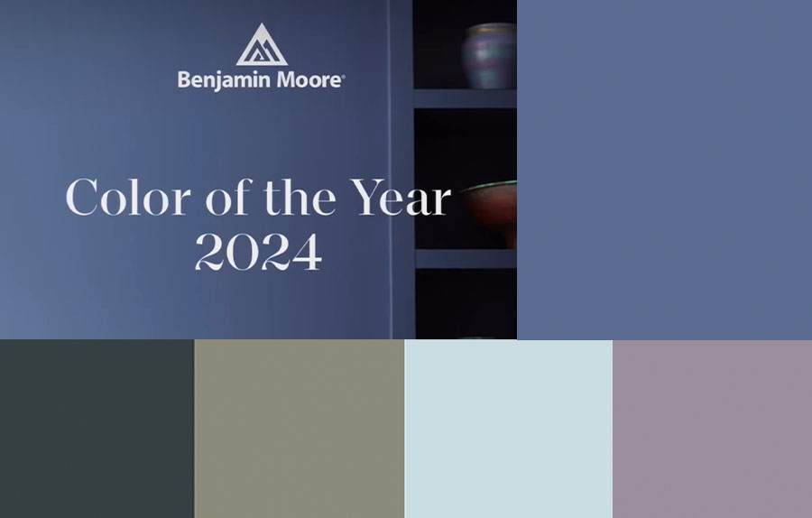
Moving into a more dramatic and colorful territory, let’s talk blue. From the soft whisper of powder blue to the deep reverence of navy, blue hues bring tranquility and serenity to spaces. Kitchens in soft blue tones feel fresh and clean, while a navy living room exudes sophistication and depth. It’s like your home is taking a deep, calming breath, inviting everyone to relax. Some great blue colors are Blue Note – 2129-30, Majestic Blue – 2051-40 or Hail Navy HC 154, Van Duesen Blue HC-156 or Blue Hydrangea 2062-60. https://www.pinterest.com/pin/201465783323817683/

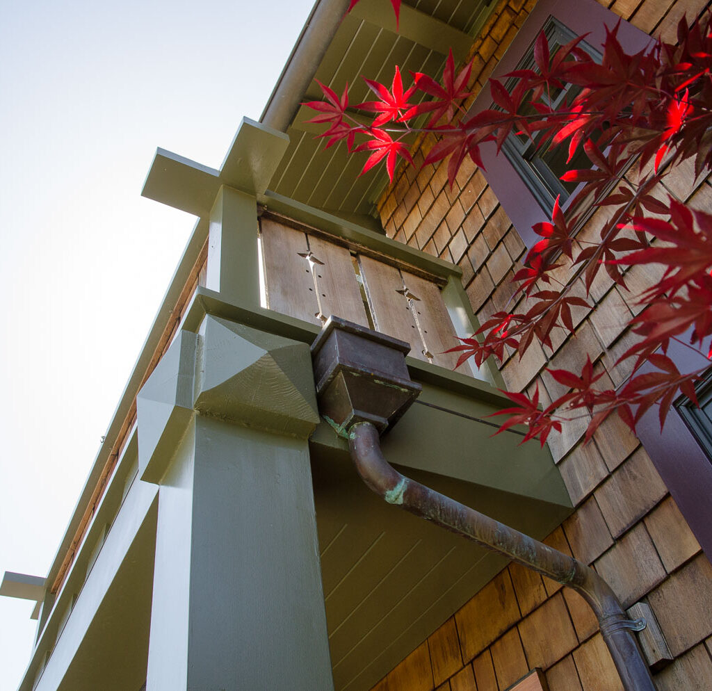
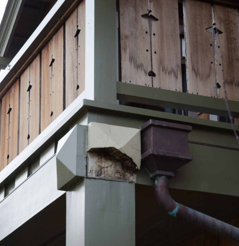
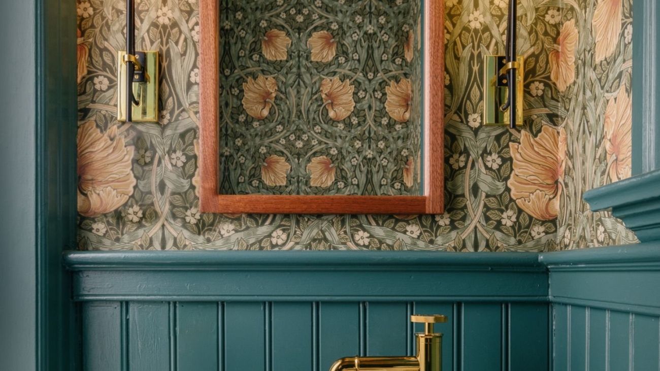
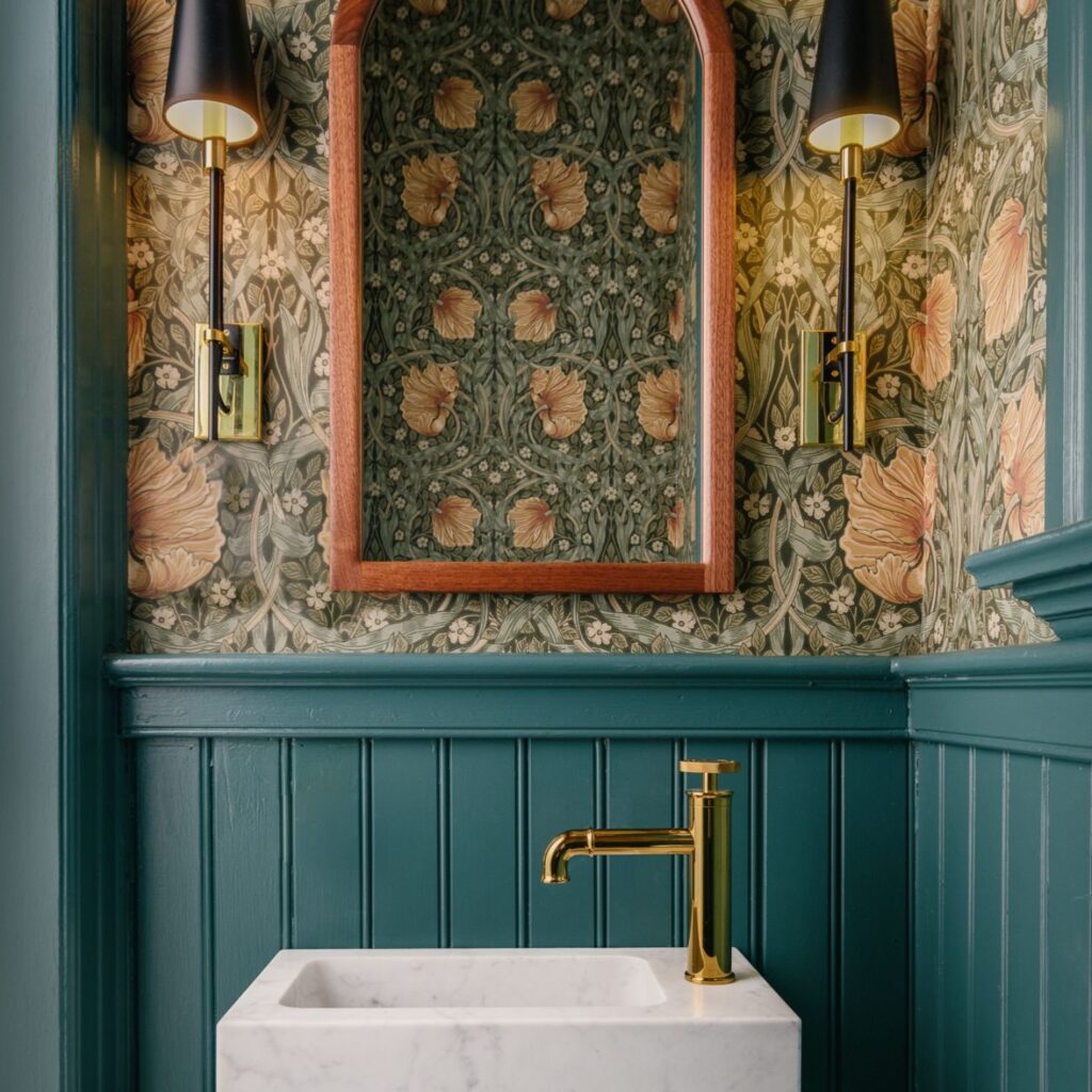
Going Green: Bringing the Outside In
Green is not just for the garden. Interior spaces splashed with sage or olive green blur the lines between the indoors and the great outdoors, creating a refreshing and inviting vibe. It’s like your living room decided to put on its best leafy dress to impress. Green works wonders in spaces that crave a touch of nature, making them feel more open, airy, and connected to the world outside. Some great greens – Guilford Green, HC-116, Saybrook Sage HC-114 , Gray Wisp is a green gray that really walks the line!!

The Bold Statement: Black Accents
For those daring to make a bold statement, black accents can add a layer of sophistication and modernity to your home. A black front door, for example, can increase your home’s curb appeal, suggesting elegance and timelessness. It’s like your home’s way of wearing a classic little black dress, making it stand out in the neighborhood. Guilford Green, HC-116, Saybrook Sage HC-114 , Gray Wisp is a green gray that really walks the line!!

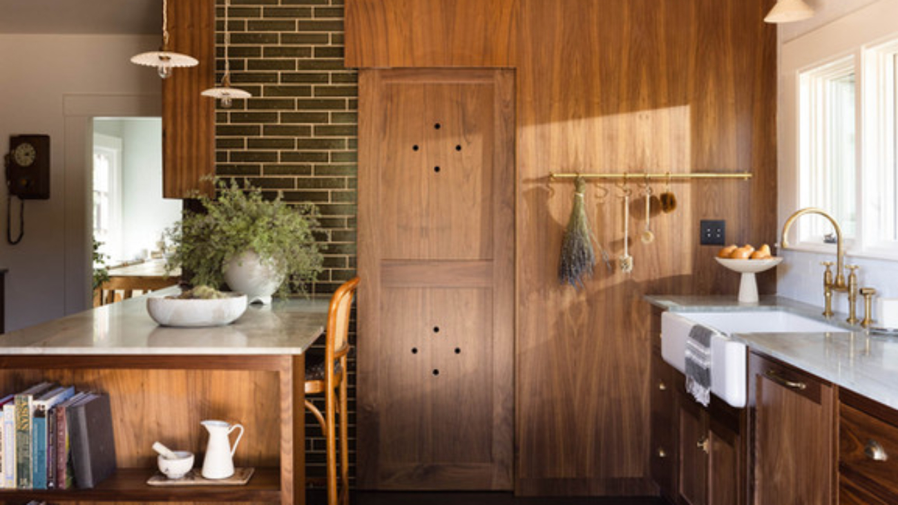
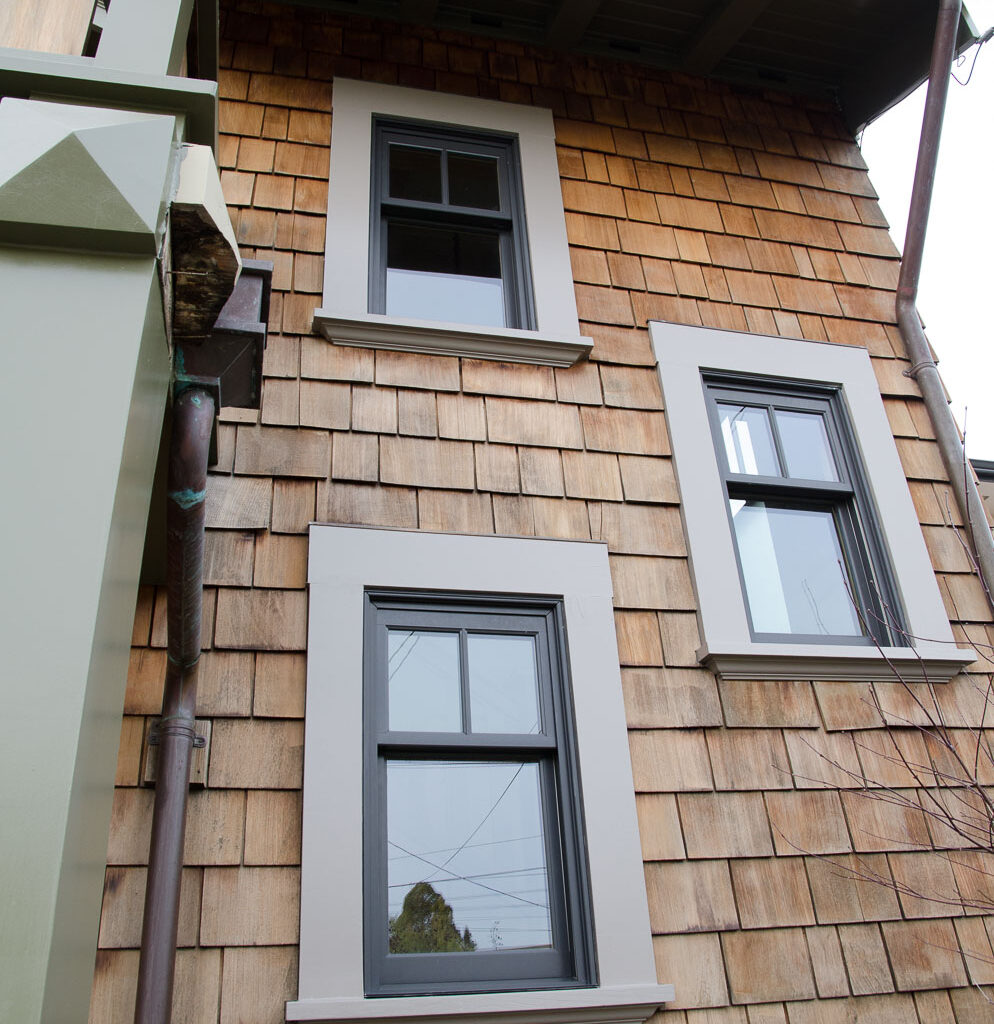
Warm Whites: A Canvas for Life
Warm whites are actually a brave color choice and they are the unsung heroes of the paint world. They provide a backdrop that is both inviting and flexible, allowing architectural details and furnishings to shine. They look great on tongue and groove siding. They are like the supportive friend who makes everyone else look good, creating a welcoming atmosphere that makes a house feel like a home. White Dove, OC 17, Swiss Coffee OC-45 or Navajo White 947 are great choices for a warm white.

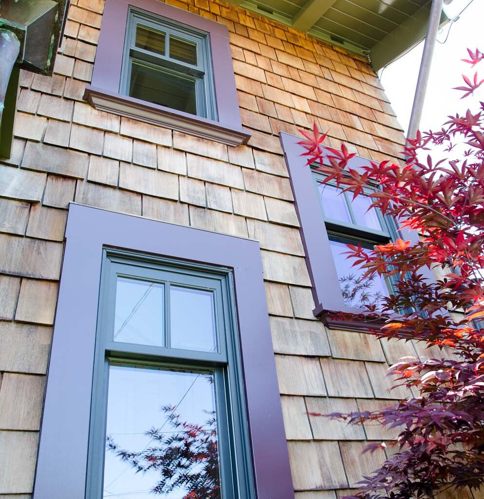
The Power of Pastels: Soft, Subtle, and Soothing
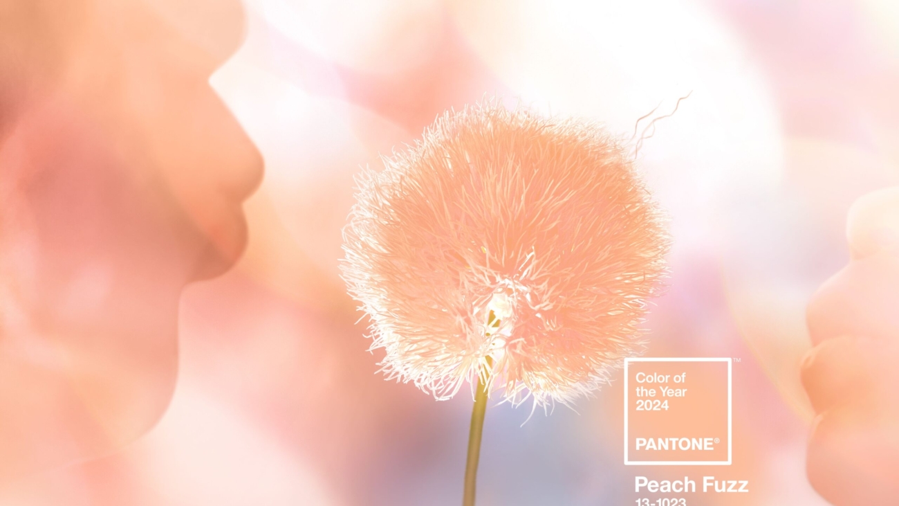
Lastly, let’s not overlook the gentle charm of pastels. Soft lavenders, pale pinks, and muted peaches offer a whisper of color, bringing a soothing and calming presence to any room. They’re like the delicate first blooms of spring, hinting at renewal and fresh starts, which can resonate deeply with homebuyers. Ask us for our professional color consultation to choose a good pastel!

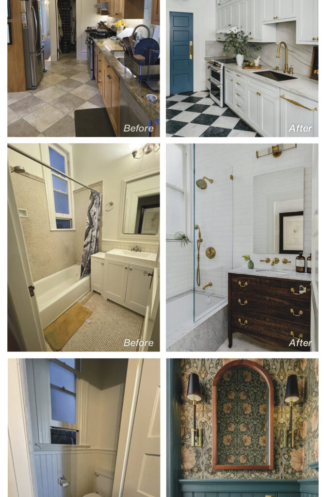
Choosing the right paint color is like selecting perfect outfit for the year! It sets the tone, creates an impression, and, if chosen wisely, can lead to classic and timeless beauty for your home. By opting for classic and trendless colors for your home, you’re not just painting walls; you’re enhancing the appeal and potentially the value of your home. Painting your exterior is a 151% return on cost. It is rally not a cost, it’s an investment in preservation and resell value with the potential for a significant return, and in the competitive real estate market, standing out for the right reasons is gold. So, grab those paint swatches, and let’s turn your home into the masterpiece it’s meant to be.

Need Help Picking Your Colors?
Schedule A Color Consultation Today!
510-567-9559

Danielle Fox of SLATE contemporary. Photo credit: Lauren Edith

Home as Canvas and Art Gallery

Interior painting and artwork have an intimate relationship. The way that light reflects, the color tones shifting against the other’s presence. It is no small thing to choose the right location, lighting, and wall color for art, or to choose the right wall color when those factors have been set.

Which is why we adore and appreciate Danielle Fox and her team of art consultants at SLATE Contemporary in Oakland. An art consultancy and gallery, SLATE represents primarily California artists, many of them from the Bay Area, with a focus on modern contemporary art.

“Our gallery and consultancy is known for contemporary, abstract art. We are always looking for a strong sense of formal qualities, which is about what the materials are and what they will do; artists that are working with composition and color; lines, planes and depth,” explains Danielle.

With over 40 emerging and mid-career artists in their stable, producing abstract, landscape, cityscape, figurative art, impressionism, expressionism, street art, op art, minimalism, and installation art, SLATE has a prodigious rotating collection. About 75% of the artists SLATE represents are based in California, with one-third of that group from the East Bay.

SLATE is a physical gallery in the vibrant Uptown neighborhood of Oakland and participates regularly in promotional events including First Fridays, Saturday Stroll, and Art Murmur. SLATE is also a consultancy, helping homeowners and business owners make decisions about purchasing the right art for their spaces.

“We are really looking for art that people want to live with in their homes,” Danielle explains. “Our emphasis is on art that fulfills the senses in some way, feeding the spirit with beauty and bringing the mind to a place of clarity. Political and conceptual art, by contrast, are important, but are not what most people want to wake up to in the morning or come home to at the end of the day.”

Additionally, SLATE works with Interior Designers and Architects to help them select pieces for their clients and projects. (One of Arana’s favorite Interior Designers is also a visual artist represented by SLATE, Anastasia Faiella.)

Danielle’s parents were artists and, “for the longest time I thought I would do anything-but!” She laughs.

She ended up “falling in love” with Art History in college, obtaining her Ph.D., and then working at Sotheby’s in London for four years. Instead of becoming a subject expert, she found herself drawn to a business development and strategy track. “I learned that I enjoy managing projects and working with people. So now, I get to do these things and do them in relation to the art world, while supporting a local community of artists and collectors.”

Danielle opened SLATE in March 2009, in Temescal. In 2013, she partnered with Shelley Barry which enabled SLATE to expand into commercial art consultancy for businesses, offices, building lobbies and the like; and they moved the gallery to its current location, where, this year, they celebrated the businesses’ 10th anniversary. SLATE Art Consulting serves clients all over the San Francisco Bay Area, including the Peninsula, Marin, Napa, Sonoma, Berkeley, Oakland, Orinda, and Lafayette. SLATE also has a presence in North Lake Tahoe with rotating exhibitions at the Ritz-Carlton hotel and a local representative to work with clients in Truckee, Martis Camp, Northstar, Mountainside, Incline Village, and surrounding areas.

But wait! There’s more…

Community Member Spotlight: Our Beloved Writer/Editor our beloved Julie

Community Member Spotlight: Our Beloved Writer/Editor

Longtime readers of our print newsletter may have noticed that not all of our articles are about paint or painting (fun topic for us, but maybe too repetitive for you) and that most of our articles are written by me or Julie Feinstein Adams — plus the occasional featured guest, or reprints from the blogosphere.

This month, we give you a behind the scenes peek at our newsletter creation process, putting the spotlight on our writer and editor and her contributions — who she is and how she is not only one of the loveliest people you will ever meet but also how she makes the “magic” of words happen for us, every issue.

Julie Feinstein Adams’s first professional writing job was as a freelance writer for the Daily Californian in 1989, and she performed her first autobiographical solo show in 1992 — both of which marked the start of a wide-ranging career encompassing journalism, theater arts, public relations, and marketing content and consulting. Julie Feinstein Adams has spent decades telling stories — others’ and her own.

Business Growth Network, a BNI Chapter where we met Julie

Her current projects include working on her memoir — in the forms of both a one-woman show and a book — about her marriage to a person who transitioned genders. (View an early version/short performance, here: jfacommunications.com/wtf-solo-showdown.)

She also volunteers with OurPath.org, hosting an online support group meeting for Partners of Trans People.

Julie and I first met in a local business networking group in 2008 and we immediately bonded. Since I have always been a wannabe writer, of course, I was drawn to her! She is a storyteller with a passion for the way that stories connect people; I am all about building community connections; it was a match!

For me, this newsletter is my form of craftsmanship. Why do Arana’s painters get to have all the fun, engaging their craft? With Julie, I get to take to my little soapbox/sandbox and do the otherwise ordinary task of writing a newsletter, my way. Arana is a painting business, yes, but we also love sharing about different aspects of the Bay Area and the things that are meaningful to us — and hopefully, this benefits you as well.

BY MARKETA

How It All Works:

In our monthly brainstorming meetings, Julie and I bounce ideas off of each other and take notes, which then become drafts. Sometimes we compile resources on a topic and that becomes a how-to article, other times we interview a community member or highlight an industry partner. These interviews become profiles, or we edit the material into guest posts, thus giving voice to, or ghostwriting for, those colleagues and friends.

As I’ve said many times in this space, and as inscribed in Arana’s mission, I deeply value community, especially community health and beautification. So, by spotlighting my colleagues and friends, as well as the cool things we find out about, and the recipes we love, this is me being of service, aligning my work with my heart-of-hearts wish for all of us — that we all thrive, prosper, and enjoy life!

The Thing About Julie:

Julie is not only a writer and performer, but she is also a coach, specializing in both business coaching and dating coaching. (Yes, dating coaching is a thing; that’s what I love about living here; there is help for everything!)

Julie explains: “As I was working with my clients — whether producing marketing content or content for dating profiles — I recognized that I was helping people clarify and articulate who they are and what they have to offer, and how their stories, the things they care about, connect them to others. So, in 2011, I became a coach.

“Whether I am working as a coach or as a writer, I am seeing beauty, or you could call it ‘essence,’ and putting a frame around that. I’m listening for that underlying thread, perceiving what is wanting to emerge, and helping my clients to recognize it in themselves and be empowered by it.”

Julie’s writing is a kind of coaching for me. It does something. It gives my thoughts form and content and helps to grease the wheels of expression. When Julie and I do this newsletter together every month, the idea generation doesn’t even take that long; it’s effortless. She’s like my own personal Blarney Stone! I get on a call with her and the ideas just start rolling in. Everyone needs a Julie!

From soup to nuts, newsletter production is a cottage industry: our in-house process includes Kristina Islas (eyecatcherdm.com) who handles the graphic design aspect; Courtney Montecino, our Assistant to the Customer Account Manager (and whom many of you talk to when you schedule your site visits), who is our proofreader, plus my daughter Sofia who does the folding and stuffs the envelopes for our print edition!

Julie offers life, business, relationship, and writing coaching, as well as group workshops on memoir writing and business blogging. If you are an aspiring writer — this is for you! Learn more at: jfacommunications.com

5abd2d_802f20c63b7b46d9bb7c8c5d45947d9c~mv2

Featured Interior Designer Colleague: Congratulations Heather Cleveland!

HCDS’s kitchen design selected for million-viewer Design Trends Forecast 2024 round-up

Arana has been delighted to be working with Heather Cleveland of Heather Cleveland Design Studio, helping realize her visions for her clients and projects. In this article, we wanted to spotlight the recognition she recently received for her design talents, compliments that are richly deserved!

This kitchen Heather calls “moody” and “hippy-meets-traditional-English” features loads of warm wood grain paneling and cabinetry accented by deep-olive-green tile, making it a winner in the eyes of Interior Design influencer Emily Henderson (stylebyemilyhenderson.com) who selected it as a harbinger of trends for 2024. View article: 7 Kitchens that Have Real Staying Power Because They Are That Good

Keep an eye on HCDS as this firm is a rising star in the Bay Area and will be one of our designer colleagues vying for a slot in Oakland Magazine’s Best-Of contest, coming this spring. We’d love to see you nominate your favorite designers and contractors during the nominations phase in March and April including us! (And of course during the Voting phase, which happens in late April and May.)

If you need ideas for nomination-worthy folks, please feel free to consult our “2024 Home Services Buyer’s Guide” which you can find on our website in the “Inspiration Hub,” under “Resources”

Pantone Color of the Year for 2024 Mostly a Miss

Pantone Color of the Year for 2024 Mostly a Miss

Experts weigh in on the awkward feeling surrounding 2024’s pick
A tradition since it was first introduced in 1999, Pantone’s announcement of the Color of the Year usually evokes a sense of whimsy and excitement. From their wildly over-embroidered company language in their press materials, to the bold graphics the company chooses to illustrate it, their Color-of-the-Year announcement has always been greeted with a fair amount of joy.

More a harbinger of industrial and fashion design trends, Pantone’s Color of the Year does sometimes seemingly predict or at least influence play in interior design schemes. Last year’s super-fun Viva Magenta was the perfect example of this, showing up as pops of color in some rooms, and whole walls and even ceilings in others. (See our article on this vibrant color pick from last year.)

This year, we aren’t so sure that will happen.

The reveal of “Peach Fuzz,” Pantone’s selection for 2024, has left us queasy and confused, and we are not alone. The New York Times recently published an article about the color, and the expert opinions gathered echoed our immediate reaction.

Discomfort with the name (which is redolent of pre-pubescence) as well as the actual tone (evoking a limited 1970s powder foundation palette matching Caucasian skin that decades of social justice work have forced makeup companies to expand, or the even more limited definition of “flesh” by Crayola) was not unique to us:

“When I think of peach fuzz — and Peach Fuzz — I think of preadolescents,” noted one reviewer… “Does the shade remind anyone else of a complexion? Specifically, a light one? That gave me pause, for a moment. I think about how brands like Fenty Beauty have pushed the cosmetics industry to make shade ranges that include people of color, especially those with dark skin. This color, plus the skin connotation of the ‘Peach Fuzz’ name, hews pretty closely to the shades worn by white people that there are no shortage of,” concluded another.

Additional comments addressed the color’s indistinct, rather fuzzy vibe: “A noncommittal shade. Neither pink nor orange;” “so, 2024: a year not for bold decisions, but for communicating a sort of vague pleasantness;” and “maybe a quiet, neither-here-nor-there color with just a hint of cheekiness (peach emoji, anyone?).”

However, dragging ourselves away from obsessing on what feels like a marketing miss by the industry leader, we can foresee that the color itself might in fact show up in interior designs this year.

The trend seems to have started last year as we personally noticed an increase in designers showcasing rooms with warmer neutrals, layering earthy terra cottas and corals with pale-peach-leaning beiges and highlighting with creams.

In its own way, Benjamin Moore seems to be on top of the pro-peach-slash-warm-neutrals trend with one of its palettes for 2024:

And yet, note that the top color BM proclaims for the year is “Blue Nova.”

Followers of our blog and newsletter for years — or fans of Benjamin Moore — know that the paint company always covers its bases with multiple palette options each January (see our color of the year report for 2023, also located on the “Resources” page of our website) — and these are usually tangential or entirely unconnected to Pantone’s prognostications.

For 2024, Sherwin Williams put forward what the company deems “a breezy, blissful blue,” they call “Upward.”

While we love the sentiments they claim it inspires, “brimming with positive energy, creative thinking, and total contentment,” we’re not sure this color is that. It feels a bit gray to us. Not a bad color at all. Certainly a lovely pale, cool blue. But not quite what we would call “a sunny-day shade.”

Still, it is a beautiful blue, and not unlike the tones Dina Bandman’s winning design reflected, in her sunroom/breakfast room en français for the 2023 San Francisco Decorator Showcase house, a vision we helped manifest:

Cabinet Refinishing Pros & Cons

Cabinet Refinishing Pros & Cons 2023

Cabinet refinishing is the quickest way to refresh a kitchen, also is a budget-friendly alternative versus replacing or refacing. If you’re looking to save time and money, the perfect way to start your improvement plan is with this professional cabinet refinishing guide.

What We’ll Be Covering

  • Cabinet Refinishing: Pros & Cons
  • What are Your Goals
  • Durability Solutions
  • Proper Preparation
  • Correct Primer
  • Correct Finish
  • Arana Project Examples
  • Arana Designer Solutions
  • Arana: Get in Touch

DOWNLOAD GUIDE

Maxwelton After-2584

After and During/Before: A Brown-Shingle Exterior in Piedmont

A repeat-client for Arana! This client purchased a new home in Piedmont and called us in to do some restoration and repair on the front door frame and period details on the wood balcony/decking.

We applied a clear product to the shingles that both protects against moisture intrusion or damage, and is flame retardant. We applied a protective and beautifying varnish to the doors, and the gorgeous wine-purple paint color the client selected that transformed the window frames and brought out the beauty of the home as a whole.

Powder+Room+-+JCD+Guerrero+Street

Perfect Powder Room and MORE: Designing for Small Spaces with Jaclyn Christensen

Followers of our Instagram or Facebook feeds may have noticed that occasionally we just can’t help but shout out powder room and water closet designs. There seems to be something about them that inspires bold choices and whimsy. A jewel-box quality. Is there a difference when designing for large or small spaces? We thought it would be fun to discuss this topic with interior designer Jaclyn Christensen, of Jaclyn Christensen Design for whom Arana has recently provided wallpaper and paint services on multiple projects — all of which absolutely delighted us.

Note: Our article features AFTER images of the stunning Victorian water closet design under discussion, as well as transformations throughout the 1300 sq ft, two-bedroom home in San Francisco. Jaclyn also shared with us her cell phone snaps of the BEFOREs, which we get to share with you! This JCD project was recently featured in California Home + Design magazine.

Arana Craftsman Painters: So, let’s get to it!. Small spaces, what makes them different?

Jaclyn Christensen Design: Sometimes small spaces are more fun than large spaces, because the challenges they present are different. Of course, every space is ultimately a challenge in some way, a puzzle to solve. You have to find the right pieces that fit together.

Arana: Are there rules or guidelines for choosing colors in large vs. small spaces?

Jaclyn: When it comes to color, I don’t think there are any rules. Some might say ‘Never paint a small space dark because that will make it feel smaller.’ But I don’t subscribe to that at all. Color choices depend on what you want the space to feel like. If you want a moodier space then we’ll pump up the color, choose one that has a saturated impact. If you are looking for more light and airy, we will handle that decision differently. It’s really about what the client is seeking, how they want to feel.

Arana: Can you say more about what went into the design for that stunning Victorian water closet?”

Jaclyn: Well, the client didn’t say ‘Hey, we want a moody water closet!’ But given that this is a Victorian era home, the inspiration to play with pattern and color came from there. It is true that powder rooms and water closets can be particularly fun spaces to stretch the creativity. It’s a bit of a contradiction, but for certain small spaces you can really push the boundaries, push the design.

Arana: It seems like possibly because it’s a small space, clients might feel more inclined to take risks there. Is that accurate?

Jaclyn: Yes. Clients are typically more willing to go a little crazier and bolder in a powder room or water closet because there’s a boundary. You can shut the door. It’s not their main living space.. It’s a little moment of their day; a little moment for their families — and guests, if they entertain a lot.

Arana: Do you ever have projects where the client wants to go bold throughout the house?

Jaclyn: Not yet, but I would love to have that client who would want to go big — ‘The sky’s the limit!’ That said, I am grateful to have clients who have that trust and believe in my capable hands to create the space they want for them and their families. This project was exactly that. These clients were so trusting of me, my design expertise, and the process. It grew exponentially over time as they saw how the results were really changing their experience of their home. We ended up touching the whole house. No pillow left unturned! The most successful projects are when you are really in sync with your client. They trust the person they hired to lead the way.

Arana: Did you have to talk the clients into the bolder elements of your design ideas?

Jaclyn: They were such wonderful clients — they were game for everything I put in front of them! From the black-and-white marble floors in the kitchen to the floor-to-ceiling marble tile and slab in the bathroom; the beautiful Philip Jeffries wall coverings and the gorgeous Waterworks fixtures! They did not skimp on quality or detail.

Arana: You mention that this project started small and then grew. What was that process?

Jaclyn: Well, many design projects have their way of kind of organically expanding on their own, because design in itself is not a straight line; this room touches that room and changes in one affect another. In this case, we started with just tackling a remodel, kitchen and bathroom, but because of Covid, timelines slowed down, and while we were waiting for the contractor to come on board, we turned our attention to furniture and fixtures throughout the house. Normally we would start with construction and then furnishings, but due to the effects of the pandemic we were having to switch up our priorities.

Arana: It seems like you were inspired by the Victorian-era architecture, but not tied to it. Is that accurate?

Jaclyn: Yes. With Victorian era architecture, I like to keep original details intact and use them to my benefit, while having them work seamlessly into the new design. These clients have a love of mid-century modern furniture. So my goal was to marry the two styles and have the result feel holistic, to have them feel like they belong together. One of my favorite things to do is mesh different design styles and have the results feel seamless.

AFTER photos by Christopher Stark

1915 Highland Painters

Paint Is Elemental

Paint is elemental. It is, in essence, a creamy blend of many of the earth’s elements: minerals, resins, oils, clays. Yes, paint can be and historically has been manufactured with heavy chemicals and toxic compounds, such as lead. But, fortunately, there is now paint on the market that is made in a manner that is truly non-toxic!

The fact is, we cannot live without paint. It’s like skin. No building could really stand for any duration without it.

In the early training of our painters, we teach them about the ingredients of paint on every product we use, and we require that they read the technical datasheets, as well as the manufacturers’ instructions. You might think that paint is a benign liquid that comes in a can and can be simply slapped on, but it’s not that simple.

I love this description of paint by the National Park Service in their “Preservation Brief 28: Painting Historic Interiors” document. It speaks to the amateur engineer in me, as well as the crunchy woo-woo type who loves crystals (also me):

“Paint is a dispersion of small solid particles, usually crystalline, in a liquid medium. Applied to a surface, this liquid has the special quality of becoming a solid, protective film when it dries. Paint also enhances the appearance of surfaces. A late Victorian writer observed that the coming of a painter to a house was cause for celebration. Indeed, these statements not only indicate the chemical and physical complexity of paint, but also its emotional impact.”

The Park Service document goes on to say, “Until the mid-20th century, almost all paints used in America could be divided according to the type of binder each had. Chemists sought to improve paints, especially when the two World Wars made traditional paint components scarce and expensive. Modern paints are far more complex chemically and physically than early paints. More ingredients have been added to the simple three-part system of pigment, binder, and vehicle.

Fillers or extenders such as clay and chalk were put in to make oil paints flow better and to make them cheaper as well. Mildewcides and fungicides were prevalent and popular until their environmental hazards were seen to outweigh their benefits. New formulations which retard the growth of the mildew and fungi are being used. As noted, lead was eliminated after 1950. Most recently, volatile organic solvents in oil paint and thinners have been categorized as environmentally hazardous.”

Did you know that painters used to be called “Mechanics”? Or at least, that is something I read somewhere once, and our Project Superintendent Steve Rubenstein and I like to say, Mechanic as a title for painter really speaks to us: This idea that painting is an art and a science, that it requires specialized tools and knowledge, and that trade knowledge is far more vast than what is portrayed on the fast-forwarded frames of HGTV.

vintage paint ad
Historically, the use of paint as protection and decoration has been recorded all the way back to the first century! Like many great innovations in the development of civilization and science, the first place on record where paint was used to decorate and protect building structures was in China: Ancient craftsmen applied hand-ground pigments, such as ochre, to wet plastered interior walls.

A structure cannot maintain integrity without paint. And a surface must be prepared, and paint properly applied, for the overall job to last for the long term.

This is something I would love for both laypeople and contractors to understand. Often, painters are regarded as providing decoration, less important than builders, plumbers, electricians, etc., and not appreciated for the highly detailed, mechanical, methodical process it is. Paint is integral to a project, and not just because it makes things pretty (although we certainly love making things pretty, too).

I am so passionate about the craft of painting because it really is an art and a science. If I talk about how proud I am of our processes, and our team, I’ll sound like I’m bragging. Maybe I am! I feel very strongly that hiring a skilled craftsperson, or a team of skilled craftspeople, is important because what we do, what we know, can make the difference in not only how a project looks, but also the longevity of it. Everything I do in my life has to align with my personal values.

Thus, running a company that has the mission of painting buildings well to beautify and protect them, which then helps maintain and support communities, and the people who live within them, while also giving good-paying jobs to skilled craftspeople that helps them support themselves and their families, while also being conscious of both using and protecting the gifts of our earth’s resources — that’s me, and Arana, in a nutshell.

Bay Area Home Services Buyer's Guide 2023

Bay Area Home Services Buyer’s Guide 2023

Welcome to Arana’s list of trusted colleagues in the home services, contracting services, and building and remodeling industry!

Our team has personally vetted these providers in our two decades of serving with or beside them for our shared clients.

We hope that this guide is a resource for you as you steward your greatest asset, your home.

(Book cover image, credits: Hand-painted floor by Charles Leonard Finishes. Ceiling and door frames by Arana. Room design by Dina Bandman Interiors for SF Decorator Showcase 2023. Photo by John Merkl.)

General Contractors

Alward Construction
510-527-6498

Buestad Construction
510-523-1925

FMSProjects Inc.
415-722-9805

Jetton Construction
510-845-3506

McCutcheon Construction
510-558-8030

Wolfe Inc.
510-289-1344

Design/Build Contractors

HDR Remodeling
510-845-6100

New Key Construction
925-369-5559

Interior Designers

AND Interior Design Studio
510-255-7806

Dina Bandman Interiors
650-867-8644

Heather Cleveland Design Studio
510-3031183

JD Designs
925-326-6601

LMB Interiors
510-531-8438

Mead Quin
510-858-7338

Nystrom Design
415-347-7109

Architects

Amato Architecture
510-420-0210

Jack Backus Architects
510-393-9699

Norman Sanchez Architecture
510-522-1100

Kitchen & Bath Design/Build

Design Set Match
510-285-0870

Stonewood Kitchen and Bath
925-933-2245

Color Consultants

Cass Morris Color & Design Consulting
510-524-1726

Landscape Architects

Arca Design Group
510-558-0636

studio M MERGE
510-698-4863

Artists/Art Consultants/Galleries

Anastasia Faiella Fine Art
415-377-2325

Marrow Gallery
415-463-2055

SLATE Contemporary Gallery
510-652-4085

Andi Yablonski
415-867-1825

Decorative Painters

Charles Leonard Decorative Finishes
510-541-1616

Caroline Lizarraga
415-724-3200

Solar Contractors

A1 Sun, Inc.
510-526-5715

Showrooms, Suppliers, Fabricators, Installers
Cabinetry

Segale Bros.
800-286-2915

Stonewood Kitchen and Bath
925-933-2245

Flooring


Elegant Flooring Design Center
925-732-6200

KFloors
925-350-4200

The Floor Show
510-845-4633

Tulip Hardwood Floors
510-558-2030

Stone and Tile


All Natural Stone
510-843-5959

Steele & Stone
510-955-7734

Windows and Doors


Golden State Window and Door Design — Berkeley Showroom
510-506-0716

Portals Wood Window and Door
510-676-6664

Windows & Beyond
925-689-6600

Shingles

Govers Sidewall Shingling
503-427-8837

Plumbing

Garcia Plumbing and Home Restoration
925-566-4057

The Lunt Marymor Company
510-985-2889

Electrical

Christman Electrical Contracting
707-332-2814

Momentum Electrical
888-280-0794

Handyman Services

Handy Neighbor
925-905-1085

Hire My Husband
925-969-0133

Honey Homes
510-519-9317

Professional Organizers

Honeybee Space Creation LLC
925-876-7767

Space and Time Organized
510-377-4545

Estate Organizer

The Organized One
510-482-5892