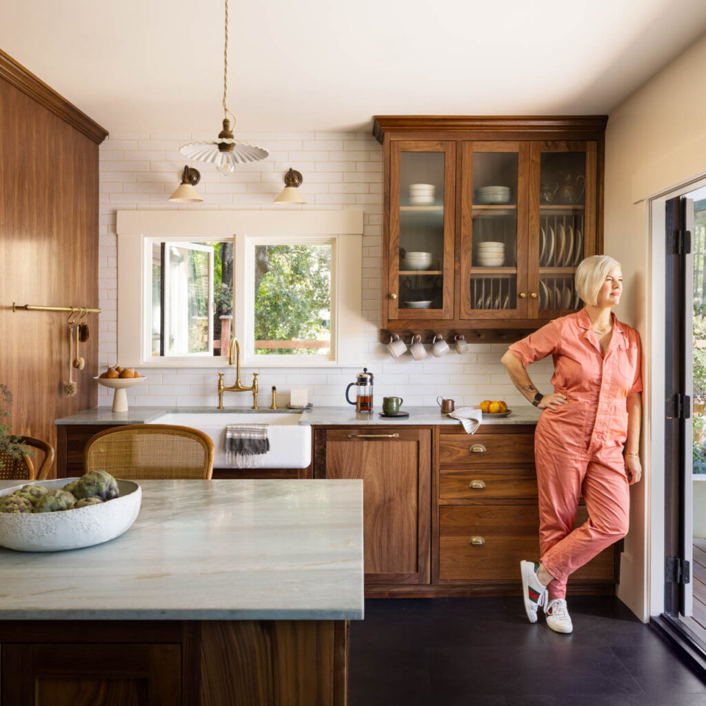
Arana has been delighted to be working with Heather Cleveland of Heather Cleveland Design Studio, helping realize her visions for her clients and projects. In this article, we wanted to spotlight the recognition she recently received for her design talents, compliments that are richly deserved!
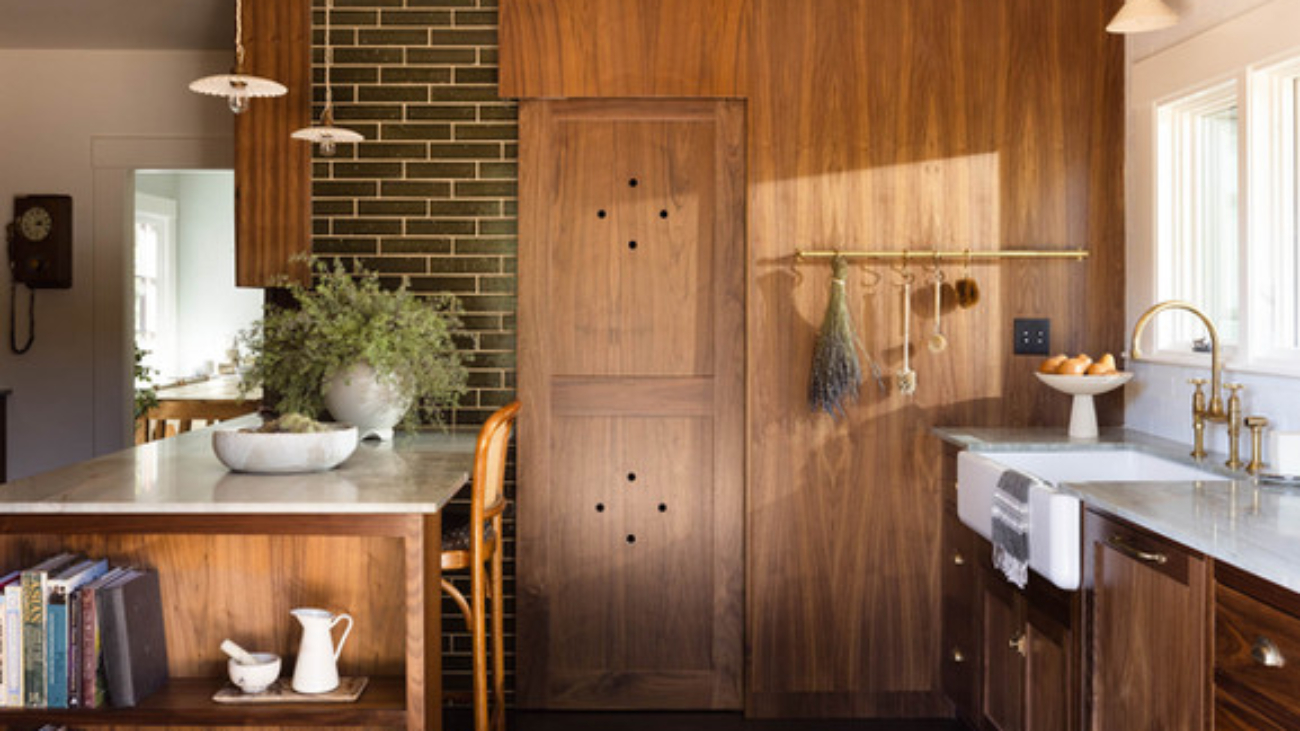
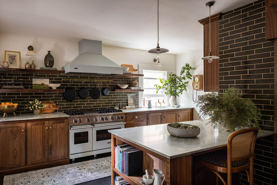
This kitchen Heather calls “moody” and “hippy-meets-traditional-English” features loads of warm wood grain paneling and cabinetry accented by deep-olive-green tile, making it a winner in the eyes of Interior Design influencer Emily Henderson (stylebyemilyhenderson.com) who selected it as a harbinger of trends for 2024. View article: 7 Kitchens that Have Real Staying Power Because They Are That Good
Keep an eye on HCDS as this firm is a rising star in the Bay Area and will be one of our designer colleagues vying for a slot in Oakland Magazine’s Best-Of contest, coming this spring. We’d love to see you nominate your favorite designers and contractors during the nominations phase in March and April including us! (And of course during the Voting phase, which happens in late April and May.)
If you need ideas for nomination-worthy folks, please feel free to consult our “2024 Home Services Buyer’s Guide” which you can find on our website in the “Inspiration Hub,” under “Resources”
Experts weigh in on the awkward feeling surrounding 2024’s pick A tradition since it was first introduced in 1999, Pantone’s announcement of the Color of the Year usually evokes a sense of whimsy and excitement. From their wildly over-embroidered company language in their press materials, to the bold graphics the company chooses to illustrate it, their Color-of-the-Year announcement has always been greeted with a fair amount of joy.
More a harbinger of industrial and fashion design trends, Pantone’s Color of the Year does sometimes seemingly predict or at least influence play in interior design schemes. Last year’s super-fun Viva Magenta was the perfect example of this, showing up as pops of color in some rooms, and whole walls and even ceilings in others. (See our article on this vibrant color pick from last year.)
This year, we aren’t so sure that will happen.
The reveal of “Peach Fuzz,” Pantone’s selection for 2024, has left us queasy and confused, and we are not alone. The New York Times recently published an article about the color, and the expert opinions gathered echoed our immediate reaction.
Discomfort with the name (which is redolent of pre-pubescence) as well as the actual tone (evoking a limited 1970s powder foundation palette matching Caucasian skin that decades of social justice work have forced makeup companies to expand, or the even more limited definition of “flesh” by Crayola) was not unique to us:
“When I think of peach fuzz — and Peach Fuzz — I think of preadolescents,” noted one reviewer… “Does the shade remind anyone else of a complexion? Specifically, a light one? That gave me pause, for a moment. I think about how brands like Fenty Beauty have pushed the cosmetics industry to make shade ranges that include people of color, especially those with dark skin. This color, plus the skin connotation of the ‘Peach Fuzz’ name, hews pretty closely to the shades worn by white people that there are no shortage of,” concluded another.
Additional comments addressed the color’s indistinct, rather fuzzy vibe: “A noncommittal shade. Neither pink nor orange;” “so, 2024: a year not for bold decisions, but for communicating a sort of vague pleasantness;” and “maybe a quiet, neither-here-nor-there color with just a hint of cheekiness (peach emoji, anyone?).”
However, dragging ourselves away from obsessing on what feels like a marketing miss by the industry leader, we can foresee that the color itself might in fact show up in interior designs this year.
The trend seems to have started last year as we personally noticed an increase in designers showcasing rooms with warmer neutrals, layering earthy terra cottas and corals with pale-peach-leaning beiges and highlighting with creams.
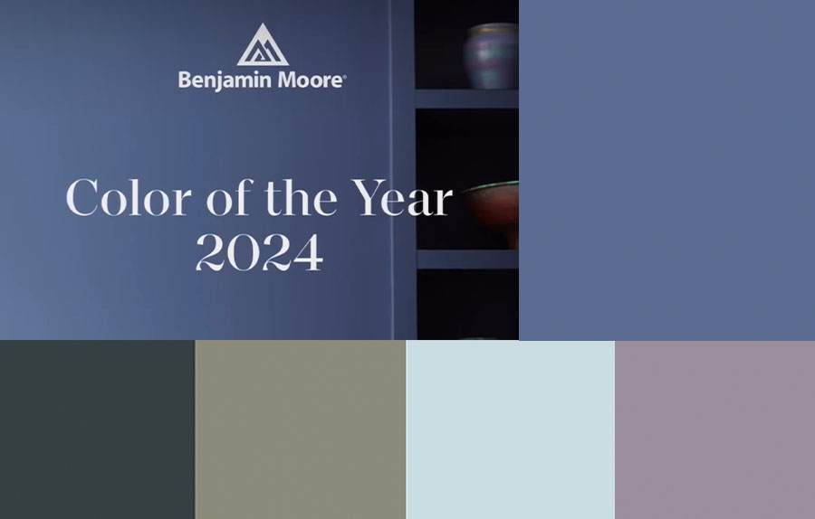
In its own way, Benjamin Moore seems to be on top of the pro-peach-slash-warm-neutrals trend with one of its palettes for 2024:
And yet, note that the top color BM proclaims for the year is “Blue Nova.”
Followers of our blog and newsletter for years — or fans of Benjamin Moore — know that the paint company always covers its bases with multiple palette options each January (see our color of the year report for 2023, also located on the “Resources” page of our website) — and these are usually tangential or entirely unconnected to Pantone’s prognostications.
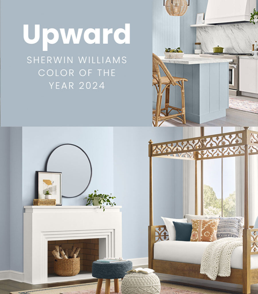
For 2024, Sherwin Williams put forward what the company deems “a breezy, blissful blue,” they call “Upward.”
While we love the sentiments they claim it inspires, “brimming with positive energy, creative thinking, and total contentment,” we’re not sure this color is that. It feels a bit gray to us. Not a bad color at all. Certainly a lovely pale, cool blue. But not quite what we would call “a sunny-day shade.”
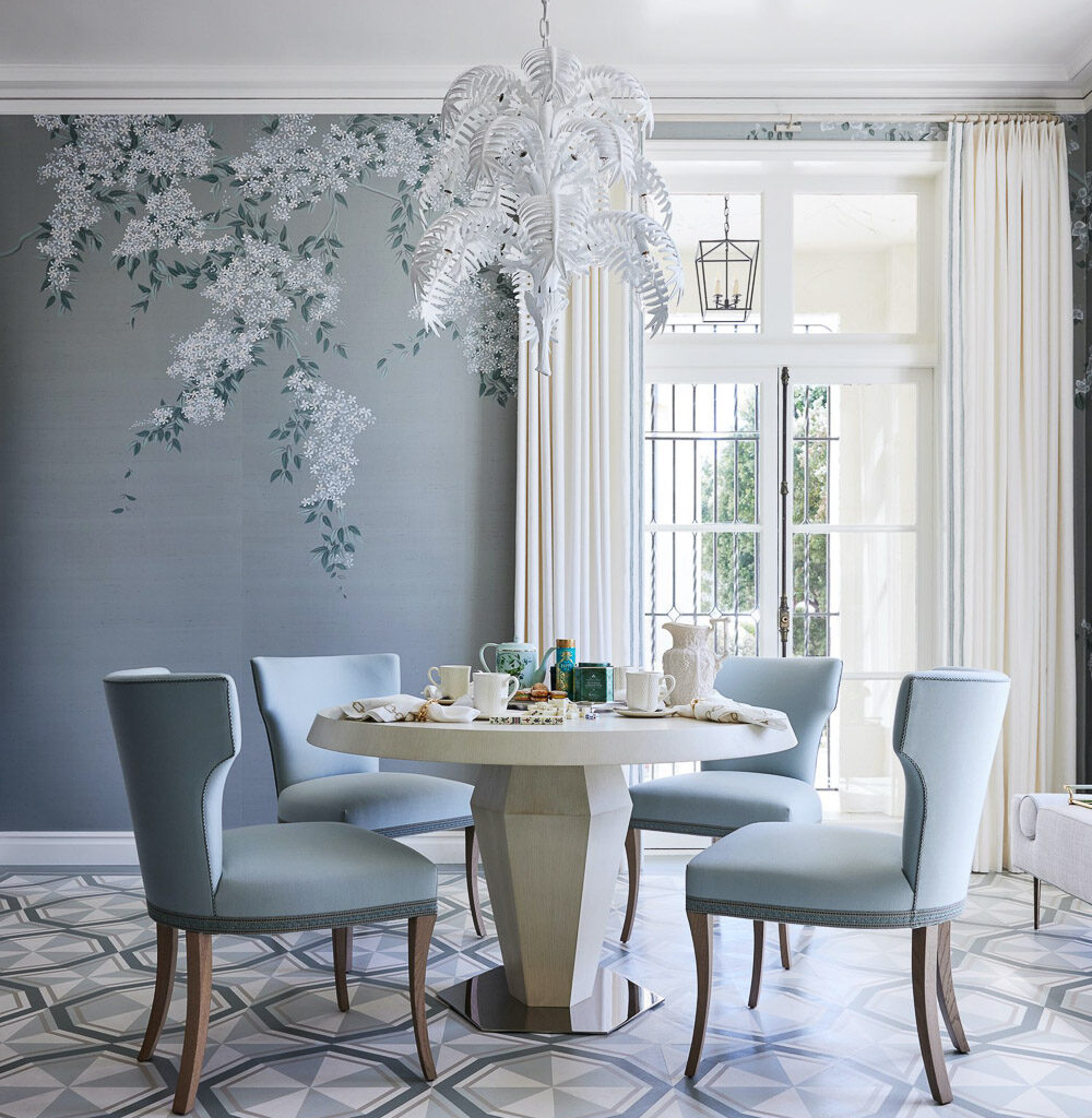
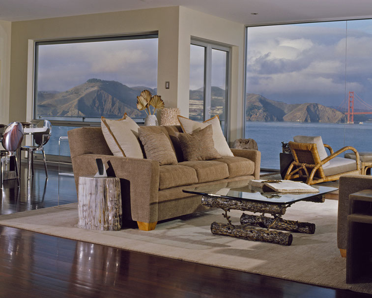
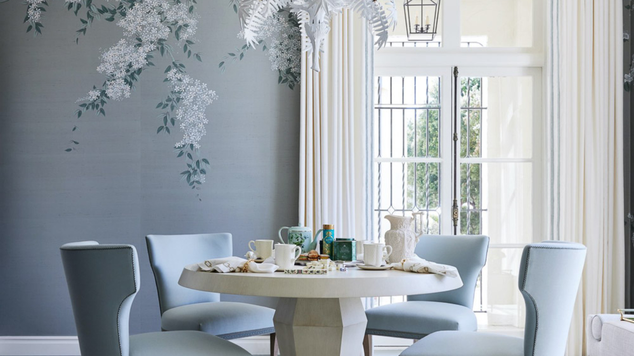
Still, it is a beautiful blue, and not unlike the tones Dina Bandman’s winning design reflected, in her sunroom/breakfast room en français for the 2023 San Francisco Decorator Showcase house, a vision we helped manifest:
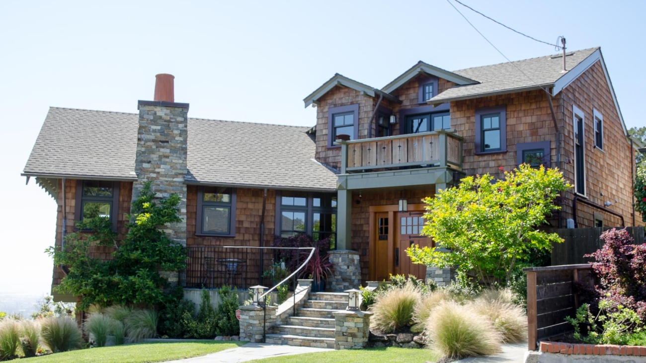
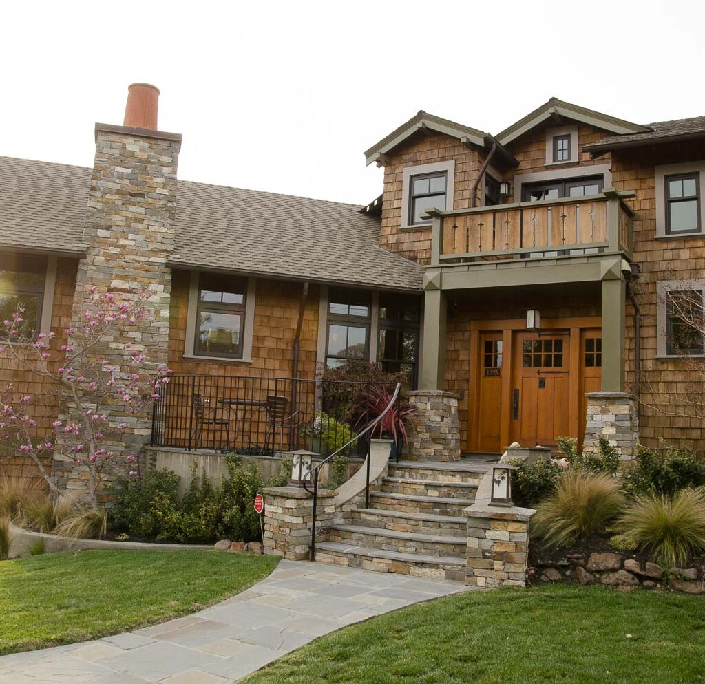
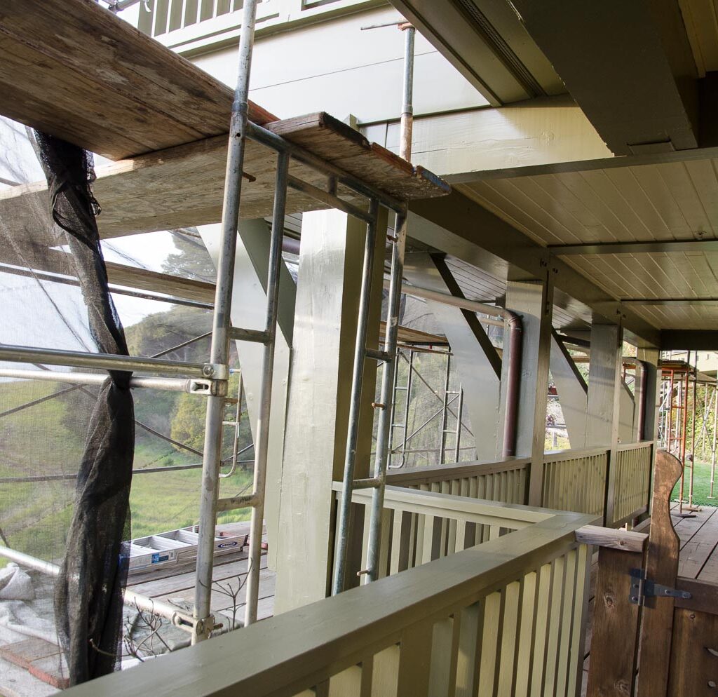
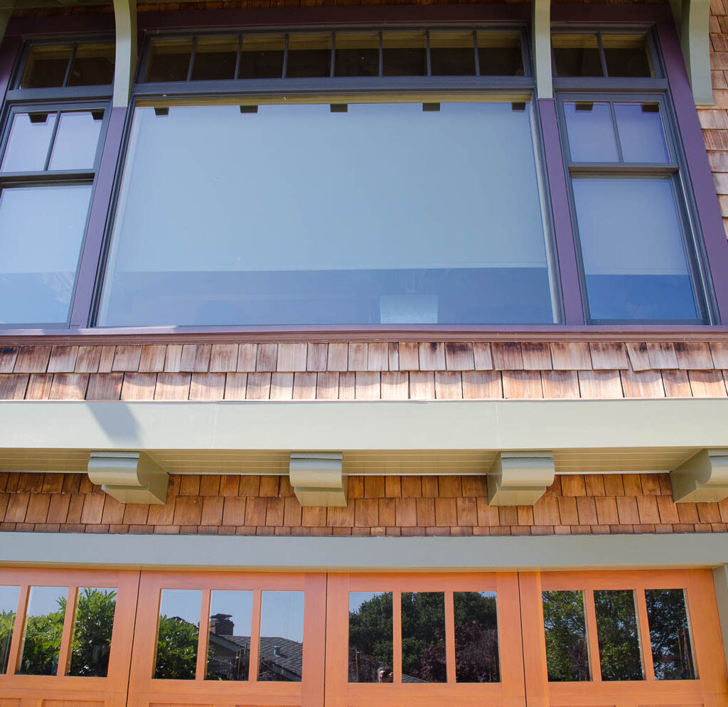
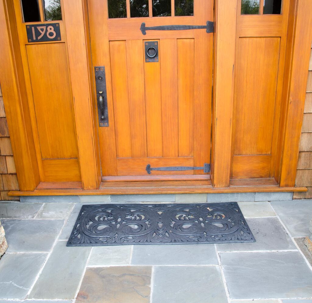
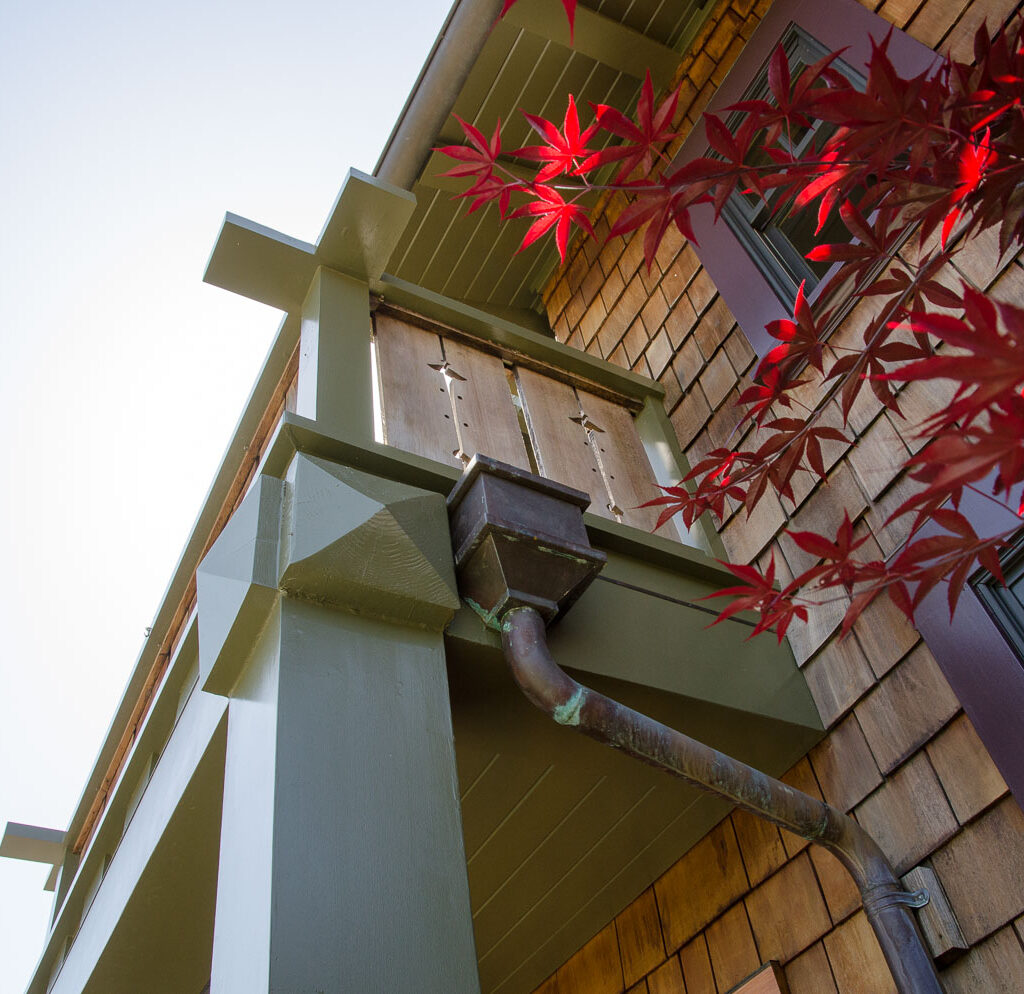
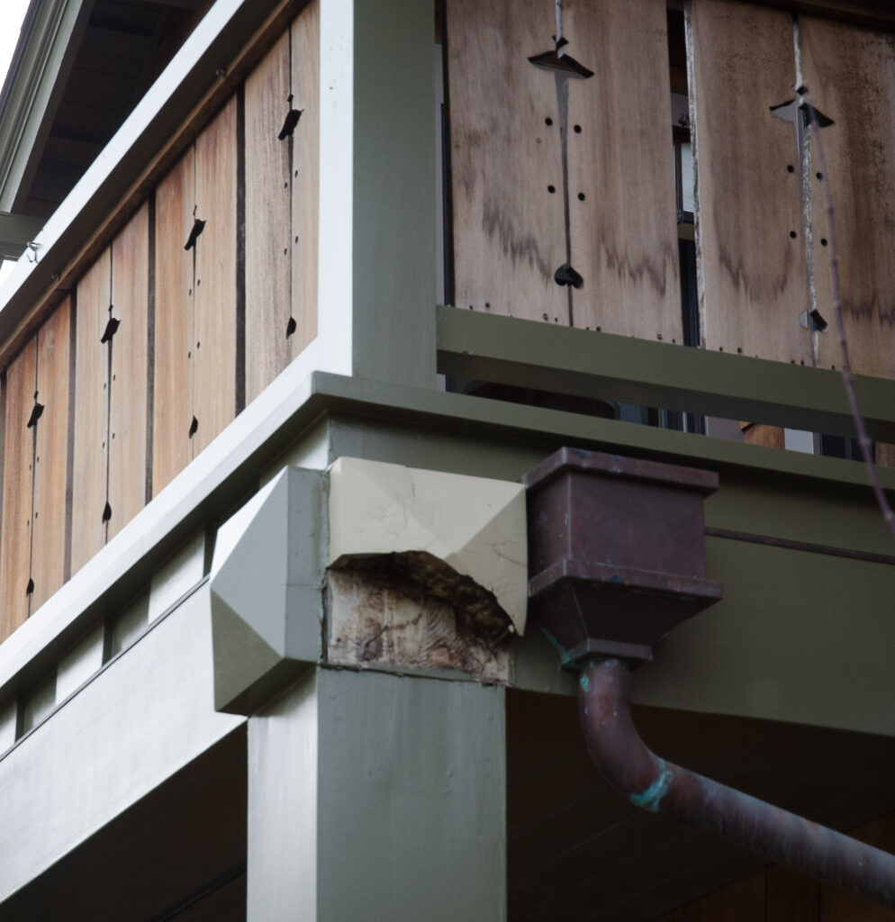
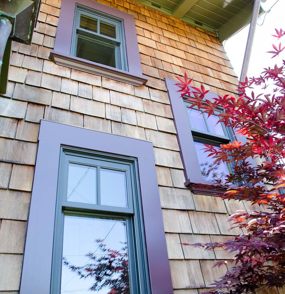
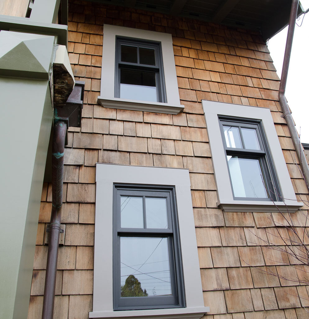
A repeat-client for Arana! This client purchased a new home in Piedmont and called us in to do some restoration and repair on the front door frame and period details on the wood balcony/decking.
We applied a clear product to the shingles that both protects against moisture intrusion or damage, and is flame retardant. We applied a protective and beautifying varnish to the doors, and the gorgeous wine-purple paint color the client selected that transformed the window frames and brought out the beauty of the home as a whole.
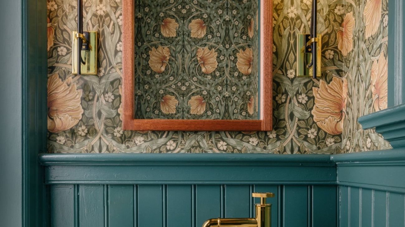
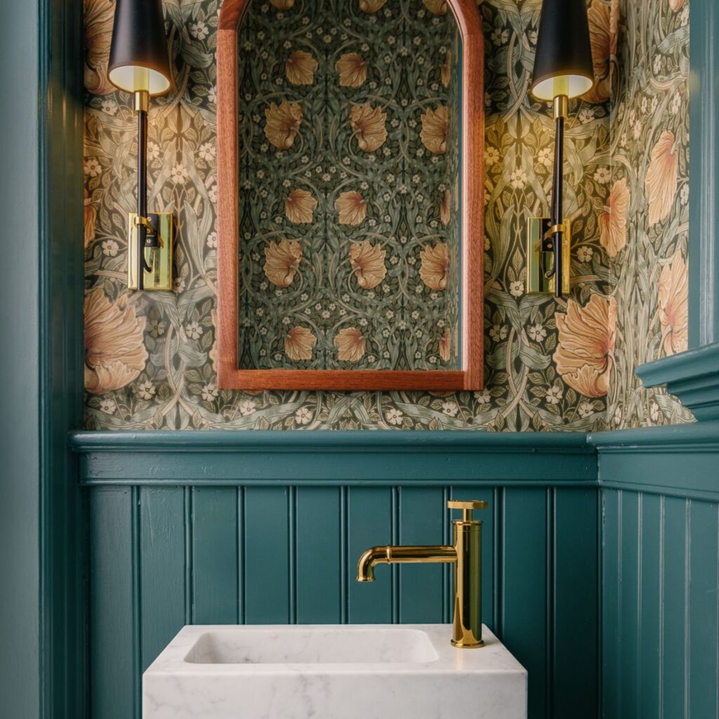
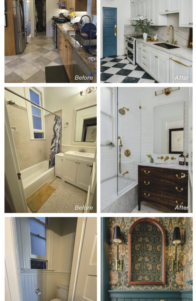
Followers of our Instagram or Facebook feeds may have noticed that occasionally we just can’t help but shout out powder room and water closet designs. There seems to be something about them that inspires bold choices and whimsy. A jewel-box quality. Is there a difference when designing for large or small spaces? We thought it would be fun to discuss this topic with interior designer Jaclyn Christensen, of Jaclyn Christensen Design for whom Arana has recently provided wallpaper and paint services on multiple projects — all of which absolutely delighted us.
Note: Our article features AFTER images of the stunning Victorian water closet design under discussion, as well as transformations throughout the 1300 sq ft, two-bedroom home in San Francisco. Jaclyn also shared with us her cell phone snaps of the BEFOREs, which we get to share with you! This JCD project was recently featured in California Home + Design magazine.
Arana Craftsman Painters: So, let’s get to it!. Small spaces, what makes them different?
Jaclyn Christensen Design: Sometimes small spaces are more fun than large spaces, because the challenges they present are different. Of course, every space is ultimately a challenge in some way, a puzzle to solve. You have to find the right pieces that fit together.
Arana: Are there rules or guidelines for choosing colors in large vs. small spaces?
Jaclyn: When it comes to color, I don’t think there are any rules. Some might say ‘Never paint a small space dark because that will make it feel smaller.’ But I don’t subscribe to that at all. Color choices depend on what you want the space to feel like. If you want a moodier space then we’ll pump up the color, choose one that has a saturated impact. If you are looking for more light and airy, we will handle that decision differently. It’s really about what the client is seeking, how they want to feel.
Arana: Can you say more about what went into the design for that stunning Victorian water closet?”
Jaclyn: Well, the client didn’t say ‘Hey, we want a moody water closet!’ But given that this is a Victorian era home, the inspiration to play with pattern and color came from there. It is true that powder rooms and water closets can be particularly fun spaces to stretch the creativity. It’s a bit of a contradiction, but for certain small spaces you can really push the boundaries, push the design.
Arana: It seems like possibly because it’s a small space, clients might feel more inclined to take risks there. Is that accurate?
Jaclyn: Yes. Clients are typically more willing to go a little crazier and bolder in a powder room or water closet because there’s a boundary. You can shut the door. It’s not their main living space.. It’s a little moment of their day; a little moment for their families — and guests, if they entertain a lot.
Arana: Do you ever have projects where the client wants to go bold throughout the house?
Jaclyn: Not yet, but I would love to have that client who would want to go big — ‘The sky’s the limit!’ That said, I am grateful to have clients who have that trust and believe in my capable hands to create the space they want for them and their families. This project was exactly that. These clients were so trusting of me, my design expertise, and the process. It grew exponentially over time as they saw how the results were really changing their experience of their home. We ended up touching the whole house. No pillow left unturned! The most successful projects are when you are really in sync with your client. They trust the person they hired to lead the way.
Arana: Did you have to talk the clients into the bolder elements of your design ideas?
Jaclyn: They were such wonderful clients — they were game for everything I put in front of them! From the black-and-white marble floors in the kitchen to the floor-to-ceiling marble tile and slab in the bathroom; the beautiful Philip Jeffries wall coverings and the gorgeous Waterworks fixtures! They did not skimp on quality or detail.
Arana: You mention that this project started small and then grew. What was that process?
Jaclyn: Well, many design projects have their way of kind of organically expanding on their own, because design in itself is not a straight line; this room touches that room and changes in one affect another. In this case, we started with just tackling a remodel, kitchen and bathroom, but because of Covid, timelines slowed down, and while we were waiting for the contractor to come on board, we turned our attention to furniture and fixtures throughout the house. Normally we would start with construction and then furnishings, but due to the effects of the pandemic we were having to switch up our priorities.
Arana: It seems like you were inspired by the Victorian-era architecture, but not tied to it. Is that accurate?
Jaclyn: Yes. With Victorian era architecture, I like to keep original details intact and use them to my benefit, while having them work seamlessly into the new design. These clients have a love of mid-century modern furniture. So my goal was to marry the two styles and have the result feel holistic, to have them feel like they belong together. One of my favorite things to do is mesh different design styles and have the results feel seamless.
Paint is elemental. It is, in essence, a creamy blend of many of the earth’s elements: minerals, resins, oils, clays. Yes, paint can be and historically has been manufactured with heavy chemicals and toxic compounds, such as lead. But, fortunately, there is now paint on the market that is made in a manner that is truly non-toxic!
The fact is, we cannot live without paint. It’s like skin. No building could really stand for any duration without it.
In the early training of our painters, we teach them about the ingredients of paint on every product we use, and we require that they read the technical datasheets, as well as the manufacturers’ instructions. You might think that paint is a benign liquid that comes in a can and can be simply slapped on, but it’s not that simple.
I love this description of paint by the National Park Service in their “Preservation Brief 28: Painting Historic Interiors” document. It speaks to the amateur engineer in me, as well as the crunchy woo-woo type who loves crystals (also me):
“Paint is a dispersion of small solid particles, usually crystalline, in a liquid medium. Applied to a surface, this liquid has the special quality of becoming a solid, protective film when it dries. Paint also enhances the appearance of surfaces. A late Victorian writer observed that the coming of a painter to a house was cause for celebration. Indeed, these statements not only indicate the chemical and physical complexity of paint, but also its emotional impact.”
The Park Service document goes on to say, “Until the mid-20th century, almost all paints used in America could be divided according to the type of binder each had. Chemists sought to improve paints, especially when the two World Wars made traditional paint components scarce and expensive. Modern paints are far more complex chemically and physically than early paints. More ingredients have been added to the simple three-part system of pigment, binder, and vehicle.
Fillers or extenders such as clay and chalk were put in to make oil paints flow better and to make them cheaper as well. Mildewcides and fungicides were prevalent and popular until their environmental hazards were seen to outweigh their benefits. New formulations which retard the growth of the mildew and fungi are being used. As noted, lead was eliminated after 1950. Most recently, volatile organic solvents in oil paint and thinners have been categorized as environmentally hazardous.”
Did you know that painters used to be called “Mechanics”? Or at least, that is something I read somewhere once, and our Project Superintendent Steve Rubenstein and I like to say, Mechanic as a title for painter really speaks to us: This idea that painting is an art and a science, that it requires specialized tools and knowledge, and that trade knowledge is far more vast than what is portrayed on the fast-forwarded frames of HGTV.
vintage paint ad Historically, the use of paint as protection and decoration has been recorded all the way back to the first century! Like many great innovations in the development of civilization and science, the first place on record where paint was used to decorate and protect building structures was in China: Ancient craftsmen applied hand-ground pigments, such as ochre, to wet plastered interior walls.
A structure cannot maintain integrity without paint. And a surface must be prepared, and paint properly applied, for the overall job to last for the long term.
This is something I would love for both laypeople and contractors to understand. Often, painters are regarded as providing decoration, less important than builders, plumbers, electricians, etc., and not appreciated for the highly detailed, mechanical, methodical process it is. Paint is integral to a project, and not just because it makes things pretty (although we certainly love making things pretty, too).
I am so passionate about the craft of painting because it really is an art and a science. If I talk about how proud I am of our processes, and our team, I’ll sound like I’m bragging. Maybe I am! I feel very strongly that hiring a skilled craftsperson, or a team of skilled craftspeople, is important because what we do, what we know, can make the difference in not only how a project looks, but also the longevity of it. Everything I do in my life has to align with my personal values.
Thus, running a company that has the mission of painting buildings well to beautify and protect them, which then helps maintain and support communities, and the people who live within them, while also giving good-paying jobs to skilled craftspeople that helps them support themselves and their families, while also being conscious of both using and protecting the gifts of our earth’s resources — that’s me, and Arana, in a nutshell.
The field of home building and remodeling has a clear path from design to construction, then on to “the finishes,” and lastly, the furnishings. After the initial design plans are complete, architects can and often do play a role throughout the construction of the project.
But, when do interior designers get involved? And can architects and interior designers ever coexist on a project?
We sat down with interior designer Vaughan Woodson of Woodson & Woodson Interiors and architect Rebecca Amato of Amato Architecture and asked them to share with us how they work — together, and separately — to help homeowners make optimal design choices for their homes.
“Often the overlap occurs in the finishes,” Amato explains. “When a client asks me if I can provide design services, I say yes, but up to a point. I will specify anything that stays attached or needs to be attached to the house, i.e.: cabinetry, tile, flooring, paint colors, lighting, plumbing fixtures. Where I draw the line is a whole other area of expertise: soft furnishings, window treatments, and accessories.”
(Featured image of project at top of article: design by Amato Architecture, build by McCutcheon Construction.)
Design by Woodson & Woodson Interiors
Woodson agrees, “When I work with an architect on a project, I appreciate being able to collaborate — with the client’s use of the space as the number-one end goal. Fortunately I’ve been doing this work for a long time and I have zero ego about it, and I think that makes me nice to collaborate with — or so I’ve been told! I have no interest in making a mark on my clients’ home other than my client saying, ‘Vaughan taught me so much about what my style is; I never would have chosen this; she pushed the envelope!’”
Design by Woodson & Woodson Interiors
Both professionals describe a clear dividing line as being about structure. Here, instead of overlapping, their skill sets complement one-another, and mutually affect the results.
Design by Amato Architecture
As an architect, structure is Amato’s passion. As she describes her thought process: “How do I move walls and create a floor plan that is functional and flows? That showcases the focal point of each room, such as art placement, or a big beautiful fireplace? If I get to do that and then the client says, ‘Okay, now I want to bring in an interior designer,’ that’s great. I love, love, love partnering with interior designers! Working with a designer, I can communicate my vision, how I’m thinking about views, where I am creating seating areas and moments, and then pass the baton.”
Both agree that it is best to bring in an interior designer early in the planning phase. As Woodson describes, if she wants to specify a particularly spectacular sofa, she may share the measurements with the architect, who might look at shifting the location of a door to optimize wall placement for it.
Or the two might have a conversation about window treatments — Will they be minimal? Will allowance be needed to create a pocket for roller shades? — If the client wants curtain panels to soften the room, space between the window casing and the crown molding will be included in the plans.
Design by Woodson & Woodson Interiors
At the most basic level, Amato’s expertise as an architect is required when drawings are needed, especially when desired changes to the home trigger a call for permits. Woodson notes that while she, and most interior designers, have their own subcontractors they work with for cosmetic changes, “as soon as the client says, we are looking to renovate our kitchen, add a sliding door, that’s when I would bring in Rebecca.”
Amato describes the flip side, when she refers potential clients to Woodson: “Sometimes, someone calls and says they are remodeling, but they are not moving any walls — that’s probably not a good fit for me. I tell them, ‘You’d be better off working with a designer.’”
Architect Rebecca Amato
There are design firms that have an in-house interior architecture department and per Amato, some building department staff will allow a person who doesn’t have a license to prepare drawings — although in that case it is helpful if the drawings are combined with a report from a structural engineer.
Another way to look at how design and architecture interact is around furniture. Do you, as a homeowner, know what pieces you want to replace or hold onto?
For her clients, Woodson likes to determine at the outset which pieces are worth keeping. “I’m a preservationist at heart,” she says. “I prefer to try to use what we have — if it works with the design direction we are going in. Sometimes really great design comes from using the clients’ own pieces, because that way, we are putting their story in.”
Interior Designer Vaughan Woodson
When you come at interior space design from this angle, Woodson explains, “maybe the dining room gets bigger, and in the laundry you don’t end up with a counter — because those decisions accommodate the story and the richness.”
Amato agrees, “I think about the furniture in the room. I will ask them, ‘Are you planning on purchasing a new dining room table, or using one you’ve inherited from your grandmother? And I will take those dimensions into account.”
“We want to know, what’s the pain point of your home now? And does this table not seat enough people, and you always wish that you could seat 8 because you have a family of 4 and you would like to have another family of 4 over and you can never do it? What are we solving — and spending all this money on with design services? Good design comes from that,” Woodson adds.
“Yes, that’s critical,” agrees Amato.
When a designer and architect collaborate, Amato says, “we are sharing as much information about the client as we can, from what’s important to them, to what their styles for decision making are. What are their hopes, and what may be some of their limitations. Maybe they’re doing work in phases because of a budget or they’ve got kids going off to school or they’re pregnant…. On a deeper level, it’s not just about the facts of life, but really, what their emotional experience is going to be.”
Ultimately, “we are following the client’s lead,” says Woodson, “and trying to make the most stylish product from that.”
Welcome to our list of trusted colleagues in the home services, contracting services, and building and remodeling industry! Our team has personally vetted these providers in our two decades of serving with or beside them for our shared clients. We hope that this guide is a resource for you, our dear clients, as you steward your greatest asset, your home.
(Above image, credits: Hand-painted floor by Charles Leonard Finishes. Ceiling and door frames by Arana. Room design by Dina Bandman Interiors for SF Decorator Showcase 2023. Photo by John Merkl.)
General Contractors
Alward Construction 510-527-6498
Buestad Construction 510-523-1925
FMSProjects Inc. 415-722-9805
Jetton Construction 510-845-3506
McCutcheon Construction 510-558-8030
Wolfe Inc. 510-289-1344
Design/Build Contractors
HDR Remodeling 510-845-6100
New Key Construction 925-369-5559
Interior Designers
AND Interior Design Studio 510-255-7806
Dina Bandman Interiors 650-867-8644
Nystrom Design 415-347-7109
Heather Cleveland Design Studio 510-3031183
JD Designs 925-326-6601
LMB Interiors 510-531-8438
Mead Quin 510-858-7338
Architects
Amato Architecture 510-420-0210
Jack Backus Architects 510-393-9699
Norman Sanchez Architecture 510-522-1100
Kitchen & Bath Design/Build
Design Set Match 510-285-0870
Stonewood Kitchen and Bath 925-933-2245
Color Consultants
Cass Morris Color & Design Consulting 510-524-1726
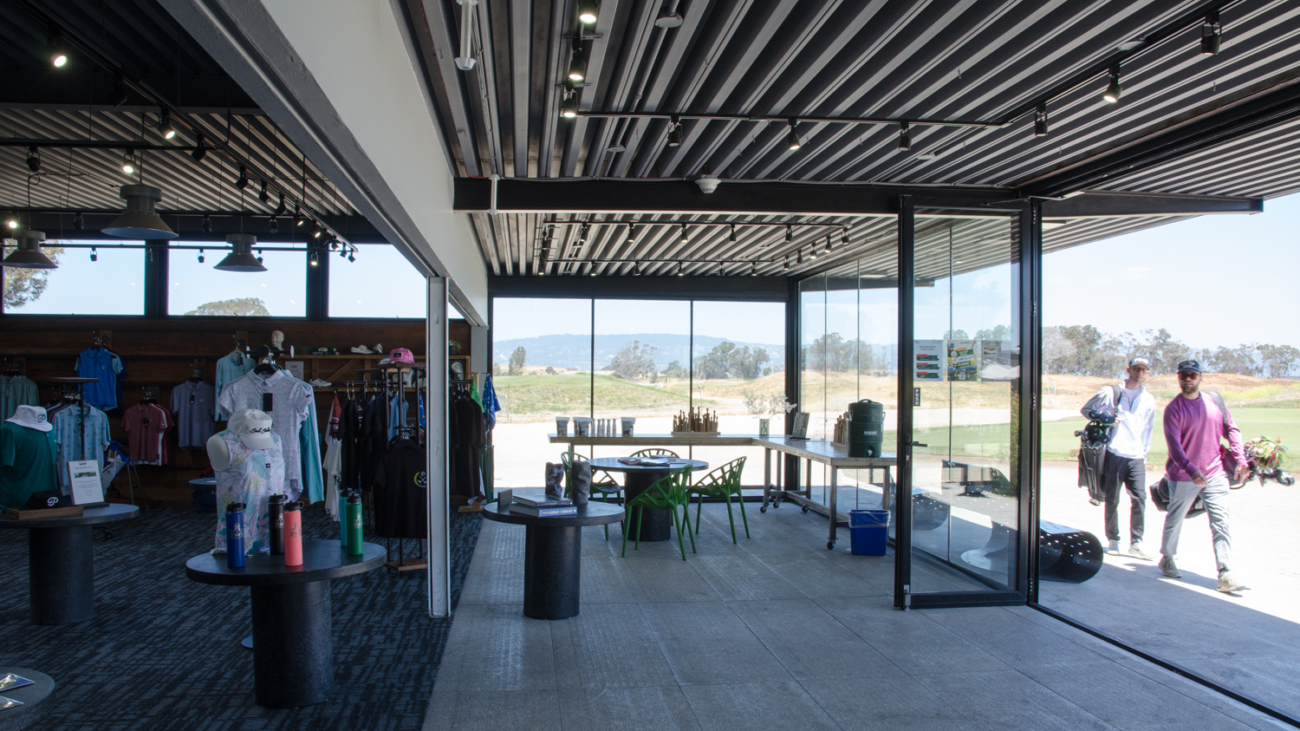
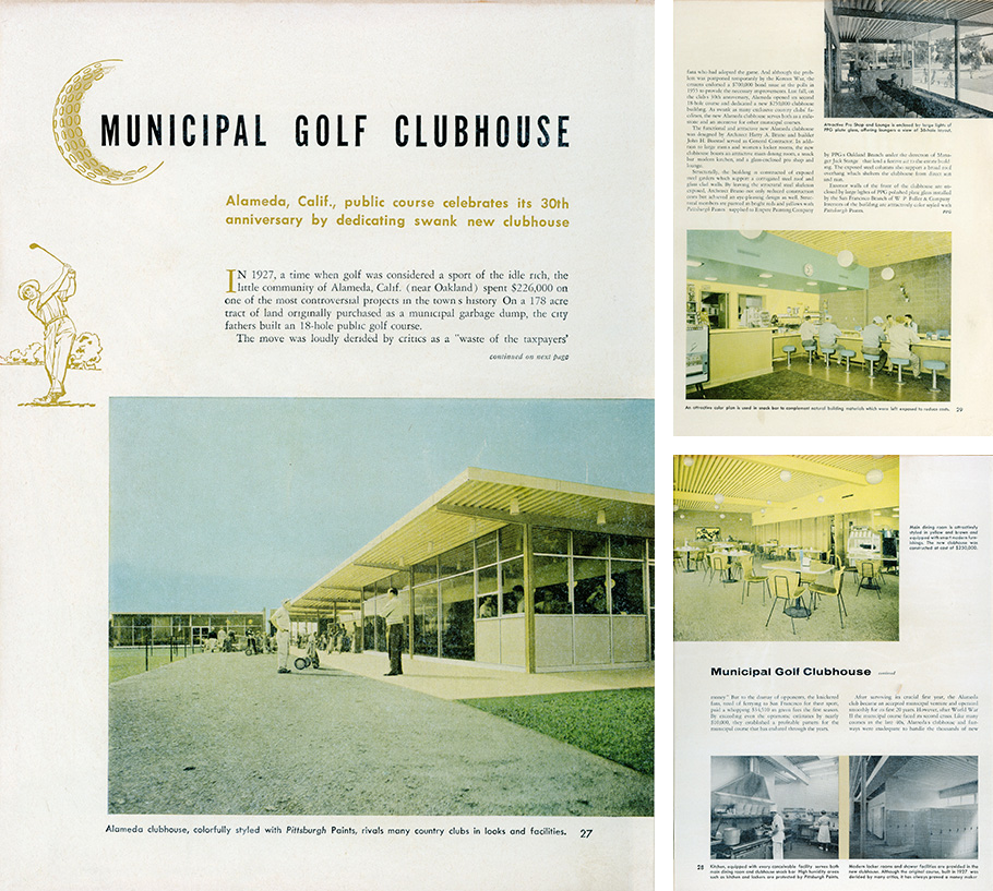
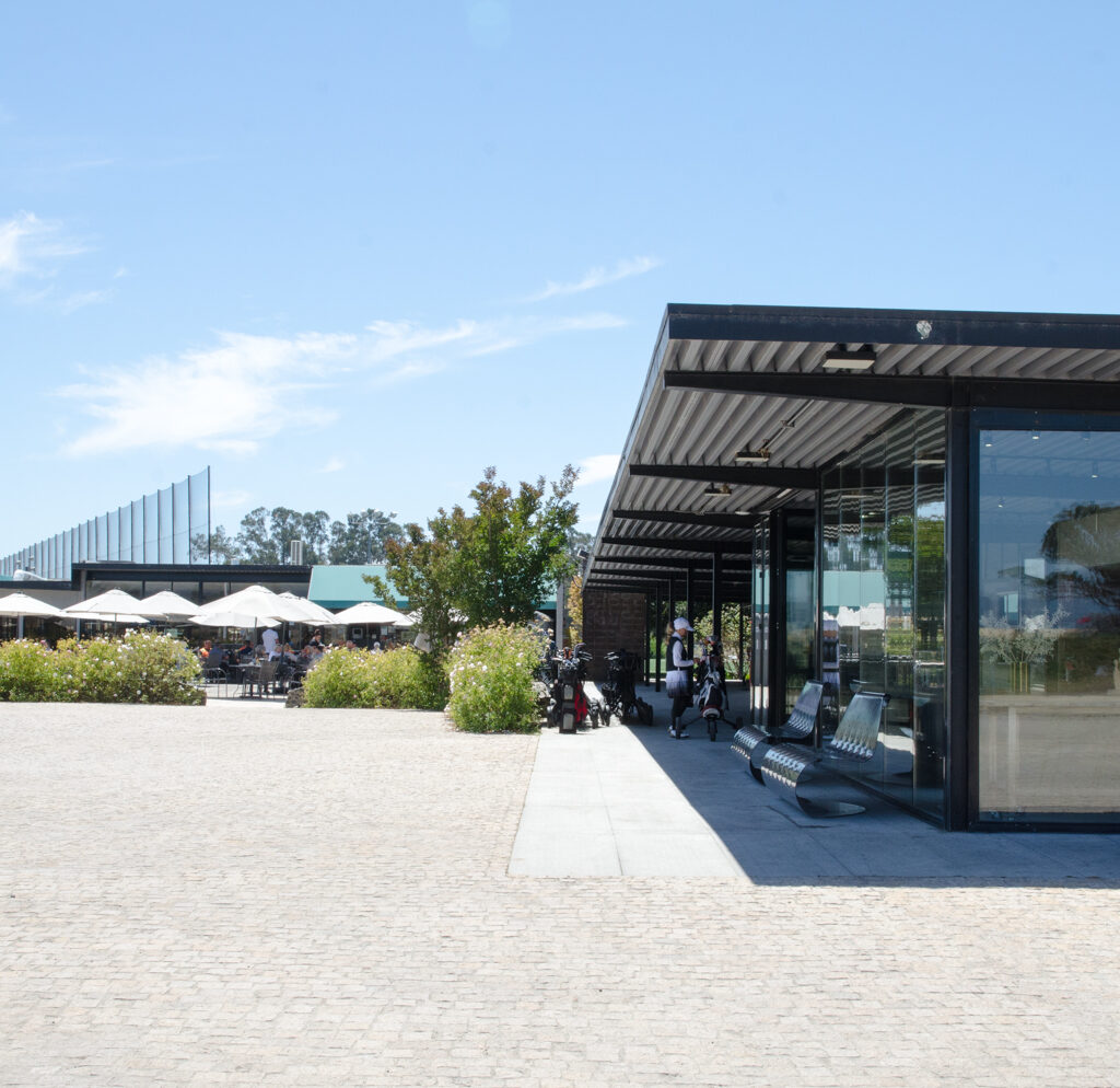
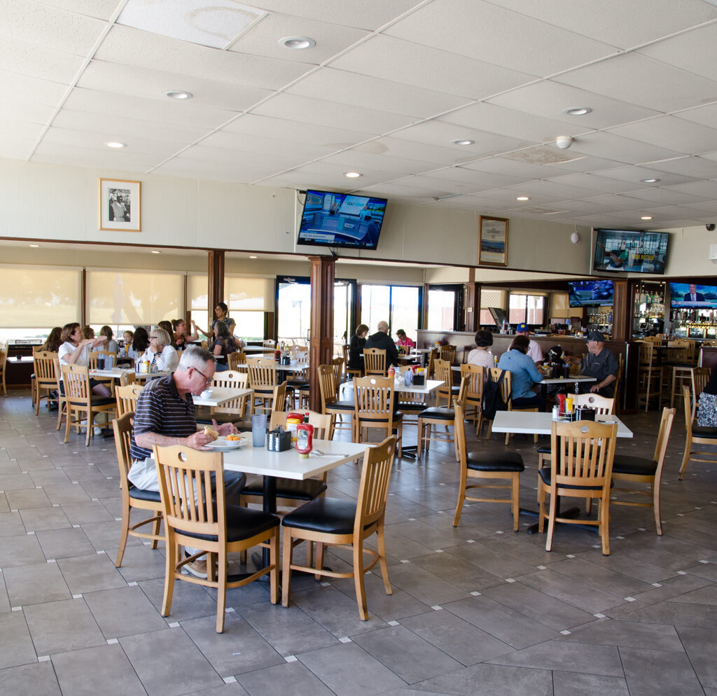
Based in Alameda, Buestad Construction has proudly contributed to the growth of local community resources for 75 years. This work included building a new Alameda Public Golf Clubhouse in 1958.
In the striking facility, “natural building materials were left exposed” which “not only reduced construction costs but achieved an eye-pleasing design” says the vintage case study (see image of original document).
We recently stopped by the busy and thriving golf course, now named Corica Park. The building is clearly still serving the community (see our photos) and many of the original architectural elements are still beautifully present, albeit with some alterations to the interiors over time.
More about the golf course: coricapark.com/history
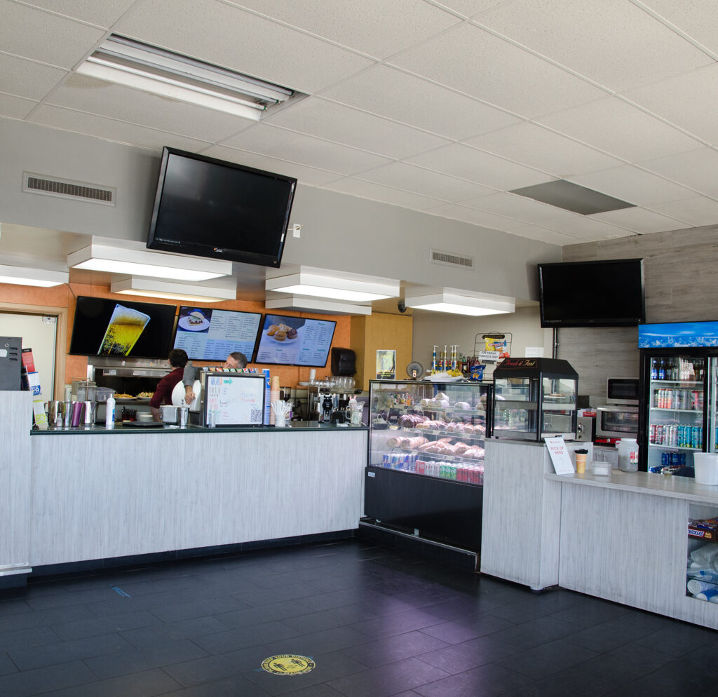
We can also report that the Reuben sandwich at Jim’s on the Course is super tasty.
Arana has proudly partnered with Buestad on their projects and are happy to highlight them as a featured industry colleague!
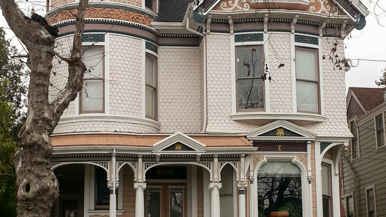
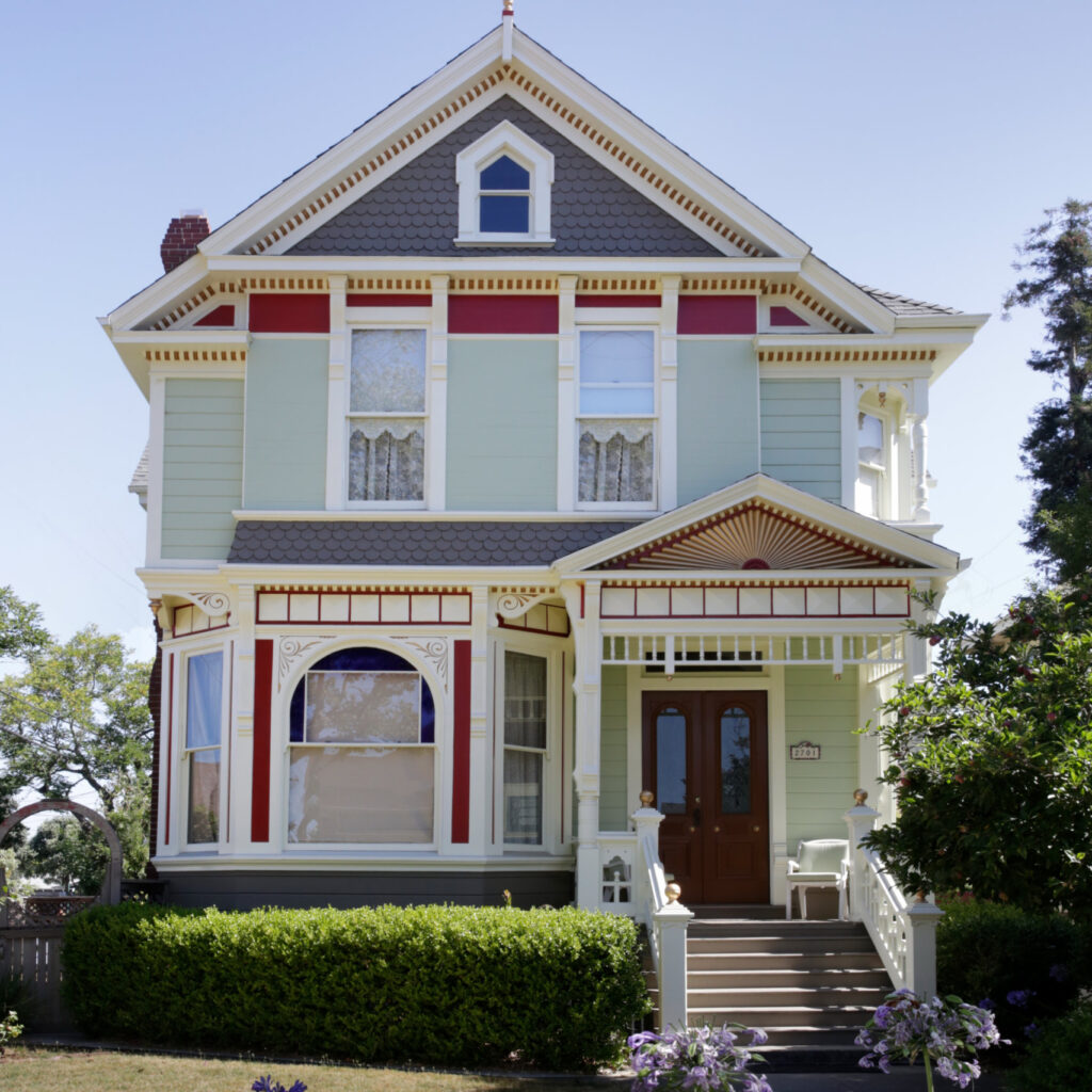
You may be surprised to learn that there are no “Victorians” in Alameda.
We are as guilty as anyone, talking about homes in our portfolio (in Alameda and other parts of the Bay Area) and using that term.
According to historian Dennis Evanofsky, who regularly leads architectural walking tours in Alameda and Oakland, there are no Victorians.
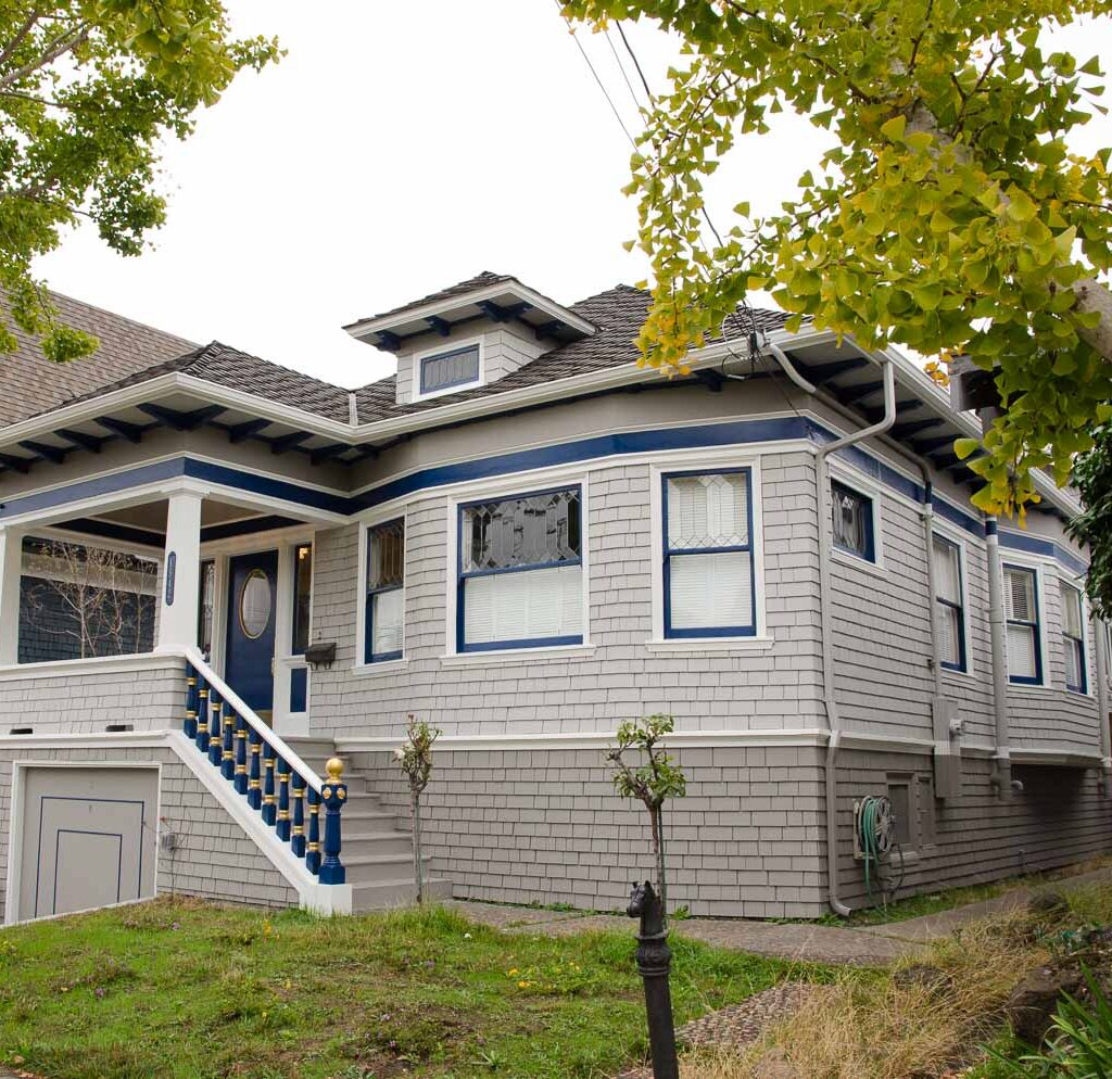
However there are many “Victorian-era” homes, a category comprised of seven distinct styles, which are, in chronological order of appearance: Greek Revival, Gothic Revival, Italianate, Stick (also called Stick-Eastlake), Queen Anne, Colonial Revival, and Craftsman.
As a sidenote: Who knew that “Craftsman” homes are considered Victorian-era? We did not! We are, however, proud that our craftsmen and craftswomen have restored, stained, and painted numerous homes from this historic period, which was marked by a high level of skilled artisan output and attention to fine detail.
If you like to nerd out on architecture like we do, we highly recommend Dennis’s walking tours, sponsored by the Alameda Post (calendar and registration, here: alamedapost.com/tours). He also provides this service for historical architecture in Oakland. Website: evanosky.info
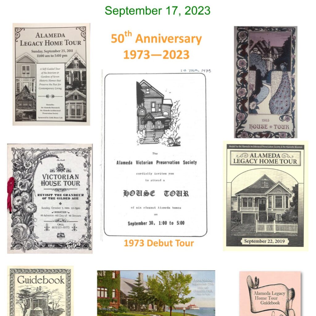
Another option for diving deep INSIDE some of these elegant structures is The Alameda Architectural Preservation Society’s annual Legacy Home Tour. This year is the 50th anniversary of the tour, which invites folks into several local treasures that have been caringly stewarded by their current owners. Tickets are required for entry. Date and time: September 17, 2023, 10am – 4pm. Info: alameda-legacy-home-tour.org
AAPS notes, “Alameda is blessed with over 4000 buildings on the Historic Study list, including many architectural styles. Our organization helps homeowners and business people appreciate the historic nature of their properties and learn restoration techniques that help bring buildings back to their original splendor.”
The tour also features a festive gathering in Franklin Park with vendors and activities. For people who really want to go all-in on the event, you can sign up to be a volunteer docent, which also gains you free admission to the tour as well as an invitation to a special owners and docents dinner that evening at the Elks Lodge. Email AAPS lead Denise Brady to sign up: [email protected]
Longtime readers of our newsletter may recall an article we wrote a few years ago after having painted a particularly “gingerbread” festooned Victorian-era home.
Decoration during that era was not just about beauty, but also had meaning for the designers, and sometimes a spiritualist component. Read more here: craftsmanpainters.com/blog/anatomy-of-a-victorian-the-not-so-secret-symbolism-of-decoration
NOTE: All homes featured in the images accompanying this article were painted by Arana
What is the “Color of the Year” and why is it relevant? Is there just one? Under the heading of nothing is as simple as it sounds, there are multiple answers to these questions. Color of the Year, as announced by the Pantone company annually in December, is a relatively new phenomenon that began not that long ago, in 2000.
Pantone’s annual announcement doesn’t just relate to house painting, but rather is an analysis of past color trends in industries including fashion, marketing, and business, as well as the mood of the culture, influences in the environment, for products and design, and a prediction (although some would say, this announcement drives rather than foretells the market) of what color will be relevant for the coming year.
This annual event originated as Pantone’s way to generate excitement about color. And the paint companies soon followed suit, announcing their own colors of the year. Basically, it’s all about marketing and P.R. But it’s also A LOT of fun to witness the reveals.
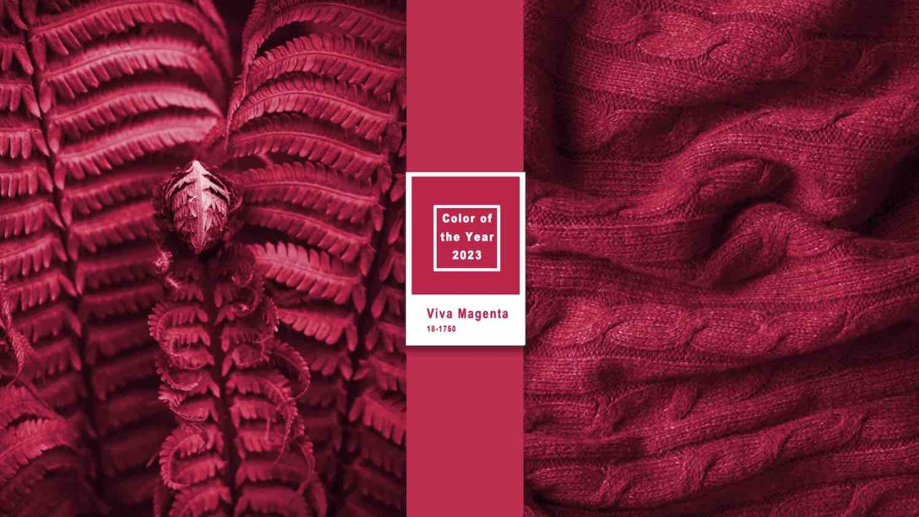
The color for 2023, according to Pantone, is a bright, deep almost-red: Viva Magenta. Read more about this selection in our Color Trends 2023 guide.
At Arana, we like to use the annual announcements as an opportunity to reflect on the jobs in our portfolio where that color has been successful for us in the past. While we have not yet had a homeowner or designer spec Viva Magenta for the walls, Anastasia Faella artfully (and presciently) highlighted this color years ago in her award-winning interior design for a Victorian-era home in San Francisco.
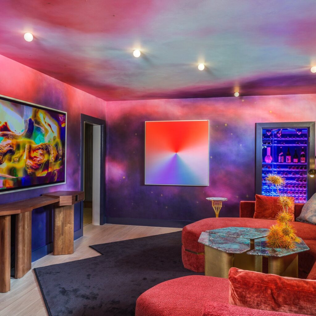
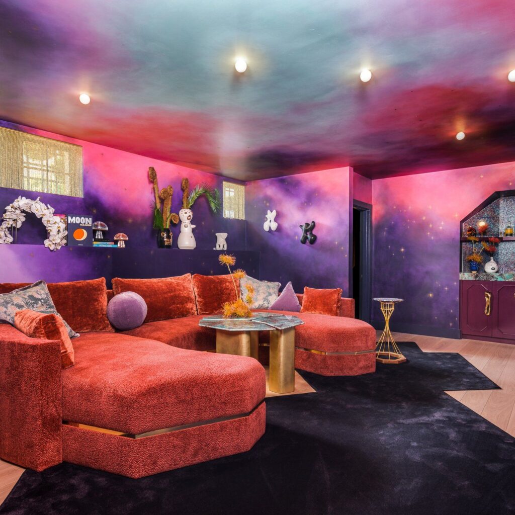
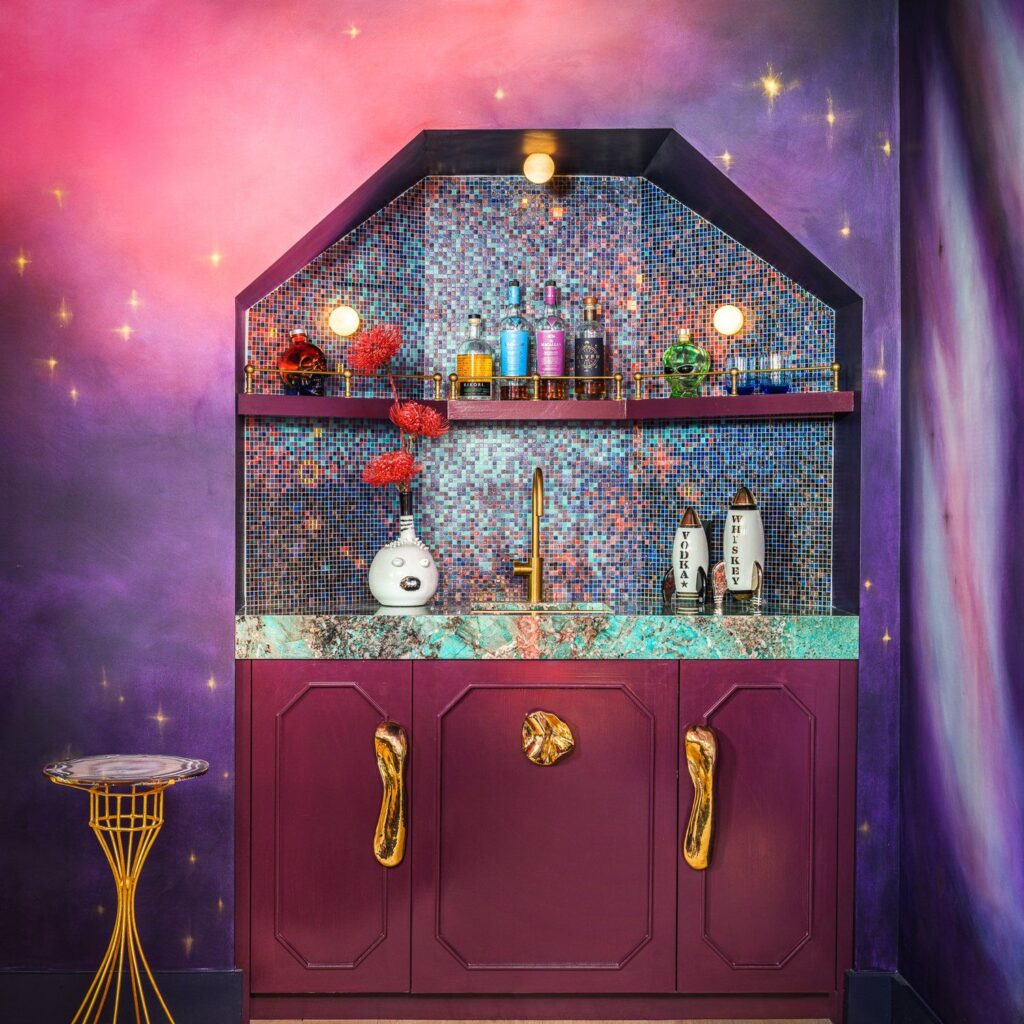
Design innovatrix Noz Nozawa of Noz Design went all out with colors that are close to this shade, if not including it, in her inter-stellar contribution to the 2023 San Francisco Decorator Showcase home, “Reflections on Stardust.” Her movie-room with wet bar and wine cellar sings in a whole universe of bright, rich, deep hues.
Design credit: Noz Design. Photo credit: Christopher Stark. See more images at: nozdesign.com/showcase2023
For a fun comparison, note this image of a cochineal beetle which played a huge part in the visuals for Pantone’s announcement, website, and press materials:
In addition to reporting on Pantone’s announcement, our Color of the Year guide also covers the hues highlighted for 2023 by Benjamin Moore.
Note that the paint company’s color selections tend to have almost no relation to Pantone’s announcement, visually, but instead are more directly relevant to what has been trending in the interior design industry.
In contrast, with a few notable bold exceptions in the design industry, Pantone’s color choice tends to have a clearer bearing on consumer goods and fashion, often including, for example, what colors the iPhone will be available in each year.
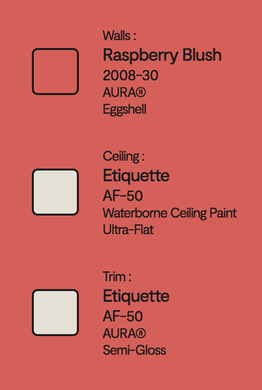
Benjamin Moore’s color for 2023, “Raspberry Blush,” is a more approachable coral shade (requiring less bravery than a leap into a whole-magenta-room, perhaps if one selected it for one’s walls).
Our clients have yet to specify it, but this closet in the receiving area of the SFDC 2023 home is in a somewhat related tone:
This closet is part of a spacious three-room receiving area off the front entry, meant to invite guests to freshen up: “And the Hazy Sea: Powder, Bath, and Anteroom” by Robbie McMillan and Marcus Keller of AubreyMaxwell Interior Design and Art Advisory.
While the majority of residential wall color selections generally don’t skew this saturated, Arana has had one client whose choices matched this level of boldness. The homeowner is a glass artist, for whom color is a playground:
Color selection and glazing by homeowner. Painting by Arana. Photo credit: Ren Dodge.
Thus, while Color of the Year is hardly a rule or direct instruction, for our designer colleagues and for our homeowner clients, we see the annual announcement as a point of consideration — to explore the different feelings that the color might evoke, and a source of inspiration, even an opportunity to make changes — as a professional retiring an old stand-by go-to color or as a homeowner considering refreshing a space.