Amato-Architecture-Great-Room-scaled-3

The Importance of Gloss and Sheen in Paint Selection

The gloss and sheen in paint isn’t something that everyone understands. This isn’t something that many people think about either. However, the gloss and sheen of paint is something that certainly impacts the final look and builds atmosphere. It is not complicated to differentiate the two, however, most people don’t even think about it. As such, we would like to take a look and dive deeper into what gloss and sheen mean to your paint selection.

Let’s take a look at how the Sheen and Gloss are Measured.
They are measured a little differently. The sheen of the paint is measured at an 85° angle. This can be very different depending on the gloss. The lower the gloss the more noticeable the sheen. However, the gloss of the paint is measured at a 60° angle to the receptor. This is important when considering what type of lighting you’ll need in the room. The receptor will measure the gloss on a scale from 1-100. The shinier the surface the higher the number on the scale.

However, the sheen of the paint is measured at an 85° angle. This can be very different depending on the gloss. The lower the gloss the more noticeable the sheen.

Both of these values should be included with your paint information so that you can make the right paint selection for your particular project. This information is available on every color of the paint out there.

What to choose for a gloss and sheen in your paint.

When you are looking for the paint you need to keep some things in mind. While it might be obvious that the color is important, the gloss and sheen are as well. Take into consideration the lighting of the room, the window placement, performance expectations, and the traffic level. Here’s when you should use low gloss and sheen:

  • When the walls have many imperfections. The less visible the imperfections will be with a lower gloss and sheen.
  • Space doesn’t need or want attention such as a ceiling or small hallway.
  • If the room has a lot of light. The higher the gloss and sheen the more reflective the paint will be with the light. Rooms with high gloss will have excessive glare and will be mirror-like.

When should you use higher gloss and sheen paint?

There are certain scenarios where high gloss paint should be used. This style of paint is perfect for accents and smaller rooms. If you are looking at your paint choices and the room in which you plan to paint, keep some of these ideas in mind that will work well with glossy type paint.

  • Rooms with low lighting and perfect walls are the perfect combination for the need for higher gloss and sheen.
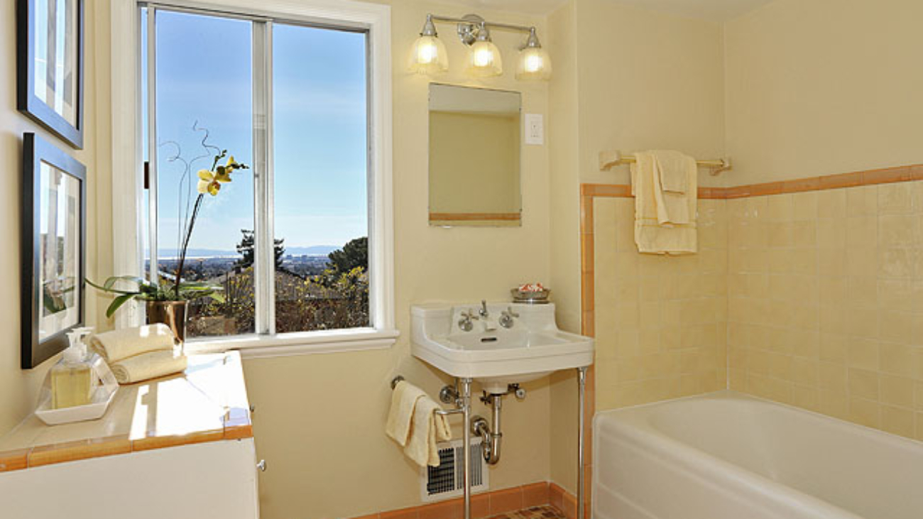
  • Places that are high traffic such as bathrooms and kids’ rooms where people are touching the walls a lot. High gloss paint tends to be easier to clean and maintain. It typically has higher durability and wears as well.
  • In a room that could use a little depth. Glossy paint can add a certain “pop” to the features in a room. Oftentimes we will see glossy paint used on the trim and around doorways. This gives that wall a bit of a “pop” that it wouldn’t otherwise have.
  • While glossy paint is easy to clean and maintain there are certain additives that higher-end paints will put into their paint to help with its durability. This is why it is important to purchase paint that is quality; so that it will last longer. This allows the user to love the paint at all sheen levels and not have to worry about long term care of it, simply based on the gloss and sheen.

Paint labels

While the paint industry does agree on how to measure gloss and sheen by the standards it is given. It doesn’t always express the gloss and sheen the same. Many times people don’t read the measurements that the manufacturer provides but simply look at the name that the manufacturer calls it. You can purchase paint in gloss, semi-gloss, satin gloss, flat, and among other names that describe the gloss and sheen of that particular paint. However, what one manufacturer calls “glossy” might be what another one considers “semi-glossy” and there isn’t a scientific way about these names. So, you will see this vary from paint brand to paint brand.

Here are the definitions of some of the various paint descriptions.

  • Glossy – Is a very high gloss product with a high light reflection.
  • Semi-Gloss -This is a less glossy surface that is still high gloss and comes with a few different names such as pearl, medium luster, and semi-gloss, depending on the manufacturer.
  • Satin-This paint is less reflective in nature. It is sometimes called eggshell, low luster, velvet, or low sheen.
  • Flat-has a matte-like finish and carries very little reflective effect.
  • It is important that you take into consideration the traffic of the room, the way the room’s lighting is and what look you are going for. We work with clients on their actual projects to get them the sheen and gloss that will fit that specific project. It is old school in thinking that the higher the sheen the easier it is to maintain and keep clean with all of the various additives that can be used in paint. If you are working on a project, you should take into consideration these things before choosing paint. The sheen and gloss can be different for each wall, depending on your needs. These paints can all come in the same color but have a very different look when applied to the wall.

Get some live examples.

If you aren’t sure what type of paint you need or this gloss and sheen thing seems a bit over the top, be sure to ask your painting expert for some samples. This will allow you to see for yourself the actual difference in the levels of gloss and sheen. Many places have charts that can show you the difference between one and another. This allows you to get a better understanding of the different levels out there.
Sheen and Gloss are affected in both exterior and interior paints. It is just another aspect to consider when you are looking at paint options.

WorkroomC_Aubergine-163-featured-image

The Art of the Pattern — Q & A with Workroom C

Carolyn Rebuffel Flannery, Principal Designer of Interior Design Firm Workroom C, based in Emeryville, offers her brand of “inspired, practical design” to clients throughout the Bay Area. With that mission comes the textiles she custom-creates to help implement her visions, making homes simply more beautiful — and colorful! We sat down with the busy designer in her light-filled studio to learn more about her creative process.

One aspect of what you do is to custom-designed patterned fabrics for your clients. Where do you get your inspiration? Going to museums! That’s one place, but I see pattern everywhere! Sometimes I will make notes about a pattern that I see, in art, in nature, that I feel like I want to do something with. Also: when there’s a pattern in my head and I can’t find it! For example, I designed my own “mattress ticking,” because I think that ticking should be in any color. You can easily find it in red, blue, or black, but not yellow, bright green, or orange!

How do you decide on the names for your patterns? My husband and I have four kids (ages 23, 21, 20, and 19). They inspire me in many ways. All of the patterns I’ve created are named after girls that are in my family, and the families of all of the creative people I’m working with. We have three daughters; they all have patterns. We didn’t name one after my son; Connor doesn’t mind!

How does your process for creating a pattern work? I start with a sketch and then, because pattern making has an interesting component of being creative, but also, you’re making choices and extrapolating. Whether you do a half-drop (a pattern that repeats in an uneven way such that if you cut it in half, the two sides would be offset) or a mirror-image, or just a very simple curve. For example, if we take a Moroccan-tile kind of pattern, getting that curve to do exactly what I want it to do, drawing it so that the line is not too thick or thin, so that the element is not too big or small: first I’m sketching it, then I’m playing with how it extrapolates out, then refining, and refining. Next, I turn it into a vector file for digital printing. Then comes testing the colors. I know, this is the color I want, but how is it going to translate on to this particular fabric? Digital image versus woven material printing is very different. Ink sits on top of a fabric. But I want the result to feel as organic as possible — as organic as a digital process can be — so I’m looking at how to meld a vision that is creative and flowy and organic with technology that is a little more rigid.

Workroom C patterned fabrics. Photo credit: Eric Zepeda

Workroom C patterned fabrics. Photo credit: Eric Zepeda

So you are trying to replicate the look and feel of hand-woven patterned textiles? Yes! That doodle that turns into a pattern — we play with the texture of the doodle so that it ends up printing in a way that looks more woven. We may try to make the pattern look as if it was drawn by hand. It’s almost like distressing blue jeans — distressed digital drawings. So we make lines that are not exact. We deliberately do not use the tools available in digital that would make it perfectly straight or even. We want variation.

Your aesthetic is beautiful, and you emphasize ease and livability. It makes sense that you might aim for the exact right amount of imperfection. Can you say more about this? Raising four kids, you learn quickly that nothing is perfect. Everything is messy. If something is already a little bit messy, I think it wears better. Not that we are deliberately adding stains to fabric! If you can sense a quality of handmade, I think that creates more ease. To have everything perfect and exactly aligned, that feels uncomfortable to me. For example, handmade tiles from Fireclay are much more attractive to me than those from a company whose tile is machine-made and has that rigid exactitude. Fireclay tile has more of a hand in it. One of the reasons I did this in the first place was that I hate wasting fabric. When you have a fabric that has a giant repeat (the primary pattern or shape that is repeated) it ends up that you can only make one 20-inch pillow with one yard. Giant repeats are great for drapes and duvets. But when you’re making pillows with it, you have to waste a lot of yardage to have the pillows be identical. If I can ‘contain’ the repeat, I waste less fabric. You will notice that my patterns are much more regular. I won’t do a floral with a repeat that goes on for 30 inches in every direction. Also, custom coloring with traditional textile producers is really expensive and has large yardage minimums. When I create a pattern, I can print just one yard. I can do it in any color. I have a giant book of colors. So we can do a test swatch when we are making design decisions, and I’ve kept the project cost down.

Workroom C patterned fabrics. Photo credit: Eric Zepeda
What are the requirements for getting test swatches from a big distributor? They usually have a three-to-five-yard minimum, with a long lead time for custom color, and then there is usually a per-yard surcharge. We can do this inexpensively and a lot faster, with more ability to customize. If the client and I fall in love with one of those large repeat textiles, I will sometimes talk them into pillows that are not perfectly centered. Or we do pillows that have all matching fronts with that single repeat, but the backs are done in a different pattern. The backs are all the same, but fronts and backs won’t match.

Because if it will cost you so much money to match and align everything perfectly, then let’s mix it up and mess it up a little bit! Obviously, if there’s a giant peacock in the middle of the fabric, you really can’t cut off his head, so you have to work around what you have chosen. When I look at a big expansive fabric pattern, I want it to be draperies. I want to see the repeat. That is my own aesthetic need — which is probably weird!

We don’t think you are weird! We love your aesthetic. Surely your clients choose you for it. How do you introduce the idea of a pattern to them, custom or otherwise? I usually bring in a few different ideas during the initial client meetings. During that phase, I am looking at what they are gravitating towards. I give the person a stack of fabrics and I say: “Throw out what you hate, and hand me what you love.” That’s a jumping off point for me. One client said she didn’t want any pattern on anything because she felt patterns were too dissonant for her. Texture was fine, tone-on-tone was fine, but anything further, she didn’t want it. So, she did not choose any patterns that were not tone-on-tone, but we did use some great, punchy wall color in the bedroom, dining room, and living room. And a fantastic black crystal chandelier over the dining table. The final design relied on color and eye-catching art for the drama rather than any pattern play.

Carolyn Rebuffel. Photo credit: Lily Dong

How would you describe your personal aesthetic? What patterns do you prefer? I’m more drawn to regular repeats. When a pattern meanders, I long for something that’s regular; I find a regular pattern comforting. I like how I can see something new in it. I think that it’s much more powerful to use a piece of art as a large visual element that has different things you are invited to look at — in my room designs, I would rather see be drawn in in that way by the art in the home, rather than by images in the fabrics. One of my daughters says I’m very matchy-matchy and I should loosen up a little bit! It’s true. I’m very inclined towards symmetrical, and I want everything to match. As long as it’s not perfect — so that’s where I’m more relaxed, in a way. Because I want to see and feel the variation that exists in the hand, and in nature.

By Julie Feinstein Adams

feng-shui-2 (1)

Harmonizing Your Home For Better Health And Wealth

Feng Shui is an art and a science. There are different forms practiced throughout the East including in Tibet, India, and China. Each version holds the fundamental concept that “placement” or arranging of the objects invites the natural world into our homes or any space through the “Five Elements” to calm, nourish, and personalized, nature-inspired interiors. The two words, “Feng Shui” translated are “Wind” and “Water,” which together symbolize flow.

The primary tool used is the Feng Shui “Bagua” (see below). The Bagua is laid over like a map onto any property or home/building based on the location of the front entrance. Each area of the house holds the energies of one of the 5 elements. Placement of furniture, art, etc., is critical to evoking the qualities of that element. The practice of Feng Shui also includes loving your environment, because doing so invites more of what you love into your space and makes it sacred.

There are many layers to creating healthy Feng Shui and include de-cluttering, placement (furniture, art, etc), lighting, fragrance, color, landscaping, re-models and home offices.

Color is a key factor in Feng Shui. It can be applied to represent one of the Five elements (Earth, Fire, Water, Air, Spirit), but should also be chosen in consideration of the space and the energies that need to be cultivated there. For example, in the master bedroom, a yang or “active” color like bright orange or red is not recommended, because bedrooms are primarily for sleep (and romance). A soothing light green Benjamin Moore Budding Green CSP 790 or Peaceful Garden CSP 830 may be ideal.

There are many layers to healthy Feng Shui, including de-cluttering, object placement, lighting, fragrance, color, and landscaping. Feng Shui principles are employed through basic principles of design for a home or office remodel from the beginning or utilizing “cures” to correct areas that may not be easily conformable to the ideal Feng Shui placement and principles.

BASIC FENG SHUI TIPS

  • Ensure that your front entrance is easy to find and keep it bright, tidy, and welcoming
  • Use a foyer table in the entry to provide a welcoming and beautiful area to receive your family and guests
  • Desks and beds should always be in the “command position” (facing the door)
  • Beds, if at all possible, should not go under a window
  • Keep bathroom doors closed
  • Choose a good “flow color” to connect the common areas of the home or office
  • Utilize personalized or nature-inspired art
  • Use stove cooktop in the kitchen regularly and keep it clean
  • Organize kids’ zones
  • Clear items from blocking any entrance
  • Enhance the presence of natural light
  • Keep your windows clean
wood staining

10 Tips to Prepare Your Home for Summer

  1. Clean the walkway: Pressure-wash the walkway, then replace damaged pavers or bricks, or just flip them over. If any pavers are sticking up too high, raise them, remove a little dirt, and drop them back in place. On concrete walkways fill in cracks with a masonry crack filler that matches the color of your concrete.
  2. Spruce up the front door: Probe the weather stripping around the door with a screwdriver and caulk any post-winter gaps before tightening hinges that may have come loose due to shifts in temperature.
  3. Clean windows and screens: Caulk any gaps in the framing and check that the mechanics are working by opening and closing each window a few times. Wash windows with a vinegar-ammonia solution first, then with water only. Dry with a squeegee.
  4. Quick tip: Wash windows on a cloudy day. Otherwise, the sun may dry the solution too soon, leaving streaks. While you’re cleaning, evaluate how your windows have fared through the winter. Look for signs of dry rot or water damage. Check the seals around windows as well, and re-caulk, re-paint , or replace damaged weather stripping where needed. This will go a long way toward keeping the hot air out and the cool air in as the weather gets warmer. Finally, clean your window screens, inspect them, repair any damage, and reinstall them in your windows. Use a hose and mild detergent, but don’t pressure wash them — the force of the spray can damage them. You can repair damaged screens with a kit you can purchase at most home improvement or hardware stores.
  5. Inspect your roof: A quick look at your roof and home’s exterior could reveal minor problems that have begun over the winter, which you can have repaired before they become major issues. Check for misaligned, cracked, or missing shingles, all of which can let water seep in. Also check flashing (those metal pieces where the shingles meet places like your chimney) for rust and inspect the caulk around pipes or skylights to be sure it hasn’t cracked. Inspect the chimney and the joints between the bricks or stones for pieces that have fallen out or have vegetation growing in them. Both could be signs of water problems.
  6. Clean the deck: Use a deck brush or power washer plus a deck-cleaning solution/wood cleaner (ask us for recommendations) to remove mold, dirt, and mildew. If the finish is worn, let the wood dry for a few days, then re-stain.
  7. Clear out the gutters: Clean leaves and debris from your gutters. The next time it rains, stand outside and look for breaks or leaks in your gutters and downspouts.
  8. Inspect your exterior paint job and repair your siding, stucco, shingles: Find areas of post-winter rot or stucco cracks and repair the damaged areas. Pressure wash your home if dirt or mildew has accumulated. Reapply overly-faded stain. Check for peeling or chipping paint and repair these areas if minor enough; consider a full repaint if peeling and cracking is widespread.
  9. Clean and recoat outdoor furniture: Clean off furniture that has been sitting in storage. Inspect metal parts for rust and treat with a rust preventative. If furniture is IPE, power wash and recoat with a clear sealer, and re-stain or repaint if coating is worn or chipped.
  10. Reinforce fence posts: Replace warped or rotten pickets or posts, then give posts a good yank to make sure they’re sturdy in the ground.
Arana Family photo

Reading the Stars and Charting 2019

Ernesto, the kids, and I spent the first week of the year in Sea Ranch, California, letting go of 2018 and committing to new and better selves in 2019.

Like any good captain and crew who look to the sea and stars before they set sail, in our family, and in our business, we take time in January to look ahead and catalogue the coming year’s trends and dominant energies. This helps us set our course for the new year.

Our mapping tools include: industry forecasts, current events, and academic sources. We also consult with a Feng Shui Master who puts together several charts based on Chinese Astrology, the first one being the Empowerment chart. This chart is a time map that describes the dominant animal and elemental characteristics of the year, and then breaks them down further by month, with a description of the corresponding energies of “Good,” “Cautious,” or “Inauspicious.” Advice is laid out for how to proceed in ways that will maximize benefit and minimize trouble.

So, what’s the scoop on 2019? A few general tips: February 4th kicks off the Lunar New Year in the Orient, and on this date, the planet enters the Year of the Golden Pig. Considered to be one of the luckiest signs in the Zodiac, the Pig represents the completion of a 12-year cycle and promises ease and peace in relationships. Conservation of resources is encouraged this year, as the beginning of a new cycle in 2020 will command much and will challenge any areas of depletion from 2019. Enjoy the ease that the Pig year brings but watch your health and budget closely!

Interestingly, this prediction that 2020 will be a year of change and challenge appears to be matching up with mainstream economic forecasts.

For anyone born in the Year of the Pig as I was, we are encouraged to broaden our horizons, deepen our wisdom, and give generously as doing all three will build up a healthy store of “Heaven Luck” which comes in handy when “Earth Luck” has been overdrawn.

In the Orient, luck is created through thought, word and deed, which can ultimately change one’s course of Fate to a course of Destiny. We are also encouraged in a Pig year to not be wasteful and to “keep up with life in a tidy way¹.”

Overall 2019 is predicted to be a good one for most and it “will be remembered fondly when it concludes on February 24, 2020¹.” From our Family to Yours, Happy 2019 and may you enjoy all of the promises of this Golden Pig year!

¹ Mandala Feng Shui, Michele Duffy, 2019 Empowerment Chart. Visit www.mandalafengshui.com for more information.

Home Mortgage Advice for 2019

By Dianne Crosby, VP of Mortgage Lending at Guaranteed Rate

Home is not just where the heart is. Residential real estate is considered an important source of wealth. Even through economic cycles, homes in California appreciate – literally “while we sleep.” If we maintain, update, and even upgrade our home, the value will accelerate. The Bay Area is a market with more buyers than sellers, and simple projects such as re-painting can raise value.

Right now, rates are lower than they were in early 2018. If you bought a home in the second quarter of 2018, you may be able to lower your interest rate, saving money each month and over the life of the loan. For those who have owned their home for a few years, the appreciation in value means it may be possible to use that equity for debt consolidation, college expenses, a home remodel, or an “Accessory Dwelling Unit” (or ADU) for extra space or rental income.

The first quarter of 2019 is a great time to review your mortgage to determine whether it is still meeting your needs. Call Dianne for more information!

Dianne Crosby
Guaranteed Rate
Berkeley, CA – 510-541-1662

Simple Squash Fajitas with Sweet Peppers

By Sun Basket, a San Francisco-based meal delivery company – www.sunbasket.com

Ingredients:
1 delicata squash
1 red onion
3 oz mini sweet peppers
6 oz cherry or grape tomatoes
1 lime
4 or 5 sprigs fresh cilantro
1 avocado
3 oz queso fresco
6 tortillas

Prep and Cook Vegetables: Trim the ends from the delicata squash. Cut the squash in half lengthwise and scoop out the seeds with a spoon, then cut each half crosswise into ¼-inch-thick half-moons. Peel the onion and cut in half lengthwise, then crosswise into ¼-inch-thick slices. Remove the stems and seeds from the mini sweet peppers; cut the peppers lengthwise into ¼-inch-wide strips.

In a large frying pan over medium-high heat, warm 1 to 2 tablespoons oil until hot but not smoking. Add the squash and cook, stirring occasionally, until starting to soften, 4 to 6 minutes. Add the onion, peppers, and ¼ cup water, season with salt and pepper, and cook, stirring occasionally, until the vegetables are just tender, 3 to 4 minutes. Transfer to a plate and season to taste with salt and pepper.

Wipe out the pan if using to heat the tortillas.

Prep Tomato Salsa, Garnishes: Cut the tomatoes in half. Juice half the lime; cut half into wedges for garnish. Coarsely chop the cilantro; set aside half for garnish. Cut the avocado in half lengthwise. Remove the pit, scoop out the flesh, and cut the flesh into ¼-inch-thick slices. Crumble the queso fresco.

In a medium bowl, stir together the tomatoes, lime juice, half the cilantro, and 1 to 2 teaspoons oil.

Season to taste with salt and pepper.

Warm the tortillas: On the stovetop directly over a flame, or in the same pan used for the vegetables over medium heat, warm the tortillas, turning once, until just pliable and warmed through, about 30 seconds per side. Transfer to a clean kitchen towel, cover, and keep warm.

Serve: Set out the tortillas, vegetables, tomato salsa, lime wedges, avocado, queso fresco, and remaining cilantro.

Kids Can Help:

Scoop out the squash seeds
Juice the lime
Scoop out the avocado
Crumble the queso fresco
Stir the tomato salsa

Exterior house painting in oakland

Tips For Hiring An Exterior House Painting Expert

You may be looking at your home and thinking about just how dull your once vibrant exterior has become. Don’t beat yourself up over it, it is actually a very common occurrence amongst homeowners. Years and even decades pass with very little, if any thought given to a home’s exterior paint.

You might also be staring at your home’s exterior, wondering what can be done to restore it. Of course there’s the do-it-yourself approach though this tends to be both expensive and produce results that range from lackluster to mediocre. Going it alone or even with help from friends and family is also incredibly time consuming and more so when you lack experience. The best option in this scenario is to hire a professional house painter. Before you balk at the cost of doing so consider all the time and money you’ll spend trying to do the job yourself. Once you have decided to hire one you’ll have a process in front of you and you’ll want to take great care in selecting the right painter.

Do Your Homework First
Long before you actually hire a painter to address the exterior needs of your home you will want to spend some time in front a computer researching candidates. It behooves you to look at reviews both on a painters website and those found on independent sites. This will begin to give you an idea of what a painters reputation is and what type of work they produce. In addition to reputation, you should consider speaking with others online who have used a specific painters service.

Interviewing Candidate Painters
Once you have a good idea of how a particular painter operates you can begin contacting prospective firms. Initiating contact via email works while speaking with them over the telephone is even better. Of course nothing beats meeting such persons/firms in person for some face time. No matter the manner of meeting, have your queries and project details ready. The more information you can give a painter the more they will be able to give back. Be sure to discuss budget and be open about ideas and desires you have. Lastly, at some point during your discussions you should ask for licensing and bonding information. Firms that operate without the aforementioned should be immediately disqualified.

Project Details
While scouting painters it is incredibly important to discuss the scope of your project as well as the reason for wanting to paint the exterior of your home. Moreover, find out who is responsible for clean up once the project is finished as not all painters address that themselves. Offer up your own ideas with regards to colors, patters, and placement. The greater the exchange of information, the better your home will look in the end and the more satisfied you will be.

Discussing Budget
While having your home painted can be an exciting venture, don’t let your imagination be bigger than your budget. By being open about what you have to spend a professional painter can formulate a plan that works. Alternatives to more expensive options are always present but usually aren’t the first ones explored by pros. Save time and hassle by being open and honest about what you can dedicate to your project.

Ask For References
Again…more homework. When speaking with a prospective painter do not hesitate to ask for references. Any professional worth their salt will not only be able to provide you with several but will be happy to do so as well. Any painter that beats around the bush or produces questionable references should be crossed of your list. When you do contact these references have a list of questions ready for them. Ask about cost, customer service, quality of work, speed of work, and ask about any problems they might have encountered etc.

Look For A Guarantee
Not all painters offer guarantees but those that do have confidence in the work they produce. Such painters should sit atop your short list of candidate hires. When speaking with firms or individuals dig deep for the details of their guarantees. Keep an eye out for those that include annual inspections and a “no cost” repair policy. These protect your investment and ensure that you get a painter that places an emphasis on quality and satisfaction.

For A Free Quote On Exterior House Painting in Oakland and Surrounding Areas Call 510-567-9559

Rosh Hashana, Jewish New Year Holiday, Honey, apple, pomegranate, hala on a wooden table

L’Shanah Tova! Happy New Year!

Yes, this September is the new year for our Jewish clients. Every year this time we are requested to finish work before the start of Rosh Hashanah or are at least told that a 2-day hiatus will be taken from all activity. I have always loved a tradition that stops the regular week and honors the sacred. The High Holidays as they are referred to, have agrarian roots. Fall ceremonies celebrate abundance and a gathering together of the fruits of our labor.

Yom Kippur, the “Day of Atonement” follows Rosh Hashanah and the days between, (the “Days of Awe”) are an invitation to reflect on the year that has just ended, what went right, or wrong, and an opportunity to make amends. Fasting and praying, apologizing to family and friends for mistakes, and promising to improve, are all part of these rituals of reflection and renewal. In college I worked for Rabbi Fred Krinsky and his wife Lyn in their home and so I connected deeply with the Judaic traditions. I grew to love the way that Judaism honored and celebrated our humanity and provided pathways for recommitting and bettering oneself and one’s connection to community and family.

Our Jewish clients remind us how important it is to take time out of our rush-rush lives for connection and I appreciate the reminder. Rabbi Krinsky was diabetic and a double amputee. Despite those physical challenges, he was a true champion for his community. He was instrumental in the Reform Jewish movement in Southern California, founding several temples and was head of the Political Science department at Pomona College. Lyn was the temple choir director, and I played flute for her choir on High Holidays. We joked that I was Jewish by association.

I loved the community that their temple brought together, how people connected with and took care of each other. I was raised Catholic. My family’s Catholicism (Roman/Latin Mass) was the kind that was canceled out by Vatican II. We were never part of a local diocese because my mother felt they didn’t mirror our values. So, I missed out on a church community growing up.

I most appreciated the way the Reform Jewish culture regarded children. In my upbringing, children were seen and not heard. During Passover Seders and other events, the way that history and stories gave meaning and defined culture, and the fact that kids had an active role in all of the discussions, left a strong impression on me

At this time of year, I am reminded that no matter what our faith, we can take time out to honor the sacred. We can invite our children to express their views. And we can reap the harvest of our participation in community, which is as nourishing for the heart as food is for the body.

THE SELF-CARE – COMMUNITY CARE CONNECTION

By Allison T. Brill, MPH via https://blog.mass.gov

Self-care – the act of valuing and maintaining our emotional and physical health – is crucial to our well-being. In order to be healthy and at our best, we need to take care of ourselves. We can only be at our best, however, with the support and love of our community. Self-care and community care are deeply connected, and we need both for healthy and resilient communities. Who are we if not in relation to one another? If one of us is unwell or struggling, we can’t be strong as a community.

Taking care of others takes our mind off of our troubles and also makes us feel good – a main benefit of self-care – because we are supporting someone else. By taking care of each and every person in the community, with the knowledge and understanding that we all experience times of vulnerability, a shared sense of responsibility is created. This responsibility creates a safer environment with less judgment and more acceptance, which in turn promotes individual and community healing and resilience.

Below are some examples of community care in action:

  • Investing in relationships.
  • Greeting people on the street.
  • Reaching out to friends and community members who are struggling.
  • Hosting a regular gathering like a potluck or game night so people can meet face to face, build relationships, and strengthen community.
  • Lending a hand to someone in need (e.g., giving someone a ride to the store or doctor, watching someone’s kids when they are in a bind, cooking a meal for someone who just got out of the hospital or had a baby).
  • Getting to know your neighbors. You live right next to them and share a street, neighborhood, and possibly a building after all.
  • Helping connect people who are out of work to jobs. Jobs strengthen individuals, families and communities.
  • Donating or organizing donations for community members who have experienced a crisis.
  • Getting involved by volunteering.
  • Sharing what you have. When we act from a place of abundance rather than scarcity, we create a culture of caring and one in which everyone’s needs can be met.
  • In today’s self-focused society, community care is a radical act. Remember that it takes a village to raise,
  • build, and strengthen individuals and a community. Let’s commit to taking care of ourselves and each other.

SEPTEMBER 28 IS “NATIONAL GOOD NEIGHBOR DAY”

source: www.holidayinsights.com

Good-neighbor relationships are one way that people engage in and celebrate community. The history of the holiday: In the early 1970s, Becky Mattson from Lakeside, Montana recognized the importance of good neighbors, and launched the effort to create a National day. With the help of her congressman Mike Mansfield, she succeeded in getting three presidents (Nixon, Ford, and Carter) to issue proclamations, along with numerous governors. In 2003, the U.S. Senate passed a resolution, sponsored by Montana Senator Max Baucus, making September 28th, National Good Neighbor Day.

Ideas of how to celebrate:

  • Smile and say “Hello” to your neighbors
  • Offer to help your neighbor in some way
  • Invite your neighbor over for a cup of tea or a meal
  • Organize a block party

PAINTER SPOTLIGHT

ALL IN THE FAMILY

​We are realizing our Vision of building our Company from within and with Family. Julio Jr (R) is now apprenticing with his Dad and Julio Sr (L) was recently promoted to Crew Leader​

kitchen painting in Oakland

The Best Colors For Your Kitchen

Next to your living room, your home’s kitchen gets the most use. It’s also an area visitors tend to visit frequently and immediately upon entering your home. Being such an important part of your home, your kitchen should not only be spacious and well organized but should look great too. Part of making and keeping a kitchen looking good is its paint. Over time, a kitchen’s paint can dull and become stained by smoke. It can also hold onto the hundreds of different smells that have originated from your stove, oven, fridge, and even food and drink left out on the counter.

In order to remedy all of the aforementioned new paint is needed. Some homeowners elect to have their kitchens painted as part of a larger redesign project while others use only paint in order to revitalize their kitchens. No matter why a homeowner chooses to repaint their kitchen, they face a number of different options and hard choices. Everything from choosing the right shade, pattern, and brand will determine just how happy a homeowner is at the conclusion of their project.

Help From Professionals
Making choices that carry the biggest benefits to a kitchen is no easy task and the sheer number of wildly different options can be confusing and maddening. When a homeowner hires a professional painting firm however a talented staff of artisans will take what a homeowner has envisioned and bring it to life. When first consulting with a professional, a homeowner will be presented with color charts, color placement counseling, and will work with test samples so that they can see their choices come to life. Moreover, professional painters will listen to and seriously consider the needs and demands of a homeowner when devising a plan of action.

Colors Galore
There is virtually no color of paint that can not be created. While this may initially sound wonderful, having too many choices often breeds indecision and regret. While a homeowner can most certainly use any color they like when repainting their kitchen, many colors simply don’t work or fit in a kitchen environment. Conversely, there are a number of colors that work exceedingly well in kitchens; making them not only stand out but fit in as part of a home.

Harbor Gray Ac-25 – A great deal of homeowners love using white or some type of off-white in their kitchen. While this is certainly understandable, white shows everything as it becomes dirty and stained. To avoid the discoloring of white paint in a kitchen, this paint is often presented by professional painters to homeowners whom want to go as white as possible. This gray is considered a neutral that pairs tremendously with brass, marble, and many other colors.

Galápagos Green 475 – This green is a deliciously deep and rich shade of green. Kitchens with a large number of pantries and cupboards look fantastic with this green surrounding them. The savory look of this green can create a dramatic look in a kitchen and will look fantastic for long periods of time.

Moore Ice Blue 2052-70 – Ice blue paint makes a kitchen look and feel as crisp as a pre-sunrise September morning. The pale blue of this shade exudes warmth and freshness while it creates a soothing kitchen atmosphere. Those homeowners whom love a white kitchen but want a bit of added color will find that Moore Ice Blue satiates quite nicely.

Farrow & Ball Pegnoir No. 286 – Homeowners looking to add a bit of fun to their kitchen will adore this color. Its delicate lavender and slight gray mix makes kitchens look modern and warm. This color can be used on ceilings and matches well with cupboards and pantries no matter their finish.

Farrow & Ball All White No. 2005 – This shade of white is perfect for homeowners whom want to go all white but don’t want a glaring white that comes off as too bright. Professional painters can use this shade of slightly muted white to create both modern and retro kitchen vibes. This white is a wonderful companion to marble counter tops too.

Benjamin Moore Raccoon Fur 2126-20 – Kitchens with elevated ceilings and plentiful wood will benefit greatly from this color. This color doesn’t scratch or bite as its name might suggest but it will bring kitchens to life with its rustic, homey outdoorsy, and slightly chalky look.

Farrow & Ball Mizzle No. 266 – This dusty grey green color is extremely versatile and can be used to create a multitude of different atmospheres within a kitchen. Being a “flexible” color means it sits well with different types of wood finishes and counter tops. Homeowners that desire a timeless look can use this color all throughout their kitchen to satisfy that need.

Benjamin Moore Revere Pewter Hc-172 – Homeowners that have kitchens full of brass and marble will find this shade of pewter to be exactly what their kitchen needs to be reinvigorated. Being a popular alternative to plain white paint, this pewter is a muted albeit bright color that manages to make kitchens feel fresh.

Benjamin Moore Lucerne Af-530 – When white paint or some variant of it isn’t enough for a homeowner, they’ll want something with much more color. Blue is always a comforting color and one that can really bring a kitchen to life. It is also a stark and joyfully jarring change to kitchens that where previously white. This blue pairs exceptionally well with black and brass accents as well.

Farrow & Ball Breakfast Room Green No. 81 – In order to liven up and make a kitchen vivacious, homeowners will want to add some real color to the walls of their galley. This particular shade of green is colorful enough to add vibrancy to any kitchen without being so overwhelming that it detracts from counter tops, cupboards, and the like. Additionally, this green works in tandem with various browns to create something truly special.

Endless Colors And Choices
The aforementioned are but a few of the choices homeowners have when they set out to redecorate, repaint, and/or re-imagine their kitchens. Depending on the kitchen, a homeowner’s personal likes/dislikes, the needs of their home, their budgets, and a whole host of other variables, professional painters might recommend reds, browns, purples, pinks, and other colors that aren’t traditionally associated with kitchens. Professionals can also create custom colors for homeowners allowing them to concoct a customer’s favorite color or something that they can only see in their mind but can’t verbally describe. The choices are virtually endless when it comes to repainting a kitchen so it behooves homeowners to take their time and work closely with the professionals they have hired in order to create the perfect color for their kitchen.

Arana Craftsman Philosophy

Loving care of your home is your first and most economical line of defense for your family’s biggest investment.

Our mission is to serve homeowners by preserving the structure that provides warmth and sustenance for their families.

We believe that Bay Area families deserve the finest work at a fair price. We work with you to protect and extend the life of your home. Your satisfaction is guaranteed.

The difference is clear when choosing Arana as your professional house painting experts in Oakland.

Oakland bathroom painting experts

What You Need To Know When Hiring An Interior Painter

There are a great many things to consider once you’ve decided to repaint the interior of your home. All of these considerations and ultimately, you choices, will factor into the “final product” so to speak. Because painting a home is considered an investment and meant to breathe new life into your home, you’ll want to make the most informed and sound choices possible.

The first and perhaps most important consideration you will face when moving forward with an interior paint job is the hiring of professional painter. There are normally many professionals operating in a given location and the internet makes it easier than ever to find and contact these firms. It has often been stated that too few choices isn’t necessarily a bad thing, especially when you’re facing too many. While the validity and weight of that statement may be up for debate, there is no arguing that having so many professional painters vying for your business can make it difficult to determine which ones are best. The following tips come directly from professionals in the painting industry and will help you navigate the seemingly endless sea of experts. They will also help the process move along smoothly and complete in a timely fashion.

Checking For Lead – Homes built before 1978 often contain lead paint, or at least traces of it. While a home that old will likely have been repainted at least a few times, it’s a good bet that some of its original lead based remains. In such scenarios, you will need to hire a professional interior painter that knows how to deal with lead paint. Lead paints are extremely hazardous so this step of the process (if applicable) should never be overlooked.

Preparing For New Paint – The repainting of your home’s interior is likely part of a greater renovation project. As such you will want all repairs, upgrades, and cleaning projects completed before the professional you’ve hired arrives. Ensuring the completion of other projects and that the areas to be repainted are clean allows professional painters to do their best work. Be extra vigilant in areas such as bathrooms and kitchens as grease and soap deposits are problematic for new paint.

Reviews And Interviews – In order to ascertain which professional painters are reputable and to weed out those that are less than such, it behooves you to spend some time doing a bit of homework in the early going. Using the internet, read reviews, be thorough when visiting a painters website, and whenever possible…try speaking with others who have worked with a painter or painting firm that strikes your fancy. Word of mouth is often the best type of review as it comes from actual real world experience and isn’t born of an online damage control campaign.

When you do finally contact a professional painter, have a list of questions and concerns at your side. Begin by asking for a company’s licensing and insurance information. Include questions pertaining to the types/brands of paints they use, how big a team they utilize, how long the job might take, and even if they are adept at working with other interior design contractors. The more questions and concerns addressed at this time, the better your experience and results will be.

Additional Costs – There are many instances where a professional painter will be forced to include surcharges in their final bill. If you have heavy furniture that you are unable to move for example, the painters you hire may do it for you albeit at an additional cost. When speaking with a painter be sure to ask about additional fees and where they may be applicable so that there are no surprises down the line. Even better, look for painters that include these charges in their quote.

Picking Colors – Choosing a color that satisfies you and does right by your home isn’t always an easy task. More often than not the sheer amount of colors available lead to confusion and frustration when you go it alone. This is why nearly all professional painters will work closely with you in the early stages of a project. Both you and the painter you’ve hired will sit down and not only bounce around ideas but will look at color charts, discuss placement options, and then apply test samples of your choices so that you can see what they look like in real life. Make certain that the painter you are thinking of working with will repeat this process until you are satisfied and at no additional cost.

Doing It Right The First Time
As is the case with everything related to home improvement projects, doing it right the first time is always the most sound way to move towards a conclusion. Hiring a less than reputable painter simply to save a few nickels and dimes rarely ends well and can double and triple costs when you are forced to hire a second team to fix the problems such individuals create. When hiring a professional painter to refresh the interior of your home don’t be hasty, don’t become parsimonious, and don’t settle for anything but the best.

AR-crop

Riding For A Cause

Not only do we appreciate our Clients for their business, but for their personal endeavors in contributing to our community in a positive and enriching way.

We had the pleasure of donating to Andrew’s recent AIDS/LifeCycle bike ride and getting to know him on a more personal level. Thank you, Andrew and Julie, for all that you do to help those in need of loving, compassionate care!

Read more about Andrew’s story below.
~ Araceli, Service Manager

“When I was 25 years old I could have done this 545-mile ride without thinking too much about it. Well, let’s just say that I am not 25 years old anymore….

It’s one thing to do a century ride. It’s a whole different ballgame to wake up and do a century ride for 6 days in a row.

I am participating in this 545-mile ride because A) it gives me a chance to get back in shape. B) this is a cause that is near & dear to my wife, Julie. She has spent 20+ years involved with pediatric HIV/AIDS and started a summer camp for kids who were positive in the Bay Area. We have a lot of pictures in our house of the children she worked with over the years who did not survive. I will ride with their pictures on my helmet to honor and remember them. C) I get to spend a week with my dear friend and riding partner, Sarah Garrett. She did the ride last year and basically told me to quit being lazy and ride with her this year. (Did I mention that I hate her now?)

Thank you to all my friends who will make this ride possible. More info about the ride can be found below:

June 3rd – June 9th, over 3,000 Cyclists, Roadies and Virtual Cyclists will be participating in AIDS/LifeCycle, a 545-mile bike ride from San Francisco to Los Angeles to raise funds for the life-saving services offered by San Francisco AIDS Foundation and the Los Angeles LGBT Center. This year, I’ll be one of them!

The services provided as a result of this event mean the world to those who receive them, and your support means the world to me.”
~ Andrew Hybl

Learn more and participate and/or donate: https://www.aidslifecycle.org/

Thermory Deck Project in Berkeley Hills

By Truitt & White

Check Out This Month’s Decking Project!

One of the best things about our beautiful East Bay, besides the great views, is the talented folks who we get to work with. This incredible deck project, featuring Thermory Decking Products, is a prime example of that talent. In fact, this decking project is so perfect, that we can’t decide what’s better: the craftsmanship or the views!

This roughly 500 square foot deck, located high in the Berkeley Hills, was assembled using products from Truitt and White. There was some custom Steel Work from local Berkeley Fabricator Larry Brown. The decking surfaces are all Thermory, and the handrail system is clear vertical grain cedar.

Albany based designer Amy Guiang did the deck design, and Arana Craftsman Painters completed the finishes. The craftsmen at McDunn Construction lead the project from conception through punchout to the 5 star satisfaction of the client.

McDunn Construction is a Berkeley based general contractor who specializes in accessory dwelling units, decks and outdoor projects. Principal, Dan McDunn, has been operating as a licensed GC since 2000 in multiple markets, and since 2010 in Berkeley, CA. You can find contact information and project photos at mcdunnconstruction.com.

Source: https://www.truittandwhite.com/project-of-the-month/thermory-deck-project-berkeley-hills

5 creative ways to practice self-care

By Lively Staff

  1. Buy a new Body Lotion

    A good body lotion or moisturizer can do wonders for your skin. As a bonus, fragrance can dramatically impact our mood, which means that a pleasant-smelling body lotion can lift your mood. Springing on a new body lotion (we personally love all-natural beauty brands) and using it to moisturize your limbs is a fantastic small way to treat yourself.
  2. Do a Digital Detox
    These days, most of us are connected 24/7. Work seems to permeate our weekends these days through intermittent emails, while our tendency to compare ourselves to others no longer knows no limits, thanks to Facebook and Instagram. Even if you don’t feel like you have issues with social media or off-hours work demands, the simple strain of constantly seeing new media and information can take a major toll. Taking just one weekend to detox from digital media can give you a refreshing mental break.
  3. Meal Prep on Sundays
    Meal prepping as self-care? Absolutely! By prepping meals ahead of time — whether they’re lunches or dinners — you set yourself up to nourish your body with healthy food all weekend long. And like we said, self-care isn’t just about relaxation. It’s about truly taking care of your health and wellness.
  4. Go for a Solo Walk
    Going for a walk is one of the simplest things you can do for yourself. It only requires ten to fifteen minutes, and it’s great for both the body and the mind. Exercise releases endorphins, which makes us happier. Meanwhile, taking in the scenery of the outdoors can help boost the mood and clear your mind.
  5. Take a Class or Lesson
    Whether it’s a one-time session or a month-long weekly class, learning a new skill is great for the brain. It also gives you something exciting and interesting to look forward to that helps cultivate new hobbies and boosts your sense of self.

    Adapted from: http://www.stay-lively.com/?s=creative+ways