Alameda bedroom painting

Creating a Cohesive Paint Color Scheme for Your Home

Understanding the Fundamentals of Home Color Coordination
Designing a harmonious paint color scheme for your home is an artful endeavor, akin to crafting a personal wardrobe. It’s about striking a balance between individual preferences and aesthetic coherence. To achieve this, a foundational understanding of color theory and home design principles is essential.

Leveraging Your Home’s Location

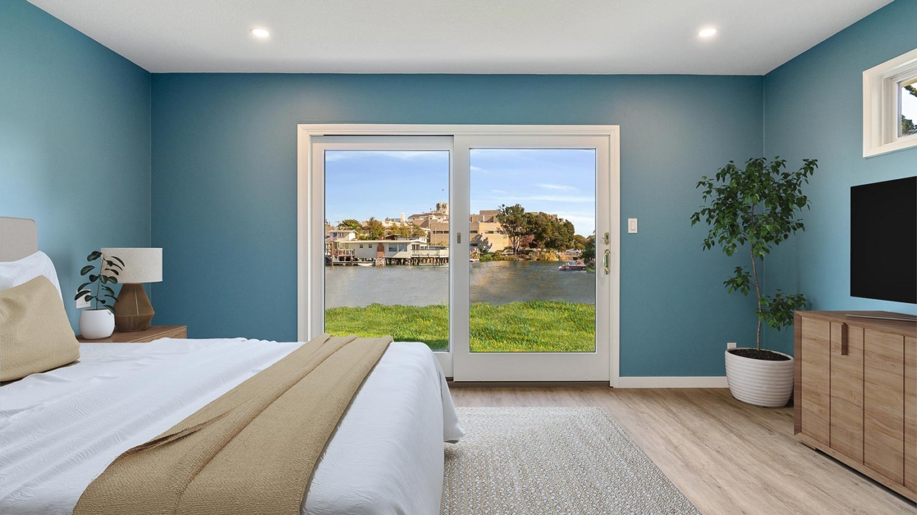
Begin by considering the location of your home. The natural surroundings and architectural style can significantly influence your color choices. For instance, a beachfront property might benefit from soft, sandy hues or cool blues, reflecting its environment. Similarly, a mountain cabin could embrace earthy tones that echo the natural landscape.

Existing Elements as a Starting Point

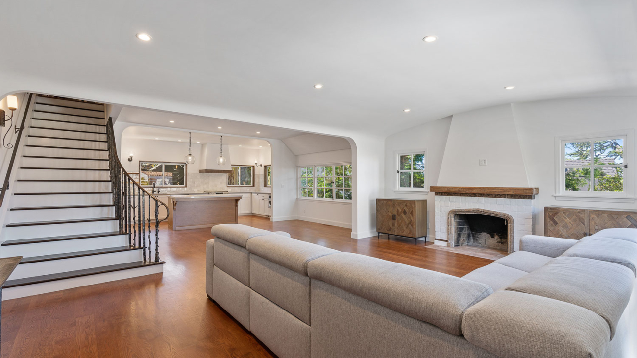
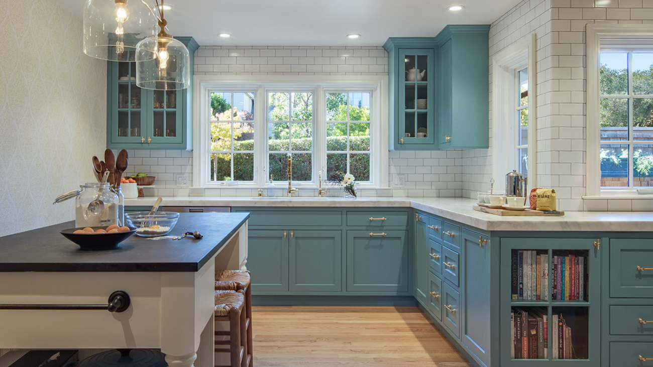
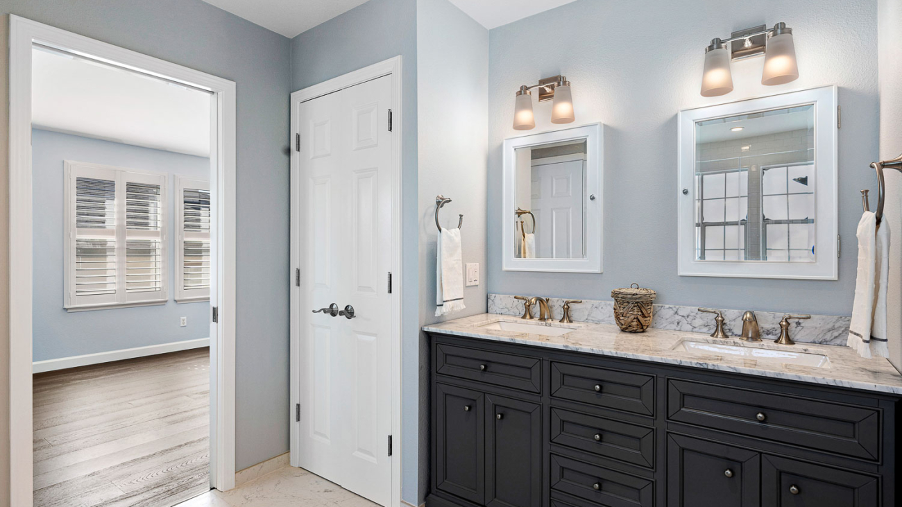
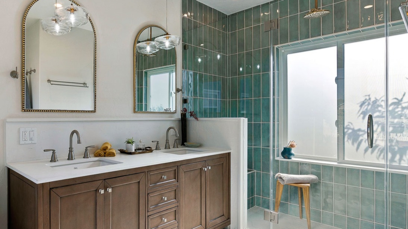
Your home’s current features, such as cabinetry, countertops, and flooring, can serve as a guide for your color palette. These elements, especially in historic homes, often have distinct color undertones that should be harmonized with the new paint colors you select.

Consistency in Undertones

Ashley Banbury, senior color designer at HGTV Home® by Sherwin-Williams, emphasizes the importance of consistency in color undertones. Whether you’re aiming for a warm or cool palette, maintaining uniform undertones across different colors ensures a fluid and seamless transition throughout the home.

Advanced Tips for a Unified Color Scheme

Amplify Existing Colors
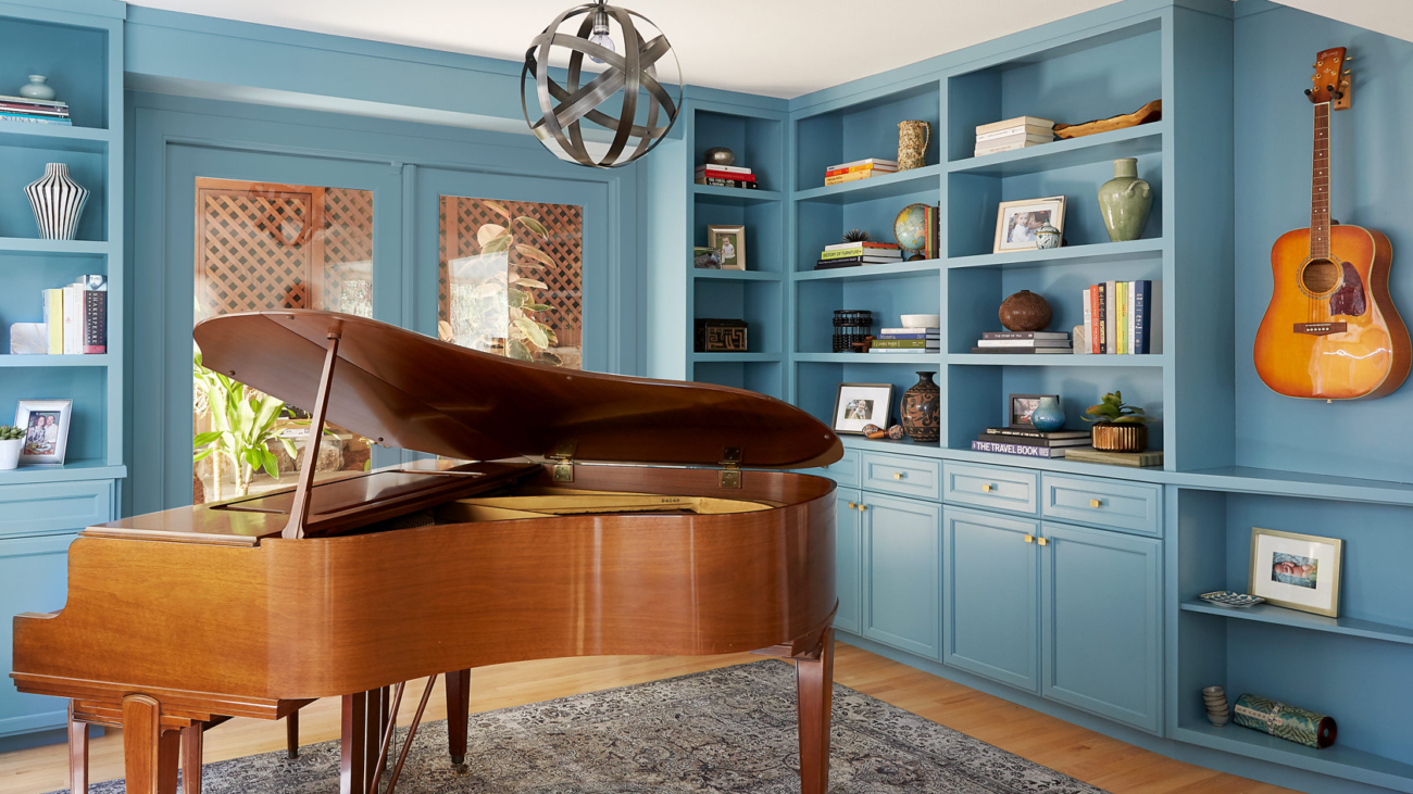
If your home already features a color you adore, use it as an anchor for your new palette. Complementary shades with similar undertones can enhance this existing color, creating a deliberate and cohesive look.

Balancing Warm and Cool Tones
A critical aspect of color selection is deciding between warm and cool tones. This choice should align with both your home’s environment and existing interior elements. The key is to avoid mixing warm and cool tones excessively, as this can create visual discord.

Utilizing Neutrals Effectively
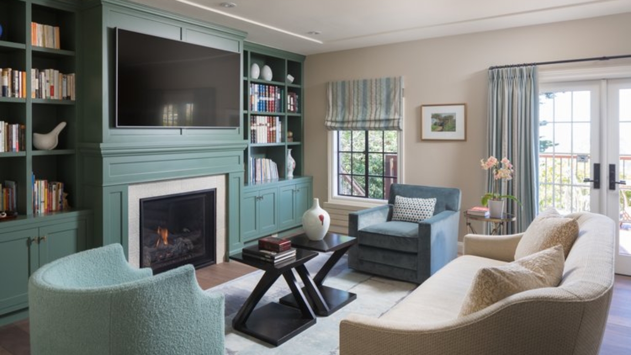
Neutrals play a pivotal role in connecting different spaces. Using a consistent neutral for trims and doors can create a sense of continuity. Additionally, incorporating a neutral as a ‘palette cleanser’ in transitional areas can effectively balance more vibrant colors in adjoining rooms.

Selecting the Right White
Choosing the right white paint is crucial, as it forms the base for layering other colors. Opt for a white that complements the overall tone of your home. Sherwin-Williams’s Greek Villa (HGSW7551) or Alabaster (HGSW7008) are excellent examples of warm, inviting whites.

Layering Room by Room
You don’t have to limit your home to a single color. For connected spaces, consider using shades within the same color family but varying in intensity. This approach can provide a smooth transition and visual interest from one room to another.

Embracing Color Diversity

Breaking the Monotony
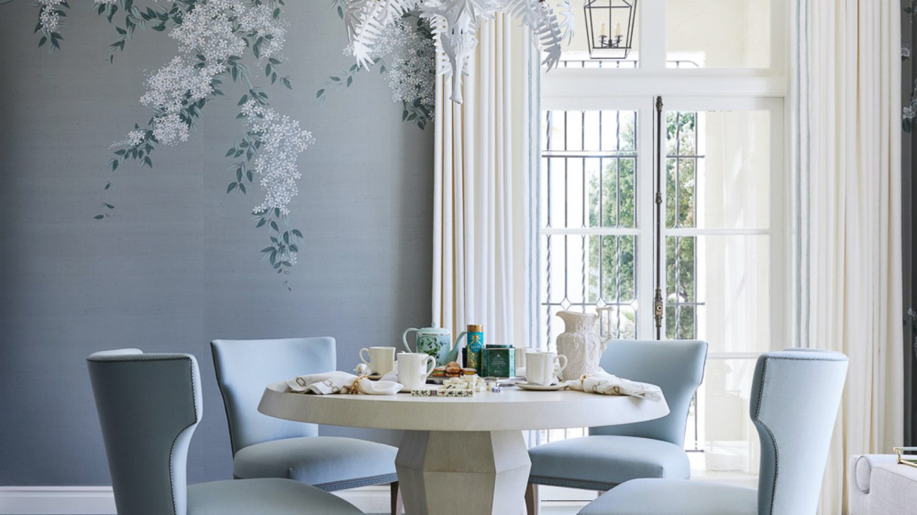
Introducing a bold or contrasting color in one or two rooms can add dimension and character to your home. This technique works well in spaces like dining rooms or studies, where a distinct color can create a focal point without overwhelming the overall scheme.

Consideration for Trim and Accents
Be mindful of the color of window trims and baseboards. Harmonizing these with your wall colors can enhance the overall aesthetic. In certain cases, matching the trim color to the wall color can create a sophisticated, unified look.

Flexibility in Paint Choices
Finally, remember that your household’s needs and preferences should also guide your color selection. For instance, accommodating a child’s favorite color in a subtle way, like on a ceiling or vanity cabinet, can add a playful touch without disrupting the overall color scheme.

Implementing Your Color Scheme with Precision

Professional Consultation
Consulting with a professional designer or color expert can provide invaluable insights tailored to your home’s unique characteristics and your personal preferences.

Sampling and Testing
Before finalizing your colors, it’s advisable to test paint samples in different areas of your home. Observe how the colors look under various lighting conditions and at different times of the day.

Quality Paint Selection
Investing in high-quality paint not only ensures durability but also impacts the overall finish and appearance of your color scheme. Consider paints that offer additional benefits, like scuff resistance, especially in high-traffic areas.

Final Thoughts
Creating a cohesive paint color scheme for your home requires a thoughtful blend of art and science. By considering your home’s location, existing features, and the principles of color harmony, you can craft a color palette that is both personal and universally appealing. Remember, the goal is to create a space that reflects your unique style while maintaining a sense of balance and coherence.

14E

Comprehensive Guide to Hiring a Professional House Painter

Paint is THE most important thing you can do to protect your home and embarking on a house painting project comes with a lot of decisions and even more questions. The key to a successful outcome lies in selecting the right painting contractor. This comprehensive guide aims to equip homeowners with the tools you need to make that decision including questions to ask, what should a good painting contract include and how to that you pick a true professional to perform your project.

Understanding Your Painting Project – Assessing Your Needs
Before you begin, clarity on your project’s general scope is an important step.

  • Are you looking to paint the interior or the exterior of your home?
  • What is known in the industry as the “Scope of Work” meaning what have you identified that either need work or that you want to change.
  • What areas are you concerned about or that are exposed to weather
  • What areas have things like old wallpaper, texture, or are showing holes or damage

Color Selection

If you are thinking of painting anything red, blue or yellow, let the Painting Contractor know. These are saturated colors that may require more than the standard 2-coat application process. Color selection either before or just as the project starts will colors ensure that there are no interruptions once painting has begun.

Choosing the Right Painting Contractor

Suitable contractors will have the following:

  • Licensed as per local regulations or State Licensing Boards
  • Liability Insurance with the proper limits (ask that you be name additionally insured)
  • Worker’s Compensation insurance (ask to see proof of insurance)
  • Ask friends, family or neighbors and check online for positive reviews from verified customers

Estimating Best Practices utilized by Painting Contractors:

In person appointments allow you to that fully review the areas and surrounding conditions with the contractor.

Painting Contractor will identify items that may not have occurred to you such as areas of rotting wood, color placement questions, elements that may be included or not included, whether or not you need scaffolding for out of reach areas on the exterior of your home.

Be able to answer questions or get back to you with answers to your questions.

Provide you with a detailed proposal that includes:

  • Scope of Work
  • Description of Work
  • Total cost of project
  • Payment Schedule
  • Notice of 3-day cancellation period
  • Paint products to be used
  • Safeguards and details of job production
  • Limits of Liability
  • Licensing and licensing board contact information
  • Warranty information
  • Contains an area for you to provide a signature showing agreement with the contents of the proposal

Most of the time, the initial jobsite visit is complementary. If additional time is spent in developing scope or meeting additional trades, the painting contractor may add that consultation cost into their proposal.

Checking the credentials and certifications of the Painting Contractor
Validate their insurance, licenses, and certifications. For pre-1978 homes, an EPA Lead-Safe certification is vital.

Additional Questions to ask

  • Crew Consistency: How are projects run, how are they supervised and what are the typical work hours.
  • References and Portfolio: Request a list of references and access to their portfolio to gauge their quality of work.
  • Materials Used: Discuss paint brands and finishes suitable for different areas of your home.
  • Preparation Process: Clarify the extent of prep work, including sanding, repairs, and furniture handling.

Warranty Provision: Paint Contractor must warranty work as specified by their state or local regulations.

Making the Final Decision
It is typical to get at least one or two other proposals from equally qualified Painting Contractors and comparing not just price but how the proposal is written, does it accurately reflect the scope of work you discussed, does it give you a good understanding of how your job will be performed and what time frame it will be performed in. You will weigh factors like the contractor’s professionalism, previous work quality, and your comfort level with their team. Avoid making a decision based solely on price.

Alameda house painting

When to Repaint Your Bay Area Home — A Comedy

This the how-to-listicle that aims to help in deciphering the cryptic signs from you home that scream, “It’s time to repaint me!” Let’s face it, your Bay Area abode is more than just four walls and a roof—it’s your castle, your sanctuary, and possibly the backdrop to some of the most epic scenes of your life. But even the grandest of castles starts to crumble and over time, they need something as basic as touch-up or a major overhaul. This is especially important if you want to keep your curb appeal game strong.

The Telltale Signs It’s Time for a New Paint

The Great Fade-Out
Chalky, sun-bleached, cobwebby look are all signs that your house has been left out in the sun too long (because, well, it has). If it has a saggy, past the expiration on the milk carton look or showing shades of pale or gothic novel veneer, it’s time for action. We wish it was just an cosmetic issue, but fading paint is your home’s cry for help. Like a sun-bleached tourist after a day at the beach, your house needs protection.

Peeling & Cracking: The Unwanted Artwork
When your home’s exterior begins to peel and crack, it’s not trying to embrace an abstract art movement—it’s signaling distress. And it is not your home’s attempt at shedding its old skin, even if it were, it doesn’t look as cool as an actual snake shedding it skin because underneath will be rot and broken-down stucco or wood. Peeling paint can lead to moisture invasion faster than pirates boarding a ship. Arrrgh, matey, it’s time to call in the professionals!

The Chalk Zone
No, not the fun, animated kind. If you run your hand across your home’s exterior and it feels like you’ve just chalked up for a gymnastics routine, that’s chalking. The sun has baked your paint (and now your stucco) into a powdery finish that is sadly not a suitable material for an outdoor mural. This is your home’s way of saying, “I’m meltinnnnnng.”

Stains & Water Damage: The Unwanted Decor
Stains and water damage are like the uninvited guests at your party—they just show up without warning and they are not attractive. If your home is starting to look like a Dalmatian with all those black mildew spots and white chalky spots, it’s time to paint it! Forget the décor, water damage is the silent home killer, creeping in and chewing up your structural system and wreak havoc like a ninja. Don’t let your home fall victim to these stealthy attackers.

Fungus Among Us
If you’re starting to spot more mushrooms on your home than in your garden, that’s a clear sign of fungal or mold growth. This isn’t the time to experiment with homemade penicillin; it’s a sign that your paint has lost its protective mojo. Your home is now playing host to spore parties, and trust us, you don’t want to be on that guest list.

Outdated Fashion

Is your home stuck in a time warp? If your curb appeal is more “yikes” than “yay,” it might be time for a wardrobe change. Homes, like people, need to keep their looks updated. If your home is still rocking the avocado green and harvest gold from decades past, it’s begging for a makeover paint job. After the paint, plant new plants, install a deck or an arbor. Feather in more Flowers. Place a park bench or two where you can admire your home’s make over. Let’s give your home the glow-up it deserves!
Frequent Queries from the Concerned Homeowner

Q: How often should I repaint my house?

A: Think of repainting like visiting your favorite hair salon. Every 8-12 years is a good refresh rate to keep your home looking and felling its best, with a little touch-up in between to cover the grays…err, we mean, the fades.

Q: Can I paint my house myself?

A: No. Definitely not. Well, most people definitely cannot. DIY house painting can be as risky as cutting your own hair before a big event. Sure, you might save some cash (or not), but are you ready to live with a less-than-perfect (or just plain ugly) outcome? For best results, leave it to the pros. We have the skills, tools, and, most importantly, the ladders.

Q: How important is choosing the right color for my house?

A: Choosing the right paint color is like selecting the right outfit for a first date—it needs to make a good impression and withstand a bit of scrutiny and the test of time. Factors such as your neighbor’s homes, siding and roof material and whether you’re going to choose a low lustre or flat sheen all come into play. Consult with a professional to find your home’s perfect match.

When your home starts showing these above signs, it’s not just being dramatic—it’s a genuine cry for help. Remember, it can’t leave and go to the doctor! Paint is the universal antidote and the home-saver! Repainting your Bay Area home is not just about aesthetics; it’s about protection, preservation, and occasionally, making the neighbors a tad jealous. So, if you notice any of these signs, don’t wait for a paintpocalypse. Give your home the TLC it deserves, and keep your castle’s curb game strong.

At Arana Craftsman Painters, our goal is clear: we aim to provide unmatched painting services that not only transform your space but also mirror your personal taste and enhance the aesthetic appeal of your property. We’re dedicated to forging enduring relationships with our clients, built on the foundations of open dialogue, dependability, and exceptional outcomes.

Why Arana Craftsman Painters Stand Out

  • Unmatched Expertise and Attention to Detail: Our highly skilled painters bring extensive experience to every project, guaranteeing meticulous care in every brush stroke and ensuring impeccable finishes. Offering a broad spectrum of painting services, we cater to both residential and commercial clients, personalizing our approach to fit your unique requirements and desires.
  • Commitment to Quality and Sustainability: We prioritize the use of premium, environmentally friendly paints and materials, assuring not only an outstanding finish but also the well-being of your family, employees, and the planet.
  • Tailored Solutions for Every Project: Recognizing the distinctiveness of each project, we collaborate closely with you to grasp your vision and provide tailored solutions that make that vision a reality. Whether it’s revamping the exterior of your home, revitalizing your interior spaces, or updating the look of your business, our expertise ensures your goals are achieved.
  • In-depth Local Insights: As experienced Oakland Painters, our deep understanding of the local architecture, climate, and aesthetic preferences enables us to offer thoughtful advice and long-lasting solutions that are impeccably aligned with the Bay Area’s unique characteristics.

Our Signature Services

  • Residential Painting: Let us transform your home with our all-encompassing interior and exterior painting services, designed to refresh and rejuvenate your living spaces.
  • Commercial Painting: Boost your business’s image with a fresh, professional appearance that reflects your brand’s quality and ethos.
  • Color Consultation: Our color experts are here to guide you in choosing the ideal palette to complement your style and enhance your space’s ambiance.
  • Eco-Friendly Practices: Embrace a healthier, more sustainable approach to your painting project with our selection of eco-friendly paints and materials.

At Arana Craftsman Painters, we’re not just painting walls; we’re enriching lives, one space at a time.

Oakland interior house painting

DIY vs. Professional Painting: Making the Right Choice for Your Home

When it comes to giving your home, a fresh look does it make sense to go full DIY (Do it Yourself) or hire you’re a professional painting contractor? This is a common predicament for homeowners. Each approach offers its unique benefits and considerations, which we will explore in detail to help you make an informed decision.

DIY Painting: Pros and Cons

Who doesn’t love to do things themselves? It can be cost-effective and of course you can have the satisfaction that you did it yourself. It also allows you to express their creativity and put a personal touch on your living spaces. Here are the key aspects of DIY painting:

The Pros:

  • Cost-Effectiveness: To pay for skilled labor can be expensive. Materials costs are the same for you as they are for a painting contractor, but you don’t have to cover liability and worker’s compensation and payroll taxes for the skilled labor.
  • Flexibility and Control: DIY projects offer the flexibility to work at your own pace and make changes as you go. You have complete control over the color choices, paint quality, and techniques used.
  • Satisfaction and Accomplishment: Completing a DIY painting project can provide a sense of achievement and personal satisfaction.

The Cons:

  • Time and Effort: Painting is time-consuming and physically demanding, especially for larger projects or spaces with high ceilings and intricate details.
  • Skill Level: Without professional experience, achieving a high-quality finish can be challenging. Mistakes and inconsistencies may require additional time and resources to correct.
  • Equipment and Materials: Proper painting requires specific tools and materials, which can add to the overall cost and complexity of the project.

Benefits of Hiring Professional Painters

Professional painting services can make a project go much smoother and can significantly enhance the beauty and quality of your project. DIYers need to consider which 2 of the 3 elements of a project are their priorities: Quality, Time and/or Budget. The advantages of hiring a painting contractor includes:

  • Expertise and Quality: Truly Professional painters bring years of experience, ensuring that the surface was prepped correctly, to produce a visually pleasing, even, and long-lasting finish.
  • Efficiency: Skilled painters know how to begin and end a project efficiently, often moving more quickly than a DIY effort. This can be particularly advantageous for tight timelines or large-scale projects.
  • Equipment and Techniques: Professionals have access to the specialized equipment and tools as well as the more effective work processes that might not be feasible for DIY painters.
  • Stress-Free Experience: Hiring a professional may mean no stress for you. You won’t have to deal with the a heavy work load for weeks on end, you won’t have to deal with waste and proper cleanup and you will be able to focus on other aspects of your life.

The reality of hiring a professional painting contractor is that their services will cost. Professional painting is almost always significantly more expensive than a DIY effort, depending on the scope and complexity of the project.

When to Choose Professional Painting

While DIY painting can be rewarding, certain scenarios call for professional expertise:

  • Complex Projects: Intricate designs, high ceilings, and exterior painting often require the skill and equipment of professionals.
  • Health and Safety Concerns: Professional painters are equipped to handle lead-based paints and other hazards safely.
  • Time Constraints: If you have a tight deadline, professionals can complete the job more quickly and efficiently.
  • For the DIYer keep in mind: For a successful paint job, preparation is key

Adequate preparation is essential for a successful paint job, whether DIY or professional.

  • Surface Preparation: Ensure walls are clean, dry, and smooth. Repair any holes or cracks and sand surfaces as necessary.
  • Quality Materials: Invest in high-quality paint and brushes. Quality materials can result in a more professional finish and longer-lasting results.
  • Protecting Your Space: Cover floors and furniture with drop cloths, and use painter’s tape to protect trim and ceilings.
  • Making Your Decision: DIY vs. Professional Painting

The choice between doing it yourself and hiring a professional painting contractor depends on a variety of factors:

  • Budget
  • Time
  • Skill level

The complexity of the project. For those seeking a cost-effective, self-paced approach, DIY painting can be the right choice. However, for high-quality, efficient, stress-free and great looking result, professional painting services are the ideal solution.

Do not discount the importance of proper planning, preparation, and the use of quality materials. With these factors in mind, you can transform your space into a beautifully painted home that reflects your style and meets your needs.

301135148_10160279110011031_3588820923027618106_n

How to Maintain Your Painted Walls for Long-lasting Beauty

Maintaining your interior paint job’s vibrant beauty and pristine condition doesn’t have to be a lot of work. With a dash of elbow grease, a sprinkle of diligence, and the right techniques up your sleeve, you can ensure your exterior surfaces will remain clean looking, intact and the envy of the neighborhood (or at least your discerning house cat). Let’s dive into what it takes get this done!

The Monthly to Quarterly Dust-Down: A Wall’s Best Friend
Believe it or not, dust and walls have a love-hate relationship. Dust loves walls, but walls, not so much. Regular dusting is your first line of defense in the battle for wall longevity. Use a soft, microfiber cloth or a gentle duster, give your walls a light once-over a month or Quarter depending on how much time you have. This isn’t just about keeping appearances; it prevents the accumulation of dust particles that can make your walls look dull and neglected over time.

Spot Cleaning: The Art of Precision
Accidents happen, we get it! Or maybe your little artist was inspired or you had an oops moment from a dinner party gone wild, walls do get their fair share of unsolicited decorations. Here is the secret sauce for spot cleaning walls that have a flat to matte sheen: a soft sponge, lukewarm water, and a drop of mild detergent. Dab gently; don’t scrub like you’re trying to erase a bad memory. This method helps remove most stains without leaving your wall looking like it went through a minor exorcism. For walls that have eggshell or higher, you can use a magic eraser or scrub a little hard.

Deep Clean Without the Drama
Once a year, your walls deserve a spa day. Especially your high traffic walls. This involves a more thorough cleaning but doesn’t require any special chants or moon phases. Simply mix a small amount of mild detergent in a bucket of water, and using a soft sponge, wash your walls from top to bottom. Apply the same principles as above. Do not go to town scrubbing on walls that have a flat or matte sheen. Why top to bottom, you ask? If you clean only the bottoms, you may start to see a two-toned color. Rinse with a second sponge dipped in clean water to prevent soap residue from throwing a comeback party. You can also use a wet cloth.

Touch-Ups: The Magic Wand of Wall Maintenance
Even with the best care, life happens, and walls can get chipped or scuffed. If and only if you have walls painted with a flat sheen, keeping a small amount of your wall paint for touch-ups can be a lifesaver. Apply with a small brush for precision and blend into the existing paint. It’s like concealer for your walls – it covers up the minor blemishes and keeps everything looking cleaner, just not flawless. You may see the paint “flash” even though it is flat. Paint is not as high quality as it used to be unfortunately and it can fade faster than it did before all of the changes.

Avoid the Fade: Shielding from the Sun
The sun is great for beaches and picnics but not so much for your paint job. Prolonged exposure to UV or direct sunlight can cause your vibrant colors to fade into a washed-out memory. Using curtains, blinds, or UV window films can protect your walls from the harsh effects of UV rays, keeping your colors bright and your spirits high.

The Right Paint for the Job
Choosing the right type of paint can make a world of difference in maintenance. Higher quality paint will hold its color for longer and resist scuffs for longer. For high-traffic areas, consider using paint with a higher “sheen” or gloss. Eggshell is a good start, Satin is better and Semigloss, while extremely shiny is best in high traffic areas that you need to keep clean. These finishes are not only more durable but also easier to clean, making them ideal for kitchens, bathrooms, and playrooms. For other areas, an eggshell or satin finish can provide a nice balance between sheen and ease of maintenance.

Humidity: The Invisible Enemy
Especially in bathrooms, high levels of humidity can be a painted wall’s nemesis, leading to peeling paint and mold growth. You can also experience streaking when a shower is running. Ensuring your home is well-ventilated, especially in areas like the kitchen and bathroom, can prevent humidity levels from reaching critical mass. A dehumidifier can also be a valuable ally in your quest to maintain optimal humidity levels.

Be Gentle: The Golden Rule of Wall Care
When it comes to maintaining painted walls, gentleness is key. Harsh chemicals and abrasive cleaning tools are the archenemies of paint. They can cause more harm than good, leaving your walls in a state of distress. Stick to mild detergents, soft cloths, and tender loving care.

Final Touch: Regular Inspection and Quick Action
Regularly inspect your walls for signs of wear and tear. Catching issues early can prevent them from escalating into full-blown wall crises. At minimum it will reduce your costs of repainting too soon. A quick touch-up here, a gentle clean there, and your walls will continue to stand tall and beautiful, come what may. Maintaining your painted walls for long-lasting beauty isn’t rocket science, but it does require a bit of effort, a touch of knowledge, and a sprinkle of humor. By following these tips, you can ensure that your walls remain a source of pride and joy, reflecting the care and love you put into your home. Remember, the walls aren’t just part of your house; they’re the backdrop to your life’s many moments and memories.

Schedule A Free Consultation Today 510.567.9559

kitchen painting in Oakland

Best Colors to Paint Your Cabinets in 2024

They say a good home is never done. And 2024 may be the year those Kitchen cabinets of your get some love… and a color change. Because cabinets are usually the centerpiece of any room you can use them as an accent or you can mute to the background. Either way, the ambiance and aesthetic appeal of your home will be greatly enhanced giving them a refresh. We see the trend towards personalization and boldness in color choices continue to dominate in 2024. This article explores some of our top colors directions for cabinet colors, ensuring your space not only looks modern but also exudes the character and warmth that makes it uniquely yours.

Soothing Greens

A color like Farrow and Ball Green Smoke No.47 is a soothing green that emerges as a frontrunner for cabinet colors in 2024. This full spectrum product from Farrow and Ball blends the calmness of green and oozes with richness and sophistication. With a nod to natures, this color promotes a serene and inviting atmosphere which is perfect for eat in kitchens and bathrooms, sage green pairs well with natural wood finishes, metallic hardware accents, and white to quartzite countertops, providing a balanced and harmonious look

Bold Blues

Just from the Benjamin Moore color line alone will you find a plethora of blues to play with. From Blue Note – 2129-30 0 is a deeper more soulful blue or Majestic Blue – 2051-40 a beachy, turquoise green blue or Hail Navy HC 154, a deep, rich baritone of a blue. These types of blues make a statement and add accet, depth and drama to any space. Bolder blues work exceptionally well in larger kitchens, by creating a feeling of luxury and expansiveness. Hardware accents in gold or brass hardware complement blue very nicely and for an added touch of elegance, or contrast them with light wood. Marble countertops for a greater contrast and more striking visual impact.

Classic Matte Black

Save a good matte black cabinet for your pantry, laundry room or mudroom where fingerprits will not abound. This is a special color choice and Onyx 2133–10 from Benjamin Moore or Off Black No. 57 by Farrow and Ball are great candidates for what continues to be a popular choice for cabinet colors in 2024. Black brings a sleek and modern aesthetic and is ideal for contemporary and minimalist designs. Matte black cabinets serve as a powerful backdrop, allowing other elements of your decor to shine. Pair them with bold hardware or colorful accessories to break the monotony and introduce vibrancy into your space.

Warm Terracotta

Back in my day, Terracotta was a color you used when you lived in the desert or Southwest. It is making a comeback, offering a warm, earthy hue that adds richness and texture to your cabinets. This color is perfect for creating a cozy, welcoming environment, reminiscent of Mediterranean or rustic styles. Terracotta cabinets pair beautifully with natural stone countertops and warm wood tones, evoking a sense of comfort and ease. Farrow and Ball’s Faded Terracotta No. CC8. The 2024 pantone color of the year is Peach Fuzz, so terracotta would definitely work in this category. You can go as orange or as pink or brown on the terracotta spectrum as you like.

Soft Pastels

Soft pastel such as a delicate blue or green brings a light, airy feel to cabinets, perfect for creating a gentle and calming ambiance. If you’re on the gulf side of the Florida panhandle, pink cabinets would also work. Pastels are versatile colors especially in light filled, sunny climates. They can be paired with darker tones and gray or to balance out their sweetness, or with whites and creams for a softer, more romantic look. Pastel pink cabinets specifically are a bold choice that can add a unique personality to your kitchen or bathroom.

Cabinets are an easy way to change things up in your home. Choosing the right color can transform your space, reflecting your personality and style. The above colors highlighted for 2024 offer a range of options, from bold and vibrant to soft and sophisticated. Whether you’re renovating your kitchen, updating your bathroom, or simply looking for a change, these colors provide the inspiration needed to create a beautiful and inviting space. Remember, the best color for your cabinets is one that you’ll love for years to come, making your home feel uniquely yours.

Are You Ready To Pick Your Cabinet Colors in 2024?
Call Today 510-567-9559


Oakland Painters
Arana Craftsman Painters
819 San Leandro Blvd
San Leandro, CA 94577
510-567-9559

312334196_506230011517747_5646806907717512788_n

Revitalize Your Home with the Essence of Spring: A Guide to Spring Colors and Decor

Spring is a time of new growth, renewal and rejuvenation, and what better way to embrace this seasonal shift than by infusing your home with the vibrant, uplifting essence of spring colors? At the heart of spring decorating is spring like, vibrant colors that breathe life into any space. These colors make it feel more inviting and energized. In this comprehensive guide, we delve into the myriad ways to incorporate the freshness of spring into your home, transforming it into a sanctuary of warmth and joy.

The Palette of Renewal: Understanding Spring Colors

Spring is synonymous with renewal, and its colors reflect this beautifully. Envision the brightness of a tangerine, the cheerfulness of sunshine, the playful spirit of pink, the freshness of grass, and the calmness of blue. Well-chosen colors will not feel like pastels, but chic, full spectrum and vibrant. For those seeking a softer ambiance, consider the diluting these colors until they are just a touch of the shade of the color. They offer the same spring-like vibe but will be more timeless and classic and add a layer of sophistication to the overall aesthetic.

Elegance in Softness: Pastel Sophistication
Soft, pastel hues are quintessential to the spring palette, offering a sophisticated take on seasonal decor. If you have a room that you like to change up now and again, now is the time! Throw out yesterday’s red and imagine your living room with the tranquility of of a blue accent or the vibrancy of pink or purple accent walls, all tied together by a floral upholstered chair that serves as a visual anchor.

Making a Statement with Spring Colors
In spaces like the kitchen, which often feature neutral palettes, the introduction of a single spring color like yellow can dramatically transform the atmosphere. Or a splash of aquamarine on bar stools with a wooden island counter top or a stand mixer introduces a fresh, almost tropical vibe. This concept can be applied across various rooms, utilizing spring colors to add personality and flair.

The Harmony of Neutrals and Brights
Spring decorating doesn’t mean shying away from white or neutrals. In fact, white walls can set the stage for bold furniture can, window treatments and art to shine. By starting with a subdued palette, you can afford to be bold in your accents, from brightly patterned bedding to colorful wall art. This balance ensures your space feels grounded yet alive with the spirit of spring.

DIY Spring Touches

Incorporating spring colors needn’t be a major commitment. Simple projects, like painting the inside of a bookcase, or changing your trim color. Even painting the ceiling of your bedroom, a bright sky blue can add a burst of brightness without overwhelming. This approach is especially suitable for renters or those on a budget, proving that a touch of spring can be both impactful and easy to achieve.

Nature’s Influence: The Lure of Green
Nothing says spring like the sight of greening grass, and incorporating this shade into your decor can mimic that feeling of renewal. From grass-green velvet furniture to floral accents in crisp white settings, the freshness of green can transform any room into a springtime haven.

Striking the Right Balance
Achieving harmony in your spring decor involves balancing light and dark colors. By pairing navy furniture with lighter fabrics and warm color accents, you can create a space that feels balanced, inviting, and vibrantly alive with spring energy.

The Subtle Touch
Introducing color doesn’t have to mean bold statements. A tone-on-tone wallpaper or subtle pattern can add depth and interest without overwhelming, proving that sometimes, less is indeed more.

A Nod to Rustic and Retro and the Power of Patterns

Even in spaces filled with antiques and rich textures, spring colors can find their home. By integrating faded rugs or pillows in pastel hues, you can create a cohesive look that bridges the gap between the old and the new.

Starting your color makeover with a beloved fabric pattern is a foolproof way to introduce spring into your decor. This approach allows for a cohesive color scheme that can be carried throughout the room, from walls to accessories, creating a harmonious and visually appealing space.

Incorporating spring colors into your home decor can be a way to brighten dark spaces, change up old heavy colors or provide a backdrop for new furniture and fixtures. By embracing the principles outlined in this guide, you can transform your living spaces into vibrant reflections of spring’s rejuvenating energy. Let the season inspire you to refresh, renew, and revitalize your home with the beauty of spring colors.

Schedule A Consultation 510-567-9559


Oakland Painters
Arana Craftsman Painters
819 San Leandro Blvd
San Leandro, CA 94577
510-567-9559

Alameda bathroom painting by Arana Craftsman Painters

Transform Your Space with Paint and Color: The Ultimate Guide to Reshaping Your Home

Welcome to the world of paint and how it can be used to transform your home or just one room in the house! Painting is not just about color; it’s a journey of creativity, where each brushstroke can alter perceptions and redefine spaces. Whether you’re yearning for a room that embraces you warmly or a space that breathes airy vastness, our guide is your canvas to reimagine your home. Let’s dive into the transformative power of paint, where possibilities are endless and every can opens a new dimension.

Create the Illusion of Space
Ever looked around your cozy corner and wished for a touch of grandeur? The secret lies in the simplicity of color. If you have a special corner that can be isolated, use a pop of color to highlight it. Put in a window seat and add a splash of color with pillows. To make a space feel larger a soft white or a delicate pastel can do wonders, especially walls, trim, and ceiling are painted in the same color. The continuity of color blurs boundaries, making the room seem boundless and especially when you have nice large windows you can invite them in. Complement this airy ambiance with light-toned rugs, transforming your snug nook into a serene expanse.

Elevate Your Ceiling
Yearning for a room that stretches endlessly towards the skies? A clever play of contrasts can give your space the lift it desires. Pair a pristine white for the ceiling with a deep, embracing hue for the walls. This contrast draws the eye upward, creating a sense of elevation. The darker tones encourage the walls to visually recede, lending a lofty air to even the most compact of rooms.

Cozy Up with Color
Large, echoing spaces can feel impersonal, but paint can sculpt a snug retreat. Create an intimate ambiance by painting your ceiling and a shorter wall in crisp white, enveloping the remaining space in darker tones. This technique pulls the room closer, crafting a cocoon of comfort and warmth. It’s like a visual hug, turning expansive areas into cozy sanctuaries.

Spotlight with Shades
Highlighting a wall is an artful reversal of the focal wall concept. Choose a lighter color for one wall and paint the remaining walls a in richer, darker shade. This solitary light wall becomes a canvas, accentuating art pieces or furniture, and directing attention precisely where you desire. It’s a masterful way to spotlight the stars of your space, ensuring they capture the gaze and admiration they deserve.

Diminish to Intensify
Large, bright spaces offer a canvas for creativity but sometimes, a more intimate atmosphere is desired. Painting walls and ceilings in deep, uniform colors creates a cozy, cave-like effect ideal for bedrooms or libraries. This method filters out excess light and focuses energy within the room, crafting a secluded oasis perfect for relaxation and contemplation.

Elongate with Ease
By painting one wall and the ceiling in a dark hue and keeping the others light, you create a visual pathway that draws the eye along the room’s length. This technique expands the space, making it appear longer and more inviting.

Broaden Your Horizons
Widen by splitting it horizontally. Paint the lower half and the ceiling in light shades and the upper half in a darker tone. This layering effect visually stretches the room, making it appear wider and more open.

Lowering the Sky
Tall rooms can feel unbalanced, but darkening the ceiling brings a sense of harmony. This technique lowers the perceived ceiling height, making the room feel cozier and more proportioned. It’s a subtle trick that adds a professional touch to your space, enhancing its overall ambiance.

Condense with Contrast
Long rooms can seem endless, but painting one of the short walls in a dark color visually shortens the space. This creates a more balanced room, focusing attention and making the space feel more inviting.

Incorporating these painting strategies into your home can dramatically alter the perception of your space. Paint is more than a medium; it’s a transformative tool that molds your environment to reflect your unique style and preferences. Whether seeking solace in a cozy nook or the freedom of an expansive retreat, the right colors can unlock the potential of your space, making it truly your own.

Oakland Painters
Arana Craftsman Painters
819 San Leandro Blvd
San Leandro, CA 94577
510-567-9559

Alameda bathroom painting

Top Oakland House Painting Tips for DIY’ers

Many people attempt to paint their own homes. In fact, most people in Oakland, like the rest of the US, paint their own homes. While it is a labor-intensive and time-consuming process, not knowing what you are doing can mean that you see underwhelming results at best.

While hiring a professional is always a good idea, you can improve the outcome by following these pro tips. Remember that tips can’t help compensate for good painting techniques or experience, but they can help you yield better results.

Prepare Your Oakland House For Painting

Preparation for house painting begins with evaluating your home’s exterior condition and planning what materials you will need. Remove all loose paint, sand any rough spots, it is not necessary to strip the surface of all previous coatings. Apply a coat of primer and fill any open holes in the wood or cracks in the stucco.

For interior painting, prepare each room by removing any soft furnishings. This includes window treatments and rugs. You can roll these up or cover them with plastic to protect from paint damage.

You will also want to cover and protect all upholstered furniture, drapes, and carpets. This will give you adequate room to work and minimize the risk of damage. It is also a good idea to cover furniture that can’t be moved. Clean dropcloths and painters plastic work well.

Clean Dirty Surfaces Before Painting

Dirty surfaces in the Kitchen for example may prevent the paint from forming a bond. Oil, dirt, and stains will make it hard for paint to bond with the wall, and after a few weeks, you’ll notice the paint peeling. So, use a de-glosser like TSP to clean up the grimy areas or a heavy-duty cleaner. You will also want to remove hand marks around the switches and doorknobs.

Use a cleaner in a circular motion, with a lint-free cloth or an abrasive pad. Best to start top down so that you can control the moisture. Make sure to mask and cover before you start. Once the surface is clean, you can spot prime and fill up all the holes and nicks, sand the surface smooth, and paint. Make sure always to wear quality rubber gloves and goggles.

Generous Use of Painter’s Tape

The right type of painter’s tape is essential for successfully completing your painting project. Using the wrong kind of tape could cause damage to your floor or furniture surfaces, leave squiggly lines (professionals do not use tape to create a straight line), and glue residue on the walls.

You can also find special-purpose tape for certain coatings, such as stucco. Green or blue color tape works best for straight lines and walls, while red is better for textured surfaces.

The tape you decide to use on the outside of your home should have a solid water-based adhesive and be UV-resistant. Do not leave tape on a surface for very long. It will start to flake and be difficult to remove.

Choosing The Right Sheen

For interior you have a choice of five basic sheen levels for your paint job: flat, matte, eggshell, satin or semigloss. Flat, Matte and eggshell are for walls. Semigloss is for wood trim.

All sheens have their benefits. Eggshell has a low shine and is more durable than a flat finish. Flat and matte also hides minor flaws in walls and ceilings. Flat can be touched up. Matte, Eggshell, Satin and Semigloss cannot be. A satin finish is perhaps the best choice for a busy family home with lots of hands because it is easiest to clean and it is not as shiny as Semigloss.

Flat paint looks great in areas with a lot less use. Matte is a bit easier to clean but is as not recommended for a high traffic area or a busy home with lots of children and pets.

Preventing Color Variation

One of the tell sale signs of a DIY paint job is how the color varies from one wall to another. Though many people who undertake painting their Oakland home may not realize this at first, it soon becomes apparent after the paint has dried. Fortunately, there is a way to address this issue.

If you have an open can when painting halfway through the wall, the difference can be noticed. You can eliminate this by mixing or “boxing” all the paint you have together. Avoid running out of once can of paint and buying a whole new can. Try to buy from the same store. Estimate how much paint you’ll need for the room or a wall, and then mix it in a 5-gallon bucket.

Here are a few more things to keep in mind:

If you can’t accurately or near accurately estimate coverage, it’s better to add more than less paint if this is your first time painting interior walls. You can then pour whatever you have left back into the can.

If your room is large, use a large bucket and have a roller screen ready instead of a roller tray. It’s faster to load with a screen than using a pan.

Dunk the roller into your paint bucket and roll it on your screen until you see it has stopped dripping.

Wait For The Paint To Dry Before Cutting It Loose

The most common problem we see with DIY Oakland house painting is imperfect lines because DIYers use tape and do not “cut lines” like professionals do. Fortunately, this is easily remedied by not just pulling the paint from the wall near the trim. If you do that, you can cause the paint to peel paint off the trim. So, start by using a razor blade and making a light cut where the wall meets the trim before pulling the tape off.

You will want to wait for at least 24 hours so that the paint is completely dry. Start from an area that nobody will notice and then lightly cut it clean. You then pull off the tape at a 45-degree angle.

Start By Painting the Trim First, Then the Ceilings, and Finally The Walls

As pros, we follow an order, and this is something we learn when starting out. You will see similar results if you follow this order too. The first thing to do is paint the trim, ceiling, and walls. This approach is easier and faster because taping off the trims is faster than all the walls.

Then when you are painting the trims, you don’t have to be careful or neat. All you need is to focus on ensuring a smooth finish on the wall. If you get some paint on the walls, don’t worry, because that will be covered with a fresh coat of paint.

Once the paint is dry on the trim (usually 24 hours), you can tape it off and start painting the ceilings and the walls.

Dina Bandman Decorator Showcase-3

How to Combine Textures and Colors for a Space You’ll Love!

Creating a unique home aesthetic that speaks to you and looks beautiful to the world isn’t just about throwing together a bunch of colors and textures and hoping for the best. Interior Design is an art form (and if you have the resources, we recommend working with an interior designer). Interior Design is part art form, part science (measuring, able to envision how a palette will come together), and good taste all rolled into one. Today, we are diving deep into the world of texture and color to give you some guidance on how to mixing textures and colors in a way that adds depth, interest, and personality to your space. So, grab your color wheels and fabric samples, and let’s get started on this exciting journey to transform your home into a masterpiece of design.

Color and Color Theory
The first place to start is with color and color theory. Color theory is not just for fine artists, it is a crucial tool in your toolkit. The right color combinations can evoke mood, drama and comfort (or discomfort if you choose the wrong thing!). Color can create the illusion of space, and tie disparate elements of your room together for a more cohesive look. If you understand how to layer, you can make a masterpiece of new and old furniture pieces and then paint the room a color that ties it all in.

Warm vs. Cool Tones
Warm tones, think reds, oranges, and yellows, are like the life of the party in your home, bringing energy and coziness. Cool tones, on the other hand, like blues, greens, and purples, are the zen masters, offering calm and serenity. Balancing these tones is key to a harmonious space. Figuring out what you gravitate more toward is key. Pinterest and design magazines are a good place to start.

The Color Wheel Is Your Friend
The color wheel isn’t just a pretty circle; it’s a roadmap to successful color combinations. Complementary colors (opposite each other on the wheel) offer vibrant contrasts, while analogous colors (next to each other) provide a more harmonious feel.

Texture: The Secret Ingredient
Texture is the secret ingredient that can elevate your home from “meh” to “wow.” It’s all about how things feel, adding depth and interest to what might otherwise be a flat and lifeless space. Texture comes in the form of pattern, material (wood, metal, stone). You can use limewash paints, faux, accent walls or accent pieces of furniture to provide visual texture.

Mix and Match with Purpose
Combine rough with smooth, matte with shiny, and hard with soft. Think a plush velvet sofa against a rough brick wall, or a sleek marble countertop paired with a textured wood cabinet. These contrasts create a sensory experience that brings your interior to life.

Layering Textures for Depth
Layering is not just for fashion; it’s a texture game-changer in interior design. Rugs on rugs, throws on sofas, and multiple pillow textures invite the eye to explore and the body to relax, adding coziness and depth to any room.

Strategic Color and Texture Combinations
Here’s where the magic happens. Combining colors and textures strategically can transform your space into a dynamic and inviting home.

Neutral Foundations with Colorful Accents
Start with a neutral palette for walls and large furniture pieces. Think whites, beiges, and greys. These shades provide a canvas for you to layer colors and textures through accents like pillows, artwork, and decorative items.

Bold Color, Subtle Textures; Subtle Color, Bold Textures
If you go bold with color, keep your textures subtle to avoid sensory overload. Conversely, if your color palette is understated, amp up the texture for visual interest. It’s all about balance although we have seen plenty of designers layer in ways we never thought possible!

Natural Materials for an Earthy Vibe
Incorporating natural materials like wood, stone, and metals can add both texture and color that resonate with an earthy, organic vibe. These elements bring a sense of the outdoors inside, creating a grounding and calming environment. They are excellent accents that ground a space and provide a transition for color and texture.

Personalizing Your Space
What colors bring your comfort and happiness? The ultimate goal in combining textures and colors is to create a space that reflects you and what makes you feel happy when you come home. Your home should tell your story, showcasing your personality, interests, and the things you love. And some people love minimalism and a non-consumptive lifestyle. Show that off too!

Artwork as a Color and Texture Catalyst
Use artwork to introduce new colors and textures or to tie together the elements in a room. A great wall color can bring out one color in a piece of artwork and make it pop. Art can be the inspiration for your entire space, guiding your choices in furniture, textiles, and decorative pieces. Check out local art dealer Slate Contemporary Gallery in Oakland https://slatecontemporary.com/ for a great source of local artists works.

Memories and Moments in Decor
Incorporate items that have personal meaning, like souvenirs from travels or family heirlooms. These pieces add unique textures and colors that are exclusive to your life and story. Frame theatre tickets from the days you lived in New York. Layout family pictures on both walls in a hallway to give it dimension and to memorialize your most treasured moments.

Experiment and Evolve
Your taste and style will evolve, and so should your space. Don’t be afraid to experiment with new color and texture combinations. The beauty of interior design is in its flexibility and the endless possibilities for personal expression.

Creating Harmony in Diversity
Combining textures and colors in your home interior is an exciting adventure in creativity and personal expression. By understanding the basics of color theory, appreciating the depth that texture brings, and strategically mixing these elements, you can create a space that is uniquely yours. Remember, the key to a stunning interior is not just in the bold moves but in the subtle touches that add depth and character to your home. Embrace the diversity of textures and the spectrum of colors to create a living space that is harmonious, inviting, and unmistakably you.

Oakland Painters
Arana Craftsman Painters
819 San Leandro Blvd
San Leandro, CA 94577
510-567-9559