Slate-Art-Painting-thumbnail

Steps to Buying Art for Your Home with a Professional Art Consultant

“When the sun is out and the pool is warm,” by Sheldon Greenberg. 48 x 40 in. Oil on canvas. At SLATE contemporary gallery.

SLATE contemporary is an art consultancy firm providing a personalized art collecting service, helping homeowners and businesses select the exact right art for their spaces.

During this process, we get to know you and the architecture of your home, and determine a selection of pieces that will suit your desired feeling, tone, your personal taste, the available light, the present or future interior design, your personal taste, and how you and your family and friends will enjoy the space. Below is a description of the process as it typically unfolds. Of course, options and adaptations are offered to suit each client’s individual circumstances.

These are the steps to the process of choosing art with a consultant:
1) Virtual gallery walk-through: Potential clients are invited first to look through SLATE’s website and let us know what they like, what they definitely don’t like, and what they are ambivalent towards. We are not limited to what’s on the site when we help clients collect, but we like to use our website as a diagnostic tool. This helps us get a sense of our client’s taste and style.

2) Home (or site) visit: We work with clients to identify potential locations for art, we measure the walls, and take photos. During this visit we look at images of artworks together. Sometimes, through this process, we are helping clients to identify or articulate their taste for the first time. Occasionally, when working with a couple, they each have different tastes and that can be very challenging. Sometimes we can find art that has elements that they will both like, sometimes we agree to let each one of them choose one piece, or each choose art for a different room. Sometimes, if those solutions don’t work, the truth is, we can’t help them. Also, for every project, every location, we are making a judgement call. Sometimes it’s a more personal decision, based on how the collector connects emotionally to the artwork. Sometimes it’s more of a design decision. For example, a room that is very neutral in overall tone might be desperate for color. Or if you have a very vibrant, visually-busy space, then the art might need to be quiet to create breathing room. All that said, it can also be nice to throw in a surprise, or chose a piece that creates visual tension, so the design doesn’t feel too predictable. In all of these ways, we are responding to what the space, and the client, needs.

3) Virtual art placement: At this point, we have developed a list of suggested artworks for specific locations, which we share digitally. We may make digital mockups showing artwork in situ, using the photos we took during the home (or site) visit.

4) Feedback: The client indicates their favorite selections.

5) Private viewing: We invite the client to the gallery for a private viewing, to see the potential selections in person. For this appointment, we may be retrieving pieces from our storage, or from the artists themselves. (NOTE: Anyone is welcome to visit SLATE gallery to see the works currently on display. However if there is a specific piece from the website you want to view, in order for us to have it ready for you, you may need to make an appointment.)

6) Short-list selections: We work with the client to further narrow down the list of pieces they want to view in their home.

7) “A man and a van:” We deliver the art to the client’s location — to meet with the client and the pieces in situ, for final decision-making and purchase. (There is a small fee for delivery, which, if the client makes a minimum purchase of $5000, the service fee is waived.) Some clients choose to skip steps 5 and 6, instead having many or all artworks under consideration brought to their home, in one, or repeat visits. We are happy to do this, however additional delivery fees apply.

Bonus tip: Whether to choose art at the start of a design/remodel project or the end
Art is often chosen at the end of an interior design project or remodel, once the design and furniture is all in. The advantage of this approach is that we can use art to balance or fine-tune the design.

However, at that point, clients are usually in a hurry to see their project completed, and ideally, building an art collection is not done in a rush. Also, it may be too late, at that point in the process, to adjust window treatments, lighting, or wall color, all of which will have an impact on how the art reads.
If you select the art first, you can create an environment for it during your renovation that makes it really sing.

Click this link to read more about Danielle Fox and SLATE on our blog. Learn more about SLATE contemporary at www.slateart.net

Danielle Fox of SLATE contemporary. Photo credit: Lauren Edith

Danielle Fox of SLATE contemporary. Photo credit: Lauren Edith
Home as Canvas and Art Gallery

Interior painting and artwork have an intimate relationship. The way that light reflects, the color tones shifting against the other’s presence. It is no small thing to choose the right location, lighting, and wall color for art, or to choose the right wall color when those factors have been set.

Which is why we adore and appreciate Danielle Fox and her team of art consultants at SLATE Contemporary in Oakland. An art consultancy and gallery, SLATE represents primarily California artists, many of them from the Bay Area, with a focus on modern contemporary art.

“Our gallery and consultancy is known for contemporary, abstract art. We are always looking for a strong sense of formal qualities, which is about what the materials are and what they will do; artists that are working with composition and color; lines, planes and depth,” explains Danielle.

With over 40 emerging and mid-career artists in their stable, producing abstract, landscape, cityscape, figurative art, impressionism, expressionism, street art, op art, minimalism, and installation art, SLATE has a prodigious rotating collection. About 75% of the artists SLATE represents are based in California, with one-third of that group from the East Bay.

SLATE is a physical gallery in the vibrant Uptown neighborhood of Oakland and participates regularly in promotional events including First Fridays, Saturday Stroll, and Art Murmur. SLATE is also a consultancy, helping homeowners and business owners make decisions about purchasing the right art for their spaces.

“We are really looking for art that people want to live with in their homes,” Danielle explains. “Our emphasis is on art that fulfills the senses in some way, feeding the spirit with beauty and bringing the mind to a place of clarity. Political and conceptual art, by contrast, are important, but are not what most people want to wake up to in the morning or come home to at the end of the day.”

Additionally, SLATE works with Interior Designers and Architects to help them select pieces for their clients and projects. (One of Arana’s favorite Interior Designers is also a visual artist represented by SLATE, Anastasia Faiella.)

Danielle’s parents were artists and, “for the longest time I thought I would do anything-but!” She laughs.

She ended up “falling in love” with Art History in college, obtaining her Ph.D., and then working at Sotheby’s in London for four years. Instead of becoming a subject expert, she found herself drawn to a business development and strategy track. “I learned that I enjoy managing projects and working with people. So now, I get to do these things and do them in relation to the art world, while supporting a local community of artists and collectors.”

Danielle opened SLATE in March 2009, in Temescal. In 2013, she partnered with Shelley Barry which enabled SLATE to expand into commercial art consultancy for businesses, offices, building lobbies and the like; and they moved the gallery to its current location, where, this year, they celebrated the businesses’ 10th anniversary. SLATE Art Consulting serves clients all over the San Francisco Bay Area, including the Peninsula, Marin, Napa, Sonoma, Berkeley, Oakland, Orinda, and Lafayette. SLATE also has a presence in North Lake Tahoe with rotating exhibitions at the Ritz-Carlton hotel and a local representative to work with clients in Truckee, Martis Camp, Northstar, Mountainside, Incline Village, and surrounding areas.

But wait! There’s more…

WorkroomC_Aubergine-163-featured-image

The Art of the Pattern — Q & A with Workroom C

Carolyn Rebuffel Flannery, Principal Designer of Interior Design Firm Workroom C, based in Emeryville, offers her brand of “inspired, practical design” to clients throughout the Bay Area. With that mission comes the textiles she custom-creates to help implement her visions, making homes simply more beautiful — and colorful! We sat down with the busy designer in her light-filled studio to learn more about her creative process.

One aspect of what you do is to custom-designed patterned fabrics for your clients. Where do you get your inspiration? Going to museums! That’s one place, but I see pattern everywhere! Sometimes I will make notes about a pattern that I see, in art, in nature, that I feel like I want to do something with. Also: when there’s a pattern in my head and I can’t find it! For example, I designed my own “mattress ticking,” because I think that ticking should be in any color. You can easily find it in red, blue, or black, but not yellow, bright green, or orange!

How do you decide on the names for your patterns? My husband and I have four kids (ages 23, 21, 20, and 19). They inspire me in many ways. All of the patterns I’ve created are named after girls that are in my family, and the families of all of the creative people I’m working with. We have three daughters; they all have patterns. We didn’t name one after my son; Connor doesn’t mind!

How does your process for creating a pattern work? I start with a sketch and then, because pattern making has an interesting component of being creative, but also, you’re making choices and extrapolating. Whether you do a half-drop (a pattern that repeats in an uneven way such that if you cut it in half, the two sides would be offset) or a mirror-image, or just a very simple curve. For example, if we take a Moroccan-tile kind of pattern, getting that curve to do exactly what I want it to do, drawing it so that the line is not too thick or thin, so that the element is not too big or small: first I’m sketching it, then I’m playing with how it extrapolates out, then refining, and refining. Next, I turn it into a vector file for digital printing. Then comes testing the colors. I know, this is the color I want, but how is it going to translate on to this particular fabric? Digital image versus woven material printing is very different. Ink sits on top of a fabric. But I want the result to feel as organic as possible — as organic as a digital process can be — so I’m looking at how to meld a vision that is creative and flowy and organic with technology that is a little more rigid.

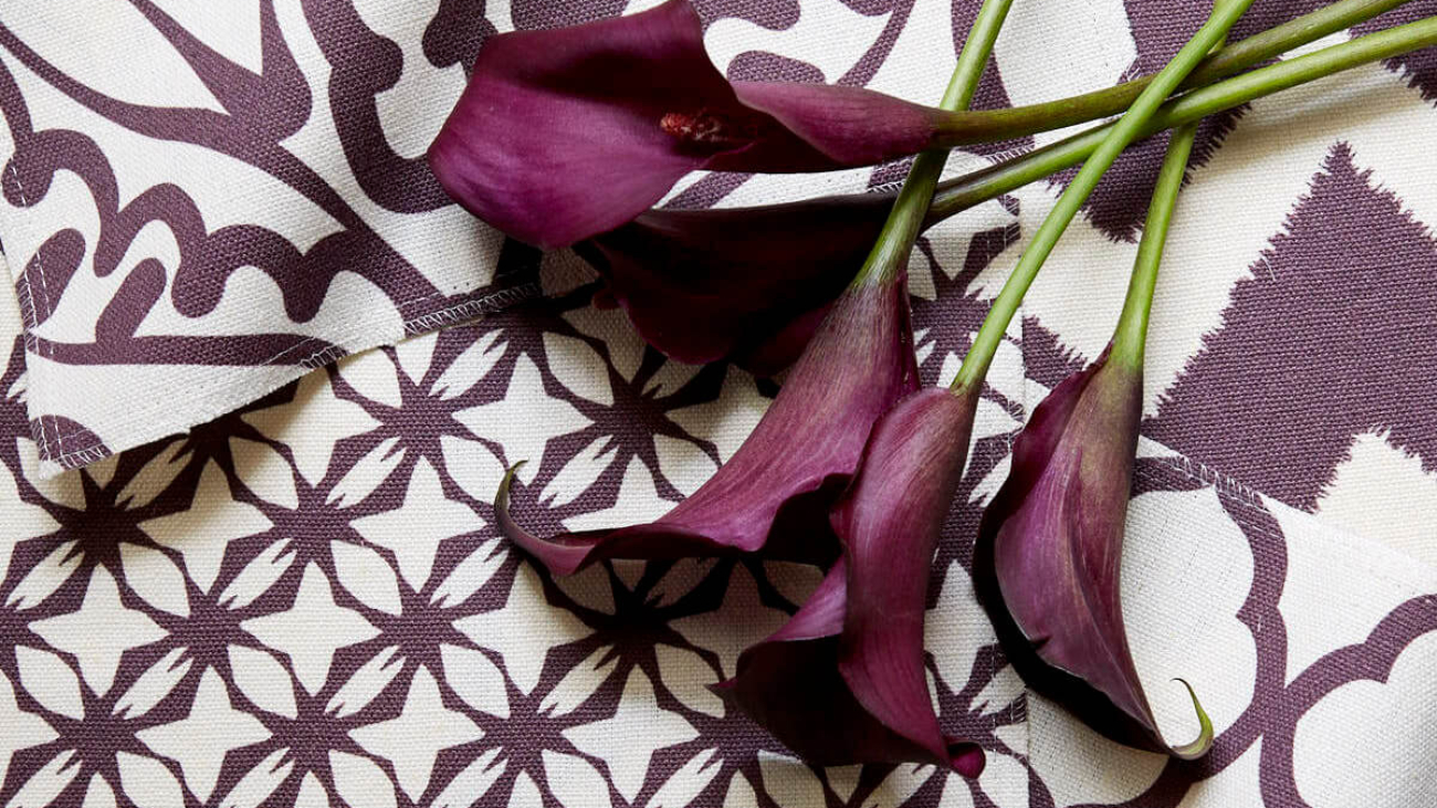
Workroom C patterned fabrics. Photo credit: Eric Zepeda

Workroom C patterned fabrics. Photo credit: Eric Zepeda

So you are trying to replicate the look and feel of hand-woven patterned textiles? Yes! That doodle that turns into a pattern — we play with the texture of the doodle so that it ends up printing in a way that looks more woven. We may try to make the pattern look as if it was drawn by hand. It’s almost like distressing blue jeans — distressed digital drawings. So we make lines that are not exact. We deliberately do not use the tools available in digital that would make it perfectly straight or even. We want variation.

Your aesthetic is beautiful, and you emphasize ease and livability. It makes sense that you might aim for the exact right amount of imperfection. Can you say more about this? Raising four kids, you learn quickly that nothing is perfect. Everything is messy. If something is already a little bit messy, I think it wears better. Not that we are deliberately adding stains to fabric! If you can sense a quality of handmade, I think that creates more ease. To have everything perfect and exactly aligned, that feels uncomfortable to me. For example, handmade tiles from Fireclay are much more attractive to me than those from a company whose tile is machine-made and has that rigid exactitude. Fireclay tile has more of a hand in it. One of the reasons I did this in the first place was that I hate wasting fabric. When you have a fabric that has a giant repeat (the primary pattern or shape that is repeated) it ends up that you can only make one 20-inch pillow with one yard. Giant repeats are great for drapes and duvets. But when you’re making pillows with it, you have to waste a lot of yardage to have the pillows be identical. If I can ‘contain’ the repeat, I waste less fabric. You will notice that my patterns are much more regular. I won’t do a floral with a repeat that goes on for 30 inches in every direction. Also, custom coloring with traditional textile producers is really expensive and has large yardage minimums. When I create a pattern, I can print just one yard. I can do it in any color. I have a giant book of colors. So we can do a test swatch when we are making design decisions, and I’ve kept the project cost down.

Workroom C patterned fabrics. Photo credit: Eric Zepeda
What are the requirements for getting test swatches from a big distributor? They usually have a three-to-five-yard minimum, with a long lead time for custom color, and then there is usually a per-yard surcharge. We can do this inexpensively and a lot faster, with more ability to customize. If the client and I fall in love with one of those large repeat textiles, I will sometimes talk them into pillows that are not perfectly centered. Or we do pillows that have all matching fronts with that single repeat, but the backs are done in a different pattern. The backs are all the same, but fronts and backs won’t match.

Because if it will cost you so much money to match and align everything perfectly, then let’s mix it up and mess it up a little bit! Obviously, if there’s a giant peacock in the middle of the fabric, you really can’t cut off his head, so you have to work around what you have chosen. When I look at a big expansive fabric pattern, I want it to be draperies. I want to see the repeat. That is my own aesthetic need — which is probably weird!

We don’t think you are weird! We love your aesthetic. Surely your clients choose you for it. How do you introduce the idea of a pattern to them, custom or otherwise? I usually bring in a few different ideas during the initial client meetings. During that phase, I am looking at what they are gravitating towards. I give the person a stack of fabrics and I say: “Throw out what you hate, and hand me what you love.” That’s a jumping off point for me. One client said she didn’t want any pattern on anything because she felt patterns were too dissonant for her. Texture was fine, tone-on-tone was fine, but anything further, she didn’t want it. So, she did not choose any patterns that were not tone-on-tone, but we did use some great, punchy wall color in the bedroom, dining room, and living room. And a fantastic black crystal chandelier over the dining table. The final design relied on color and eye-catching art for the drama rather than any pattern play.

Carolyn Rebuffel. Photo credit: Lily Dong

How would you describe your personal aesthetic? What patterns do you prefer? I’m more drawn to regular repeats. When a pattern meanders, I long for something that’s regular; I find a regular pattern comforting. I like how I can see something new in it. I think that it’s much more powerful to use a piece of art as a large visual element that has different things you are invited to look at — in my room designs, I would rather see be drawn in in that way by the art in the home, rather than by images in the fabrics. One of my daughters says I’m very matchy-matchy and I should loosen up a little bit! It’s true. I’m very inclined towards symmetrical, and I want everything to match. As long as it’s not perfect — so that’s where I’m more relaxed, in a way. Because I want to see and feel the variation that exists in the hand, and in nature.

By Julie Feinstein Adams

feng-shui-2 (1)

Harmonizing Your Home For Better Health And Wealth

Feng Shui is an art and a science. There are different forms practiced throughout the East including in Tibet, India, and China. Each version holds the fundamental concept that “placement” or arranging of the objects invites the natural world into our homes or any space through the “Five Elements” to calm, nourish, and personalized, nature-inspired interiors. The two words, “Feng Shui” translated are “Wind” and “Water,” which together symbolize flow.

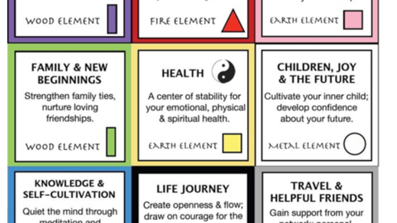
The primary tool used is the Feng Shui “Bagua” (see below). The Bagua is laid over like a map onto any property or home/building based on the location of the front entrance. Each area of the house holds the energies of one of the 5 elements. Placement of furniture, art, etc., is critical to evoking the qualities of that element. The practice of Feng Shui also includes loving your environment, because doing so invites more of what you love into your space and makes it sacred.

There are many layers to creating healthy Feng Shui and include de-cluttering, placement (furniture, art, etc), lighting, fragrance, color, landscaping, re-models and home offices.

Color is a key factor in Feng Shui. It can be applied to represent one of the Five elements (Earth, Fire, Water, Air, Spirit), but should also be chosen in consideration of the space and the energies that need to be cultivated there. For example, in the master bedroom, a yang or “active” color like bright orange or red is not recommended, because bedrooms are primarily for sleep (and romance). A soothing light green Benjamin Moore Budding Green CSP 790 or Peaceful Garden CSP 830 may be ideal.

There are many layers to healthy Feng Shui, including de-cluttering, object placement, lighting, fragrance, color, and landscaping. Feng Shui principles are employed through basic principles of design for a home or office remodel from the beginning or utilizing “cures” to correct areas that may not be easily conformable to the ideal Feng Shui placement and principles.

BASIC FENG SHUI TIPS

  • Ensure that your front entrance is easy to find and keep it bright, tidy, and welcoming
  • Use a foyer table in the entry to provide a welcoming and beautiful area to receive your family and guests
  • Desks and beds should always be in the “command position” (facing the door)
  • Beds, if at all possible, should not go under a window
  • Keep bathroom doors closed
  • Choose a good “flow color” to connect the common areas of the home or office
  • Utilize personalized or nature-inspired art
  • Use stove cooktop in the kitchen regularly and keep it clean
  • Organize kids’ zones
  • Clear items from blocking any entrance
  • Enhance the presence of natural light
  • Keep your windows clean