What Is a Color Brush Out?

What Is a Color Brush Out?

A question we often get asked is: “Do you do color brush outs?”

YES. We do!

What is a Brush Out?

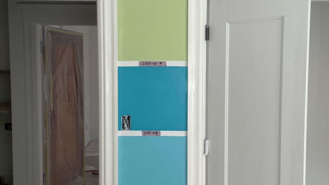
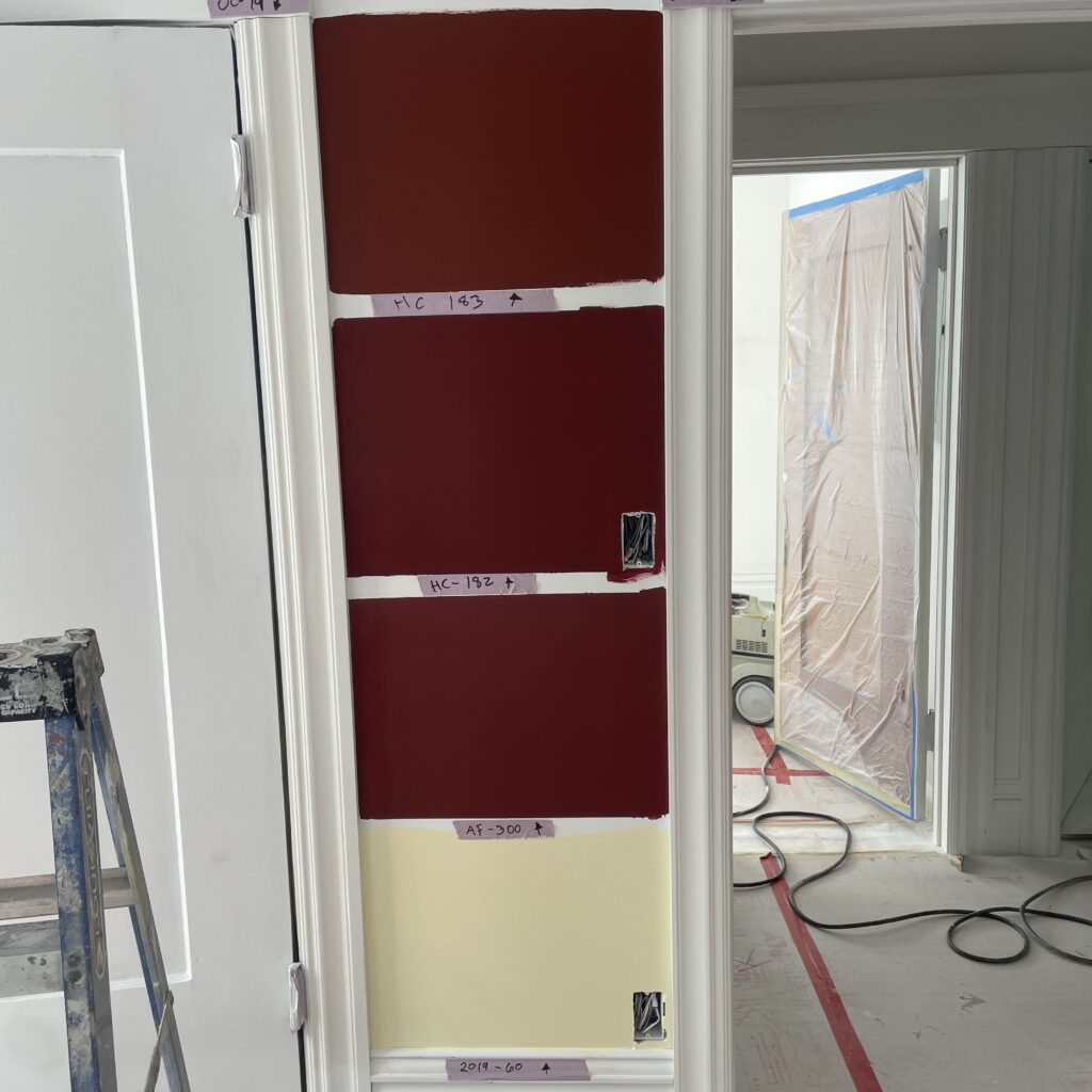
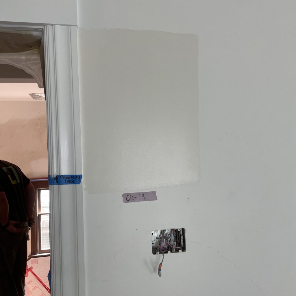
A brush out is when your painter takes samples of the colors you are considering and paints them directly on the surface for you so you can see how they will interact with that surface, and how light affects the color throughout the day. Even light bouncing off the floor affects how a color reads.

We find that sometimes our clients need almost-life-sized samples to get a sense of what the final result is going to look like. This is one way we can help people choose!

How big is a brush out sample?

Often we go with a 2ft x 2ft square.

In the images on this post, as you can see, the colors the client is deciding between are not that far apart from each other in terms of tone. This type of choice can be particularly challenging.

The brush-out helps them compare and contrast, and make a better choice!

And yes, we will prime right over those samples before painting the room, so that the final result is clean and even.

Option B is to do brush outs on a card, which doesn’t give the same surface-interaction, but is close enough, and bonus, you can move it around the room to see the light in different areas.

However (are you still with us? This is pretty nerd-level detail…) we prefer painting directly on the wall, especially in older homes where walls often have a texture to them which causes the color to read a little differently.

How can we help you have the best experience with hiring a painting contractor for your home’s interiors and exteriors? Contact us to learn more about our full-service offerings.

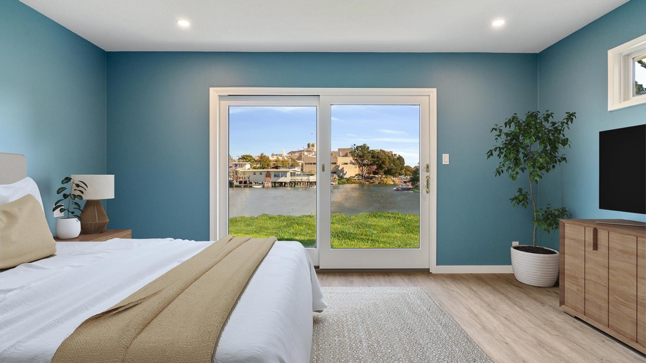
Alameda bedroom painting

Creating a Cohesive Paint Color Scheme for Your Home

Understanding the Fundamentals of Home Color Coordination
Designing a harmonious paint color scheme for your home is an artful endeavor, akin to crafting a personal wardrobe. It’s about striking a balance between individual preferences and aesthetic coherence. To achieve this, a foundational understanding of color theory and home design principles is essential.

Leveraging Your Home’s Location

Begin by considering the location of your home. The natural surroundings and architectural style can significantly influence your color choices. For instance, a beachfront property might benefit from soft, sandy hues or cool blues, reflecting its environment. Similarly, a mountain cabin could embrace earthy tones that echo the natural landscape.

Existing Elements as a Starting Point

Your home’s current features, such as cabinetry, countertops, and flooring, can serve as a guide for your color palette. These elements, especially in historic homes, often have distinct color undertones that should be harmonized with the new paint colors you select.

Consistency in Undertones

Ashley Banbury, senior color designer at HGTV Home® by Sherwin-Williams, emphasizes the importance of consistency in color undertones. Whether you’re aiming for a warm or cool palette, maintaining uniform undertones across different colors ensures a fluid and seamless transition throughout the home.

Advanced Tips for a Unified Color Scheme

Amplify Existing Colors
If your home already features a color you adore, use it as an anchor for your new palette. Complementary shades with similar undertones can enhance this existing color, creating a deliberate and cohesive look.

Balancing Warm and Cool Tones
A critical aspect of color selection is deciding between warm and cool tones. This choice should align with both your home’s environment and existing interior elements. The key is to avoid mixing warm and cool tones excessively, as this can create visual discord.

Utilizing Neutrals Effectively
Neutrals play a pivotal role in connecting different spaces. Using a consistent neutral for trims and doors can create a sense of continuity. Additionally, incorporating a neutral as a ‘palette cleanser’ in transitional areas can effectively balance more vibrant colors in adjoining rooms.

Selecting the Right White
Choosing the right white paint is crucial, as it forms the base for layering other colors. Opt for a white that complements the overall tone of your home. Sherwin-Williams’s Greek Villa (HGSW7551) or Alabaster (HGSW7008) are excellent examples of warm, inviting whites.

Layering Room by Room
You don’t have to limit your home to a single color. For connected spaces, consider using shades within the same color family but varying in intensity. This approach can provide a smooth transition and visual interest from one room to another.

Embracing Color Diversity

Breaking the Monotony
Introducing a bold or contrasting color in one or two rooms can add dimension and character to your home. This technique works well in spaces like dining rooms or studies, where a distinct color can create a focal point without overwhelming the overall scheme.

Consideration for Trim and Accents
Be mindful of the color of window trims and baseboards. Harmonizing these with your wall colors can enhance the overall aesthetic. In certain cases, matching the trim color to the wall color can create a sophisticated, unified look.

Flexibility in Paint Choices
Finally, remember that your household’s needs and preferences should also guide your color selection. For instance, accommodating a child’s favorite color in a subtle way, like on a ceiling or vanity cabinet, can add a playful touch without disrupting the overall color scheme.

Implementing Your Color Scheme with Precision

Professional Consultation
Consulting with a professional designer or color expert can provide invaluable insights tailored to your home’s unique characteristics and your personal preferences.

Sampling and Testing
Before finalizing your colors, it’s advisable to test paint samples in different areas of your home. Observe how the colors look under various lighting conditions and at different times of the day.

Quality Paint Selection
Investing in high-quality paint not only ensures durability but also impacts the overall finish and appearance of your color scheme. Consider paints that offer additional benefits, like scuff resistance, especially in high-traffic areas.

Final Thoughts
Creating a cohesive paint color scheme for your home requires a thoughtful blend of art and science. By considering your home’s location, existing features, and the principles of color harmony, you can craft a color palette that is both personal and universally appealing. Remember, the goal is to create a space that reflects your unique style while maintaining a sense of balance and coherence.
Alameda bedroom painting

Top Paint Colors to Increase Your Home’s Value

Curb appeal is everything when it comes to elevating your home’s market appeal and value, the power of paint (and choosing the right color) cannot be overstated. Selecting the right palette can transform your space from “just another property” to the property on the block. But in this sea of endless color choices, which colors should you bet on? Fear not, as we guide you through the top paint colors to boost your home’s allure and value.

Neutral Yet Sophisticated: Why Grays and Beiges Reign Supreme
First on our list is the ever-versatile gray. Far from being dull, the right shade of gray offers a backdrop that is both sophisticated and neutral. It’s like the Switzerland of colors—peaceful, neutral, and widely appealing and it goes with everything! Whether you opt for a cool slate or a warm dove gray, this color supports a variety of decor styles, making your home a canvas for potential buyers’ imaginations. Some amazing Benjamin Moore grays are Kendall Charcoal HC-166, Wrought Iron 2124-10 for darker and richer grays, on the lighter side, there is Storm and Chelsea Gray HC-168

Not to be outdone, “beige” has made a comeback. Just be careful you are not bringing back the 70s version of it. Once deemed too blah, today’s beiges are anything but. With undertones of pink, green, or gold, beige can add warmth and depth to rooms, suggesting a canvas of endless possibilities to prospective buyers. It’s like giving them a warm hug, saying, “Welcome home.” Benjamin Moore’s Shaker Beige HC-45 is a CLASSIC that Interior Designers use as a go-to, Grant Beigh HC-83, Manchester Tan HC-81or Sherwin William Accessible Beige SW 7036 or Valspar Savory Beige 3002-10C.

Blue Hues: Tranquility Meets Value
Moving into a more dramatic and colorful territory, let’s talk blue. From the soft whisper of powder blue to the deep reverence of navy, blue hues bring tranquility and serenity to spaces. Kitchens in soft blue tones feel fresh and clean, while a navy living room exudes sophistication and depth. It’s like your home is taking a deep, calming breath, inviting everyone to relax. Some great blue colors are Blue Note – 2129-30, Majestic Blue – 2051-40 or Hail Navy HC 154, Van Duesen Blue HC-156 or Blue Hydrangea 2062-60. https://www.pinterest.com/pin/201465783323817683/

Going Green: Bringing the Outside In
Green is not just for the garden. Interior spaces splashed with sage or olive green blur the lines between the indoors and the great outdoors, creating a refreshing and inviting vibe. It’s like your living room decided to put on its best leafy dress to impress. Green works wonders in spaces that crave a touch of nature, making them feel more open, airy, and connected to the world outside. Some great greens – Guilford Green, HC-116, Saybrook Sage HC-114 , Gray Wisp is a green gray that really walks the line!!

The Bold Statement: Black Accents
For those daring to make a bold statement, black accents can add a layer of sophistication and modernity to your home. A black front door, for example, can increase your home’s curb appeal, suggesting elegance and timelessness. It’s like your home’s way of wearing a classic little black dress, making it stand out in the neighborhood. Guilford Green, HC-116, Saybrook Sage HC-114 , Gray Wisp is a green gray that really walks the line!!

Warm Whites: A Canvas for Life
Warm whites are actually a brave color choice and they are the unsung heroes of the paint world. They provide a backdrop that is both inviting and flexible, allowing architectural details and furnishings to shine. They look great on tongue and groove siding. They are like the supportive friend who makes everyone else look good, creating a welcoming atmosphere that makes a house feel like a home. White Dove, OC 17, Swiss Coffee OC-45 or Navajo White 947 are great choices for a warm white.

The Power of Pastels: Soft, Subtle, and Soothing
Lastly, let’s not overlook the gentle charm of pastels. Soft lavenders, pale pinks, and muted peaches offer a whisper of color, bringing a soothing and calming presence to any room. They’re like the delicate first blooms of spring, hinting at renewal and fresh starts, which can resonate deeply with homebuyers. Ask us for our professional color consultation to choose a good pastel!

Choosing the right paint color is like selecting perfect outfit for the year! It sets the tone, creates an impression, and, if chosen wisely, can lead to classic and timeless beauty for your home. By opting for classic and trendless colors for your home, you’re not just painting walls; you’re enhancing the appeal and potentially the value of your home. Painting your exterior is a 151% return on cost. It is rally not a cost, it’s an investment in preservation and resell value with the potential for a significant return, and in the competitive real estate market, standing out for the right reasons is gold. So, grab those paint swatches, and let’s turn your home into the masterpiece it’s meant to be.

Need Help Picking Your Colors?
Schedule A Color Consultation Today!
510-567-9559