Cestaro-13

Greeting the Soul of a Home: Designing for Historic Homes and the Modern Families that Live in Them

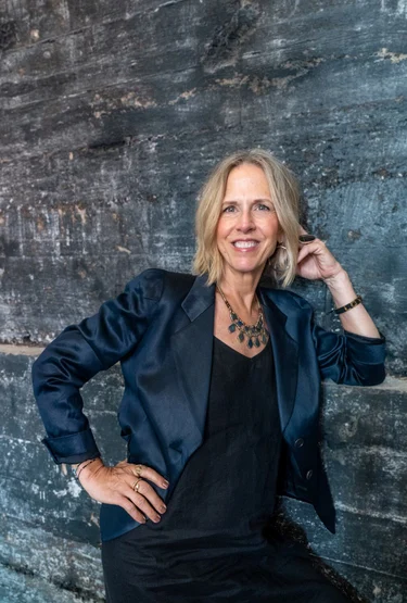
By Laura Martin Bovard

Arana has been fortunate to partner with many talented interior designers in the Bay Area and our long-term relationship with Laura Martin Bovard and LMB Interiors (lmbinteriors.com) is a standout in this regard. It is our pleasure and joy to contribute our team’s craftsman skills to realizing the visions in Laura’s projects, many of which are transformations of architecturally-significant older homes into gorgeous, playful, and inviting environments for the modern families moving into them. We asked Laura to share with our community her thoughts on creating balance between the two forces, old and new; how she approaches adding beauty and enhancing liveability – while touching on some of the recent projects we’ve worked on together for her clients. 

When I first arrive at a client’s home, I greet the space, the landscape, and the architecture, as if they are their own entities. My next step, if it is an architecturally significant home, is to assess the original craftsmanship. I always intend to maintain the original details, the quality that went into the building of the home. 

And then there’s so much more than what meets the eye to consider: There is soul and lived-memory infused into the space, whether from previous owners or the original craftspeople who built it, or both. The history and the stories of how people moved through and lived in a home are woven into its walls and play a part in the way a home feels and looks; just as the new homeowners will add their story. 

I’m such a firm believer that stories are how humans weave together their existence across lifetimes. And historic homes carry  a soulfulness that new homes just don’t. Historic homes cure over time; there’s a richness to them. A certain level of groundedness. You can imagine who else was staring up at that ceiling 80 years ago. The passage of time in a given space is something that’s fun to contemplate; doing so furthers one’s connection to it. 

We greet the soul of the home to be reverential toward the original quality craftsmanship, because legacy homes, historic homes, are almost always built better and with more integrity than what’s built now. A lot of the woodworking was more detailed; you are not going to see a lot of that level of quality and attention these days. 

However, when we begin an interior design project, we want to consider who’s living there today. And if they really want to infuse a totally different aesthetic onto this home, we will necessarily walk a line between honoring the clients and honoring a home. 

Most clients today don’t want to be surrounded by a lot of ornate, heavy velvets and dark colors. They tend to prefer a lighter, fresher palette. And so we find ways to bring in some of that without tipping the scale too far toward one direction or the other – the direction of the original architecture or the direction of the client. That’s the conversation we are having. It’s a very thoughtful process.

Morse House Entry LMB Interiors 2019_10_29_0548b (1) for web

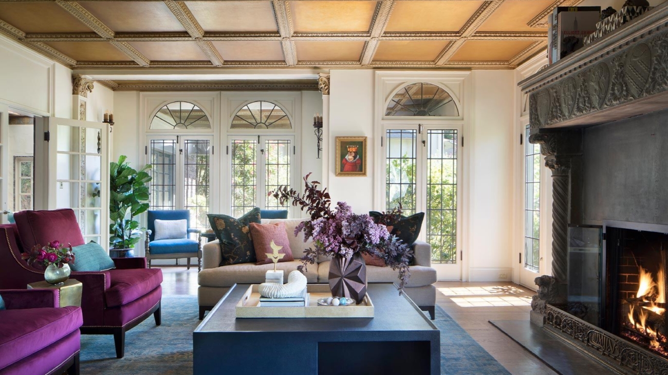
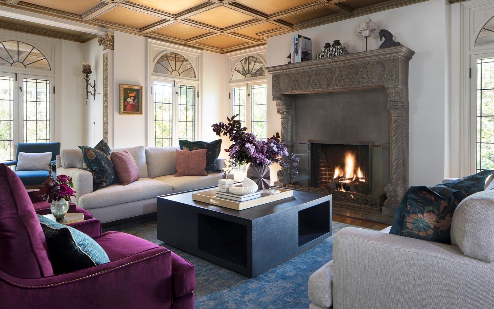
Project: Hollywood Regency

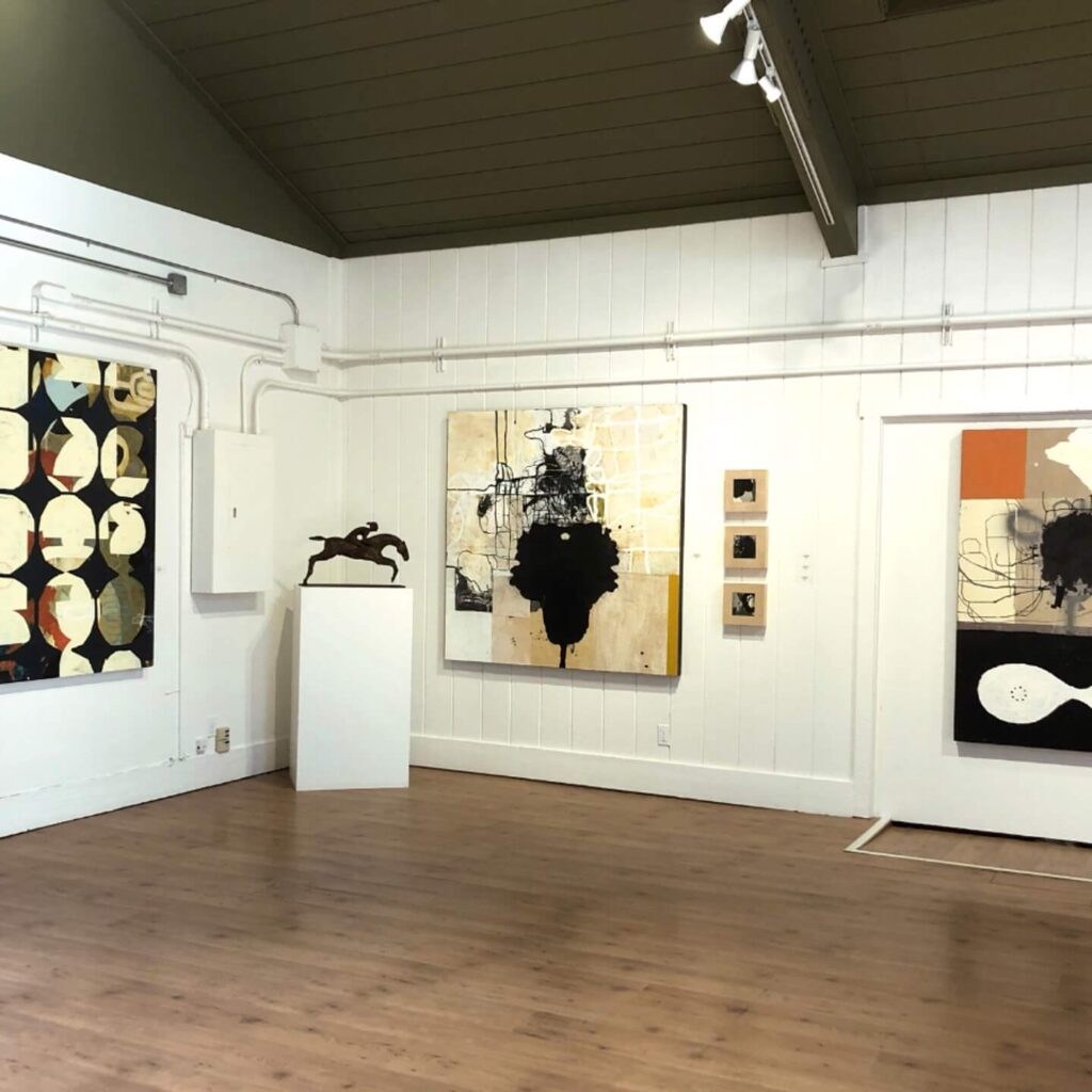
When people buy an estate home, there is a certain amount of stewardship that comes along with it. In particular, our “Hollywood Regency” project demonstrates this. The homeowners – a couple – see it as the community’s home as much as it is their home. They throw parties often, fundraising for civic entities and causes, including Oakland Parks and Rec, Fairyland, and organizations that impact education for Oakland’s youth, plus political fundraising, supporting Barbara Lee and other East Bay politicians. 

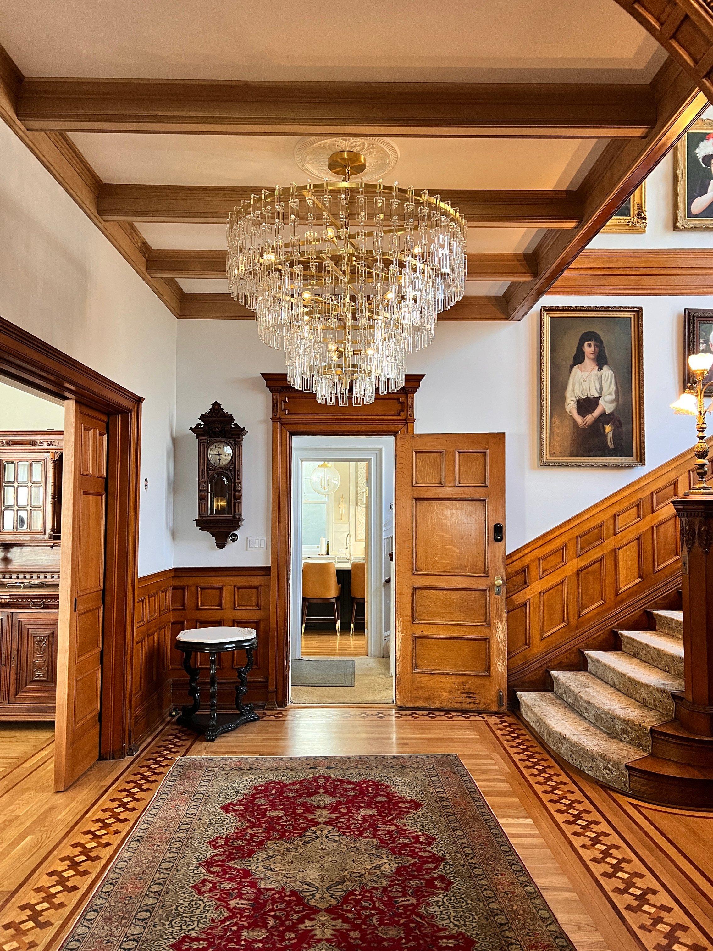
Their home, known as The Morse House, is on the list of historical landmarks in Oakland, and it is just stunning. The house set the tone. These clients had a passion for local art, so it was fun to weave their love of it into the designs. Their aesthetic was their own version of what’s known as “Hollywood Regency,” which harmonized with the home being so grand. Hollywood Regency style reached its height of popularity in California between the 1920s and 1950s, so playing with this historical sensibility in this landmark home built in 1934 felt just right. 

Morse House Living Room LMB Interiors alt view 2019_10_29_0323 (1) for web

We brought in bright colors in the furniture and art, with plenty of jewel tones, while keeping walls neutral. We needed painters who understood how to perform a high-quality job on such a significant home, so of course we teamed with Arana Craftsman Painters. 

Some wood features needed to be sanded down and prepped really well to maintain the provenance of the craftsmanship; you can’t just throw a new coat of paint on top of the original wood! The process requires skilled painters who can achieve clean edges and leave it in a good state for either the next homeowners, or the next paint job 20 years down the road. It has to age well. Having a clean, expert, professional paint job keeps the level of quality congruent with a historical home, ensuring the home is maintained with that sense of stewardship and respect. This kind of attention takes a certain level of investment, but it’s longer lasting, looks better, and celebrates the house. 

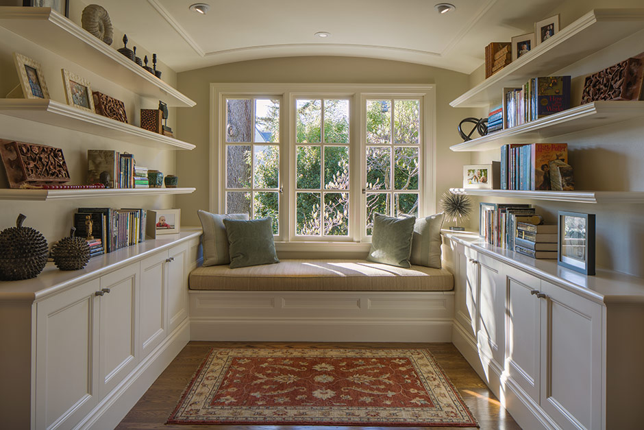
Project: Piedmont Craftsman

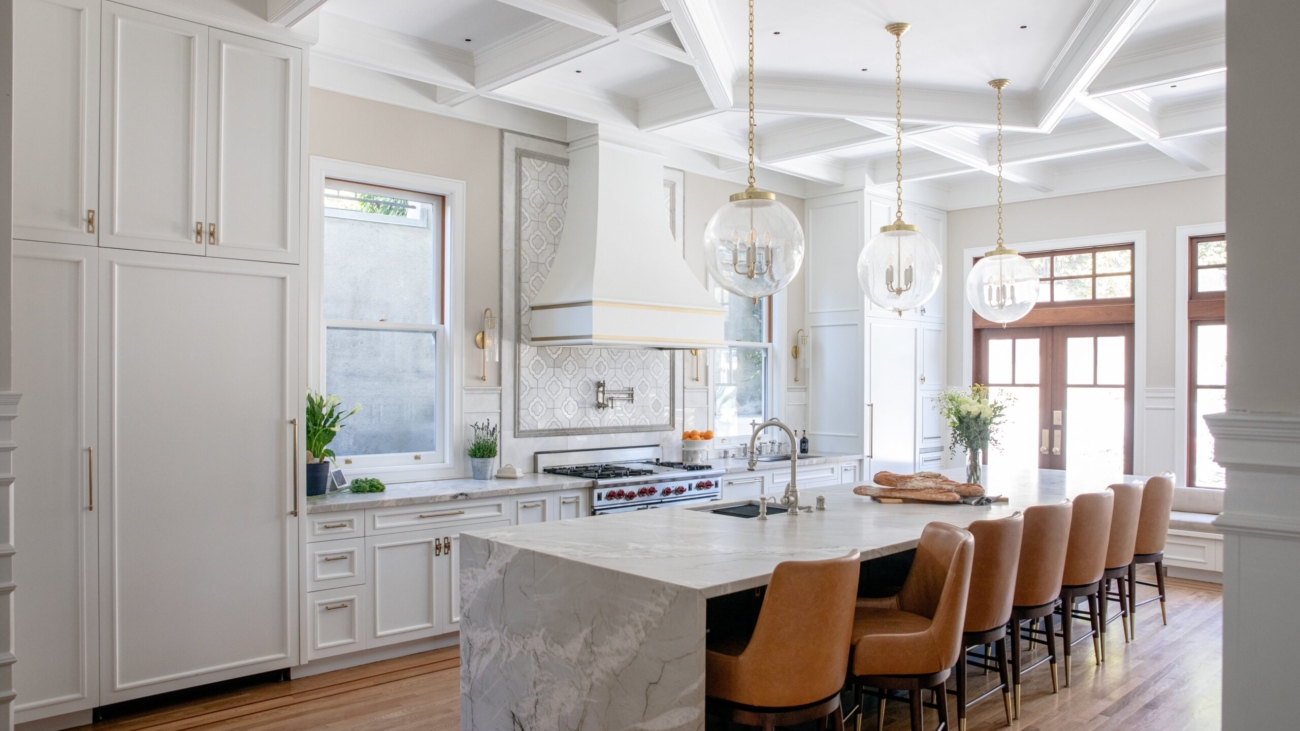
A lot of people buying historic homes today are not only far younger than the structures themselves, but also they potentially have not been exposed to legacy homes before. And so the question becomes, how do you integrate a home with history with the needs of a younger family? In this case, the family that purchased this Craftsman estate were certainly worldly and appreciated quality, but we wanted the interior to reflect their style which was more playful, more energetic, a little bit more fresh. 

One technique we used was color. We enlivened certain areas: the kitchen, the sitting area, the solarium, and the little library with a lighter palette, while maintaining the original kind of grand Craftsman quality of the manor in select other areas throughout the home.

But then there were the very grand touches that were not part of the original architecture to contend with. One set of the home’s previous owners had been Italian, and the owners after them inherited their design additions, which skewed towards a rather heavy-handed Italianate look. These next owners layered in some Asian touches, per their taste. And so, in working with the home and its history for our clients, ultimately, we needed to peel the layers back to restore the original, timeless, tasteful Craftsman elegance. 

Italiante Fireplace Piedmont

Some of the layers we liked, and those we kept. For example, we all agreed that we enjoyed the spirit of the Italianate fireplace. And we liked the more-recently-added tile details and flooring in the solarium, because it felt appropriate for a sunroom to have that. In the dining room, we also kept the ornate ceilings, just touching up and refreshing them. We left that original, very grand application, while choosing to temper the impact with a natural woven grasscloth wallcovering, thus connecting the room in spirit to adjacent, lighter areas of the house. 

Project: Maybeck Craftsman

For this Maybeck Craftsman that had been purchased by very discerning clients, the work was going to involve a very specific challenge: restoring and/or replacing huge areas of redwood paneling – a key design element in Maybeck homes. We knew we needed an expert team, because we needed every detail to be flawless. So of course, this project called for Arana’s “stainmaster” Ernesto and his team.

Stainmaster Ernesto Arana and his team

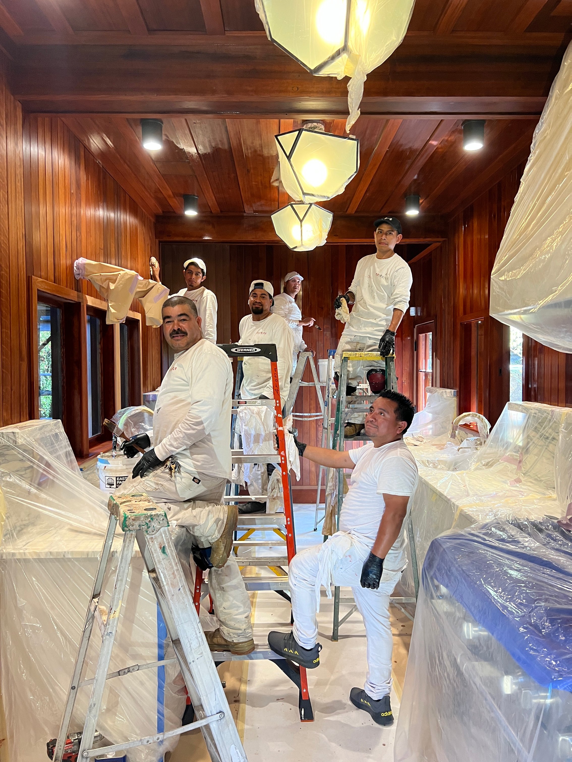
Color matching the stain from old redwood to new redwood is a challenge, and in this situation, after decades of life, curing, sunlight, et. al. – let’s just call it “50 shades of brown-and-red.” It is a massive undertaking to have new wood look like it was there all along, and to freshen, clean, and care for the old wood at the same time so that it will continue to serve. It’s an art. Color matching it all took many rounds of mixing to get right, and in the end, the results were exactly what the home needed.

Stewardship Is a Relationship

Historic homes and modern families and the design that brings them together is a relationship benefitting from exquisite listening, understanding, respect, communication, and connection. Like any good marriage, each partner affirms and appreciates the strengths the other brings to the equation. Good design is like a marriage counselor, helping the parties to maintain their unique qualities in some areas and choosing where to blend in others; ultimately creating something greater than the sum of their parts.

Read more of Laura Martin Bovard’s articles about theory and philosophy of interior design on her blog and view her design firm’s portfolio at lmbinteriors.com

________

Photo credits:

Morse house: Mo Saito; Piedmont Craftsman: Paul Dyer; Arana Team: Laura Martin Bovard

Nadia_Andreini_240510_063-Edit

European Elegance Meets California Cool

By Donatella Mazzini and Simona Corradini

Infusing Italian Flair into West Coast Interiors

As the name of our company implies, we (Donatella and Simona) are both Italian, and our interior design style takes inspiration from the wonder that is Italy. Although we live in California, we return to our home country every year – to visit family, source from our vendors and of course, for inspiration. 

Venice_Canal_Photographer_Donatella_Mazzini

Drawing from the elegance, history, and artistic heritage of Italy while blending in a more laid-back, contemporary vibe of California we create home designs for our clients that are stylish, classic yet fresh, and beautifully livable. Would you like to bring a bit of Europe into your California home?

Here are a few design tips, along with photos from our most recent trip, this past summer:

Classic Meets Modern: Think of a sleek minimalist living room adorned with a vintage Venetian mirror or a rustic Tuscan dining table paired with modern chairs. This juxtaposition creates a unique and eclectic aesthetic that is both sophisticated and inviting. 

IMG_0592

Natural Materials and Textures: Italian design emphasizes the use of natural materials like stone, marble, wood, and wrought iron and brass. Consider pairing a marble sink reminiscent of an Italian villa with a modern kitchen; or terracotta tiles to bring warmth and texture to a patio, reminiscent of the landscapes of Tuscany. 

Artisanal Craftsmanship: From hand-painted ceramics to custom-made furniture, investing in quality pieces sourced in Italy not only enhances the aesthetic appeal but also creates a sense of connection to European artistry and heritage.

Earth Tones and Neutral Palettes: Italian interiors often feature a palette of earthy tones, inspired by the natural surroundings. Warm beiges, soft browns, and muted greens evoke the tranquility of the countryside. 

Maximizing Natural Light: Taking full advantage of natural light is a concept that Italians and Californians share. Large windows and open floor plans invite light in; sheer curtains or strategically placed mirrors can enhance this effect. 

Indoor-Outdoor Flow: Taking inspiration from Italian courtyards and terraces, add comfortable seating areas, outdoor kitchens, and lush greenery to the backyard.

Al Fresco Dining: Adding a rustic wooden table, string lights, and potted plants evokes the charm of an Italian piazza and encourages leisurely meals under an open sky – embodying the relaxed, communal spirit of both cultures.  

Curated Collections: Europeans, particularly Italians, have a knack for curating collections of art, books, and antiques. Californians can adopt this approach by displaying personal collections that tell a story and add character to their homes. 

Timeless Elegance: Choose pieces that transcend trends – quality over quantity, classic pieces, and a cohesive design scheme can create interiors that are both stylish and enduring. 

NadiaAndreini_211011_332

+++

Photo info:

Marble and coffered ceilings balance the contemporary feel of the lighting and colors in this completely transformed kitchen in San Francisco. Interior Design by Florentine Design. Photographer: Nadia Andreini | DILUNA Photography

Venice Canal: Colors mirrored by the water are a feast for the eyes. Photographer: Donatella Mazzini 

This modern chandelier perfectly fits in the classic foyer of this San Francisco Victorian; Interior Design by Florentine Design. Photographer: Nadia Andreini | DILUNA Photography

Minimalism meets beautiful details in this restaurant interior – with a Murano glass chandelier, rich wood tables and beautiful, original, 1500s vaulted ceilings; in Tolentino, Italy. Photographer Simona Corradini

Donatella Mazzini (left) and Simona Corradini (right), founders of Florentine Design

1719243438472-6b4456c9-8513-4de4-9243-9889264608fc_1

Designers on Design: A Compendium of Links

Over the years, in writing our newsletter (which is also posted on this blog) we have interviewed and hosted guest blogs by numerous brilliant and talented Bay Area interior designers and landscape architects, sharing their wisdom on how to make our homes beautiful, inside and out.

This post is an opportunity for us to collect links to all of these articles in one place and share them with you! And if you are not already on our e-newsletter or snail-mail newsletter list, please reach out to us and let us know. Send a message to [email protected] or sign up via the contact form on our website: craftsmanpainters.com/contact. Please include your physical address if you would like to receive the print version.

DESIGNERS ON DESIGN ~ THE LINKS:

By Arana Craftsman Painters

Sue Fisher King Book Selection-1

Beautiful Books for Cozy Reading Nooks

A Holiday Gift Guide
There is something about a book; a real book that you hold in your hands: the texture of the edges of the pages, the way the words and the spaces between the words comprise a visual pattern as well as communicating ideas. And when included, the beautiful images. Books intended to be appreciated for their beauty, often featuring travel, fashion, art, food…

And then there is the art of displaying books. Interior designers know this intimately. Rare is the room that does not host a stack of books, or a single book, possibly propped up against a sturdy object. Whether on a coffee table or a sofa table, or in a bookcase, or on a shelf, or tucked next to ceramic flour and sugar jars on the kitchen counter, the presence of beautiful books feeds the eyes, heart, and mind. We love to see them, pick them up and hold them, page through them, settle into a cozy chair and escape into them for a while.

So, with the holidays coming, we thought we would ask some of our favorite interior designer colleagues for their current favorite “coffee table” books, that they or you might enjoy actually reading in cozy nooks — and create a gift guide for you, dear readers, this holiday season. In the process, we also collected from them their favorite independent sources for this type of book. Plus, for this article, we are including a few images from their portfolios of beautiful spaces that are the perfect setups for settling in and enjoying books.

Book nook designed by LMB Interiors; built by McCutcheon Construction; painted by Arana

Laura Martin Bovard (lmbinteriors.com):

Sumo unedited
“For coffee table books, I adore shopping at Sue Fisher King. I’m not sure if she carries it, but I’m loving SUMO, by Annie Liebovitz.”

Recently released in an XXL edition, SUMO draws on 40 years of the photographer’s work, including photojournalism for Rolling Stone magazine in the 1970s and her trademark, simultaneously quirky and moving conceptual portraits of celebrities for Vanity Fair and Vogue.

Sue Fisher King: 3067 Sacramento St. San Francisco

French-inspired window-seat area in Atherton primary suite, designed by Robineve & Co. Interiors.

Katie Cole (robineveinteriors.com):

“Assouline is my go-to for coffee table books. Each one is special, particularly the oversized editions like this one about Coco Chanel, Chanel: The Impossible Collection, which we’re ordering for a client right now.”

Each book in Assouline’s “The Impossible Collection” series is hand-bound, hand-printed on art-quality paper, and comes in a linen clamshell presentation case. Chanel: The Impossible Collection, by Alexander Fury.

Shop online at: assouline.com

Cozy fireplace for reading beside; living room designed by Laura Eichel

Laura Eichel (lauraeichel.com):

“One of my favorite coffee table books is Ken Fulk’s The Movie in My Mind — available directly from the publisher, Assouline (assouline.com). Ken Fulk is a well-known interior designer based in San Francisco who creates incredible interiors for homes and hotels. He is notorious for his wit, effortless style, and sense of fun, and he brings this energy to every project. This book is a testament to his exquisite taste and prolific creativity.” Eichel’s favorite local spots for in-person browsing: The Gardener and Builders Booksource, both on 4th Street.

The Gardener: 1836 Fourth St, Berkeley

Builders Booksource: 1817 Fourth St, Berkeley

A perfect reading corner for cuddling up with a book; design by Mead Quin

Mead Quin (meadquin.com):

“World’s Finest Homes (from Beta-Plus Publishing) is a beautiful book full of architecture and interior design from all around the world. Each project, elegant, subtle, and inspiring, comes with a brief description and introduction to the responsible firm. The book itself is rather large, making it a fantastic addition to a large coffee table.”

For in-person book perusal and acquisition, Quin recommends: William Stout Architectural Books in Jackson Square, located at 804 Montgomery Street, San Francisco.

Featured image at top, photo credit: Laura Martin Bovard. Pictured: selection of books on shelf at Sue Fisher King

affinity

Unique Holiday Gifts

The holidays are a great time to celebrate those around us. But let’s just say we here at Arana would not blink an eye if you took these suggestions and applied them, liberally, to amassing your own gift pile.

Succulents as art, group craft, and decor

Living succulent arrangements from Sarah Dunn’s Wild Goddess designs are a good choice at any time of year, but since wreaths are a thing for many people in December, we especially wanted to point you toward the art she creates from the wide range of colors and textures that these drought-tolerant plants-as-art offer.

With names like “Abundance,” “Gratitude,” and “Inspiration,” these sustainable and gorgeous wreaths cannot fail to touch your heart. Each hand-crafted creation combines varieties of Echeveria, Graptoveria, Jade, Kalanchoe, Sedeveria, and Sempervarium for a unique composition of shapes and colors.

If you like to DIY, Wild Goddess sells “Dream Boxes” with succulents, framing, and instructions to help you manifest your vision. Or, you can schedule a workshop with Sarah, great for corporate groups, grown-up birthday parties, bachelorette parties, creative collectives, and/or any gathering of family or friends who want to create something beautiful together.

Learn more: wildgoddessdesigns.com

Art as art

When we think about buying art, often it’s an investment. And sometimes, it takes time. A while back we wrote about one of our favorite local galleries, SLATE contemporary located on 25th Street in Oakland, and the concierge service they offer for your home art selection: bit.ly/arana-art-guide

We 100% endorse that thoughtful process, and, can we also suggest that sometimes buying art is about falling in love at first sight?

December is a lovely time to visit the wine country, so why not stop in and see SLATE’s special exhibition at Cornerstone Sonoma, a combination marketplace featuring shops, tasting rooms, live music, and home to Sunset magazine’s “Gardens + Outdoor Test Kitchen.”

SLATE’s current exhibition at Cornerstone, CROSSING BOUNDARIES (bit.ly/slate-exhibit), features works by artists Silvia Poloto, Martin Webb, Christy Lee Rogers, Gordon Studer, Rob Snyder, and Marta Moreu.

Located in the SBHG Gallery @Cornerstone Sonoma, the venue SBHG Gallery at Cornerstone Sonoma is just a 45-minute drive from Oakland: 23570 Arnold Drive, Sonoma, CA 95476. The show is open to the public through January 2, Wednesday through Sunday from 11am–5pm, and by appointment. To schedule an appointment or for additional information, please email [email protected], or call SLATE’s Gallery Manager, Robin Reiners, at 208-720-4547.

Jeff & Sio-172-2-Edit-Edit

10 Things to Consider When Choosing Paint Colors for Your Interiors

By Judy Dinkle, Interior Designer and Color Consultant

Interior Designer Judy Dinkle is one of Arana’s go-to color consultants for our clients. As part of the service we provide, we include a free one-hour paint color consultation for whole-house interior or whole-house exterior contracts. We asked Judy to give us some pointers that we could pass along to our community; things to keep in mind when selecting paint colors for your home.

Judy says:

  1. Choose right the first time. Paint may not be that expensive, but labor costs can add up. Choosing colors carefully at the start of a project will save you time, and money, later on.
  2. Follow the “Rule of Three.” To give your room a sense of depth and a feeling of being thoughtfully designed, choose three colors that work well together for your wall color, accent color, and secondary accent color.
  3. Be bold. Often, I find that homeowners are afraid of being too bold, or of choosing colors that are too personal. I recommend choosing colors you will love living in. Your spaces will be more welcoming and authentic as a result. If your favorite color is red, paint a room red! Or choose an accent area to paint red, and add red pillows. The truth is, any color can look good if it is properly integrated into the palette of the home.
  4. Look in your closet for inspiration. When I ask my clients, “What would you like?” and they just don’t know — I ask them to show me their closet. The colors that are in your closet tend to be what you naturally gravitate towards and look good in. The spaces in your home should feel good and flatter you in the same way.
  5. Pick a color from your favorite BIG things. Another way to get your color cues is to look to the strongest and largest pattern in a room. Begin with a beloved piece of furniture or a rug, a stone countertop, carpeting or wood floors, one visually striking item that is very large in the space. Pick a color from that piece or pattern and start from there. That might be your wall color, or you might choose a more neutral wall color that compliments it, for example, a shade of white or ecru.
  6. Pair colors to enhance the energy of the space. In general, pairing colors that are adjacent to each other on the color wheel enhances the mood they project. Pairing cool colors such as blue and green in a room will lead to a more casual or relaxing feel that will work best in your informal and private spaces, like the bedroom. Reds and oranges together are warm and energizing — good for places where you want a lift such as a laundry area, entry, mudroom, or a home office or workout space.
  7. Skip the beige, or give it life. People tend to like beige because it’s safe. But it’s also pretty blah. If you want to do neutral well, the trick is to contrast cool and warm tones. For example, a warm beige-y-wheat paired with a cool gray can create a little tension that is more interesting to look at than if you chose all shades of the same neutral tone.
  8. Create a color strategy for the whole house. We don’t want every room to be the same color, but we do want all of the colors throughout the house to have flow. A red sofa in the living room might be echoed by a burgundy accent color in a bedroom. You might take a bright cabinet color like sea green in the kitchen and repeat it in the palette of an adjacent great room or dining room, in painted accents or in the pattern of the pillows or curtains, so that those spaces talk to each other.
  9. Go BIG in small spaces or places. Small spaces, like powder rooms, for example, can be a fun place to apply your boldest, brightest, deepest colors on the walls. While in general, painting a room white will make a tiny space look bigger, I like to give more power to a space by using bold color. Let your big rooms expand with the lighter tones and have the small spaces be more cocooned and impactful.
  10. Choose the right finishes. A good rule of thumb is to always do painted-wood trim in a furniture finish, like satin, rather than a semi-gloss; it looks richer. Sometimes I break this rule and choose to paint a door, wall panel, or divider screen in a high-gloss for drama and shine, however, the surface needs to be nearly flawless to begin with and the preparation of that surface also has to be perfect because high-gloss shows every imperfection. So choose wisely, (and hire a good painting contractor, of course).

Credits for images in this post:

PHOTO CREDIT: Garett Wisesan

PROJECT CREDITS: Painting Contractor: Arana Craftsman Painters; Color Consultant and Interior Designer: Judy Dinkle

Judy Dinkle of JD Designs is an award-winning interior designer located in the Bay Area. You are welcome to contact her directly about her color consulting and design services at [email protected] or 925-330-6774. Learn more about her work at www.houzz.com/pro/judydinkle/judy-dinkle-jd-designs

2020 MIH Stats

Philanthropy Spotlight: Carolyn Rebuffel Flannery and Make It Home

Faithful readers of our blog may recognize the name of interior designer Carolyn Rebuffel Flannery. We have loved working with Carolyn to help realize her beautiful, pattern-driven design projects and have featured her twice in previous articles, once for her inventive self-created textiles and again when we wanted our designer colleagues to weigh in on their favorite shades of white paint.

While many of us have pivoted in different ways in 2020, Carolyn took a big leap. Closing her design business for one year, Carolyn dedicated herself to launching and running a charitable nonprofit, Make It Home. Combining her longtime advocacy for foster children with her knowledge of and networks in the design community, Carolyn’s new non-profit places donated new and gently-used furniture and fixtures (a longtime waste issue in the design industry) in homes of newly-adopted foster children and of previously homeless adults transitioning out of crisis and into permanent residences.

Thus, Make It Home provides quality furniture, including beds, lamps, tables, and dining sets to vulnerable populations who might otherwise not have access to these things that create home. With COVID-19 causing the need for support to surge, Carolyn decided to have Make It Home be her main priority.

And now, what started out as a one-year sabbatical has turned into a full-time career change. Carolyn reports, “I am not going back to residential interior design—this endeavor is too much fun and has the potential to help so many people. So I am going to do it full-time for the foreseeable future.”

“I might take on a design project here or there,” she adds, “if it looks as fun as what I am doing now, but…”

Click here to read more about Make It Home, as covered in Business of Home.

At Arana Craftsman Painters we care deeply about supporting community. We wanted to spotlight Carolyn for her courageous leap into full-time philanthropic work and are honored to count her among our creative, change-making colleagues, clients, and friends.

Are you working to make a difference in the world? Would you like to have your work featured in our newsletter? Contact us!