AdobeStock_240481165

Staying Sane: Navigating the Holidays

Elena Skroznikova is a certified nutrition counselor, science-based health coach, and addiction survivor. Looking ahead to Halloween, Thanksgiving, and all of the holidays in December, we are sharing with you some of Elena’s holiday-preparation tips — as these may be useful for anyone seeking to not overindulge in a season that is practically dedicated to just that! Here are a few of her suggestions for getting through the onslaught with your sanity intact:

Food Strategies

ENJOY YOURSELF! It’s ok to give yourself a little leeway around food during the holidays, as long as you try to choose the healthiest options (high quality, low-sugar, whole-grain) and follow some essential rules.

EAT A HEALTHY BREAKFAST Seriously, every day. Whole grains like steel-cut oats, brown rice, and buckwheat are some of my favorites. Low blood sugar is a relapse trigger for food and alcohol addiction. By making breakfast a staple, you’ll be less likely to succumb to overeating and over-snacking.

DRINK WATER Sometimes, when we think we’re hungry, we’re really just dehydrated. Staying hydrated keeps up energy levels, eases digestion, and helps reduce cravings. I prefer to sip hot or warm water for its cleansing effects on the body. Add a twist of lemon for a little anti-inflammatory zing.

TAKE FISH OIL During the holidays, when I know I’m going to eat a little more, I double up on my fish oil supplements to combat inflammation. I recommend EFA Essentials from Pure Encapsulations.

Emotional Strategies

BREATHE Remember to stop what you’re doing and take three deep breaths during your day. A deep breath calms our thoughts and re-sets the mind.

SLOW DOWN It’s ok to press pause in the middle of all this chaos, even when the chaos is celebration. I try to schedule a day or two in December when I have nothing scheduled and nowhere to go, a day to recover. When that’s not possible, a one-hour nap can really pick me up!

MOVE YOUR BODY Exercise is the fastest mood and health booster. Don’t wait until January to join a gym or start a health routine. It doesn’t have to be strenuous. Just a half hour of brisk walking, yoga, cycling, dance, or almost anything that gets you moving will help you look and feel better, relieve tension, reduce stress, and boost immunity. Pick something you can stick to and enjoy.

TAKE A WALK Step outside. A short walk really helps me clear my head.

MEDITATE Consistent meditation and yoga are wonderful tools of support. (I focus more on self-care in December than at any other time of the year!)

DO LESS Don’t go to so many parties; cross some of those things off your To Do list. Also, don’t stress over gifts! I simplify holiday shopping by picking up treats at the farmers’ market. Special olive oils are a simple, tasty staple of my gift list.

RELAX I have found that taking the supplement GABA, a soothing neurotransmitter associated with sleep, has a powerful calming effect on the brain when taken before bed.

To read the full article and access more resources from Elena Skroznikova, visit www.sweetsci.com.

180710_EZ_CarolynRebuffelDesigns57235

Designers’ Favorites: Carolyn Rebuffel Flannery on White Interiors

Carolyn Rebuffel Flannery, Workroom C (https://workroomc.com/): Benjamin Moore: Super White, Linen White, White Dove, Decorator’s White

How would you describe your design aesthetic? Home as a haven; peace, simplicity and beauty that resonates with each client’s lifestyle. We strive to craft designs that are inspired, savvy, and practical, and that promote a sense of calm and comfort. We specialize in designing homes for busy families looking for a soothing retreat to call their own.

What advice would you give to homeowners about choosing whites? My top four faves and why: Super White — when there is tons of light; Linen White — super-complimentary in traditional settings and works well with antiques; White Dove — softer than Super White and friendly to other colors; and Decorator’s White — works almost all of the time, in all different lighting conditions.

We put together a blog post listing our top 10 favorite whites, along with a short description of each one’s color undertones, with links to each on the Benjamin Moore website.

Do you have a project/story that demonstrates an unexpected or particularly spectacular use of white? I did have one project where we tried about 15 different whites and ended up using two of the fifteen. That was a crazy project…!

Recently, I moved into a new house, and I realized that this is the third time that I’ve moved into a new house and painted the whole entire interior white! For me, personally, painting the entire house white gives me the perfect jumping off point for art and pattern play, and layering all of that together. My first two homes were very traditional. One house had been built in 1912, the other was a Spanish Mediterranean.

In both of those, Linen White worked all the way through. Linen white is a softer, more traditional white. The house I just moved into is darker, so I’m using White Dove, which brightens it up.

For clients, if I can talk them into being bolder with fabrics and cabinet color choices, then I like white because it’s a great backdrop. But, if I specify a sofa in a very snazzy fabric, that tends to make people more nervous than if I paint their wall a bold color.

Still, I’d rather do a snazzy sofa, patterned pillows, patterned drapes — big, little, and medium patterns and pillow sizes, and paint the walls white. As a designer, you always make your boldest suggestion first, and then you adjust. In theory, white doesn’t really seem like it would be a bold suggestion, but it is.

Eichler-Living-Room-Fireplace-2

Designers’ Favorites: Laura Martin Bovard on White Interiors

We recently interviewed a number of prominent Bay Area interior designers on their favorite shades of white for painting interiors. In this post, Laura Martin Bovard weighs in.

Laura Martin Bovard, LMB Interiors (www.lmbinteriors.com): Benjamin Moore White Dove

How would you describe your design aesthetic? Curated chic; a warm approach to modern; with an emphasis on layers, textures, handmade, and authentic.

We believe having a beautiful home supports us in living a beautiful life. We take our clients’ vision, who they are and who they are becoming, and channel that into an environment that is welcoming, inspiring, and restorative.

What advice would you give to homeowners about choosing whites? Benjamin Moore’s White Dove is our absolute favorite go-to white. You almost can’t go wrong with White Dove no matter what environment it’s in. It’s warm, clean, and pairs well in modern, traditional, and transitional interiors. That said, sometimes people like a warmer white. Recently we specified a warmer white for a client, Feather Down.

Whites can be very interesting! Layering whites can be a really breathy, beautiful, cloudlike way of creating richness and depth, especially if you want to do an all-white house. There is one architectural genre where all white is traditionally acceptable, and expected, and that would be a Spanish Mediterranean — which is often all white with a darker accent color on the trim.

Do you have a project/story that demonstrates an unexpected or particularly spectacular use of white? Whites can be very tricky because a lot of people will think white is just white, and then they’ll pick any old white, and then when you put it up it’s very cold and jarring, you discover it’s got way too much blue in it, or too much yellow.

I wouldn’t paint any interior all-white unless it was Modern. I wouldn’t paint a traditional home all white, with the exception of when we are highlighting art collections. The austerity of a modern place asks for an all-white palette, and even then, I’d rather use Edgecomb Gray with a white trim — which is what I did in my own house.

And then I went back through and painted all the trim Edgecomb Gray to match — a detail my husband wanted because matching trim is a more traditional translation of Modern. Then again, I’m really loving Pale Oak these days as an alternative to Edgecomb Gray.

White-Article-006

Designers’ Favorites: Mead Quin on White Interiors

We recently interviewed a number of prominent Bay Area interior designers on their favorite shades of white for painting interiors. In this post, Mead Quin weighs in.

Interior Designer Mead Quin

Mead Quin, Emeryville (www.meadquindesign.com) All White by Farrow and Ball, and Simply White by Benjamin Moore

How would you describe your design aesthetic? Beauty Simplified is our brand essence. We believe less is more. We love creating thoughtful, restrained, elegant spaces that are timeless and serene.

What advice would you give to homeowners about choosing whites? I love white because of its modern, clean and quiet characteristics. For me personally, as a painter, it feels like a beautiful blank canvas to start my work on. A common concern is that white will feel cold and sterile. Thankfully, there are a million shades and our clients trust us to recommend the right one that will keep their home feeling warm and inviting.

We often select white for clients who collect art. In this circumstance, it is important to find a neutral shade, not too cool or too warm, so that the white walls support the art rather than detract from it. It also supports the home feeling like a welcoming space rather than an art gallery.

In one of the homes where we are currently working, we just went through the exercise of selecting a neutral, overall color. The house has very high ceilings where one room opens up to the next. While tempted to go with one of our favorites, Benjamin Moore Simply White, we decided to go with a pale taupe/grey, Benjamin Moore Classic Gray, to create a feeling of coziness. The result was perfect. Everything feels fresh and light yet is still warm and inviting.

Do you have a project/story that demonstrates an unexpected or particularly spectacular use of white? We recently published a project in Interiors magazine (photos of that project are included in this blog post); the client had an unbelievable collection of art. It was particularly important to find a quiet, neutral white that would feature rather than compete with the art in any way.

Central-Ave-Queen-Anne-Victorian-Blog

How Long Does Exterior House Paint Last?

Surface preparation, power washing, and getting the right contractor on the job are all things that should be taken into consideration when you are planning to paint your home. Your exterior paint is an investment. We are not speaking solely on a financial level here either. New paint helps with the aesthetics of your home, but most importantly it protects your home. It protects the building from moisture, bug invasion, and prolongs the life of the siding. These are all very important jobs which is why finding the right paint and contractor is important.

While we might have gotten off topic a bit, we thought it was important for you to realize the importance of your paint choices. How long does exterior house paint last? Well, that depends on a few factors such as the environment the paint is enduring. Also, the products used are important as well as the age of the home. A general rule of thumb though is that your paint job should last at least 5 years before you are looking at painting again. Some paints last longer.

While you are thinking about getting your house painted you should keep in mind that there are many types of paints out there. You should educate yourself and ask a contractor what they recommend for your dwelling. Not all paint is made for the very surface that your siding is made of. In fact, there was a time when we couldn’t paint vinyl siding for example. However, the painting industry has come a long way and now it is very possible and less costly than putting on all new siding.

Be sure that you choose a very good quality or premium paint. Now, this will be more costly but this paint is made to last and endure the elements.

What type of siding you have will determine the type of paint you will need. Some of these paints are more expensive than others. Paint for a wood sided house would be around $65 per gallon.

Invest in a good painting company.

Not all painting companies are the same. Take your time to look around for reviews and recommendations online. Ask around on social media about who people might recommend. It is important that you find a licensed and insured painting contractor that will show up and complete the job as requested. Be careful out there, there are a lot of companies that don’t care about their reputation. They will paint your home and have it looking great but in 2 years you find it starting to peel and prematurely aged. This is because they didn’t put forth the effort to surface prep as they should have.

The exterior of your home should be pressure washed, re-caulked, sanded, and sealed before new paint goes on. This are important steps that aren’t always done by painting contractors. They should take the time to scrape and sand on the surfaces that need it. If board replacement is necessary, they should address that as well. Surface prep is the most important step in the painting process and needs the most attention to detail. Without it your painting job won’t last long and you’ll have to do it all over again.

kitchen painting in Oakland

The Best Colors For Your Kitchen

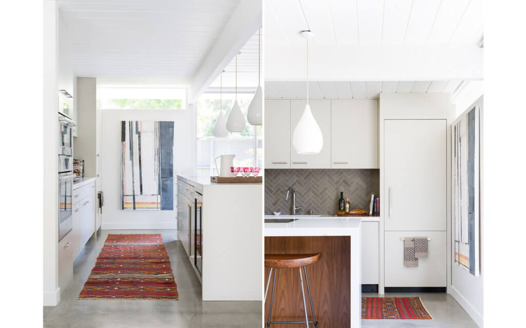
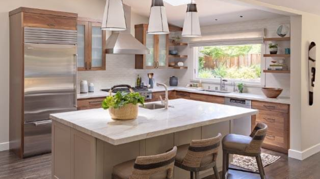
Next to your living room, your home’s kitchen gets the most use. It’s also an area visitors tend to visit frequently and immediately upon entering your home. Being such an important part of your home, your kitchen should not only be spacious and well organized but should look great too. Part of making and keeping a kitchen looking good is its paint. Over time, a kitchen’s paint can dull and become stained by smoke. It can also hold onto the hundreds of different smells that have originated from your stove, oven, fridge, and even food and drink left out on the counter.

In order to remedy all of the aforementioned new paint is needed. Some homeowners elect to have their kitchens painted as part of a larger redesign project while others use only paint in order to revitalize their kitchens. No matter why a homeowner chooses to repaint their kitchen, they face a number of different options and hard choices. Everything from choosing the right shade, pattern, and brand will determine just how happy a homeowner is at the conclusion of their project.

Help From Professionals
Making choices that carry the biggest benefits to a kitchen is no easy task and the sheer number of wildly different options can be confusing and maddening. When a homeowner hires a professional painting firm however a talented staff of artisans will take what a homeowner has envisioned and bring it to life. When first consulting with a professional, a homeowner will be presented with color charts, color placement counseling, and will work with test samples so that they can see their choices come to life. Moreover, professional painters will listen to and seriously consider the needs and demands of a homeowner when devising a plan of action.

Colors Galore
There is virtually no color of paint that can not be created. While this may initially sound wonderful, having too many choices often breeds indecision and regret. While a homeowner can most certainly use any color they like when repainting their kitchen, many colors simply don’t work or fit in a kitchen environment. Conversely, there are a number of colors that work exceedingly well in kitchens; making them not only stand out but fit in as part of a home.

Harbor Gray Ac-25 – A great deal of homeowners love using white or some type of off-white in their kitchen. While this is certainly understandable, white shows everything as it becomes dirty and stained. To avoid the discoloring of white paint in a kitchen, this paint is often presented by professional painters to homeowners whom want to go as white as possible. This gray is considered a neutral that pairs tremendously with brass, marble, and many other colors.

Galápagos Green 475 – This green is a deliciously deep and rich shade of green. Kitchens with a large number of pantries and cupboards look fantastic with this green surrounding them. The savory look of this green can create a dramatic look in a kitchen and will look fantastic for long periods of time.

Moore Ice Blue 2052-70 – Ice blue paint makes a kitchen look and feel as crisp as a pre-sunrise September morning. The pale blue of this shade exudes warmth and freshness while it creates a soothing kitchen atmosphere. Those homeowners whom love a white kitchen but want a bit of added color will find that Moore Ice Blue satiates quite nicely.

Farrow & Ball Pegnoir No. 286 – Homeowners looking to add a bit of fun to their kitchen will adore this color. Its delicate lavender and slight gray mix makes kitchens look modern and warm. This color can be used on ceilings and matches well with cupboards and pantries no matter their finish.

Farrow & Ball All White No. 2005 – This shade of white is perfect for homeowners whom want to go all white but don’t want a glaring white that comes off as too bright. Professional painters can use this shade of slightly muted white to create both modern and retro kitchen vibes. This white is a wonderful companion to marble counter tops too.

Benjamin Moore Raccoon Fur 2126-20 – Kitchens with elevated ceilings and plentiful wood will benefit greatly from this color. This color doesn’t scratch or bite as its name might suggest but it will bring kitchens to life with its rustic, homey outdoorsy, and slightly chalky look.

Farrow & Ball Mizzle No. 266 – This dusty grey green color is extremely versatile and can be used to create a multitude of different atmospheres within a kitchen. Being a “flexible” color means it sits well with different types of wood finishes and counter tops. Homeowners that desire a timeless look can use this color all throughout their kitchen to satisfy that need.

Benjamin Moore Revere Pewter Hc-172 – Homeowners that have kitchens full of brass and marble will find this shade of pewter to be exactly what their kitchen needs to be reinvigorated. Being a popular alternative to plain white paint, this pewter is a muted albeit bright color that manages to make kitchens feel fresh.

Benjamin Moore Lucerne Af-530 – When white paint or some variant of it isn’t enough for a homeowner, they’ll want something with much more color. Blue is always a comforting color and one that can really bring a kitchen to life. It is also a stark and joyfully jarring change to kitchens that where previously white. This blue pairs exceptionally well with black and brass accents as well.

Farrow & Ball Breakfast Room Green No. 81 – In order to liven up and make a kitchen vivacious, homeowners will want to add some real color to the walls of their galley. This particular shade of green is colorful enough to add vibrancy to any kitchen without being so overwhelming that it detracts from counter tops, cupboards, and the like. Additionally, this green works in tandem with various browns to create something truly special.

Endless Colors And Choices
The aforementioned are but a few of the choices homeowners have when they set out to redecorate, repaint, and/or re-imagine their kitchens. Depending on the kitchen, a homeowner’s personal likes/dislikes, the needs of their home, their budgets, and a whole host of other variables, professional painters might recommend reds, browns, purples, pinks, and other colors that aren’t traditionally associated with kitchens. Professionals can also create custom colors for homeowners allowing them to concoct a customer’s favorite color or something that they can only see in their mind but can’t verbally describe. The choices are virtually endless when it comes to repainting a kitchen so it behooves homeowners to take their time and work closely with the professionals they have hired in order to create the perfect color for their kitchen.

Arana Craftsman Philosophy

Loving care of your home is your first and most economical line of defense for your family’s biggest investment.

Our mission is to serve homeowners by preserving the structure that provides warmth and sustenance for their families.

We believe that Bay Area families deserve the finest work at a fair price. We work with you to protect and extend the life of your home. Your satisfaction is guaranteed.

The difference is clear when choosing Arana as your professional house painting experts in Oakland.

Interior Painting Oakland

Interior Paint Finishes For Your Home

It’s not enough picking the right painting firm, colors, patterns, nor designs for your upcoming interior redesign project. In addition to all of the aforementioned, you’ll need to pick the right finish for your interior paint if you hope to be happy with the results of your project. Different finishes add different things to a home and can dramatically alter or affect the atmospheres in homes.

In all, there are four major types of interior paint finishes. When consulting with the painters you’ve hired the subject of finish will inevitably arise. When it does, the more you know…the more you can accomplish and ensure that your home will look and feel great at project’s end.

Flat Paint
Flat paint is commonly used by contractors because of its matte finish. Flat paint does not reflect light which is perfect for those rooms that require darker colors or a muted appearance. While flat paints can indeed be beautiful, they do not wash too well. This means that you should expect your new paint to gradually, albeit slowly, lose its vibrancy.

Eggshell Paint
Like flat paints, eggshell paints feature matte finishes. Where they differ however is in their ability to shine. Eggshell paints are more vivacious and deep than are their flat cousins. Regardless of the color chosen, eggshell paints are much more pronounced than flat paints. These paints can be put to tremendous use in any area of a home as well.

Satin Paint
In layman’s terms, satin paint is merely “medium gloss”. Satins are both smooth and attractive in any color which is why they are often selected for use in bathrooms and kitchens. Perhaps best of all, satin paints are extremely washable and therefore they can be cleaned repeatedly without fear of dulling or fading.

Glossy Paints
Being the most reflective of paints, both semi and high gloss types are excellent choices for traffic heavy rooms. Additionally glosses are resistant to humidity, heat, and dirt. This means that when they do eventually require cleaning, you can do so without damaging their integrity. If you have furniture that is in need of fresh paint, glossy paints can restore them and give them a new-like sheen. Despite their many advantages however, glosses will not hide imperfections on a wall.

When In Doubt
If you are having difficulty selecting a color, brand, or finish for your new interior paint, a professional is only a phone call away. Interior paint isn’t the type of project a homeowner should attempt to tackle on their own. The numerous advantages that come with the initial consultation with a professional will make this perfectly clear. Professionals will not only add new paint to the interior of you home but they’ll utilize their artistic experience and knowledge to help you create something truly unique that improves and revitalizes your home.a