The field of home building and remodeling has a clear path from design to construction, then on to “the finishes,” and lastly, the furnishings. After the initial design plans are complete, architects can and often do play a role throughout the construction of the project.
But, when do interior designers get involved? And can architects and interior designers ever coexist on a project?
We sat down with interior designer Vaughan Woodson of Woodson & Woodson Interiors and architect Rebecca Amato of Amato Architecture and asked them to share with us how they work — together, and separately — to help homeowners make optimal design choices for their homes.
“Often the overlap occurs in the finishes,” Amato explains. “When a client asks me if I can provide design services, I say yes, but up to a point. I will specify anything that stays attached or needs to be attached to the house, i.e.: cabinetry, tile, flooring, paint colors, lighting, plumbing fixtures. Where I draw the line is a whole other area of expertise: soft furnishings, window treatments, and accessories.”
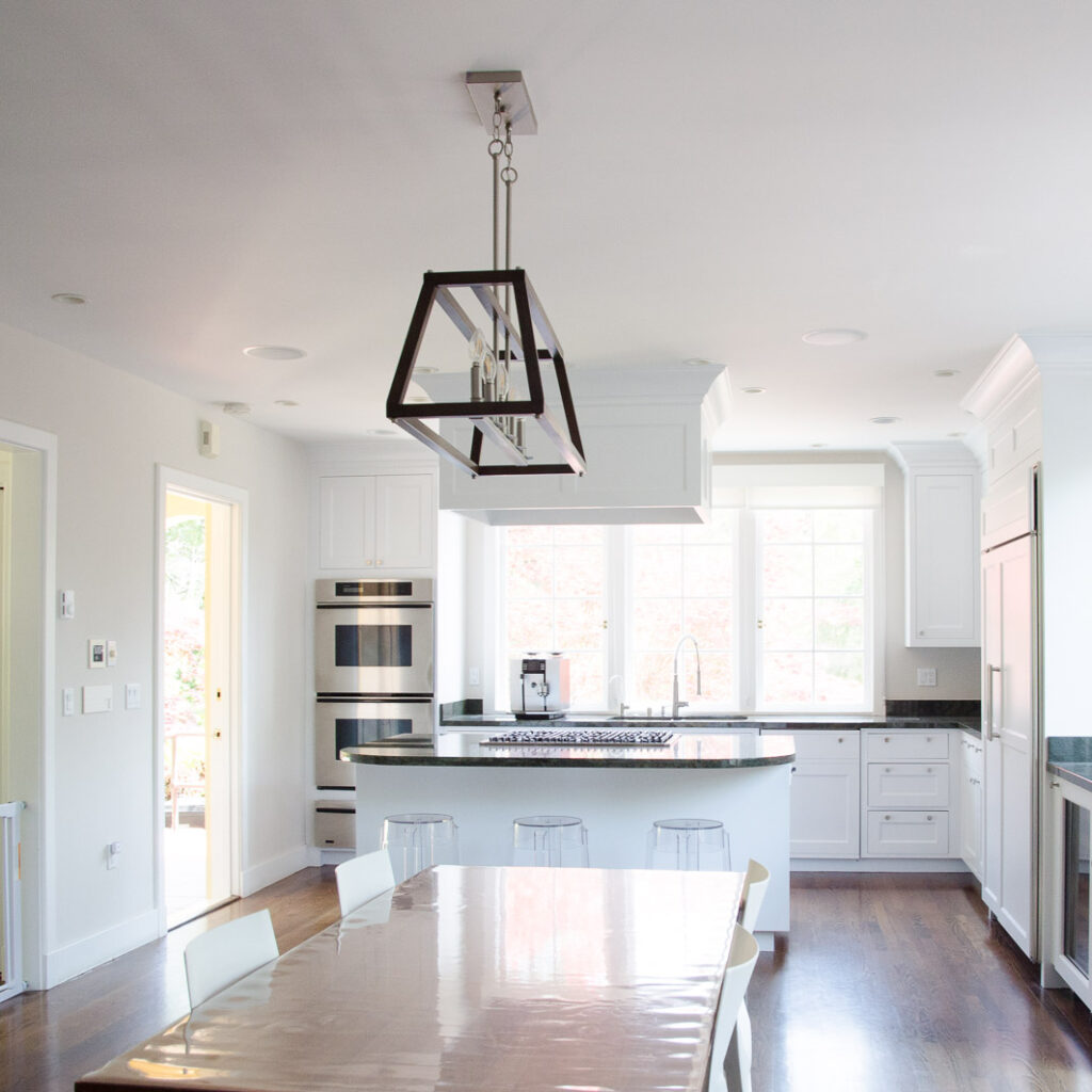
(Featured image of project at top of article: design by Amato Architecture, build by McCutcheon Construction.)
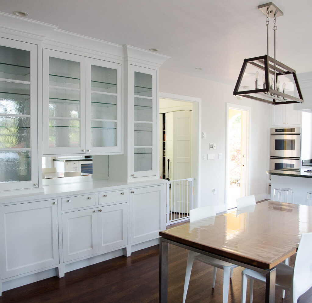
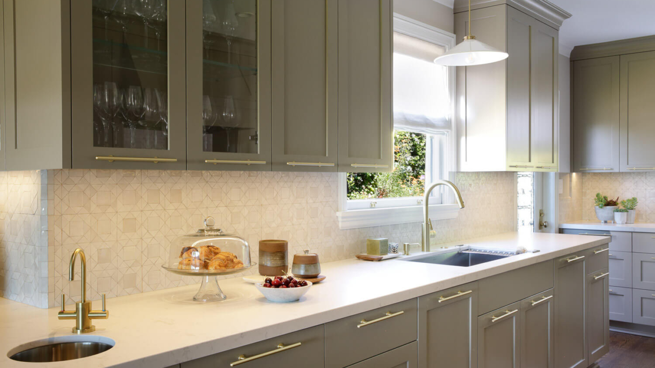
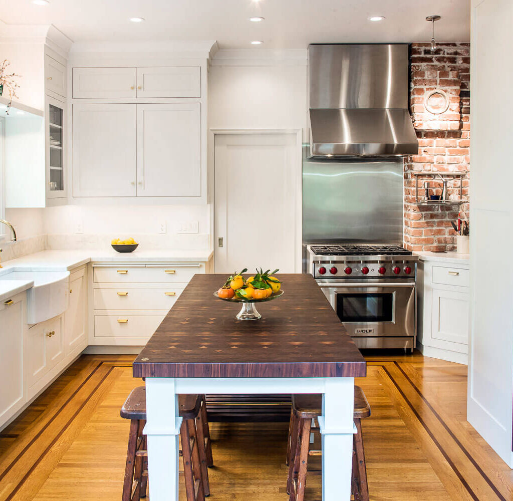
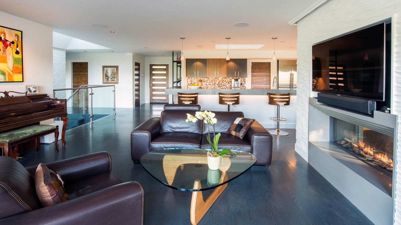
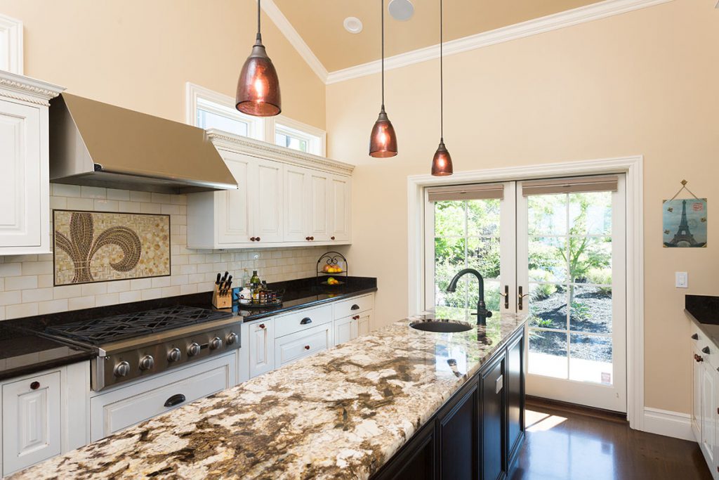
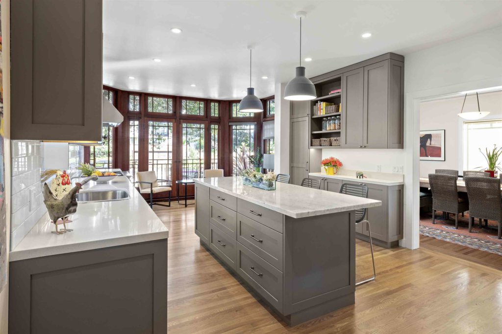
Design by Woodson & Woodson Interiors
Woodson agrees, “When I work with an architect on a project, I appreciate being able to collaborate — with the client’s use of the space as the number-one end goal. Fortunately I’ve been doing this work for a long time and I have zero ego about it, and I think that makes me nice to collaborate with — or so I’ve been told! I have no interest in making a mark on my clients’ home other than my client saying, ‘Vaughan taught me so much about what my style is; I never would have chosen this; she pushed the envelope!’”
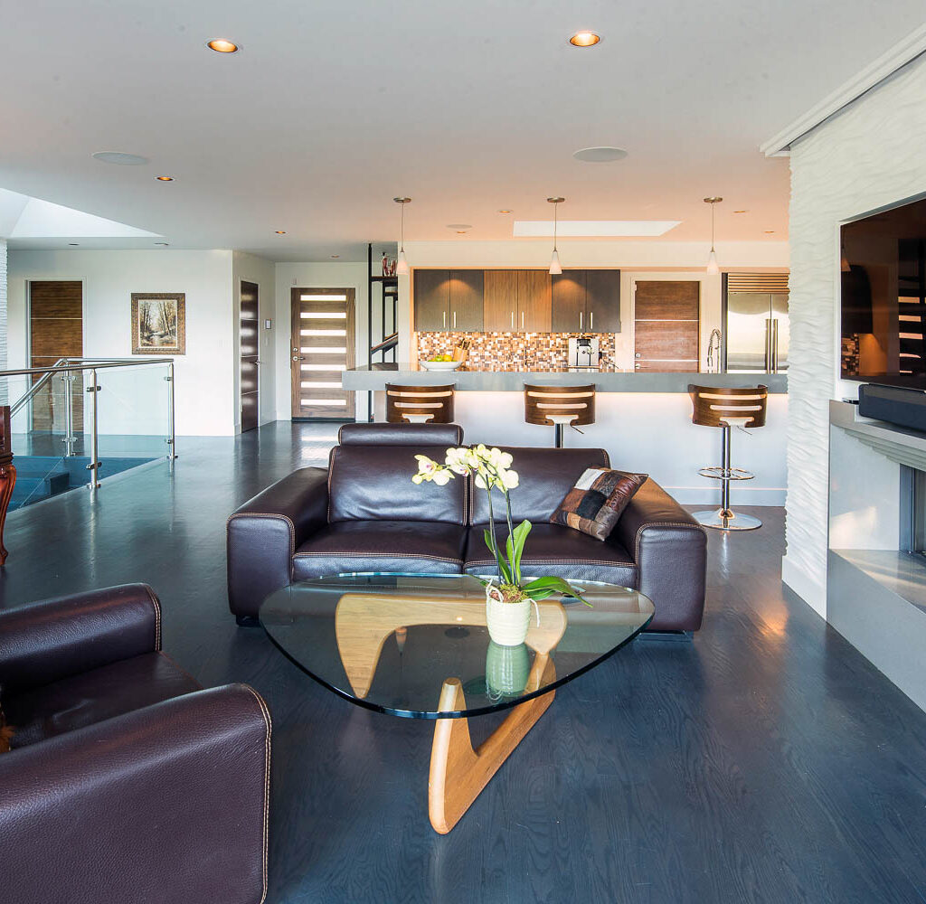
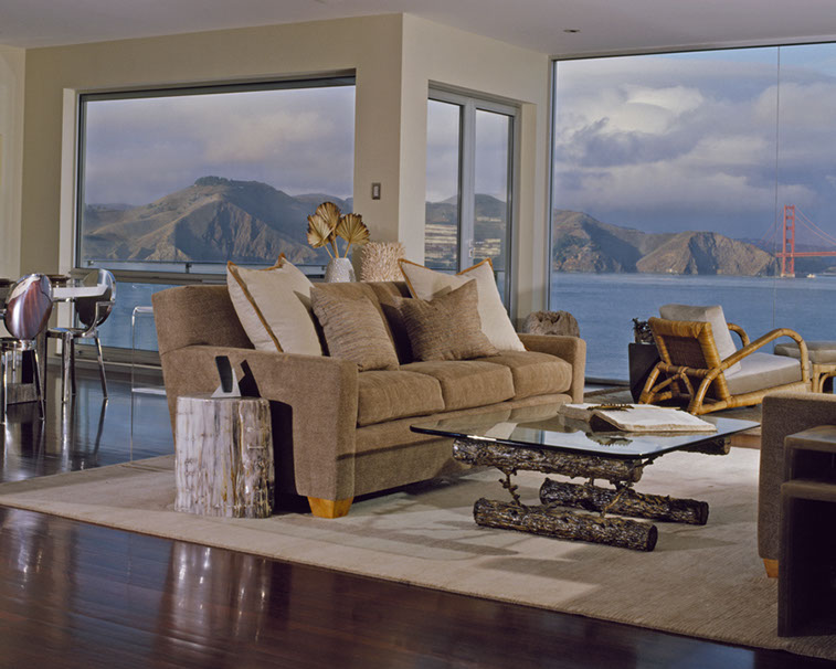
Design by Woodson & Woodson Interiors
Both professionals describe a clear dividing line as being about structure. Here, instead of overlapping, their skill sets complement one-another, and mutually affect the results.
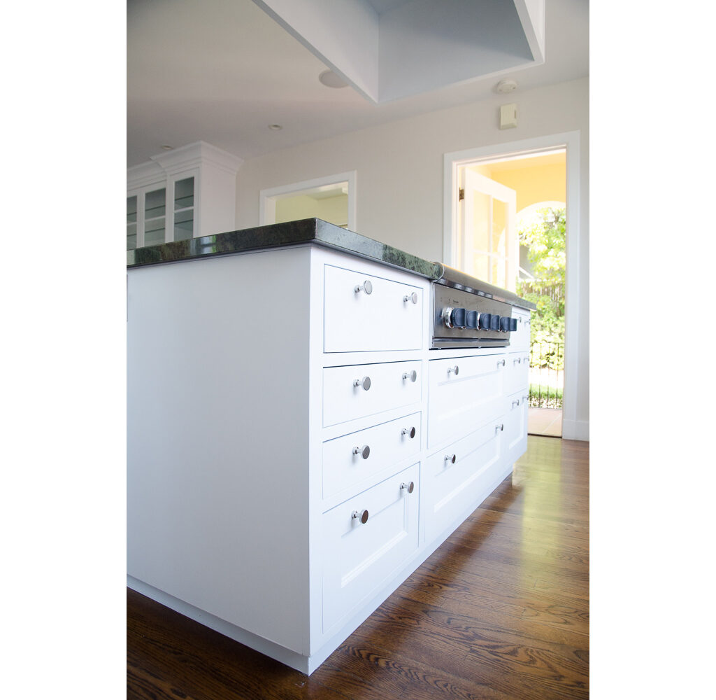
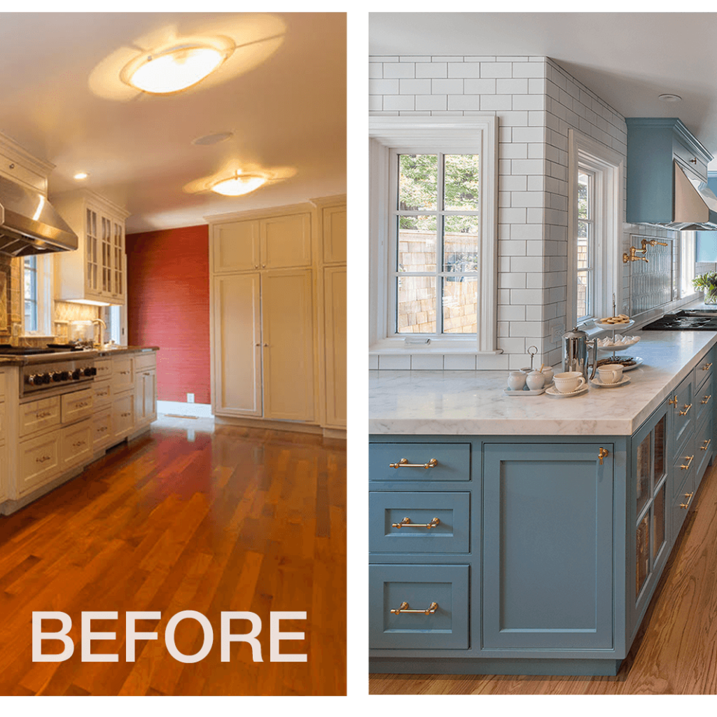
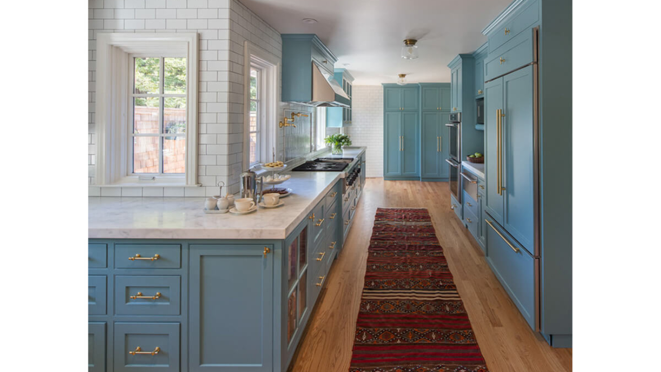
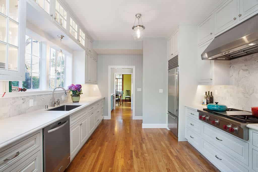
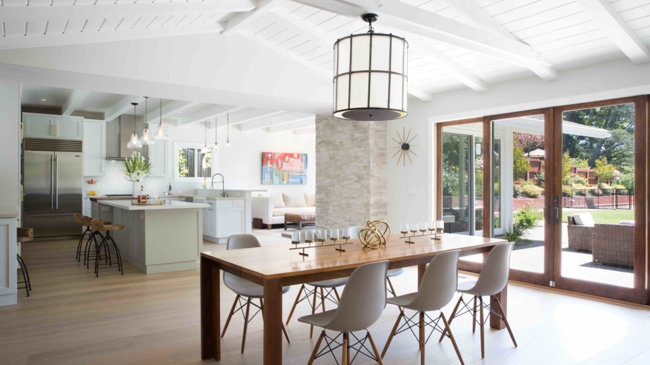
Design by Amato Architecture
As an architect, structure is Amato’s passion. As she describes her thought process: “How do I move walls and create a floor plan that is functional and flows? That showcases the focal point of each room, such as art placement, or a big beautiful fireplace? If I get to do that and then the client says, ‘Okay, now I want to bring in an interior designer,’ that’s great. I love, love, love partnering with interior designers! Working with a designer, I can communicate my vision, how I’m thinking about views, where I am creating seating areas and moments, and then pass the baton.”
Both agree that it is best to bring in an interior designer early in the planning phase. As Woodson describes, if she wants to specify a particularly spectacular sofa, she may share the measurements with the architect, who might look at shifting the location of a door to optimize wall placement for it.
Or the two might have a conversation about window treatments — Will they be minimal? Will allowance be needed to create a pocket for roller shades? — If the client wants curtain panels to soften the room, space between the window casing and the crown molding will be included in the plans.
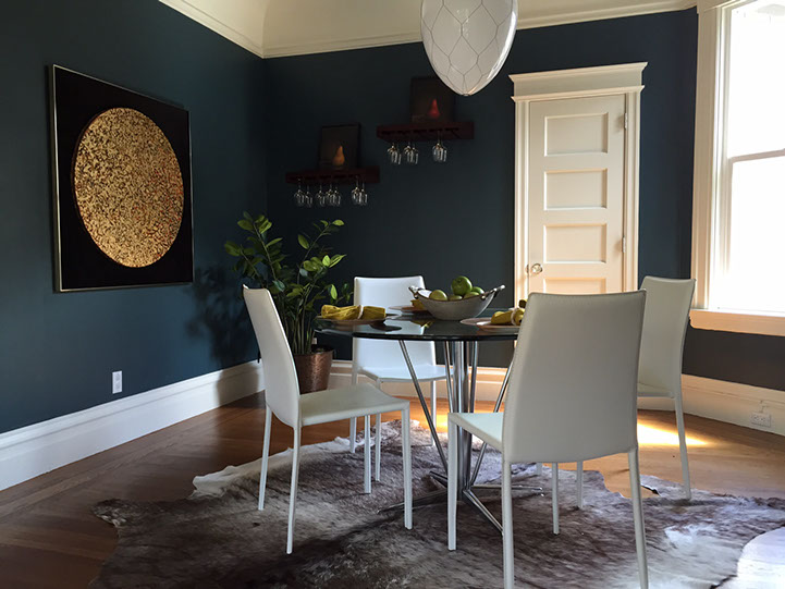
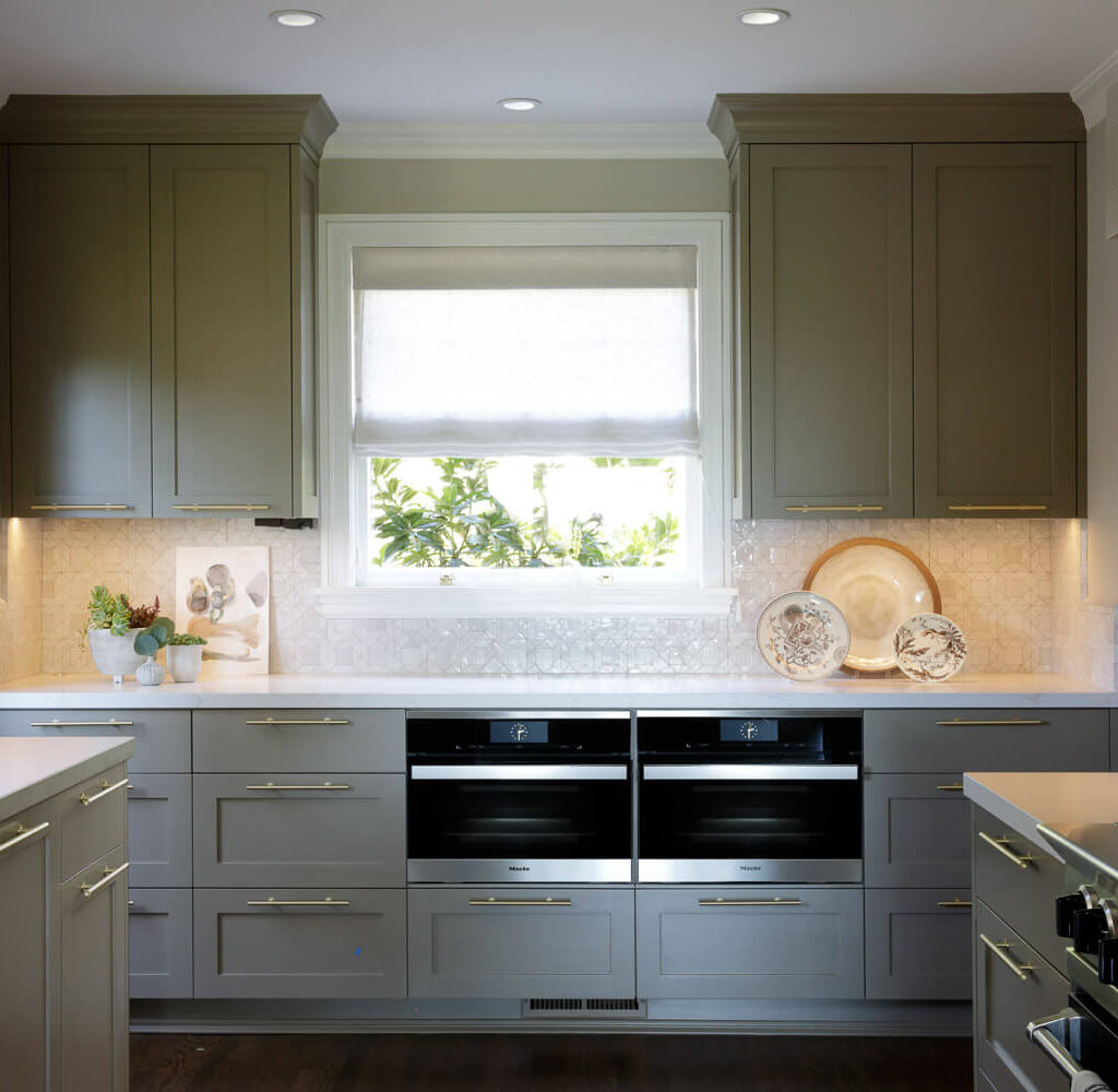
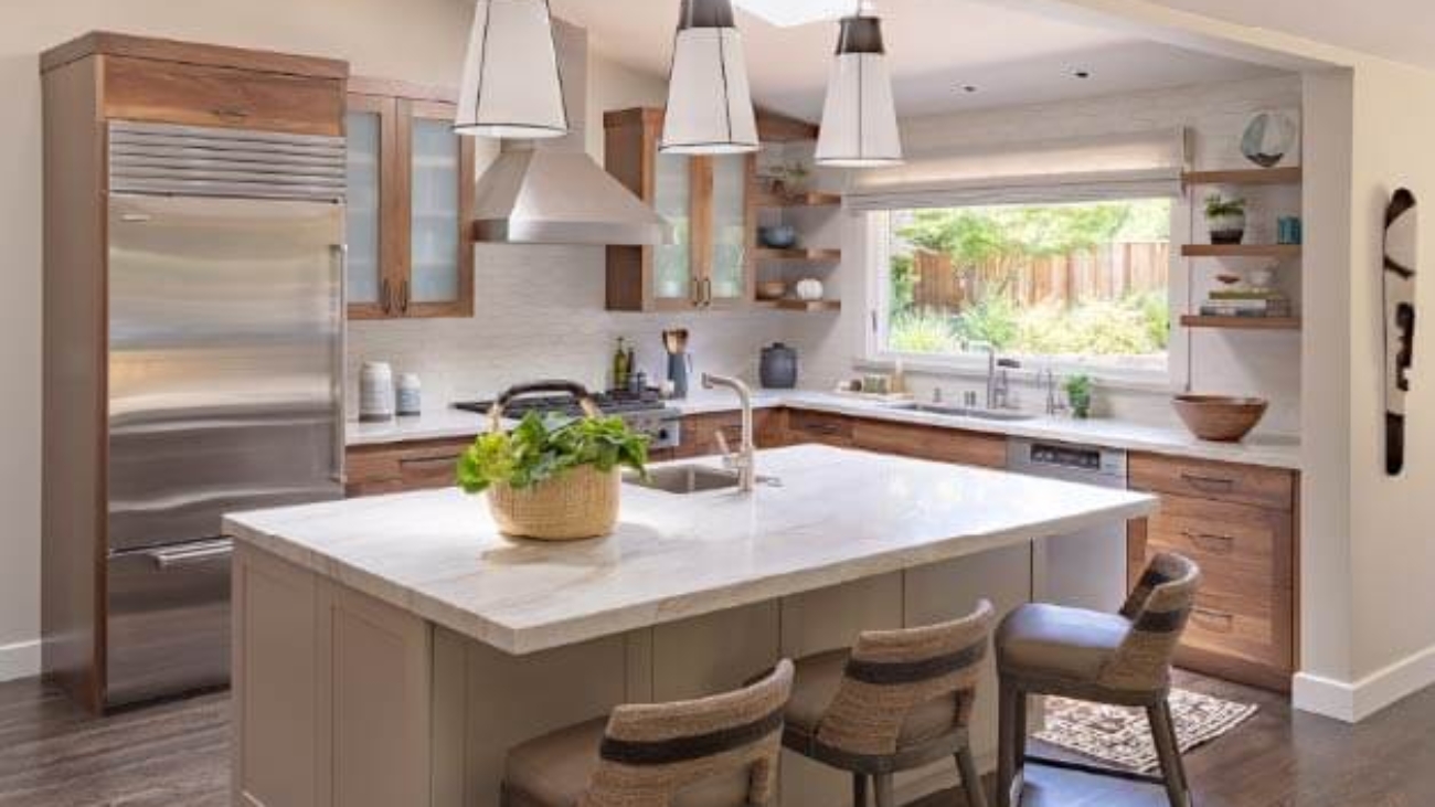
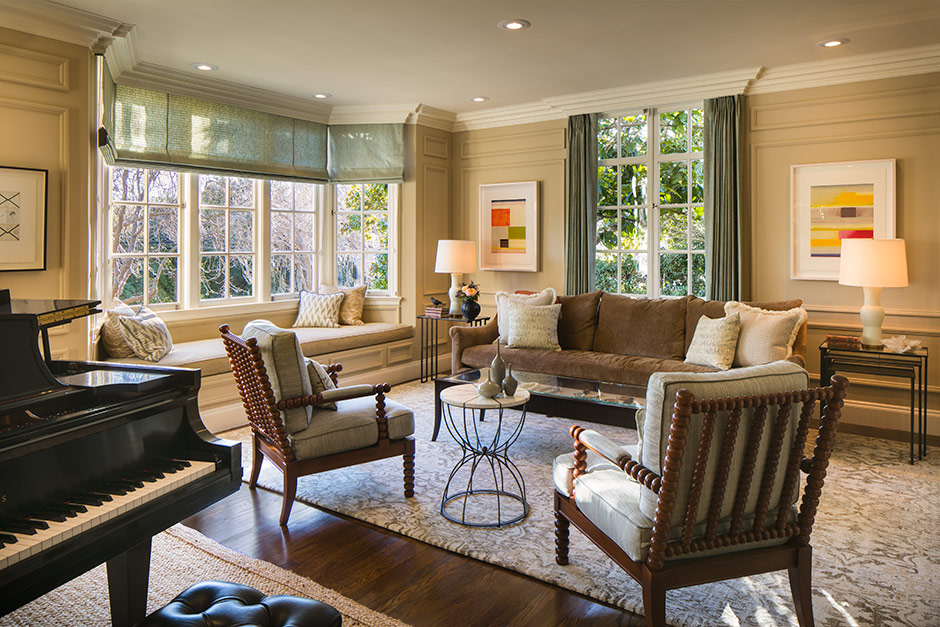
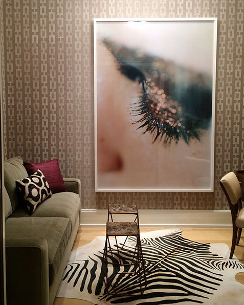
Design by Woodson & Woodson Interiors
At the most basic level, Amato’s expertise as an architect is required when drawings are needed, especially when desired changes to the home trigger a call for permits. Woodson notes that while she, and most interior designers, have their own subcontractors they work with for cosmetic changes, “as soon as the client says, we are looking to renovate our kitchen, add a sliding door, that’s when I would bring in Rebecca.”
Amato describes the flip side, when she refers potential clients to Woodson: “Sometimes, someone calls and says they are remodeling, but they are not moving any walls — that’s probably not a good fit for me. I tell them, ‘You’d be better off working with a designer.’”

Architect Rebecca Amato
There are design firms that have an in-house interior architecture department and per Amato, some building department staff will allow a person who doesn’t have a license to prepare drawings — although in that case it is helpful if the drawings are combined with a report from a structural engineer.
Another way to look at how design and architecture interact is around furniture. Do you, as a homeowner, know what pieces you want to replace or hold onto?
For her clients, Woodson likes to determine at the outset which pieces are worth keeping. “I’m a preservationist at heart,” she says. “I prefer to try to use what we have — if it works with the design direction we are going in. Sometimes really great design comes from using the clients’ own pieces, because that way, we are putting their story in.”

Interior Designer Vaughan Woodson
When you come at interior space design from this angle, Woodson explains, “maybe the dining room gets bigger, and in the laundry you don’t end up with a counter — because those decisions accommodate the story and the richness.”
Amato agrees, “I think about the furniture in the room. I will ask them, ‘Are you planning on purchasing a new dining room table, or using one you’ve inherited from your grandmother? And I will take those dimensions into account.”
“We want to know, what’s the pain point of your home now? And does this table not seat enough people, and you always wish that you could seat 8 because you have a family of 4 and you would like to have another family of 4 over and you can never do it? What are we solving — and spending all this money on with design services? Good design comes from that,” Woodson adds.
“Yes, that’s critical,” agrees Amato.
When a designer and architect collaborate, Amato says, “we are sharing as much information about the client as we can, from what’s important to them, to what their styles for decision making are. What are their hopes, and what may be some of their limitations. Maybe they’re doing work in phases because of a budget or they’ve got kids going off to school or they’re pregnant…. On a deeper level, it’s not just about the facts of life, but really, what their emotional experience is going to be.”
Ultimately, “we are following the client’s lead,” says Woodson, “and trying to make the most stylish product from that.”