Shelter in Place, Part II: ADUs — Costs, options, and considerations

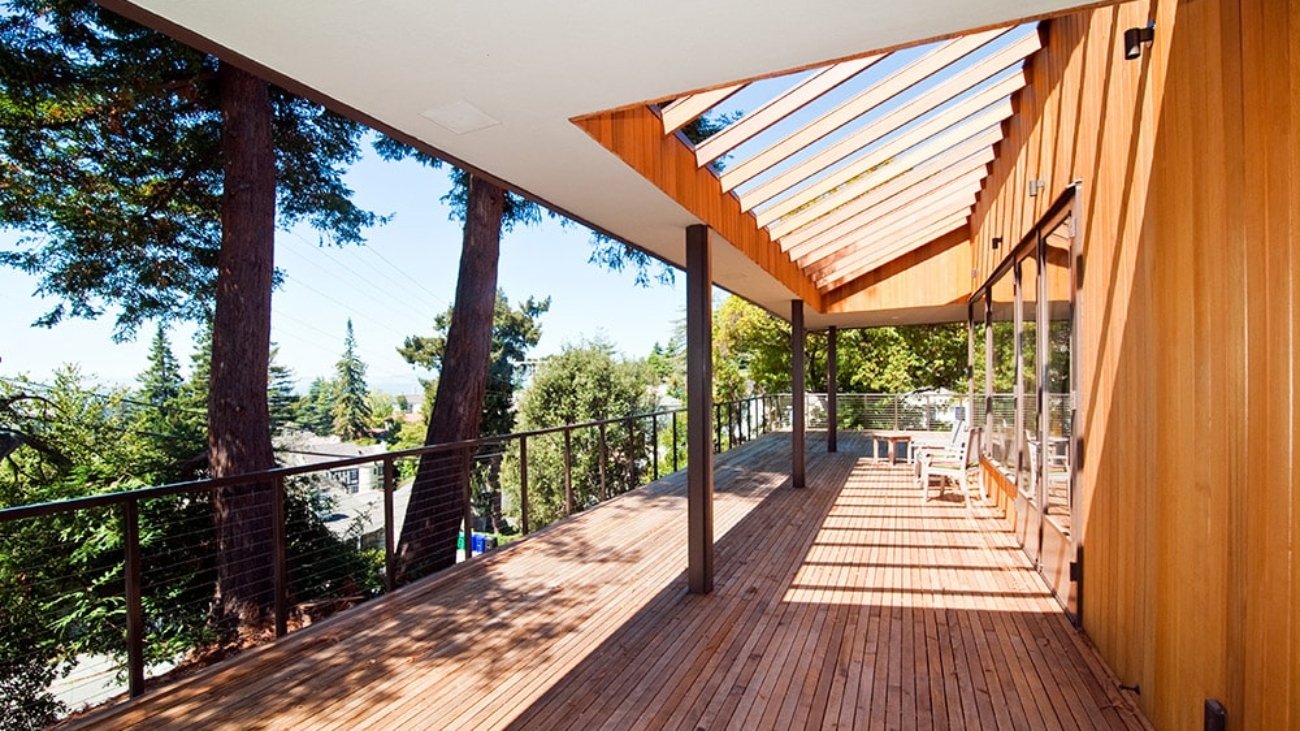
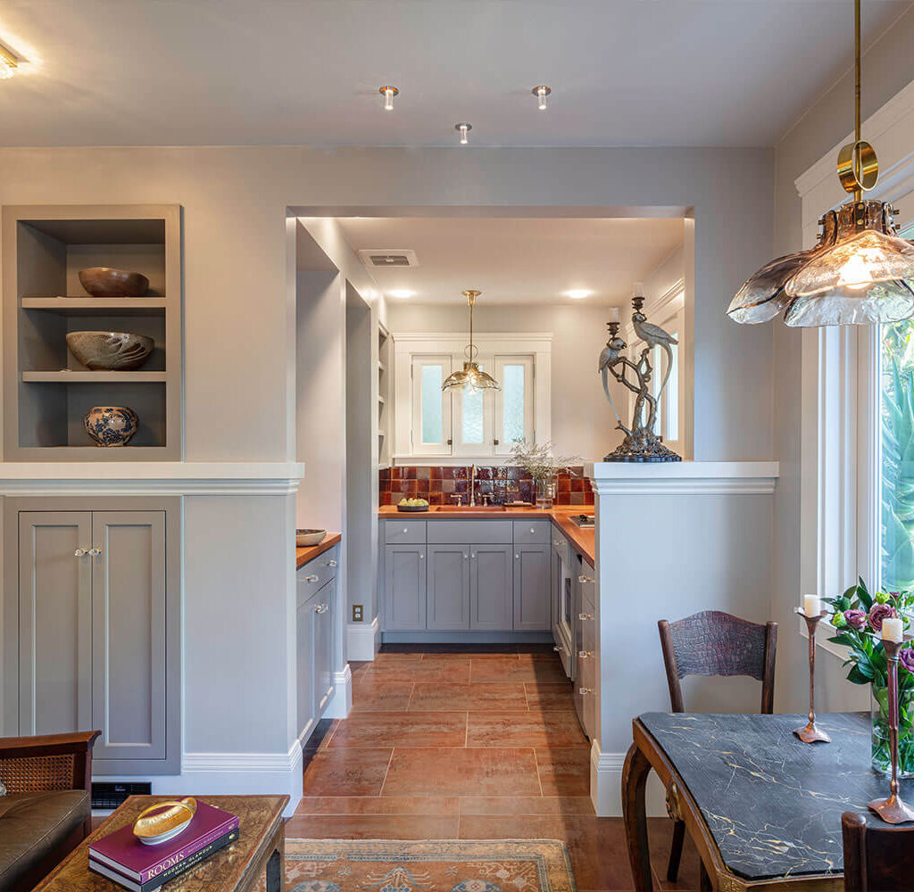
Continuing our conversation about Accessory Dwelling Units (ADUs), we asked Kevin Mond, head of design and sales for HDR Remodeling, as well as co-owner and vice president of the company, to describe in detail the process, costs, and range of options, to help our community make the best decisions for themselves. Arana has partnered with HDR on a number of projects, including the gorgeous custom-built ADU featured in this article.

Kevin writes:

Our company built our first ADU in 2015 and, from what we’ve seen, the rapid rise in requests for ADUs has been a fairly recent phenomenon. In the beginning, we were mostly working on garages, converting them into dwellings — this is a huge undertaking, especially when it comes to dealing with getting permits. Over the last five years, as the trend has continued upward, we’ve seen requests for ADUs vary quite a bit and we have found that there is simply not a one-size-fits-all reason or solution.

ADUs tend to fall into a few different categories. Some people simply want to generate rental income. They have space and want to invest in their property, but because it’s a rental, they prioritize doing the work as cost-effectively as possible, rather than focusing on quality. Those are not typically our clients since the high level of craftsmanship HDR Remodeling provides often comes at a higher price point.

Another category we see are couples whose parents will help them buy a house in the Bay Area, one on a big lot, with the condition or future goal of having the parents move into that ADU in retirement and be close to their children and grandchildren. We also see the case where parents own a large house and are willing to downsize and have the next generation take over the big house while the parents move into an ADU in the backyard.

A fourth reason is that people simply want to create additional space. Many of us in the Bay Area live in smaller homes; by adding more square footage in a separate part of the house or on the property, we can have that music studio, yoga studio, or home office (a huge Covid-19 need).

What excites me about ADUs is how creatively we have to think. It’s very different from designing a 2000-square-foot home.

For an ADU, you have to spend a lot of time analyzing every square foot, even every square inch — maximizing the layout so that the space feels larger than what it really is.

This challenge makes you rethink assumptions. You start asking questions like: Why does a bathroom need its own sink? If the kitchen sink can work just as well as your wash station, you can have one sink for the whole structure.

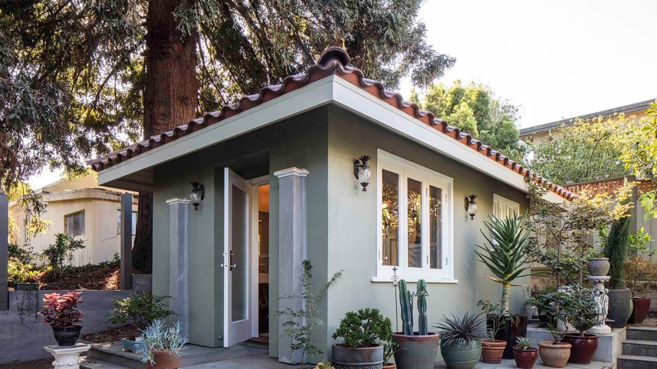
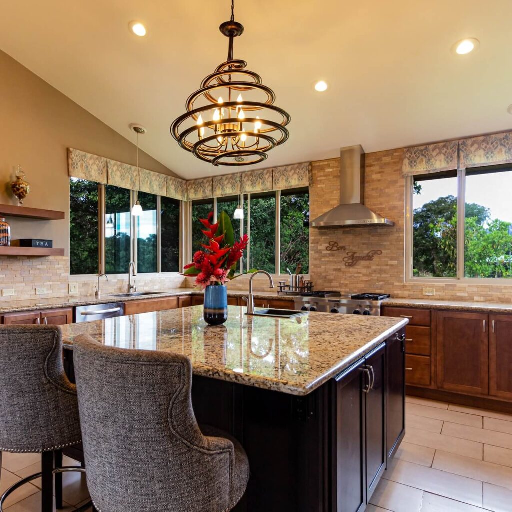
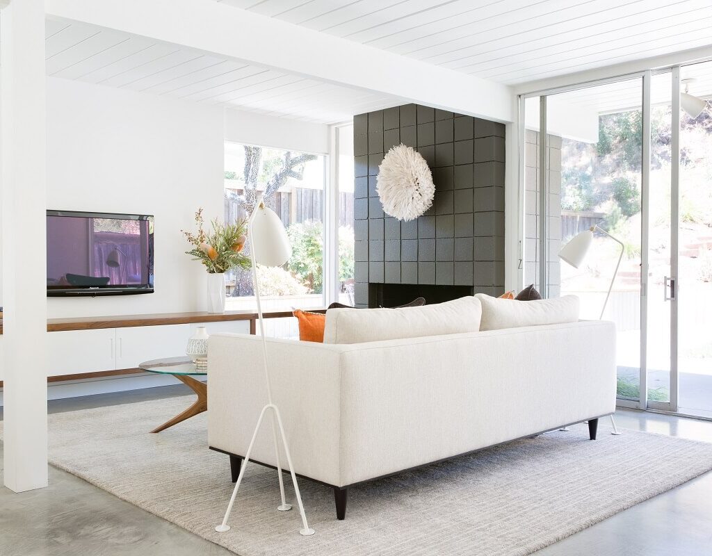
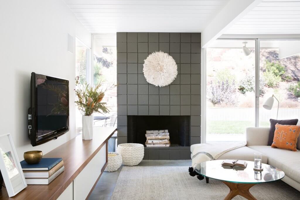
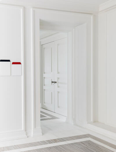
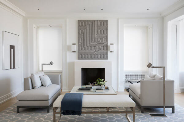
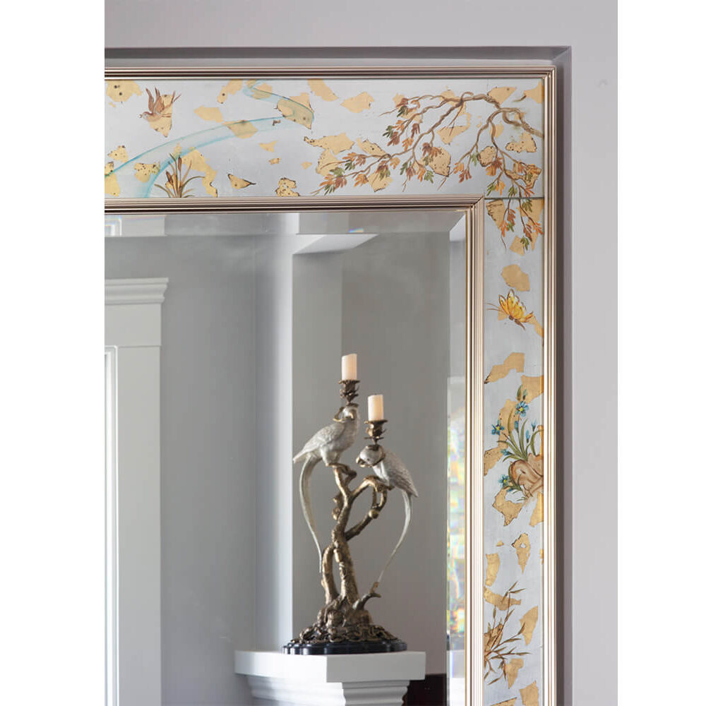
In one recent build, for a 250-square-foot ADU (click here to view photos in Arana’s portfolio) — which is very small — the clients didn’t have a specific need in mind, but they wanted flexibility. So, we installed a Murphy bed and a combined-use sink. This project also shows how the smallest details make a difference. For example, we took a mirror that they really liked, and instead of a simple surface-mount, we recessed it, just to avoid having it protrude from the wall. This helped make the space — which has a kitchen, bathroom, dining area, and bedroom — feel bigger. We vaulted the ceilings to make the interior feel larger than it really is.

There is a funny battle within ADU design. People love their backyards, but they also want the additional square footage of living space. Negotiating those competing desires is a dance we do so that we can provide enough square footage for each.

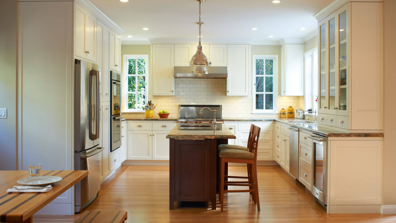
We also help clients decide if the trade-off is worth it. A backyard ADU may not always be the best choice; it depends on what you are trying to accomplish. If it’s a home office, a ground-up backyard ADU may not be the best route to go. It is costly to bring in electrical and plumbing and all of the systems required in a dwelling. In cases like this, installing a prefab structure might make more sense. If the homeowner doesn’t have a large backyard, building an attached ADU inside the home is sometimes an option. We recently completed a project in a standard 2-bedroom, 1-bath, 1200-1500 square foot, Oakland home, where we were able to dig down to achieve the required 8-foot ceiling height.

ADUs, especially ones with full plumbing and electrical, are often more expensive than people expect. For construction costs only, the budget can be around $350-$450K, and beyond. Even if you self-manage the project, construction costs can still end up being around $300- $400K, plus time spent project managing. And then you have to add in the costs for engineering, permitting, interior design, and furniture and decor. If there is room in the budget, I advise clients to prioritize using higher quality materials.

If instead of an ADU, you want to build a studio or an office in your backyard, that is much less costly. It’s a completely different permitting process and simpler to build. You are not excavating, bringing in plumbing, electrical, etc., or even having to pour a deep foundation. Because these structures are considered sheds, the foundation requirements are much simpler; you can do something very straightforward for about a third of the cost.

Another cost-cutting option, and one that also speeds up the process, is installing a prefabricated structure. For prefabricated dwellings, HDR recommends Abodu (abodu.com). We completed three Abodu installs for clients so far in 2020 and are finishing up two more, right now. For prefab sheds, a company we like is YardPods (yardpods.com).

People think, “I have a garage here, it’s kind-of falling apart, I’m 80% there, I just need to put some drywall and heat…” But that unfortunately is far from reality.

A garage built in the 1920s was built to store things, not people. To convert to a space where people live, the safety considerations go way up. You typically have to do additional framing, pour in a foundation, upgrade the siding to ensure that it’s waterproof, and make sure that the roof is in good shape. Plus you have to excavate and bring in proper systems, like plumbing and electrical. It doesn’t matter if the space is 200 square feet or 800 square feet, systems are where the costs go up.

A clear, upfront explanation of the cost is helpful because most people I talk to say ‘I thought ADUs would cost around $150K.’ There is a preconceived notion that smaller dwellings should cost far less to build than a larger structure. That’s why it is so important for us to educate the general public in order to assist in better upfront decision making. We appreciate the opportunity to reach Arana’s audience on this topic!

By Kevin Mond.

Learn more at: www.hdrremodeling.com

02_Williams_Ext_Wind_Closed-1500

Shelter in Place with Accessory Dwelling Units

Now that “Sheltering in Place” has become the “new normal,” many of us are looking to our homes to support us more than ever before. Maintenance projects that we might have been putting off are suddenly in our faces 24/7 and getting long-needed attention. And with this new and constant attention to home, we recognize that we need our spaces to be multi-functioning, as everything from work, to school, to socializing is now being done on video-chat.

While video in some ways feels more distanced than the in-person world of before, it is also more intimate. We are peering into each other’s homes through these tiny boxes on our screens!

Speaking of tiny… another concept that has become even more popular in recent years is the multi-purpose and modular-functioning tiny home — as well as the idea of creatively carving out space in your existing full-sized home, whether within the structure, going underneath, adding onto, or installing an entirely new structure; whether built from scratch or pre-fabricated and placed in your yard.

All of these can be classified as an ADU. ADU stands for “Accessory Dwelling Unit.” Sometimes quaintly or antiquated-ly referred to as the “in-Law” or even “Mother-In-Law” unit. In legal terms, an ADU is a space that has its own entrance, a bedroom, its own bathroom, storage of some kind, and a kitchen.

While ADUs might have once been the place that gave you breathing room from your Mother-In-Law when she came to stay for extended periods (not for us, we love our MILs!), today the ADU serves many functions, from an income-generator via Airbnb, to a home-office or home-schoolroom, to a way to re-welcome-home adult children who previously left the nest, or shelter other relatives long-term, creating an accommodating extended family compound in uncertain (and even in better!) times.

There are two categories and four typical formats of an ADUs: Detached — either Constructed or Pre-built; or Attached — usually a garage conversion or underground excavation.

A general ballpark-estimate for a 200-square-foot interior ADU is about $150,000 and a 650-square-foot backyard-detached cottage may run you as much as $350,000. Prices will vary depending on size, as well as any unforeseen construction issues that come up, plus how fancy you want to go with materials, appliances, decoration, furnishings, etc.

In the Bay Area, some see the rise in ADUs as a solution to rising new-housing needs. And legislation has followed suit in recent years. We’ve experienced a welcome decrease in the regulations that were previously deal-breakers, or at least headache-makers, including reducing or eliminating parking requirements, and shortening distance from curb measurements for permitting, as cities like Oakland and Berkeley are searching for lower-impact ways to create more housing.

In comparison with countries across the world, it seems that the United States has started to catch on to the benefits of multi-generational family housing, seeing ADUs as a pathway to keeping families together; although economic factors are also a noted influence and now, the pandemic.

Currently, California holds the #2 spot in the U.S. for the highest percentage of multi-generational family homes.

More and more in the Bay Area, we are seeing scenarios like this one: a large backyard cottage might house an adult child in their 20s with the parents living in the front house, and as this next generation marries and starts to have kids, the new growing family and aging parents swap places, with parents moving to the backyard abode and aging-in-place.

Of course, the key to having an ADU install be a positive experience is hiring an experienced and knowledgeable team. We have worked with HDR Remodeling and other general contractors and architects whom we refer to and are referred by who can steer you through the process with, hopefully, as little grief and as much information to reasonably calibrate expectations of cost and duration, as possible.

Sunnyhills-Crocker-Highlands-2

Kitchen Trends To Avoid In 2020

We don’t want to brag, but you can show us any kitchen, and we can assume, in a few years or so, when it was designed or revamped (we know it’s a neat party trick)—because kitchen architecture, like fashion and another home decor, usually follows patterns that come and go.

One minute of avocado-green refrigerators are great, and the next, they’re painfully old. Ditto: flooring of linoleum. We could still say the same thing about cane furniture— only that it came and disappeared, gone, and coming back later.

Many reasons make a kitchen design unwanted and lose the appeal it had on people. One of the reasons is that many modern designs are coming up, thus phasing out traditional kitchen trends that have been there before.

However, some of the old kitchen trends like the use of wood counter tops are slowly coming back and are replacing modern kitchen trends. With the onset of 2020, we figured we’d take a look at a couple of past-their-prime types that are ready to retire, at least until the pattern inevitably comes back.

marble counter tops

Let’s clarify — we’re thinking about the real stone, not the feel of marble. With its distinctive striations and shading, it will always look good in the kitchen or the bathroom. Correct marble counter tops, however, come up with a lot of things.

These need to be resealed every few years; these will scrape, rub, or stain; and they are brittle, so that heat and even some chemicals become troublesome if misused. What is the explanation for the exit? There are more robust options available— such as marble, butcher- stone, or even granite.

Marble is expensive to purchase and also will take a toll on your pocket, installing it on your kitchen wall, counter top, or even on the floor. That alone may make a homeowner opt for cheap alternatives to use in their kitchen.

All-White Kitchens

You can’t really go wrong with a white kitchen, but it’s bland, and the design world is over. Where’s the personality? The all-white kitchen has become synonymous in many homes and hotels. It is good to show class in your kitchen and even at the entire house.

However, this trend should not be with us in 2020, moving forward. The main reason is that it does not incorporate any creativity in it. Most all white kitchen are monotonous and do not have any sense of style in them.

With the onset of modern kitchen interior designs, many people opt to use warm colors in their kitchen. This is because warm colors are suitable for appetite and also have an artistic look.

Subway Tiles

There’s nothing objectionable about the subway tiles— it’s just that they’ve been so overdone that they’ve refurbished the bathroom, and they just look like overkill.

There are many other fun ways to make a back splash. Why not try a different form, a handmade tile, or even a stone slab instead?

Industrial-Style Statement Lighting

Heavy, bulky pendant lighting had a moment, but the industrial style had come and gone in favor of something a little lighter and more understated. The new method lets the rest of the kitchen shine and doesn’t block the view in the open concept room.

  • Tip: Make sure you always pay attention to the height of your lighting as applied to your floors, cabinets, or kitchen- island.

Plaster Walls

They’ve been all over our Instagram for the last few years. Don’t give in, man. It’s hard to imagine, but the wall plaster would look incredibly old quite early. Oh, it’s a hassle to keep clean, and it can smear quickly. Not perfect for a room where stuff will sometimes spill or splatter.

Barn Doors

They were probably on their way out a couple of years ago — and now they’re legal. They’re just too overdone, and only really make sense in a minimal type of home.

Open Shelving

In this day and age, using open shelving as a style in your kitchen may seem outdated. As the days progress, many people are adopting the use of closed shelving in their kitchens.

Open shelving is being phased out with modern home designs. The main reason for this is the open shelving design looks ugly and may create an eyesore to anyone looking at the content on the shelves.

Open- space kitchen

We used to design a kitchen with open space and no doors to increase the space around and also enhance movement in the kitchen. Today, we see the folly in our ways, and we want our walls back.

People were tired of staring at mountains of dirty dishes while they were sitting on the couch, or putting their heads on tossing pillows that feel like dinner last night.

Granite Themed Counter Tops

For many years, granite has been used as the most preferred material for counter tops. Most modern-day designers discourage the use of granite counter tops. As time progress, the trend is slowly fading away, and most people are adopting other styles of designing their counter tops.

Most people are opting to use stone, timber, and concrete as the preferred material for counter tops. White quartz will have a fantastic look if it is used as the primary material for your counter top.

Closed-off kitchens

Just like the rest of the house, Quirk notes, the floor plans are available, and they’re here to live.

You may not always want to see the chaos that can build up in the kitchen, but it doesn’t suit modern tastes anyway. Most people refer to open floor kitchens as “Kitchens without Borders.”

Conclusion
The architecture of your kitchen is one of the most important choices you need to make while decorating your house. The reason is simple: you can’t change the look of your kitchen as quickly as the equipment needs installation and plumbing. Right now, the usual thing is to create a modern kitchen that’s specially built.

If you haven’t yet settled on the most suitable type of decoration for your kitchen, this article will be helpful for you to know kitchen- designs to avoid. We encourage you to apply multiple models for you to have a kitchen that has been modernized and has your personal touch.

180710_EZ_CarolynRebuffelDesigns57235

Designers’ Favorites: Carolyn Rebuffel Flannery on White Interiors

Carolyn Rebuffel Flannery, Workroom C (https://workroomc.com/): Benjamin Moore: Super White, Linen White, White Dove, Decorator’s White

How would you describe your design aesthetic? Home as a haven; peace, simplicity and beauty that resonates with each client’s lifestyle. We strive to craft designs that are inspired, savvy, and practical, and that promote a sense of calm and comfort. We specialize in designing homes for busy families looking for a soothing retreat to call their own.

What advice would you give to homeowners about choosing whites? My top four faves and why: Super White — when there is tons of light; Linen White — super-complimentary in traditional settings and works well with antiques; White Dove — softer than Super White and friendly to other colors; and Decorator’s White — works almost all of the time, in all different lighting conditions.

We put together a blog post listing our top 10 favorite whites, along with a short description of each one’s color undertones, with links to each on the Benjamin Moore website.

Do you have a project/story that demonstrates an unexpected or particularly spectacular use of white? I did have one project where we tried about 15 different whites and ended up using two of the fifteen. That was a crazy project…!

Recently, I moved into a new house, and I realized that this is the third time that I’ve moved into a new house and painted the whole entire interior white! For me, personally, painting the entire house white gives me the perfect jumping off point for art and pattern play, and layering all of that together. My first two homes were very traditional. One house had been built in 1912, the other was a Spanish Mediterranean.

In both of those, Linen White worked all the way through. Linen white is a softer, more traditional white. The house I just moved into is darker, so I’m using White Dove, which brightens it up.

For clients, if I can talk them into being bolder with fabrics and cabinet color choices, then I like white because it’s a great backdrop. But, if I specify a sofa in a very snazzy fabric, that tends to make people more nervous than if I paint their wall a bold color.

Still, I’d rather do a snazzy sofa, patterned pillows, patterned drapes — big, little, and medium patterns and pillow sizes, and paint the walls white. As a designer, you always make your boldest suggestion first, and then you adjust. In theory, white doesn’t really seem like it would be a bold suggestion, but it is.

Eichler-Living-Room-Fireplace-2

Designers’ Favorites: Laura Martin Bovard on White Interiors

We recently interviewed a number of prominent Bay Area interior designers on their favorite shades of white for painting interiors. In this post, Laura Martin Bovard weighs in.

Laura Martin Bovard, LMB Interiors (www.lmbinteriors.com): Benjamin Moore White Dove

How would you describe your design aesthetic? Curated chic; a warm approach to modern; with an emphasis on layers, textures, handmade, and authentic.

We believe having a beautiful home supports us in living a beautiful life. We take our clients’ vision, who they are and who they are becoming, and channel that into an environment that is welcoming, inspiring, and restorative.

What advice would you give to homeowners about choosing whites? Benjamin Moore’s White Dove is our absolute favorite go-to white. You almost can’t go wrong with White Dove no matter what environment it’s in. It’s warm, clean, and pairs well in modern, traditional, and transitional interiors. That said, sometimes people like a warmer white. Recently we specified a warmer white for a client, Feather Down.

Whites can be very interesting! Layering whites can be a really breathy, beautiful, cloudlike way of creating richness and depth, especially if you want to do an all-white house. There is one architectural genre where all white is traditionally acceptable, and expected, and that would be a Spanish Mediterranean — which is often all white with a darker accent color on the trim.

Do you have a project/story that demonstrates an unexpected or particularly spectacular use of white? Whites can be very tricky because a lot of people will think white is just white, and then they’ll pick any old white, and then when you put it up it’s very cold and jarring, you discover it’s got way too much blue in it, or too much yellow.

I wouldn’t paint any interior all-white unless it was Modern. I wouldn’t paint a traditional home all white, with the exception of when we are highlighting art collections. The austerity of a modern place asks for an all-white palette, and even then, I’d rather use Edgecomb Gray with a white trim — which is what I did in my own house.

And then I went back through and painted all the trim Edgecomb Gray to match — a detail my husband wanted because matching trim is a more traditional translation of Modern. Then again, I’m really loving Pale Oak these days as an alternative to Edgecomb Gray.

White-Article-006

Designers’ Favorites: Mead Quin on White Interiors

We recently interviewed a number of prominent Bay Area interior designers on their favorite shades of white for painting interiors. In this post, Mead Quin weighs in.

Interior Designer Mead Quin

Mead Quin, Emeryville (www.meadquindesign.com) All White by Farrow and Ball, and Simply White by Benjamin Moore

How would you describe your design aesthetic? Beauty Simplified is our brand essence. We believe less is more. We love creating thoughtful, restrained, elegant spaces that are timeless and serene.

What advice would you give to homeowners about choosing whites? I love white because of its modern, clean and quiet characteristics. For me personally, as a painter, it feels like a beautiful blank canvas to start my work on. A common concern is that white will feel cold and sterile. Thankfully, there are a million shades and our clients trust us to recommend the right one that will keep their home feeling warm and inviting.

We often select white for clients who collect art. In this circumstance, it is important to find a neutral shade, not too cool or too warm, so that the white walls support the art rather than detract from it. It also supports the home feeling like a welcoming space rather than an art gallery.

In one of the homes where we are currently working, we just went through the exercise of selecting a neutral, overall color. The house has very high ceilings where one room opens up to the next. While tempted to go with one of our favorites, Benjamin Moore Simply White, we decided to go with a pale taupe/grey, Benjamin Moore Classic Gray, to create a feeling of coziness. The result was perfect. Everything feels fresh and light yet is still warm and inviting.

Do you have a project/story that demonstrates an unexpected or particularly spectacular use of white? We recently published a project in Interiors magazine (photos of that project are included in this blog post); the client had an unbelievable collection of art. It was particularly important to find a quiet, neutral white that would feature rather than compete with the art in any way.

Amato-Architecture-Great-Room-scaled-3

The Importance of Gloss and Sheen in Paint Selection

The gloss and sheen in paint isn’t something that everyone understands. This isn’t something that many people think about either. However, the gloss and sheen of paint is something that certainly impacts the final look and builds atmosphere. It is not complicated to differentiate the two, however, most people don’t even think about it. As such, we would like to take a look and dive deeper into what gloss and sheen mean to your paint selection.

Let’s take a look at how the Sheen and Gloss are Measured.
They are measured a little differently. The sheen of the paint is measured at an 85° angle. This can be very different depending on the gloss. The lower the gloss the more noticeable the sheen. However, the gloss of the paint is measured at a 60° angle to the receptor. This is important when considering what type of lighting you’ll need in the room. The receptor will measure the gloss on a scale from 1-100. The shinier the surface the higher the number on the scale.

However, the sheen of the paint is measured at an 85° angle. This can be very different depending on the gloss. The lower the gloss the more noticeable the sheen.

Both of these values should be included with your paint information so that you can make the right paint selection for your particular project. This information is available on every color of the paint out there.

What to choose for a gloss and sheen in your paint.

When you are looking for the paint you need to keep some things in mind. While it might be obvious that the color is important, the gloss and sheen are as well. Take into consideration the lighting of the room, the window placement, performance expectations, and the traffic level. Here’s when you should use low gloss and sheen:

  • When the walls have many imperfections. The less visible the imperfections will be with a lower gloss and sheen.
  • Space doesn’t need or want attention such as a ceiling or small hallway.
  • If the room has a lot of light. The higher the gloss and sheen the more reflective the paint will be with the light. Rooms with high gloss will have excessive glare and will be mirror-like.

When should you use higher gloss and sheen paint?

There are certain scenarios where high gloss paint should be used. This style of paint is perfect for accents and smaller rooms. If you are looking at your paint choices and the room in which you plan to paint, keep some of these ideas in mind that will work well with glossy type paint.

  • Rooms with low lighting and perfect walls are the perfect combination for the need for higher gloss and sheen.
  • Places that are high traffic such as bathrooms and kids’ rooms where people are touching the walls a lot. High gloss paint tends to be easier to clean and maintain. It typically has higher durability and wears as well.
  • In a room that could use a little depth. Glossy paint can add a certain “pop” to the features in a room. Oftentimes we will see glossy paint used on the trim and around doorways. This gives that wall a bit of a “pop” that it wouldn’t otherwise have.
  • While glossy paint is easy to clean and maintain there are certain additives that higher-end paints will put into their paint to help with its durability. This is why it is important to purchase paint that is quality; so that it will last longer. This allows the user to love the paint at all sheen levels and not have to worry about long term care of it, simply based on the gloss and sheen.

Paint labels

While the paint industry does agree on how to measure gloss and sheen by the standards it is given. It doesn’t always express the gloss and sheen the same. Many times people don’t read the measurements that the manufacturer provides but simply look at the name that the manufacturer calls it. You can purchase paint in gloss, semi-gloss, satin gloss, flat, and among other names that describe the gloss and sheen of that particular paint. However, what one manufacturer calls “glossy” might be what another one considers “semi-glossy” and there isn’t a scientific way about these names. So, you will see this vary from paint brand to paint brand.

Here are the definitions of some of the various paint descriptions.

  • Glossy – Is a very high gloss product with a high light reflection.
  • Semi-Gloss -This is a less glossy surface that is still high gloss and comes with a few different names such as pearl, medium luster, and semi-gloss, depending on the manufacturer.
  • Satin-This paint is less reflective in nature. It is sometimes called eggshell, low luster, velvet, or low sheen.
  • Flat-has a matte-like finish and carries very little reflective effect.
  • It is important that you take into consideration the traffic of the room, the way the room’s lighting is and what look you are going for. We work with clients on their actual projects to get them the sheen and gloss that will fit that specific project. It is old school in thinking that the higher the sheen the easier it is to maintain and keep clean with all of the various additives that can be used in paint. If you are working on a project, you should take into consideration these things before choosing paint. The sheen and gloss can be different for each wall, depending on your needs. These paints can all come in the same color but have a very different look when applied to the wall.

Get some live examples.

If you aren’t sure what type of paint you need or this gloss and sheen thing seems a bit over the top, be sure to ask your painting expert for some samples. This will allow you to see for yourself the actual difference in the levels of gloss and sheen. Many places have charts that can show you the difference between one and another. This allows you to get a better understanding of the different levels out there.
Sheen and Gloss are affected in both exterior and interior paints. It is just another aspect to consider when you are looking at paint options.

Central-Ave-Queen-Anne-Victorian-Blog

How Long Does Exterior House Paint Last?

Surface preparation, power washing, and getting the right contractor on the job are all things that should be taken into consideration when you are planning to paint your home. Your exterior paint is an investment. We are not speaking solely on a financial level here either. New paint helps with the aesthetics of your home, but most importantly it protects your home. It protects the building from moisture, bug invasion, and prolongs the life of the siding. These are all very important jobs which is why finding the right paint and contractor is important.

While we might have gotten off topic a bit, we thought it was important for you to realize the importance of your paint choices. How long does exterior house paint last? Well, that depends on a few factors such as the environment the paint is enduring. Also, the products used are important as well as the age of the home. A general rule of thumb though is that your paint job should last at least 5 years before you are looking at painting again. Some paints last longer.

While you are thinking about getting your house painted you should keep in mind that there are many types of paints out there. You should educate yourself and ask a contractor what they recommend for your dwelling. Not all paint is made for the very surface that your siding is made of. In fact, there was a time when we couldn’t paint vinyl siding for example. However, the painting industry has come a long way and now it is very possible and less costly than putting on all new siding.

Be sure that you choose a very good quality or premium paint. Now, this will be more costly but this paint is made to last and endure the elements.

What type of siding you have will determine the type of paint you will need. Some of these paints are more expensive than others. Paint for a wood sided house would be around $65 per gallon.

Invest in a good painting company.

Not all painting companies are the same. Take your time to look around for reviews and recommendations online. Ask around on social media about who people might recommend. It is important that you find a licensed and insured painting contractor that will show up and complete the job as requested. Be careful out there, there are a lot of companies that don’t care about their reputation. They will paint your home and have it looking great but in 2 years you find it starting to peel and prematurely aged. This is because they didn’t put forth the effort to surface prep as they should have.

The exterior of your home should be pressure washed, re-caulked, sanded, and sealed before new paint goes on. This are important steps that aren’t always done by painting contractors. They should take the time to scrape and sand on the surfaces that need it. If board replacement is necessary, they should address that as well. Surface prep is the most important step in the painting process and needs the most attention to detail. Without it your painting job won’t last long and you’ll have to do it all over again.

WorkroomC_Aubergine-163-featured-image

The Art of the Pattern — Q & A with Workroom C

Carolyn Rebuffel Flannery, Principal Designer of Interior Design Firm Workroom C, based in Emeryville, offers her brand of “inspired, practical design” to clients throughout the Bay Area. With that mission comes the textiles she custom-creates to help implement her visions, making homes simply more beautiful — and colorful! We sat down with the busy designer in her light-filled studio to learn more about her creative process.

One aspect of what you do is to custom-designed patterned fabrics for your clients. Where do you get your inspiration? Going to museums! That’s one place, but I see pattern everywhere! Sometimes I will make notes about a pattern that I see, in art, in nature, that I feel like I want to do something with. Also: when there’s a pattern in my head and I can’t find it! For example, I designed my own “mattress ticking,” because I think that ticking should be in any color. You can easily find it in red, blue, or black, but not yellow, bright green, or orange!

How do you decide on the names for your patterns? My husband and I have four kids (ages 23, 21, 20, and 19). They inspire me in many ways. All of the patterns I’ve created are named after girls that are in my family, and the families of all of the creative people I’m working with. We have three daughters; they all have patterns. We didn’t name one after my son; Connor doesn’t mind!

How does your process for creating a pattern work? I start with a sketch and then, because pattern making has an interesting component of being creative, but also, you’re making choices and extrapolating. Whether you do a half-drop (a pattern that repeats in an uneven way such that if you cut it in half, the two sides would be offset) or a mirror-image, or just a very simple curve. For example, if we take a Moroccan-tile kind of pattern, getting that curve to do exactly what I want it to do, drawing it so that the line is not too thick or thin, so that the element is not too big or small: first I’m sketching it, then I’m playing with how it extrapolates out, then refining, and refining. Next, I turn it into a vector file for digital printing. Then comes testing the colors. I know, this is the color I want, but how is it going to translate on to this particular fabric? Digital image versus woven material printing is very different. Ink sits on top of a fabric. But I want the result to feel as organic as possible — as organic as a digital process can be — so I’m looking at how to meld a vision that is creative and flowy and organic with technology that is a little more rigid.

Workroom C patterned fabrics. Photo credit: Eric Zepeda

Workroom C patterned fabrics. Photo credit: Eric Zepeda

So you are trying to replicate the look and feel of hand-woven patterned textiles? Yes! That doodle that turns into a pattern — we play with the texture of the doodle so that it ends up printing in a way that looks more woven. We may try to make the pattern look as if it was drawn by hand. It’s almost like distressing blue jeans — distressed digital drawings. So we make lines that are not exact. We deliberately do not use the tools available in digital that would make it perfectly straight or even. We want variation.

Your aesthetic is beautiful, and you emphasize ease and livability. It makes sense that you might aim for the exact right amount of imperfection. Can you say more about this? Raising four kids, you learn quickly that nothing is perfect. Everything is messy. If something is already a little bit messy, I think it wears better. Not that we are deliberately adding stains to fabric! If you can sense a quality of handmade, I think that creates more ease. To have everything perfect and exactly aligned, that feels uncomfortable to me. For example, handmade tiles from Fireclay are much more attractive to me than those from a company whose tile is machine-made and has that rigid exactitude. Fireclay tile has more of a hand in it. One of the reasons I did this in the first place was that I hate wasting fabric. When you have a fabric that has a giant repeat (the primary pattern or shape that is repeated) it ends up that you can only make one 20-inch pillow with one yard. Giant repeats are great for drapes and duvets. But when you’re making pillows with it, you have to waste a lot of yardage to have the pillows be identical. If I can ‘contain’ the repeat, I waste less fabric. You will notice that my patterns are much more regular. I won’t do a floral with a repeat that goes on for 30 inches in every direction. Also, custom coloring with traditional textile producers is really expensive and has large yardage minimums. When I create a pattern, I can print just one yard. I can do it in any color. I have a giant book of colors. So we can do a test swatch when we are making design decisions, and I’ve kept the project cost down.

Workroom C patterned fabrics. Photo credit: Eric Zepeda
What are the requirements for getting test swatches from a big distributor? They usually have a three-to-five-yard minimum, with a long lead time for custom color, and then there is usually a per-yard surcharge. We can do this inexpensively and a lot faster, with more ability to customize. If the client and I fall in love with one of those large repeat textiles, I will sometimes talk them into pillows that are not perfectly centered. Or we do pillows that have all matching fronts with that single repeat, but the backs are done in a different pattern. The backs are all the same, but fronts and backs won’t match.

Because if it will cost you so much money to match and align everything perfectly, then let’s mix it up and mess it up a little bit! Obviously, if there’s a giant peacock in the middle of the fabric, you really can’t cut off his head, so you have to work around what you have chosen. When I look at a big expansive fabric pattern, I want it to be draperies. I want to see the repeat. That is my own aesthetic need — which is probably weird!

We don’t think you are weird! We love your aesthetic. Surely your clients choose you for it. How do you introduce the idea of a pattern to them, custom or otherwise? I usually bring in a few different ideas during the initial client meetings. During that phase, I am looking at what they are gravitating towards. I give the person a stack of fabrics and I say: “Throw out what you hate, and hand me what you love.” That’s a jumping off point for me. One client said she didn’t want any pattern on anything because she felt patterns were too dissonant for her. Texture was fine, tone-on-tone was fine, but anything further, she didn’t want it. So, she did not choose any patterns that were not tone-on-tone, but we did use some great, punchy wall color in the bedroom, dining room, and living room. And a fantastic black crystal chandelier over the dining table. The final design relied on color and eye-catching art for the drama rather than any pattern play.

Carolyn Rebuffel. Photo credit: Lily Dong

How would you describe your personal aesthetic? What patterns do you prefer? I’m more drawn to regular repeats. When a pattern meanders, I long for something that’s regular; I find a regular pattern comforting. I like how I can see something new in it. I think that it’s much more powerful to use a piece of art as a large visual element that has different things you are invited to look at — in my room designs, I would rather see be drawn in in that way by the art in the home, rather than by images in the fabrics. One of my daughters says I’m very matchy-matchy and I should loosen up a little bit! It’s true. I’m very inclined towards symmetrical, and I want everything to match. As long as it’s not perfect — so that’s where I’m more relaxed, in a way. Because I want to see and feel the variation that exists in the hand, and in nature.

By Julie Feinstein Adams

wood staining

10 Tips to Prepare Your Home for Summer

  1. Clean the walkway: Pressure-wash the walkway, then replace damaged pavers or bricks, or just flip them over. If any pavers are sticking up too high, raise them, remove a little dirt, and drop them back in place. On concrete walkways fill in cracks with a masonry crack filler that matches the color of your concrete.
  2. Spruce up the front door: Probe the weather stripping around the door with a screwdriver and caulk any post-winter gaps before tightening hinges that may have come loose due to shifts in temperature.
  3. Clean windows and screens: Caulk any gaps in the framing and check that the mechanics are working by opening and closing each window a few times. Wash windows with a vinegar-ammonia solution first, then with water only. Dry with a squeegee.
  4. Quick tip: Wash windows on a cloudy day. Otherwise, the sun may dry the solution too soon, leaving streaks. While you’re cleaning, evaluate how your windows have fared through the winter. Look for signs of dry rot or water damage. Check the seals around windows as well, and re-caulk, re-paint , or replace damaged weather stripping where needed. This will go a long way toward keeping the hot air out and the cool air in as the weather gets warmer. Finally, clean your window screens, inspect them, repair any damage, and reinstall them in your windows. Use a hose and mild detergent, but don’t pressure wash them — the force of the spray can damage them. You can repair damaged screens with a kit you can purchase at most home improvement or hardware stores.
  5. Inspect your roof: A quick look at your roof and home’s exterior could reveal minor problems that have begun over the winter, which you can have repaired before they become major issues. Check for misaligned, cracked, or missing shingles, all of which can let water seep in. Also check flashing (those metal pieces where the shingles meet places like your chimney) for rust and inspect the caulk around pipes or skylights to be sure it hasn’t cracked. Inspect the chimney and the joints between the bricks or stones for pieces that have fallen out or have vegetation growing in them. Both could be signs of water problems.
  6. Clean the deck: Use a deck brush or power washer plus a deck-cleaning solution/wood cleaner (ask us for recommendations) to remove mold, dirt, and mildew. If the finish is worn, let the wood dry for a few days, then re-stain.
  7. Clear out the gutters: Clean leaves and debris from your gutters. The next time it rains, stand outside and look for breaks or leaks in your gutters and downspouts.
  8. Inspect your exterior paint job and repair your siding, stucco, shingles: Find areas of post-winter rot or stucco cracks and repair the damaged areas. Pressure wash your home if dirt or mildew has accumulated. Reapply overly-faded stain. Check for peeling or chipping paint and repair these areas if minor enough; consider a full repaint if peeling and cracking is widespread.
  9. Clean and recoat outdoor furniture: Clean off furniture that has been sitting in storage. Inspect metal parts for rust and treat with a rust preventative. If furniture is IPE, power wash and recoat with a clear sealer, and re-stain or repaint if coating is worn or chipped.
  10. Reinforce fence posts: Replace warped or rotten pickets or posts, then give posts a good yank to make sure they’re sturdy in the ground.