Berkeley Kitchen Painting

Guide to Choosing the Right Paint Brand for Your Kitchen

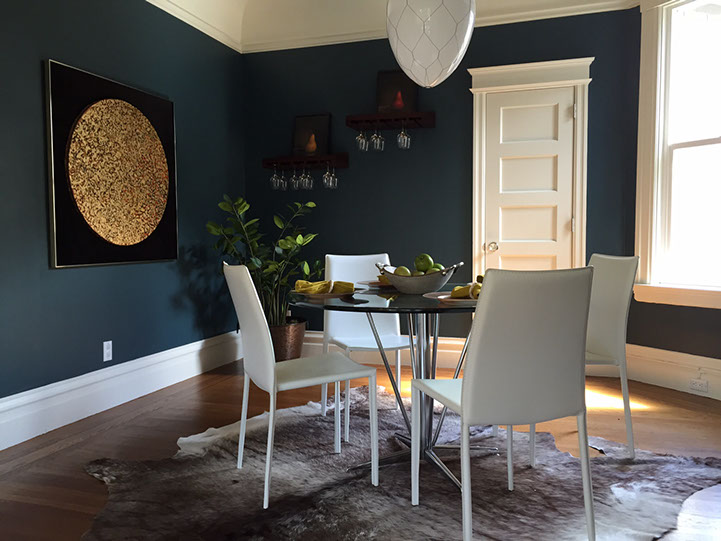
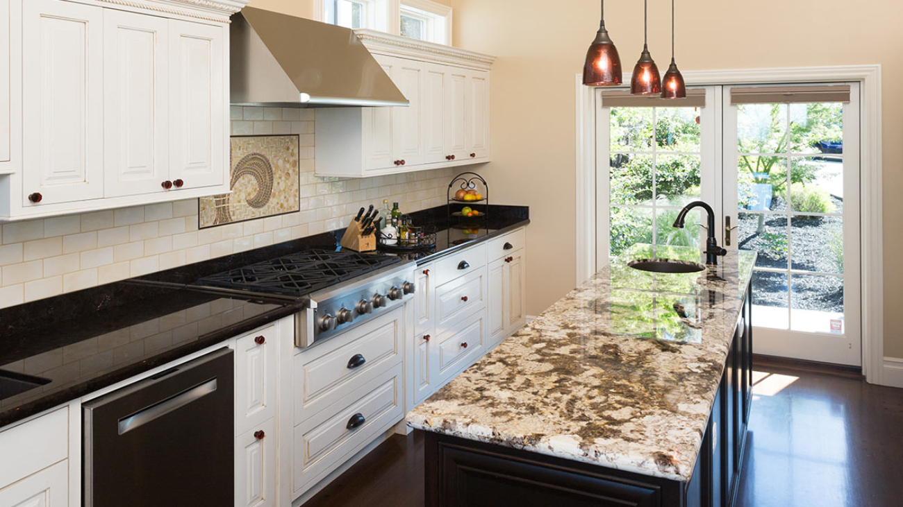
When painting your kitchen, selecting the right color and the brand is an important decision. The kitchen is the heart of the home and needs to be durable and resistant for the unique challenges kitchen surfaces face such as moisture, grease, and temperature variations. With an array of brands available, it’s crucial to choose one that guarantees longevity, quality, and the aesthetic appeal to match your home’s vibe.

Top Paint Brands for Kitchens ranked by our favorites:

Benjamin Moore stands out for its exceptional quality and durability. Regal and Aura are the best lines to choose from. ScuffX is a new line that is particularly good for trim and cabinets. Aura only comes in the lowest sheen on flat. What is even more important is the choice of sheen. Eggshell and Satin are a wipeable finish that ideal for kitchen walls. Benajmin Moore has one of the largest ranges of color stories in the industry.

Farrow & Ball has luxurious colors and an amazing finish and durability. F&B colors offer a richly pigmented paint with an eco-friendly formulation. Their claim to fame is that they are a milk-ased paint. With sheens referred to as Modern Emulsion, Estate Emulsion, Estate Eggshell and Full Gloss you have a wide range of sheens to choose from that work great for different surfaces especially those in the kitchen. Farrow & Ball paint is robust, washable, and mold-resistant finish. The depth of their colors adds a touch of sophistication to any kitchen.

Sherwin-Williams is known for their slogan “Cover the World,” Sherwin William is the largest paint manufacturer on the planet. Their dark colors do not cover well, but they have greys and in-between colors. a range of kitchen-specific paints, including the Emerald® Interior Acrylic Latex Paint. Known for its superior resistance to stains and its ability to be cleaned easily, it ensures that your kitchen walls remain pristine. Moreover, its anti-microbial properties make it a safe choice for a space where food is prepared.

Valspar has a Paint + Primer combination that offers remarkable great coverage and durability. The color stories are not as popular as the top 3 in this article, but their paint stands up well to kitchen challenges, with a scrubbable finish that makes maintenance a breeze. They offer a far better price point than the top 3 listed in this article and can be found at independent hardware stores in the United States which means that they are easily accessible in the downtown areas and you don’t have to traverse a large store to get to the paint department.

Behr – Made by Home Depot, Behr’s has a mixed reputation. Their Marquee® Interior Paint & Primer touts a one-coat coverage which can save time and effort. That could be possible depending on the color. For darker colors these types of paints are ideal because darker colors can sometimes take 3 – 4 coats before proper coverage can be achieved. Like many of the paint brands in this article, Behr paint is durable and easy-clean finish make it a practical choice for the kitchen. Behr’s palette includes vibrant and neutral shades, suitable for any kitchen design and they can mix color from any other line you wish to match.

Factors to Consider When Selecting Paint for Your Kitchen

Paint should be durable and washable: Kitchens require paint that can withstand frequent cleaning and resist stains from cooking splashes.

Paint Sheens are a personal choice: Semi-gloss or satin finishes are recommended for high traffic kitchens where a lot of steaming and frying takes place. They remain the most cleanable and wipeable and reduce scrubbing. They do reflect light and cause colors to read differently, but they can also cause the space to appear lighter and brighter. Eggshell is the preferred sheens for most kitchens.

Color Selection is key: The right color can transform your kitchen, making it important to choose a brand that offers a wide range of options.

Eco-Friendliness” is subjective: In California all paint has been remanufactured to meet environmental air-quality standards. What we consider eco-friendly is whether or not you have to paint again in 5 years or 10 years. More frequent painting is not eco-friendly.

Price can be the deciding factor: While budget is always a consideration, investing in a high-quality paint can save money in the long run by reducing the need for frequent touch-ups. Our top picks are the best in terms of price and longevity.

Preparing Your Kitchen for Painting

Proper preparation is key to achieving a professional-looking finish. Before you begin, ensure your kitchen walls are clean, dry, and free from grease. You can use a degreasing chemical like Trisodium phosphate which will degrease and degloss shiny surfaces or you can Mix 1 cup vinegar with 3 cups of water, 1 cup of baking soda and ½ cup of dish soap in a bowl and wipe down the surfaces and then sand to degloss. Primer can be used over touch surfaces or special surfaces such as metal or vinyl. Mask and covering floors, windows, countertops and appliances will protect them from dust, drips and splatters.

Application Tips for the Perfect Finish

Use High-Quality Brushes and Rollers: Investing in good tools can significantly affect the outcome of your paint job.

Follow the Right Technique: For best results, start from the top of the room (Ceiling, Trim and then Walls) and work your way down, maintaining a wet edge to avoid lap marks.

Allow Adequate Drying Time: Between coats, ensure the paint is completely dry before applying the next layer to avoid any unwanted texture or bubbling.

Maintaining Your Kitchen’s New Look

Once your kitchen is beautifully painted, maintaining its appearance is crucial. Sometimes streaks will form when condensation from cooking and temperature cause them to develop. It is important to wipe these down immediately so that they don’t permanently imbed in the paint. Wipe up spills and splatters immediately to prevent stains. Gently clean the walls with a soft cloth and mild detergent to keep them looking fresh and vibrant for years to come.

Choosing the right paint brand for your kitchen is a decision that influences not just the aesthetics but also the longevity and functionality of the space. Brands like Benjamin Moore, Sherwin-Williams, Behr, Farrow & Ball, and Valspar offer products that meet the demands of the kitchen environment, combining durability, washability, and a wide color palette. By considering factors such as finish, color selection, and eco-friendliness, you can select a paint that not only looks beautiful but also stands up to the daily rigors of kitchen use. With the right preparation, application, and maintenance, your kitchen can remain a vibrant and welcoming space for years to come.

Alameda interior painting by the professionals

Residential House Painting Tips

Painting a residential house is an important task that can give a fresh and vibrant look to your home. A fresh coat of paint can enhance the curb appeal of your home, protect it from weather damage, and increase its value. However, residential house painting is not a simple task, and it requires careful planning, preparation, and execution.

In this article, we will discuss some essential tips for residential house painting that will help you achieve the best results.

  • Choose the right paint: The first step in residential house painting is to choose the right paint. Consider the climate of your area, the condition of your home, and the desired look you want to achieve. You should choose a paint that is durable, long-lasting, and provides adequate protection against weather conditions.
  • Clean and prepare the surface: Before painting your house, you need to clean and prepare the surface. This includes removing dirt, debris, and loose paint. You can use a pressure washer or a scrub brush to clean the surface. If there is any mold or mildew, you should remove it using a solution of water and bleach.
  • Repair any damages: Once the surface is clean, you should inspect it for any damages such as cracks, holes, or rot. Repairing these damages is essential to ensure a smooth and even paint job. You can use wood filler, caulk, or spackle to fill the gaps and holes.
  • Use quality equipment: Residential house painting requires quality equipment such as brushes, rollers, and sprayers. You should choose the right equipment based on the size of the surface you are painting. Using quality equipment will ensure a professional-looking finish.
  • Apply primer: Applying primer is an essential step in residential house painting. Primer helps the paint adhere better to the surface, provides a smooth and even base, and improves the durability of the paint. You should apply primer after cleaning and repairing the surface and allow it to dry completely.
  • Choose the right painting technique: There are different painting techniques that you can use, such as brushing, rolling, or spraying. The choice of technique depends on the type of surface you are painting and the desired finish. For instance, rolling is suitable for large surfaces, while brushing is ideal for edges and corners.
  • Follow safety precautions: Residential house painting can be hazardous, especially if you are working at heights. You should follow safety precautions such as wearing protective gear, using ladders or scaffolds correctly, and avoiding painting in extreme weather conditions.

In conclusion, residential house painting is a significant investment that can enhance the value and appearance of your home. By following these tips, you can achieve the best results and ensure a professional-looking finish. Remember to choose the right paint, clean and prepare the surface, repair any damages, use quality equipment, apply primer, choose the right painting technique, and follow safety precautions.

Alameda house painting

When to Repaint Your Bay Area Home — A Comedy

This the how-to-listicle that aims to help in deciphering the cryptic signs from you home that scream, “It’s time to repaint me!” Let’s face it, your Bay Area abode is more than just four walls and a roof—it’s your castle, your sanctuary, and possibly the backdrop to some of the most epic scenes of your life. But even the grandest of castles starts to crumble and over time, they need something as basic as touch-up or a major overhaul. This is especially important if you want to keep your curb appeal game strong.

The Telltale Signs It’s Time for a New Paint

The Great Fade-Out
Chalky, sun-bleached, cobwebby look are all signs that your house has been left out in the sun too long (because, well, it has). If it has a saggy, past the expiration on the milk carton look or showing shades of pale or gothic novel veneer, it’s time for action. We wish it was just an cosmetic issue, but fading paint is your home’s cry for help. Like a sun-bleached tourist after a day at the beach, your house needs protection.

Peeling & Cracking: The Unwanted Artwork
When your home’s exterior begins to peel and crack, it’s not trying to embrace an abstract art movement—it’s signaling distress. And it is not your home’s attempt at shedding its old skin, even if it were, it doesn’t look as cool as an actual snake shedding it skin because underneath will be rot and broken-down stucco or wood. Peeling paint can lead to moisture invasion faster than pirates boarding a ship. Arrrgh, matey, it’s time to call in the professionals!

The Chalk Zone
No, not the fun, animated kind. If you run your hand across your home’s exterior and it feels like you’ve just chalked up for a gymnastics routine, that’s chalking. The sun has baked your paint (and now your stucco) into a powdery finish that is sadly not a suitable material for an outdoor mural. This is your home’s way of saying, “I’m meltinnnnnng.”

Stains & Water Damage: The Unwanted Decor
Stains and water damage are like the uninvited guests at your party—they just show up without warning and they are not attractive. If your home is starting to look like a Dalmatian with all those black mildew spots and white chalky spots, it’s time to paint it! Forget the décor, water damage is the silent home killer, creeping in and chewing up your structural system and wreak havoc like a ninja. Don’t let your home fall victim to these stealthy attackers.

Fungus Among Us
If you’re starting to spot more mushrooms on your home than in your garden, that’s a clear sign of fungal or mold growth. This isn’t the time to experiment with homemade penicillin; it’s a sign that your paint has lost its protective mojo. Your home is now playing host to spore parties, and trust us, you don’t want to be on that guest list.

Outdated Fashion

Is your home stuck in a time warp? If your curb appeal is more “yikes” than “yay,” it might be time for a wardrobe change. Homes, like people, need to keep their looks updated. If your home is still rocking the avocado green and harvest gold from decades past, it’s begging for a makeover paint job. After the paint, plant new plants, install a deck or an arbor. Feather in more Flowers. Place a park bench or two where you can admire your home’s make over. Let’s give your home the glow-up it deserves!
Frequent Queries from the Concerned Homeowner

Q: How often should I repaint my house?

A: Think of repainting like visiting your favorite hair salon. Every 8-12 years is a good refresh rate to keep your home looking and felling its best, with a little touch-up in between to cover the grays…err, we mean, the fades.

Q: Can I paint my house myself?

A: No. Definitely not. Well, most people definitely cannot. DIY house painting can be as risky as cutting your own hair before a big event. Sure, you might save some cash (or not), but are you ready to live with a less-than-perfect (or just plain ugly) outcome? For best results, leave it to the pros. We have the skills, tools, and, most importantly, the ladders.

Q: How important is choosing the right color for my house?

A: Choosing the right paint color is like selecting the right outfit for a first date—it needs to make a good impression and withstand a bit of scrutiny and the test of time. Factors such as your neighbor’s homes, siding and roof material and whether you’re going to choose a low lustre or flat sheen all come into play. Consult with a professional to find your home’s perfect match.

When your home starts showing these above signs, it’s not just being dramatic—it’s a genuine cry for help. Remember, it can’t leave and go to the doctor! Paint is the universal antidote and the home-saver! Repainting your Bay Area home is not just about aesthetics; it’s about protection, preservation, and occasionally, making the neighbors a tad jealous. So, if you notice any of these signs, don’t wait for a paintpocalypse. Give your home the TLC it deserves, and keep your castle’s curb game strong.

At Arana Craftsman Painters, our goal is clear: we aim to provide unmatched painting services that not only transform your space but also mirror your personal taste and enhance the aesthetic appeal of your property. We’re dedicated to forging enduring relationships with our clients, built on the foundations of open dialogue, dependability, and exceptional outcomes.

Why Arana Craftsman Painters Stand Out

  • Unmatched Expertise and Attention to Detail: Our highly skilled painters bring extensive experience to every project, guaranteeing meticulous care in every brush stroke and ensuring impeccable finishes. Offering a broad spectrum of painting services, we cater to both residential and commercial clients, personalizing our approach to fit your unique requirements and desires.
  • Commitment to Quality and Sustainability: We prioritize the use of premium, environmentally friendly paints and materials, assuring not only an outstanding finish but also the well-being of your family, employees, and the planet.
  • Tailored Solutions for Every Project: Recognizing the distinctiveness of each project, we collaborate closely with you to grasp your vision and provide tailored solutions that make that vision a reality. Whether it’s revamping the exterior of your home, revitalizing your interior spaces, or updating the look of your business, our expertise ensures your goals are achieved.
  • In-depth Local Insights: As experienced Oakland Painters, our deep understanding of the local architecture, climate, and aesthetic preferences enables us to offer thoughtful advice and long-lasting solutions that are impeccably aligned with the Bay Area’s unique characteristics.

Our Signature Services

  • Residential Painting: Let us transform your home with our all-encompassing interior and exterior painting services, designed to refresh and rejuvenate your living spaces.
  • Commercial Painting: Boost your business’s image with a fresh, professional appearance that reflects your brand’s quality and ethos.
  • Color Consultation: Our color experts are here to guide you in choosing the ideal palette to complement your style and enhance your space’s ambiance.
  • Eco-Friendly Practices: Embrace a healthier, more sustainable approach to your painting project with our selection of eco-friendly paints and materials.

At Arana Craftsman Painters, we’re not just painting walls; we’re enriching lives, one space at a time.

301135148_10160279110011031_3588820923027618106_n

How to Maintain Your Painted Walls for Long-lasting Beauty

Maintaining your interior paint job’s vibrant beauty and pristine condition doesn’t have to be a lot of work. With a dash of elbow grease, a sprinkle of diligence, and the right techniques up your sleeve, you can ensure your exterior surfaces will remain clean looking, intact and the envy of the neighborhood (or at least your discerning house cat). Let’s dive into what it takes get this done!

The Monthly to Quarterly Dust-Down: A Wall’s Best Friend
Believe it or not, dust and walls have a love-hate relationship. Dust loves walls, but walls, not so much. Regular dusting is your first line of defense in the battle for wall longevity. Use a soft, microfiber cloth or a gentle duster, give your walls a light once-over a month or Quarter depending on how much time you have. This isn’t just about keeping appearances; it prevents the accumulation of dust particles that can make your walls look dull and neglected over time.

Spot Cleaning: The Art of Precision
Accidents happen, we get it! Or maybe your little artist was inspired or you had an oops moment from a dinner party gone wild, walls do get their fair share of unsolicited decorations. Here is the secret sauce for spot cleaning walls that have a flat to matte sheen: a soft sponge, lukewarm water, and a drop of mild detergent. Dab gently; don’t scrub like you’re trying to erase a bad memory. This method helps remove most stains without leaving your wall looking like it went through a minor exorcism. For walls that have eggshell or higher, you can use a magic eraser or scrub a little hard.

Deep Clean Without the Drama
Once a year, your walls deserve a spa day. Especially your high traffic walls. This involves a more thorough cleaning but doesn’t require any special chants or moon phases. Simply mix a small amount of mild detergent in a bucket of water, and using a soft sponge, wash your walls from top to bottom. Apply the same principles as above. Do not go to town scrubbing on walls that have a flat or matte sheen. Why top to bottom, you ask? If you clean only the bottoms, you may start to see a two-toned color. Rinse with a second sponge dipped in clean water to prevent soap residue from throwing a comeback party. You can also use a wet cloth.

Touch-Ups: The Magic Wand of Wall Maintenance
Even with the best care, life happens, and walls can get chipped or scuffed. If and only if you have walls painted with a flat sheen, keeping a small amount of your wall paint for touch-ups can be a lifesaver. Apply with a small brush for precision and blend into the existing paint. It’s like concealer for your walls – it covers up the minor blemishes and keeps everything looking cleaner, just not flawless. You may see the paint “flash” even though it is flat. Paint is not as high quality as it used to be unfortunately and it can fade faster than it did before all of the changes.

Avoid the Fade: Shielding from the Sun
The sun is great for beaches and picnics but not so much for your paint job. Prolonged exposure to UV or direct sunlight can cause your vibrant colors to fade into a washed-out memory. Using curtains, blinds, or UV window films can protect your walls from the harsh effects of UV rays, keeping your colors bright and your spirits high.

The Right Paint for the Job
Choosing the right type of paint can make a world of difference in maintenance. Higher quality paint will hold its color for longer and resist scuffs for longer. For high-traffic areas, consider using paint with a higher “sheen” or gloss. Eggshell is a good start, Satin is better and Semigloss, while extremely shiny is best in high traffic areas that you need to keep clean. These finishes are not only more durable but also easier to clean, making them ideal for kitchens, bathrooms, and playrooms. For other areas, an eggshell or satin finish can provide a nice balance between sheen and ease of maintenance.

Humidity: The Invisible Enemy
Especially in bathrooms, high levels of humidity can be a painted wall’s nemesis, leading to peeling paint and mold growth. You can also experience streaking when a shower is running. Ensuring your home is well-ventilated, especially in areas like the kitchen and bathroom, can prevent humidity levels from reaching critical mass. A dehumidifier can also be a valuable ally in your quest to maintain optimal humidity levels.

Be Gentle: The Golden Rule of Wall Care
When it comes to maintaining painted walls, gentleness is key. Harsh chemicals and abrasive cleaning tools are the archenemies of paint. They can cause more harm than good, leaving your walls in a state of distress. Stick to mild detergents, soft cloths, and tender loving care.

Final Touch: Regular Inspection and Quick Action
Regularly inspect your walls for signs of wear and tear. Catching issues early can prevent them from escalating into full-blown wall crises. At minimum it will reduce your costs of repainting too soon. A quick touch-up here, a gentle clean there, and your walls will continue to stand tall and beautiful, come what may. Maintaining your painted walls for long-lasting beauty isn’t rocket science, but it does require a bit of effort, a touch of knowledge, and a sprinkle of humor. By following these tips, you can ensure that your walls remain a source of pride and joy, reflecting the care and love you put into your home. Remember, the walls aren’t just part of your house; they’re the backdrop to your life’s many moments and memories.

Schedule A Free Consultation Today 510.567.9559

Dina Bandman Decorator Showcase-3

How to Combine Textures and Colors for a Space You’ll Love!

Creating a unique home aesthetic that speaks to you and looks beautiful to the world isn’t just about throwing together a bunch of colors and textures and hoping for the best. Interior Design is an art form (and if you have the resources, we recommend working with an interior designer). Interior Design is part art form, part science (measuring, able to envision how a palette will come together), and good taste all rolled into one. Today, we are diving deep into the world of texture and color to give you some guidance on how to mixing textures and colors in a way that adds depth, interest, and personality to your space. So, grab your color wheels and fabric samples, and let’s get started on this exciting journey to transform your home into a masterpiece of design.

Color and Color Theory
The first place to start is with color and color theory. Color theory is not just for fine artists, it is a crucial tool in your toolkit. The right color combinations can evoke mood, drama and comfort (or discomfort if you choose the wrong thing!). Color can create the illusion of space, and tie disparate elements of your room together for a more cohesive look. If you understand how to layer, you can make a masterpiece of new and old furniture pieces and then paint the room a color that ties it all in.

Warm vs. Cool Tones
Warm tones, think reds, oranges, and yellows, are like the life of the party in your home, bringing energy and coziness. Cool tones, on the other hand, like blues, greens, and purples, are the zen masters, offering calm and serenity. Balancing these tones is key to a harmonious space. Figuring out what you gravitate more toward is key. Pinterest and design magazines are a good place to start.

The Color Wheel Is Your Friend
The color wheel isn’t just a pretty circle; it’s a roadmap to successful color combinations. Complementary colors (opposite each other on the wheel) offer vibrant contrasts, while analogous colors (next to each other) provide a more harmonious feel.

Texture: The Secret Ingredient
Texture is the secret ingredient that can elevate your home from “meh” to “wow.” It’s all about how things feel, adding depth and interest to what might otherwise be a flat and lifeless space. Texture comes in the form of pattern, material (wood, metal, stone). You can use limewash paints, faux, accent walls or accent pieces of furniture to provide visual texture.

Mix and Match with Purpose
Combine rough with smooth, matte with shiny, and hard with soft. Think a plush velvet sofa against a rough brick wall, or a sleek marble countertop paired with a textured wood cabinet. These contrasts create a sensory experience that brings your interior to life.

Layering Textures for Depth
Layering is not just for fashion; it’s a texture game-changer in interior design. Rugs on rugs, throws on sofas, and multiple pillow textures invite the eye to explore and the body to relax, adding coziness and depth to any room.

Strategic Color and Texture Combinations
Here’s where the magic happens. Combining colors and textures strategically can transform your space into a dynamic and inviting home.

Neutral Foundations with Colorful Accents
Start with a neutral palette for walls and large furniture pieces. Think whites, beiges, and greys. These shades provide a canvas for you to layer colors and textures through accents like pillows, artwork, and decorative items.

Bold Color, Subtle Textures; Subtle Color, Bold Textures
If you go bold with color, keep your textures subtle to avoid sensory overload. Conversely, if your color palette is understated, amp up the texture for visual interest. It’s all about balance although we have seen plenty of designers layer in ways we never thought possible!

Natural Materials for an Earthy Vibe
Incorporating natural materials like wood, stone, and metals can add both texture and color that resonate with an earthy, organic vibe. These elements bring a sense of the outdoors inside, creating a grounding and calming environment. They are excellent accents that ground a space and provide a transition for color and texture.

Personalizing Your Space
What colors bring your comfort and happiness? The ultimate goal in combining textures and colors is to create a space that reflects you and what makes you feel happy when you come home. Your home should tell your story, showcasing your personality, interests, and the things you love. And some people love minimalism and a non-consumptive lifestyle. Show that off too!

Artwork as a Color and Texture Catalyst
Use artwork to introduce new colors and textures or to tie together the elements in a room. A great wall color can bring out one color in a piece of artwork and make it pop. Art can be the inspiration for your entire space, guiding your choices in furniture, textiles, and decorative pieces. Check out local art dealer Slate Contemporary Gallery in Oakland https://slatecontemporary.com/ for a great source of local artists works.

Memories and Moments in Decor
Incorporate items that have personal meaning, like souvenirs from travels or family heirlooms. These pieces add unique textures and colors that are exclusive to your life and story. Frame theatre tickets from the days you lived in New York. Layout family pictures on both walls in a hallway to give it dimension and to memorialize your most treasured moments.

Experiment and Evolve
Your taste and style will evolve, and so should your space. Don’t be afraid to experiment with new color and texture combinations. The beauty of interior design is in its flexibility and the endless possibilities for personal expression.

Creating Harmony in Diversity
Combining textures and colors in your home interior is an exciting adventure in creativity and personal expression. By understanding the basics of color theory, appreciating the depth that texture brings, and strategically mixing these elements, you can create a space that is uniquely yours. Remember, the key to a stunning interior is not just in the bold moves but in the subtle touches that add depth and character to your home. Embrace the diversity of textures and the spectrum of colors to create a living space that is harmonious, inviting, and unmistakably you.

Oakland Painters
Arana Craftsman Painters
819 San Leandro Blvd
San Leandro, CA 94577
510-567-9559

Sue Fisher King Book Selection-1

Beautiful Books for Cozy Reading Nooks

A Holiday Gift Guide
There is something about a book; a real book that you hold in your hands: the texture of the edges of the pages, the way the words and the spaces between the words comprise a visual pattern as well as communicating ideas. And when included, the beautiful images. Books intended to be appreciated for their beauty, often featuring travel, fashion, art, food…

And then there is the art of displaying books. Interior designers know this intimately. Rare is the room that does not host a stack of books, or a single book, possibly propped up against a sturdy object. Whether on a coffee table or a sofa table, or in a bookcase, or on a shelf, or tucked next to ceramic flour and sugar jars on the kitchen counter, the presence of beautiful books feeds the eyes, heart, and mind. We love to see them, pick them up and hold them, page through them, settle into a cozy chair and escape into them for a while.

So, with the holidays coming, we thought we would ask some of our favorite interior designer colleagues for their current favorite “coffee table” books, that they or you might enjoy actually reading in cozy nooks — and create a gift guide for you, dear readers, this holiday season. In the process, we also collected from them their favorite independent sources for this type of book. Plus, for this article, we are including a few images from their portfolios of beautiful spaces that are the perfect setups for settling in and enjoying books.

Book nook designed by LMB Interiors; built by McCutcheon Construction; painted by Arana

Laura Martin Bovard (lmbinteriors.com):

Sumo unedited
“For coffee table books, I adore shopping at Sue Fisher King. I’m not sure if she carries it, but I’m loving SUMO, by Annie Liebovitz.”

Recently released in an XXL edition, SUMO draws on 40 years of the photographer’s work, including photojournalism for Rolling Stone magazine in the 1970s and her trademark, simultaneously quirky and moving conceptual portraits of celebrities for Vanity Fair and Vogue.

Sue Fisher King: 3067 Sacramento St. San Francisco

French-inspired window-seat area in Atherton primary suite, designed by Robineve & Co. Interiors.

Katie Cole (robineveinteriors.com):

“Assouline is my go-to for coffee table books. Each one is special, particularly the oversized editions like this one about Coco Chanel, Chanel: The Impossible Collection, which we’re ordering for a client right now.”

Each book in Assouline’s “The Impossible Collection” series is hand-bound, hand-printed on art-quality paper, and comes in a linen clamshell presentation case. Chanel: The Impossible Collection, by Alexander Fury.

Shop online at: assouline.com

Cozy fireplace for reading beside; living room designed by Laura Eichel

Laura Eichel (lauraeichel.com):

“One of my favorite coffee table books is Ken Fulk’s The Movie in My Mind — available directly from the publisher, Assouline (assouline.com). Ken Fulk is a well-known interior designer based in San Francisco who creates incredible interiors for homes and hotels. He is notorious for his wit, effortless style, and sense of fun, and he brings this energy to every project. This book is a testament to his exquisite taste and prolific creativity.” Eichel’s favorite local spots for in-person browsing: The Gardener and Builders Booksource, both on 4th Street.

The Gardener: 1836 Fourth St, Berkeley

Builders Booksource: 1817 Fourth St, Berkeley

A perfect reading corner for cuddling up with a book; design by Mead Quin

Mead Quin (meadquin.com):

“World’s Finest Homes (from Beta-Plus Publishing) is a beautiful book full of architecture and interior design from all around the world. Each project, elegant, subtle, and inspiring, comes with a brief description and introduction to the responsible firm. The book itself is rather large, making it a fantastic addition to a large coffee table.”

For in-person book perusal and acquisition, Quin recommends: William Stout Architectural Books in Jackson Square, located at 804 Montgomery Street, San Francisco.

Featured image at top, photo credit: Laura Martin Bovard. Pictured: selection of books on shelf at Sue Fisher King

Amato-Architecture-Great-Room-scaled-3 (1)

Architects and Designers: Who does what and how do they work together?

The field of home building and remodeling has a clear path from design to construction, then on to “the finishes,” and lastly, the furnishings. After the initial design plans are complete, architects can and often do play a role throughout the construction of the project.

But, when do interior designers get involved? And can architects and interior designers ever coexist on a project?

We sat down with interior designer Vaughan Woodson of Woodson & Woodson Interiors and architect Rebecca Amato of Amato Architecture and asked them to share with us how they work — together, and separately — to help homeowners make optimal design choices for their homes.

“Often the overlap occurs in the finishes,” Amato explains. “When a client asks me if I can provide design services, I say yes, but up to a point. I will specify anything that stays attached or needs to be attached to the house, i.e.: cabinetry, tile, flooring, paint colors, lighting, plumbing fixtures. Where I draw the line is a whole other area of expertise: soft furnishings, window treatments, and accessories.”

(Featured image of project at top of article: design by Amato Architecture, build by McCutcheon Construction.)

Design by Woodson & Woodson Interiors

Woodson agrees, “When I work with an architect on a project, I appreciate being able to collaborate — with the client’s use of the space as the number-one end goal. Fortunately I’ve been doing this work for a long time and I have zero ego about it, and I think that makes me nice to collaborate with — or so I’ve been told! I have no interest in making a mark on my clients’ home other than my client saying, ‘Vaughan taught me so much about what my style is; I never would have chosen this; she pushed the envelope!’”

Design by Woodson & Woodson Interiors

Both professionals describe a clear dividing line as being about structure. Here, instead of overlapping, their skill sets complement one-another, and mutually affect the results.

Design by Amato Architecture

As an architect, structure is Amato’s passion. As she describes her thought process: “How do I move walls and create a floor plan that is functional and flows? That showcases the focal point of each room, such as art placement, or a big beautiful fireplace? If I get to do that and then the client says, ‘Okay, now I want to bring in an interior designer,’ that’s great. I love, love, love partnering with interior designers! Working with a designer, I can communicate my vision, how I’m thinking about views, where I am creating seating areas and moments, and then pass the baton.”

Both agree that it is best to bring in an interior designer early in the planning phase. As Woodson describes, if she wants to specify a particularly spectacular sofa, she may share the measurements with the architect, who might look at shifting the location of a door to optimize wall placement for it.

Or the two might have a conversation about window treatments — Will they be minimal? Will allowance be needed to create a pocket for roller shades? — If the client wants curtain panels to soften the room, space between the window casing and the crown molding will be included in the plans.

Design by Woodson & Woodson Interiors

At the most basic level, Amato’s expertise as an architect is required when drawings are needed, especially when desired changes to the home trigger a call for permits. Woodson notes that while she, and most interior designers, have their own subcontractors they work with for cosmetic changes, “as soon as the client says, we are looking to renovate our kitchen, add a sliding door, that’s when I would bring in Rebecca.”

Amato describes the flip side, when she refers potential clients to Woodson: “Sometimes, someone calls and says they are remodeling, but they are not moving any walls — that’s probably not a good fit for me. I tell them, ‘You’d be better off working with a designer.’”

Architect Rebecca Amato

There are design firms that have an in-house interior architecture department and per Amato, some building department staff will allow a person who doesn’t have a license to prepare drawings — although in that case it is helpful if the drawings are combined with a report from a structural engineer.

Another way to look at how design and architecture interact is around furniture. Do you, as a homeowner, know what pieces you want to replace or hold onto?

For her clients, Woodson likes to determine at the outset which pieces are worth keeping. “I’m a preservationist at heart,” she says. “I prefer to try to use what we have — if it works with the design direction we are going in. Sometimes really great design comes from using the clients’ own pieces, because that way, we are putting their story in.”

Interior Designer Vaughan Woodson

When you come at interior space design from this angle, Woodson explains, “maybe the dining room gets bigger, and in the laundry you don’t end up with a counter — because those decisions accommodate the story and the richness.”

Amato agrees, “I think about the furniture in the room. I will ask them, ‘Are you planning on purchasing a new dining room table, or using one you’ve inherited from your grandmother? And I will take those dimensions into account.”

“We want to know, what’s the pain point of your home now? And does this table not seat enough people, and you always wish that you could seat 8 because you have a family of 4 and you would like to have another family of 4 over and you can never do it? What are we solving — and spending all this money on with design services? Good design comes from that,” Woodson adds.

“Yes, that’s critical,” agrees Amato.

When a designer and architect collaborate, Amato says, “we are sharing as much information about the client as we can, from what’s important to them, to what their styles for decision making are. What are their hopes, and what may be some of their limitations. Maybe they’re doing work in phases because of a budget or they’ve got kids going off to school or they’re pregnant…. On a deeper level, it’s not just about the facts of life, but really, what their emotional experience is going to be.”

Ultimately, “we are following the client’s lead,” says Woodson, “and trying to make the most stylish product from that.”

QM-White-Article-32-600x414

Designer’s Favorites: Quinn Morgan on White Interiors

We recently interviewed a number of prominent Bay Area interior designers on their favorite shades of white for painting interiors. In this post, Quinn Morgan weighs in. (To return to the introduction and access links to other designers’ interviews, click here.)

Quinn Morgan (www.quinnmorgandesign.com): Benjamin Moore’s Capitol White, Simply White, and Heron White

How would you describe your design aesthetic? Layers of complementary textures to engage the senses; items carefully curated, blending new and heritage pieces; colors chosen for warmth and impact. My firm creates environments that are meant to be not just inhabited, but experienced; homes that are nurturing and inspirational.

What advice would you give to homeowners about choosing whites? It would be impossible to say one white works everywhere! Light, reflections, indoor-to-outdoor relationship, all of these influence color rendering in every space, differently. The goal is to select the perfect white for each space.

Consider your entire paint palette and choose the main color, trim, and ceiling color all at once. Keep in mind your furnishings, art, and the feeling you want the room to have. Every white has a subtle color within it and that tone will become more pronounced based on the colors it is paired with.

For our clients, we paint large swatches on a large board, 18″ x 24″ or larger, that they can move around the room and see if they love it on each wall throughout the day.

Do you have a project/story that demonstrates an unexpected or particularly spectacular use of white?
https://www.quinnmorgandesign.com/los-altos-project For this project, the architect specified white for the walls, and as the interior designer, I worked with him to decide which shade of white.

The home is so big and airy and Modern. White welcomes the light as it moves through the space. White is such a complementary backdrop to the furnishings and objects; it really showcases the pieces in front of it. I love to use white as a supporting player, so to speak.

It’s funny to be discussing whites now, because lately, what I am becoming known for is my obsession with color — particularly the psychology of color and then the impact it has. We think of color as just being on the walls, but in reality, it also starts to inhabit the space.

For example, when I first moved into my house, the wall colors were really dark. I do really like dark rooms! But I began noticing that the color was so unflattering to everybody! I was sitting there, having company over, and nobody looked good! It didn’t work with anyone’s skin tone, and it made my eyes tired. The wall color had a physical impact on my energy level in the room.

When I changed the color, the effect was immediately palpable. I believe the color should complement the homeowner. It’s important that your backdrop actually supports you! So if I were to choose a bedroom color, if I am going for something soothing , I look to a client’s eye color, or their hemoglobin color — the red in their skin; to choose accent colors. The colors throughout the room relate to them, like with fashion.

My living room has undergone a few transformations. The first color I applied after that realization was a very subtle blue, and I just I redid it again — because I didn’t want a color anymore. I wanted the room to feel more grounding, so I chose a warm taupe-gray.

Color lives in the atmosphere around us. If your home is on a lakefront, light reflecting off water will impact how color looks in the room. If you have an indoor-outdoor connection — woods, water reflecting the sky — all these reflections are working at the same time, affecting all four walls in the room differently. Whether I’m selecting a color or a shade of white, I’m usually looking for the one that will work best on the predominant walls.

White-Article-4-2

Designers’ Favorites: Dawn Carlson on White Interiors

We recently interviewed a number of prominent Bay Area interior designers on their favorite shades of white for painting interiors. In this post, Dawn Carlson weighs in.

Carol Perry and Dawn Carlson of MAS Design

Dawn Carlson, MAS Design (https://masinteriordesign.com/): Sherwin Williams’ Incredible White

How would you describe your design aesthetic? We believe designs should be layered and unpredictable, that they should be curated so that each design speaks to who our clients are.

It’s about helping clients find what they love, what sanctuary means to them, and then elevating that so that it sings.

We love wabi-sabi, organic texture, and sculptural forms — all of which transcends most styles.

We like to say that the current that runs through our work is chic, fresh, and eminently livable.

What advice would you give to homeowners about choosing whites? We do have a favorite: Sherwin Williams’ Incredible White (the perfect name!) — it has a whisper of gray in it. Sherwin Williams is not a “designer” paint brand and so, price-wise it is accessible; and best of all, this white tends to work in almost every light!

I’ve never had a project that it did not look great in. Whites can appear too yellow, beige, pink…

This white always has a crisp, clean appearance and depth. You can do a whole house in it, and the look of it will vary from room to room, according to the light in each space, with just enough variation that it creates subtle interest, but also provides cohesion.

It’s definitely a go-to. We always tell our clients to look for a white with minimal hue, but not so stark that it ends up looking flat. When you narrow in on a selection, paint very large (3’ x 3’) samples in different rooms, next to your trims—in shadowy corners as well as sunny spots. Look at all of them at different times of day. The light will change a lot. This is a pretty sure-fire way to ensure that you’re going to love it, no matter what.

Do you have a project/story that demonstrates an unexpected or particularly spectacular use of white? One of our favorite projects was in Sonoma County, a getaway for one of our clients who live primarily in Japan and San Francisco: https://masinteriordesign.com/project/sonoma-county/ The clients had an uber-modern perspective, but wanted to mix it up a little due to the spectacular natural surroundings this vacation home enjoys. So we decided on Organic Modern for our design direction. We used Incredible White in all of the rooms in this home to juxtapose against the artisan/organic/imperfect elements and neutral hues that we brought in to give meaning and comfort to the clean, modern space.

The depth of the white gave in to the subtlety and textures that would complement the natural surroundings, and also showcased the organic elements by juxtaposing against them.

(Note: Click this link to view the Sonoma project discussed above. Enclosed images are from a different home in MAS Designs’ portfolio.)

Beautiful white interior

Choosing White Paint Colors for Your Interiors: Bay Area Designers Share Their Favorites!

A Paler Shade of White: Meditations on Choosing White for Your Walls

I have a lot of conversations with homeowners and interior designers about color. Working primarily in the Bay Area, I’ve noticed that few homeowners choose white, especially for exteriors.

Bathroom; interior design by Quinn Morgan

I have my own ideas about this. Like, maybe it’s just too gray and foggy here for white. People want color to brighten things up!

When I travel to sunnier, southern locales (relative to our latitude), I see more candy-colors than muted tones, and far more white exteriors, perhaps inspired by the contrast against bold, blue skies. (Think coastal Greece, a hillside frosted with white houses, as an extreme example.)

But lately, white seems to be making a comeback. My company has seen an uptick in designers spec-ing more whites. White works well as a background, a neutral classic that highlights the art and furniture when used in interiors.

As a painting contractor, I love color, and yet I have to say, choosing white — whereas this used to be a “boring” default color — now we find it often elevates a space. Did the fact that Benjamin Moore named its “Simply White” as “Color of the Year” in 2016 have an influence on the growing trend?

Eichler living room in white, designed by LMB Interiors

At the time, the company noted in a press release for the announcement: “The color white is transcendent, powerful and polarizing – it is either taken for granted or obsessed over,” said Ellen O’Neill, Benjamin Moore Creative Director.

She continued, “White is not just a design trend, it is a design essential. The popularity of white, the necessity of white, the mystique of white is quantifiable in our industry. Of the top ten best-selling Benjamin Moore colors, variants of white occupy five spots. It was inevitable that we would ultimately recognize white as our Color of the Year.”

An art collector’s home, designed by Mead Quin

Frankly, white exteriors are still quite rare. But interiors…? Yes!

For this topic, we talked to a number of our favorite local designers about their favorite white paint colors for interiors, and projects they loved that featured this color (that isn’t really a color, but is).